GRAPHIC DESIGN CLASS 3 | COLOR AND TYPOGRAPHY
Having gone through the Interesting lecture by our teacher @lhorgic, i will be answering the questions given for the lecture under the title above.
QUESTION ONE

• IN YOUR OWN WORD EXPLAIN WHAT YOU MEAN BY COLOR AND TYPOGRAPHY.
Color
Color as well as typography are a very important part of graphic design process. Colors helps a graphic design to portray a visual effect on the information he wants to display. In that way, it makes it catchy to the eye of the intended party even before they have even seen what information is to be displayed. If an information is meant for kids bright colors will be preferable as kids are easily drawn to such effects.
Typography
Typography on the other hand is the way the information is arranged to make it clear and easy to understand by the intended party. It is also as important as the use of color.
Typography involves knowing the font to use, where to put your information, the spacing and the size to use for a design. Different designs require different types and style of all these and as a Graphic designer, knowing when all of this is applicable will bring out the best of your creativity.
Both color and typography when applied correctly on the work of a very creative graphic designer, the outcome can only be a top design.
QUESTION TWO
• MENTION FIVE COLORS AND WHAT THEY REPRESENT AS YOU WERE TAUGHT IN THIS CLASS.
There were a lot of color explained in the lecture class, so the five I selected are Red, Yellow, Green, Blue and Black. Each color is used to represent different emotions and they are all uniquely different in their own way.
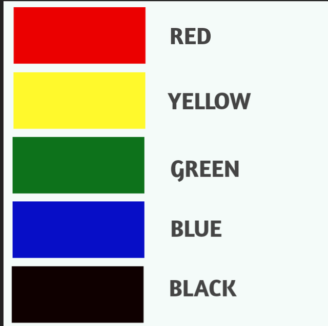
| COLOR | MEANING |
|---|---|
| RED | 🟥 |
| i | Love |
| ii | Danger |
| iii | Energy |
| YELLOW | 🟨 |
| i | Happiness |
| ii | Spontaneity |
| iii | Hope |
| GREEN | 🟩 |
| i | Harmony |
| ii | Nature |
| iii | Growth |
| BLUE | 🟦 |
| i | Calm |
| ii | Intelligence |
| iii | Trust |
| BLACK | ⬛ |
| i | Elegance |
| ii | Sophistication |
| iii | Power |
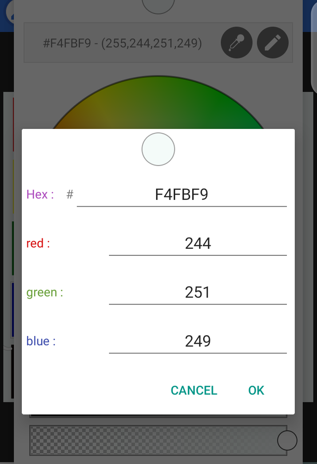
On pixel lab, the hex code for the color can be chosen and applied. I played around with a few of them according to the codes given in class. I got a few of them correctly on my first try.
QUESTION THREE
• RESEARCH THREE MORE FONTS EACH FOR THE FOLLOWING CATEGORY
• script
• serif
• san serif
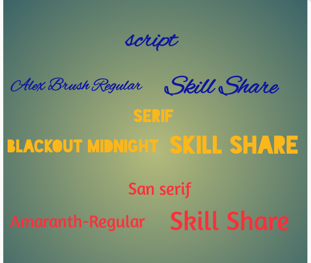
All fonts were gotten on the pixellab app
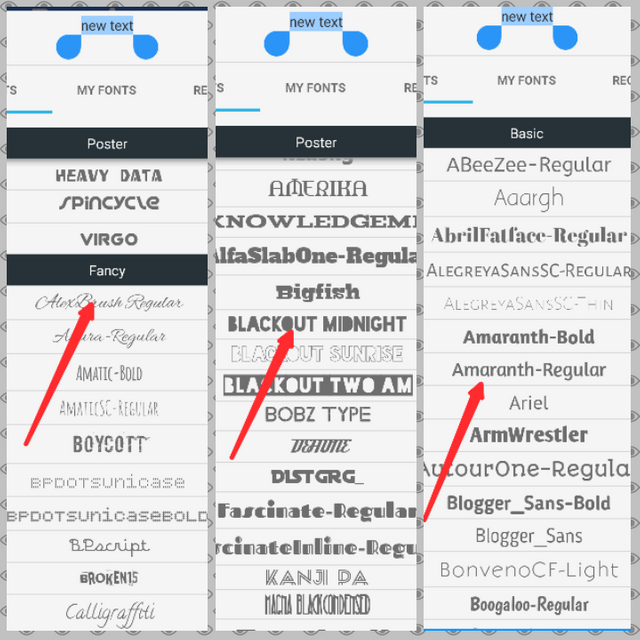
script - These fonts are created to look like handwriting but they look only more elegant than handwritings. They are very fluid and in nature as can be seen in the image above.
serif they are fonts that have serifs, which is is a kind of stroke at the end of the font as seen in the image above.
san serif- they are fonts that are just without serifs , meaning no strokes at the end of the font as seen in the image above.
QUESTION FOUR
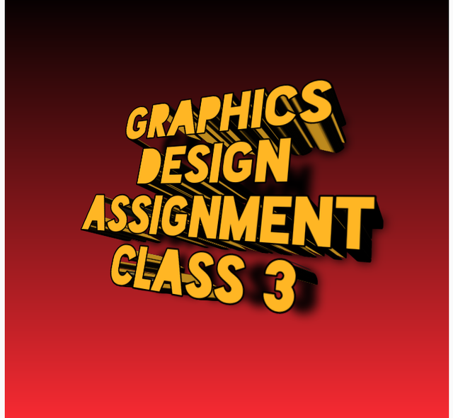
• CREATE A SIMPLE DESIGN SHOWING YOUR UNDERSTANDING OF THIS LESSON
My understanding of the lecture is that the design doesn't always have to be complex but must contain the key Information the potential viewer is looking for. That is the essence of a design

This design was also done using Pixellab, I am more familiar with Corel 9 but I decided to use the app from the previous lesson for my designs.
Thanks for this wonderful lecture our teacher @lhorgic.
CC : @atim1234
@lhorgic
@niglys
Thanks for participating.
My observation
You didn't give 3 examples each for the font categories and in question 4, your design look distorted because of the font arrangement. That is why we recommend allignment,it make going through design type very easy to read and comprehend. You did well all the same.
Thanks for the grades sir. I think I didn't properly read the questions well in question 3, and for question four I am not very good with pixellab but i tried using it instead of Corel which i am familiar with so as to improve.. I'll work on my font arrangement, which is one of the essence of your lecture. Thanks again for explaining my mistakes