CLASS 8 GRAPHIC DESIGN APPLICATION ASSIGNMENT ON LOGO CREATION by hazmat
LOGO CREATION ON PIXELLAB

Having thoroughly read the lecture class by our Design App teacher @niglys8 on things to do when creating logos using a design application, i will be answering the questions given on Logo creation.

1 List the 4 information that should be gotten from your client before you create an amazing logo.

Logos are a creative way to sell out your brand to people. When a person see's a Coca-Cola logo you immediately know it's a beverage drink because that what the brand is synonymous with.
A logo has to be unique in its own way, so it's not confused with other people organization. In essence it should not be too cumbersome with information, one glance at it should tell the person what it is you're about. Too much information makes it look disorganized and distorted.
There are a number of factors one has to take into account in creating a logo design for a brand. The following are needed to create a logo design.
• NAME OF THE BRAND
The name of most brands play a big role in the design of the brand logo. A lot of brands prefer their logos to have a semblance of their organization name , sometimes the whole letters and sometimes just a few letters from the name. So in designing a logo one important thing to note is the brand name as it will be a pointer to a large percentage of your design.
• WHAT THE BRAND IS KNOWN
What the brand does is also another factor to consider when designing so as not to design something fit for another brand. An example is designing a hair brand logo for a beverage brand or a mobile phone brand, it won't work out. So knowing what the brand does will help your creativity in the design process.
• COLOR OF THE BRAND
Most brands will always want their logo color to be that of their business. if there is a unique color that is very prominent to that organization it is your job as a designer to note it and try to factor it into your design. This is not always the case with all brands but it's also a very important factor when designing.
• SLOGAN OF THE BRAND
Slogans are very important just like the other factors mentioned above. Some brands are even know by their slogans and not the brand name or even the brand color. Finding a way to input this is a plus in the design.
All of these factors come into play when creating a logo, it is now up to the designer to be creative enough to apply all of these successfully.
2 Create a simple LETTERMARK logo design for a beauty brand and show picture screenshots of the process involved.
For this design i will be using the Pixel lab design application to create a logo for a beauty brand.

MY LOGO DESIGN
The following are the steps i followed to create the logo
STEP 1
I used a white background at the start of the design.

STEP 2
Then using the shape icon, I created a square shape and colored it black.

STEP 3
I embossed the square shape that was created at 90°.

STEP 4
The still using the shape icon, I created a circle shape and placed it in the middle of the embossed square.

STEP 5
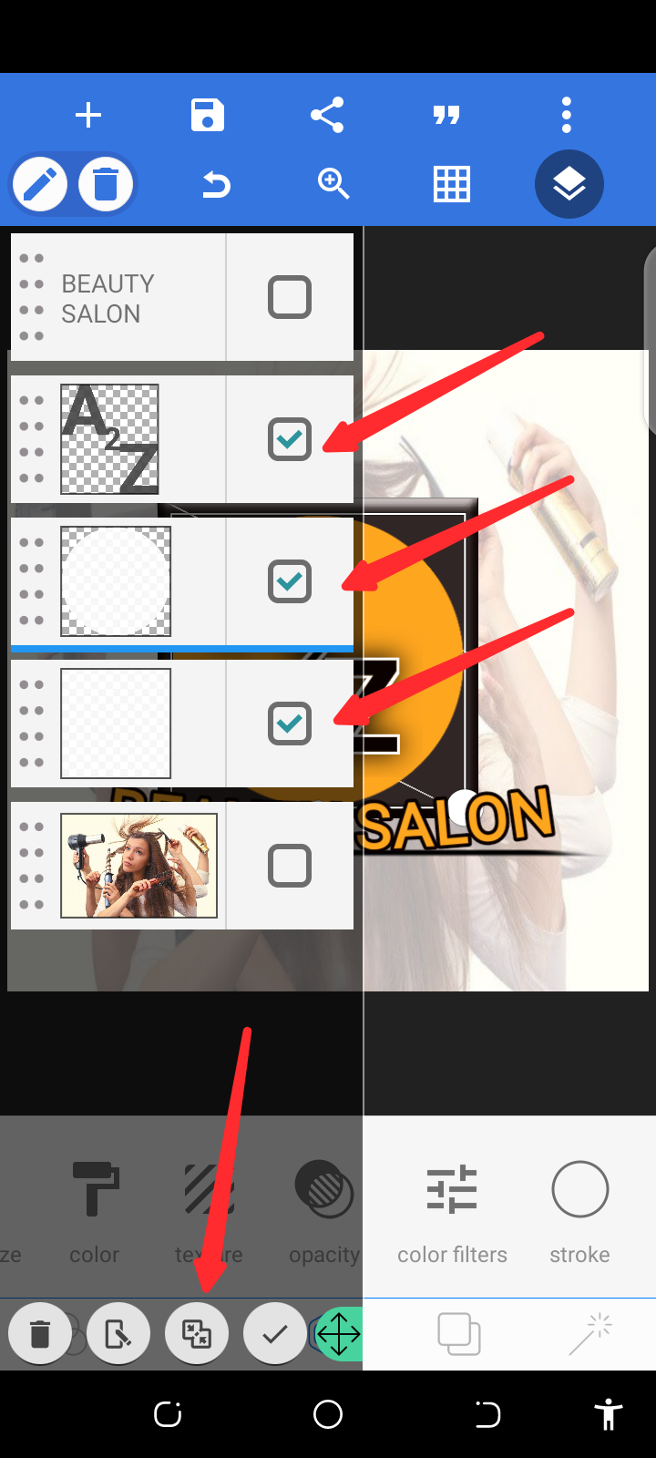
I used the layer icon at the top right hand corner to merge them together.

STEP 6
The I began to add my text, the using the stroke icon I set stroke width to 3.

STEP 7
I added shadow to my text A2Z, with the blur shadow at 25.

STEP 8
Now I added the text BEAUTY SALON, then used the stroke icon that was used initially. But now the shadow used is the 3D shadow as you can see at the bottom of the text. After doing this I curved the text.

STEP 9
Using the add icon, I selected an image using from gallery option into my design.

Then placing the image at the back of the design and reduced the opacity.

STEP 10
Using merge tool
STEP 11
Then completing the a to Z text on my logo.
The a TO z is depicting the fact that all round beauty process can be found with the brand.
As can be seen with the lady in the background doing a lot of beauty process.
I've not been very interested in Logo creation since i started practicing on Graphic design. This class has afforded me the opportunity to improve in a lot of areas in Design. For this I say a big thank you to the headmaster @atim1234 , and all teachers that have taken their time to lecture us so far Design App teacher @niglys8, Design Science Teacher @lhorgic and Design Software teacher @printskill and the wonderful @daytona475 for the support given to this class so far. It has really been an honor
Very nice logo you have created dear! You have not limited yourself to the teacher's ideas.
Good job!
Thanks for the support, it means a lot
Dear @hazmat
I really appreciate you for your active participation in the pixel lab application logo design class 8.
Bravo! You did excellently well.
The overall grading score for the final semester exams would be provided to you soon.
Click here to participate in the final exams.
I wish you all the best!