Graphic design class 4||Colour combination||by@dibie
Hello everyone 🤗
I trust we are all doing well today.
So here is my assignment for graphic design class 4 anchored by @lhorgic
please enjoy!


Just like the popular saying
"With all colours combined,the world shines"
There is this wonderful feeling that comes with the mixing of colours that cannot be articulated using words when you come across it.
it is pure art! Colour combination is the combining or mixing together of different colours to form a unique outcome.
The key to successful combination of colours is to understand how colour react, interact and appear with each other.
A designer have to understand and be familiar with certain colour theories like,colour psychology, features,Harmony and colour wheel also.
Thanks to our amiable GD teacher @lhorgic who took it upon himself to engligthen us on all of this aforementioned things,making our work towards understanding Colour combination a walk in the park.
It is imperative to note that for one to become a pro in combining colours without fear of flaws or mistakes is to master the artistry of colour psychology and colour wheel,very important!
You wouldn't want to mix or combine 2 or more colours that dispicts anger and disgust when designing a weeding invite...smiles.
It is important to also note that,we can't have a conversation about colour wheel without talking about "colour harmonies" which is the selection of colours that look aesthetics and pleasing side by side. This two concept are interwoven and work hand in hand.
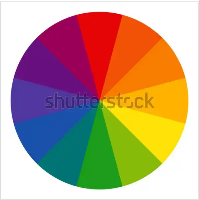
The colour wheel which consist of 3 primary colours(red,yellow and blue)3 secondary colours(green,orange,purple)and 6 tertiary colors(e.g blue-green or red violet)is an important component when it comes to applying colours to design.

Cutting a line across the colour wheel generates yet another classification of colours namely
•Warm colours:e.g orange,red,yellow.
•Cool colours:e.g green,blue,purple.
Just as seen in the screenshot below

Now, that brings us to the pattern of combination.
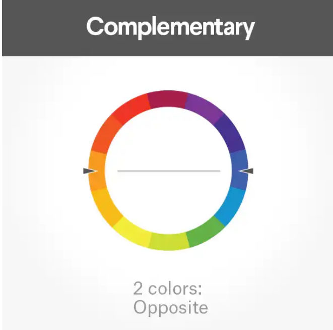
The colour scheme or combination pattern in colour wheel consist of 3 colour combinations
•Complementary colour combination
•Analogous colour combination
•Triadic combination
let's take them one after the other
-Complementary Color combination: These colours are majorly for complementing just like it sounds.It is not the dominant colours used in a design,it is only used in amplifying the dominant colour. Using this colour has a way of making your design stand out,
look more attractive and sophisticated.
These colours are on the opposite sides of a dominant colour in the colour wheel.
-Analogous Colour combination:these colours sit next to each other in the colour wheel.They can easily be mistaking for each other.
This particular set of colours have a way of piquing interest of people differently.
In this scheme,one colour dominate,one support and one accent.

-Triadic colours:This colours are meticulously spaced around the colour wheel,they exhibits brightness and harmony as some of their quality.
Using triadic Colour combo make design stand out and help audience to quickly located certain information on the flier or design.

ok here is my compilation of 5 more colour combination and their respective hex code.

| Colour | Hex code |
|---|---|
| I.Green Pantone | #52AF59 |
| II.Rosy Brown | #B78F8F |

| Colour | Hex code |
|---|---|
| I.Orange yellow Crayola | #FFD65C |
| II.Blue jeans | #05B1FF |

| Colour | Hex code |
|---|---|
| I.Verdigris | #66C0B8 |
| II.Pale pink | #FFE2E5 |
| III.Uranian blue | #BBDEFB |
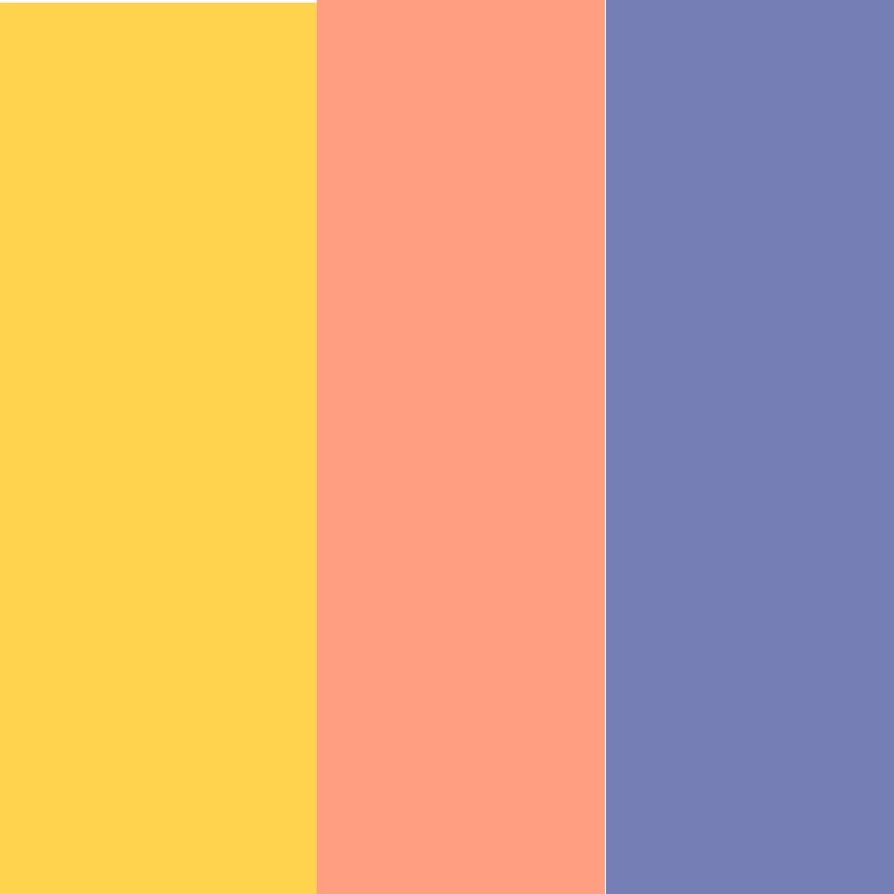
| Colour | Hex code |
|---|---|
| I.Sunglow | #FFD34E |
| II.Vivid Tangerine | #FF9E80 |
| III.Glaucous | #767FB5 |

| Colour | Hex code |
|---|---|
| I.Melon | #EEBBAB |
| II.Copper rose | #9F6B6B |
| III.Congo Pink | #F49992 |
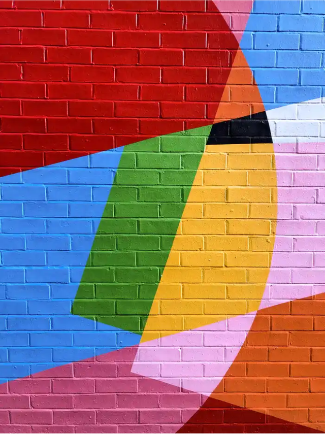
After going through this lesson and understanding the concept of colour wheel and colour combination,I try putting it into practice by designing something using PIXEL LAB one of the recommended Android phone graphic design app here in this class..
I intentionally chose this app instead of other app that only require template for design because I wanted to know my stances so far and how much I have learnt here on this online class.
so here is my design and how I started designing from the scratch.

from the starting point


| Colour | Hex |
|---|---|
| i. yellow orange wheel | FF9800 |
| ii.Falu red | 7E1319 |
I only made use of 2 colours in my design, yellow orange wheel as the main colour and falu red to compliment my design,as we alredy know that black and white are not to be classified as colours,they are only there to amplify and modify the design.
I also made use of script font to compliment serif font just as seen above in my design
Conclusion
colour combination and colour wheel are concept every graphic designer must be familiar with and also understand to a very large extent to become a pro in graphic designing.
Thank to @lhorgic and this GD class here on steem skillshare,we have been able to
fully comprehend these things.
Thanks for staying 🤗
special regards:@lhorgic @atim1234 @steemskillshare
assignment by @dibie
Otherwise stated "All unsourced image are properties of the author"
@dibie,you did a very good job and this shows you really understand this lesson...I believe you can do even better. Keep it up. Also try as much as possible not to use images that has watermark in them such as the one used in question 2 having the Shutterstock watermark. Your design in question 4 looks good as time goes on we will be looking at how to properly add assets such as image to our design. Weldone dear student.