Graphic Design Class 3 | Colour and Typography
 Designed using Procreate and Canva
Hello, Steem SkillShare!
Learning is one of the best things in life. I have always been the type of person who loves to go to school to learn. In fact, because of my love for learning, I studied to become a teacher. And now here I am, a teacher in a public school in the Philippines for eight years now! And I am very fortunate to have found a community in steemit that caters my interest and my hunger for learning.
So today, let me share to you what I learned from the Graphic Design Class 3, which tackles Typography and Colours. This has been a very comprehensive class by @lhorgic. Thank you very much Sir for sharing your expertise to us...
Before I will answer the questions and do the activities or our assignments, let me share to you my notes. Yes! I made notes for this lesson and of course, because I love note taking.
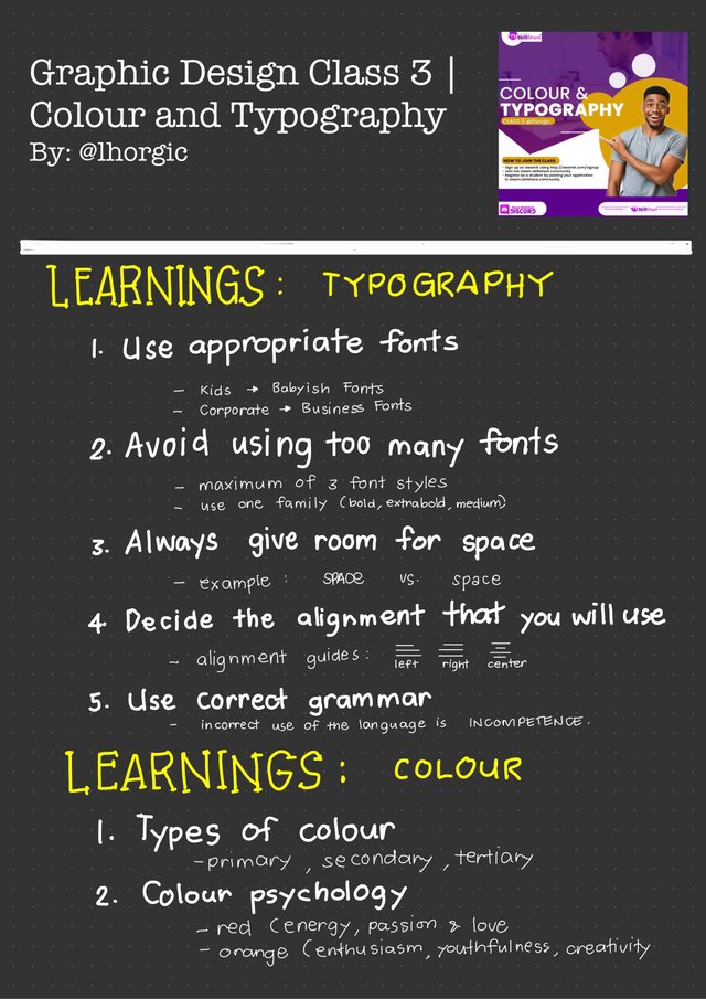 This note is made using GoodNotes App
In this page, I outlined my learnings of the topic or lesson discuss by our instructor. According to him, when we talk about graphic design, typography and colours are the two basic things that we need to know and master. For typography, it is very important to:
- Use appropriate font style.
- Avoid using too many fonts.
- Always consider space in design.
- Decide the alignment to be used.
- Use correct grammar always.
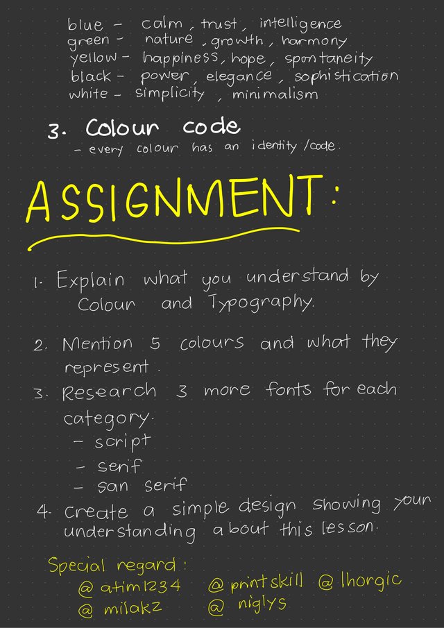 This note is created using GoodNotes App
As a working-in-progress graphic designer, I have to know its types, psychology, and identity. These things are important in order for me to maximize the uses and functions of colours in graphic design.
I also wrote down the questions and activities that I need to answer and do. I believe in doing the assignment, I will gain more knowledge about the course/subject. So now, allow me to share my answers.

1. Explain the what you understand by Colour and Typography
Colour and Typography are two fundamental areas that a graphic designer or artist should know and master. Colour has different types such as primary, secondary and tertiary. Each color has its own identity and code and each has its own meaning. Colours can manifest emotions and feelings. Thus, the graphic designer should know and use colour properly, effectively and efficiently. On the other hand, typography is a useful tool in graphic design to be able to communicate to the clientele in education, marketing, business and many more. Therefore, every graphic designer should know how to maximize appropriately its uses and functions.
2. Mention 5 colours and what they represent
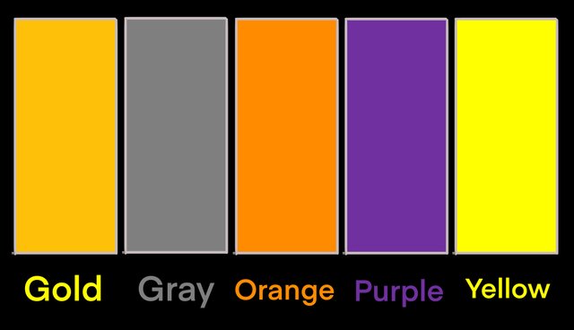 This image is created using Procreate
One of the interesting thing about this lesson is the psychology or colours or the symbolisms of colors! Graphic designers should pick the right colours when designing something because the color itself will transcend a message to the clientele.
- GOLD - success, wealth, generousity
- GRAY - balance, security, maturity
- ORANGE - confidence, warmth, energy
- PURPLE - luxury, dignity, royalty
- YELLOW - optimism, friendly, abundance
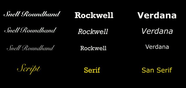
3. Research 3 more fonts for each category: script, serif, san serif
 This image is created using Procreate
Actually, since I am a Technical Drafting Teacher, I know already these categories of letters/fonts.
- SNELL ROUNDHAND - Script letters appear like a long and extended letters and are mostly used in aesthetics.
- ROCKWELL - Serif letters have serifs, a small extension of the letters. These fonts are widely used in textbooks and magazines because they create an illusion of a straight horizontal line to guide the reader.
- VERDANA - San Serif have no serifs. They are commonly used in technical and business purposes.
4. Create a simple design showing your understanding about this lesson
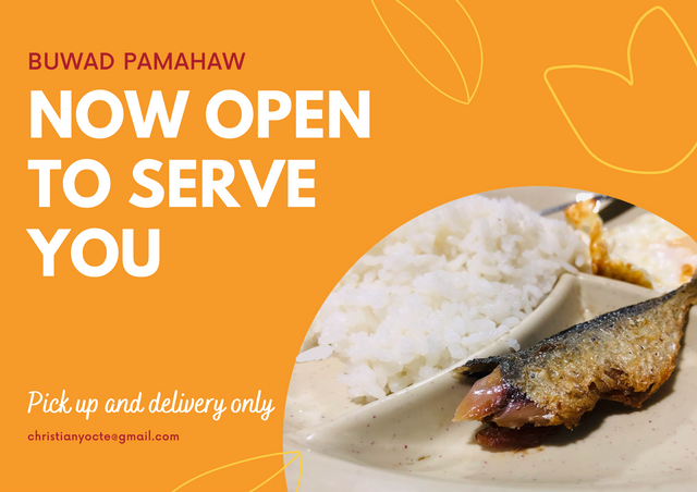
So, here is my output to showcase my understanding of the lesson. I have featured here my food/breakfast this morning. This morning, I just had egg, rice and the dried fish. I choose gold as colour because it signifies wealth. Although, most wealthy people in the Philippines do not eat dried fish on a daily basis, but for ordinary and poor, having something to eat is already a blessing. For me, true wealthy person is someone who is grateful.
Thank you so much for this opportunity to attend your class @lhorgic! I had so much fun in doing my assignment! Also, best regards to the admin, moderators and to my teachers in graphic design: @milakz, @atim1234, @printskill, @niglys.

Thanks for participating,here is your grade
My Observation
I love your presentation,it really good to know you took note of certain key points. In question 3,you only mentioned one example each instead of 3 examples for each category.Your Design is also very good,I can also see that you used left alignment for your type. Kudos
OMG! I misunderstood the question in number 3. My bad. But its okay. Anyways thank you for your feedback!