DESIGN YOUR SHIRT FOR STEEM | Neon lights by @zmoreno
Hello to everyone in this wonderful SteemWomenClub community! Today I bring you my participation for this contest “DESIGN A SHIRT FOR STEEM” (you can find it here), for which I designed this model:
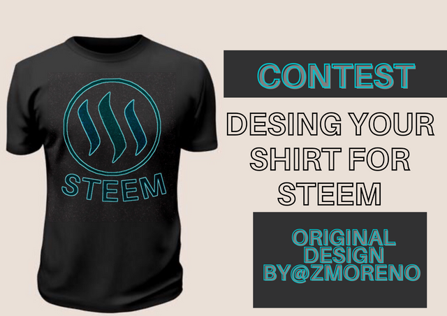
Edit and design done by me, Isabella Moreno.
INSPIRATION
I was inspired by a neon sign to create the logo for my shirt. Below is an example of what I had in mind:

TOOLS
For this process I used three apps on my phone: Picsart, Canva and Remini, which I share with you below.
I searched for the STEEM logo and several shirt vectors in google search. I chose the following:
STEP BY STEP OF THE DESIGN
I started on Picsart. It seems to me an application with a lot of options to deal with color, texture effects, filters, combine photos and images; it is simple to use despite being a mobile application. As a first step, I started working on a white shirt to have better clarity; I added the logo with the "add image" tool:
Until it looked like this:
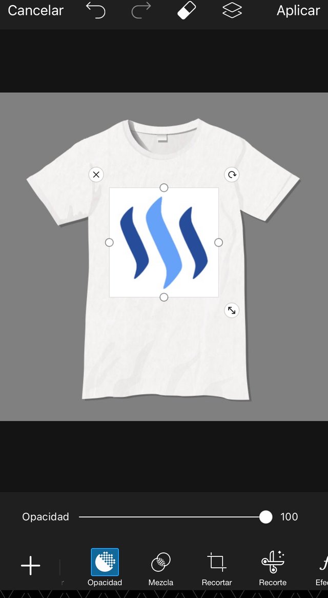
Immediately this option opens, it displays the tools inside it.
I started to play with the tools. Then I used the tool to cut with a certain shape and I outlined the border of the logo as follows:
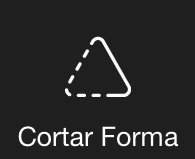

Then, once the logo was cut in a circular shape and placed on the t-shirt, I played with lights, contrast, brightness and saturation to get the logo to look the way I saw it in my mind.

At this point, the logo looked like this:

-C0947044D03F.jpeg](https://steemitimages.com/640x0/https://cdn.steemitimages.com/DQmWqP3f5QW7V5HhvW26Q8cqLvQ9FuUhfD9qmaJyDdFT2wB/1BDCD8C6-E884-43B2-A51B-C0947044D03F.jpeg)
Then, once I finished the process of editing the logo on its own, I started blending its edit with the shirt using the "blend" tool.

I used the blend called "underexpose color". Then, in case I wasn't totally convinced, I modified the saturation and brightness of the logo a bit. The result was as follows:
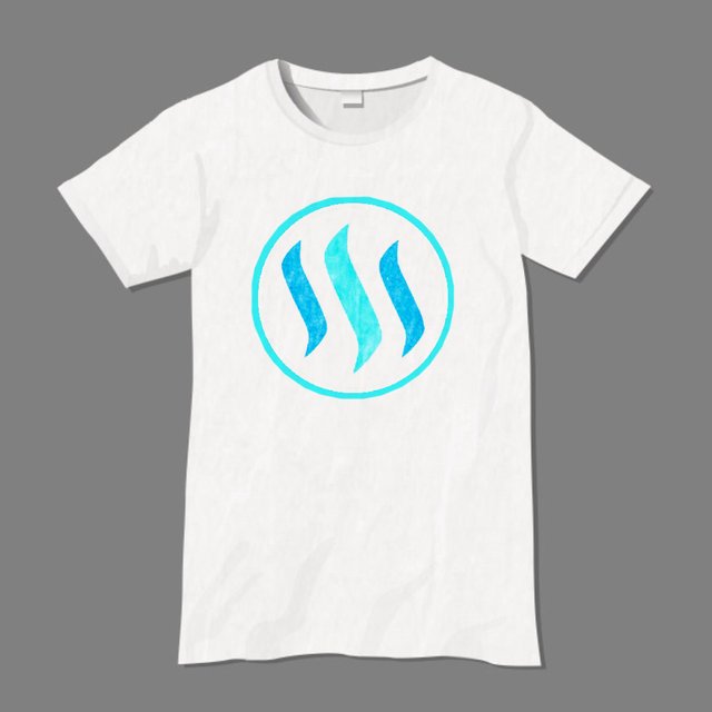
Once this was finished, I decided to add lettering. But, since there are no good free fonts in Picsart, I moved to Canva. Canva is just as easy to work with, even more so. I immediately went to the text session, where I chose the font Aileron Regular, which is found for free; I made it bold, modified the letter so that they had more separation and placed the inverted curve effect upwards. To finish and so that it didn't look blunt, I removed a bit of transparency.
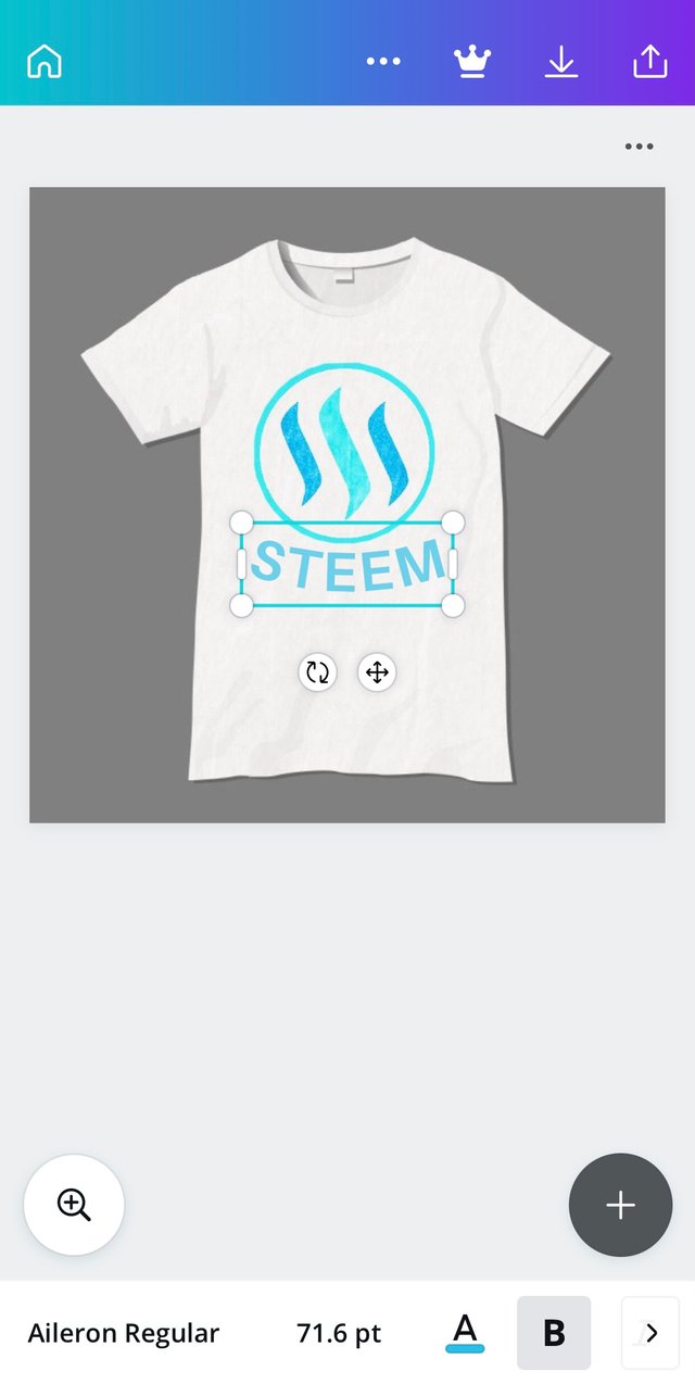
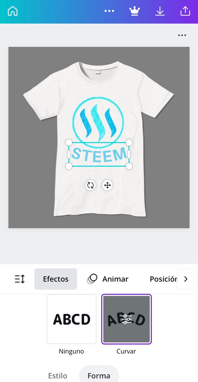
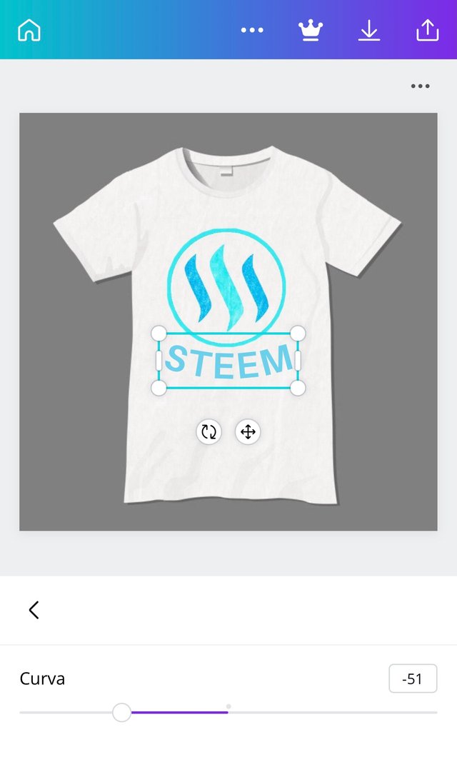
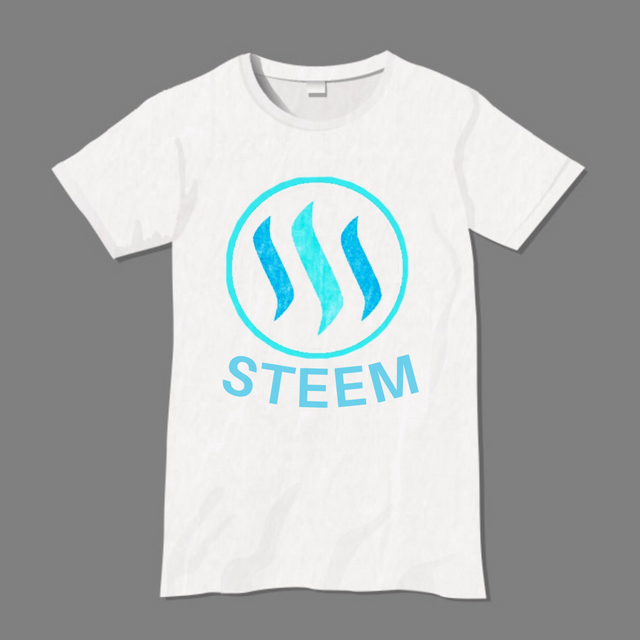
Once this was done, I decided it was time to work on the logo on its own, since the shirt did not convince me at all. I took the logo and cut it out. Then I started trying effects again in Picsart, but this time including the lettering. Then, like an incredible miracle, I found a filter that fascinated me: neon.

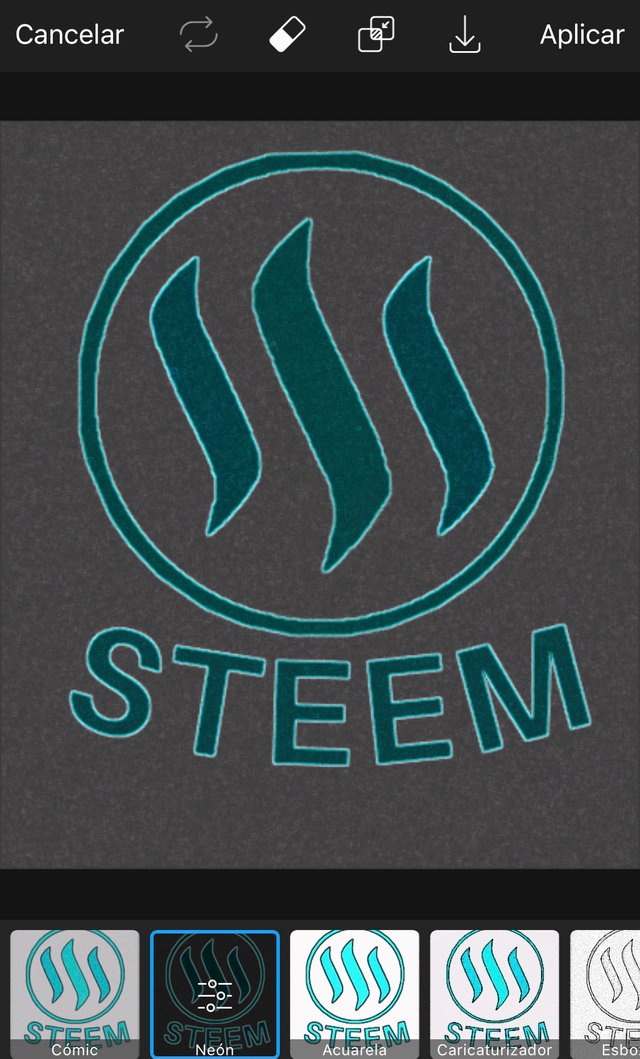
This effect made contact with me immediately. Once this was defined, I decided to change the tone of the shirt to the one I showed you at the beginning: a black t-shirt. I placed the logo on the shirt in the same way as before, started editing light, shadow, saturation, brightness and color until it looked like this:
I loved how it turned out looking with the neon tone. Then, to improve the quality of the logo and image, I used Remini, which is an application that improves the quality of photos in an incredible way, and whose free version allows you to do it five times a day. The result was like this:
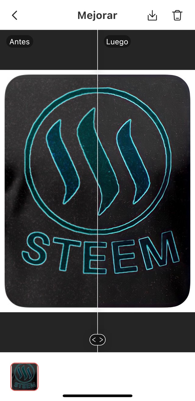
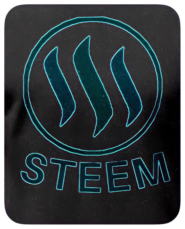
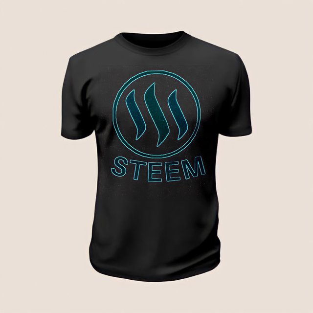
Once the whole editing process was finished, I was finally able to see both final results side by side.
FINAL RESULTS
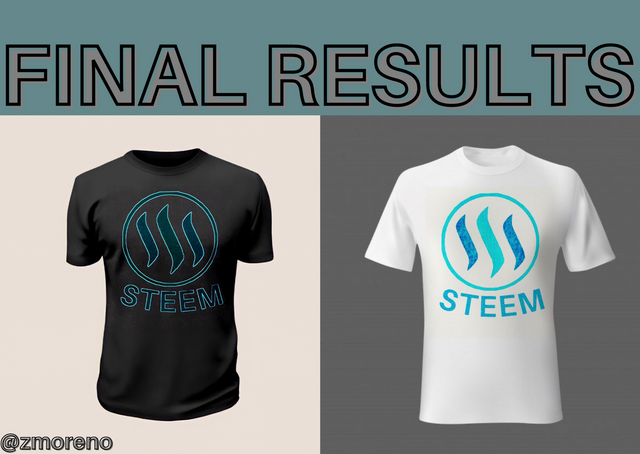
I really enjoyed making the design of this shirt. It was a fun experience that made me experiment with the tools that I already had in my cell phone, but that I had never dared to use.
All photos used for the step-by-step are screenshots of the mentioned applications.
I invite @ellieth, @betzaelcorvo, @astilem, @yusvelasquez.
I hope you liked the design, that you found the tutorial useful and that you enjoyed reading it. Thank you very much for stopping by, greetings!

Here is the screenshot of my twitter post.
That's a really nice T-shirt, I loved the colors.
Thank you very much, I'm glad you liked it!
Hola bella amiga. Muchísimas gracias por participar en el concurso y compartir con nosotros este lindo diseño. Me encanta la camisa negra se ve muy bien. Saludos y mucha suerte..
Hola, muchas gracias por tan lindo comentario y por tu apoyo, ¡me alegra que te haya gustado la camisa negra! Saludos.