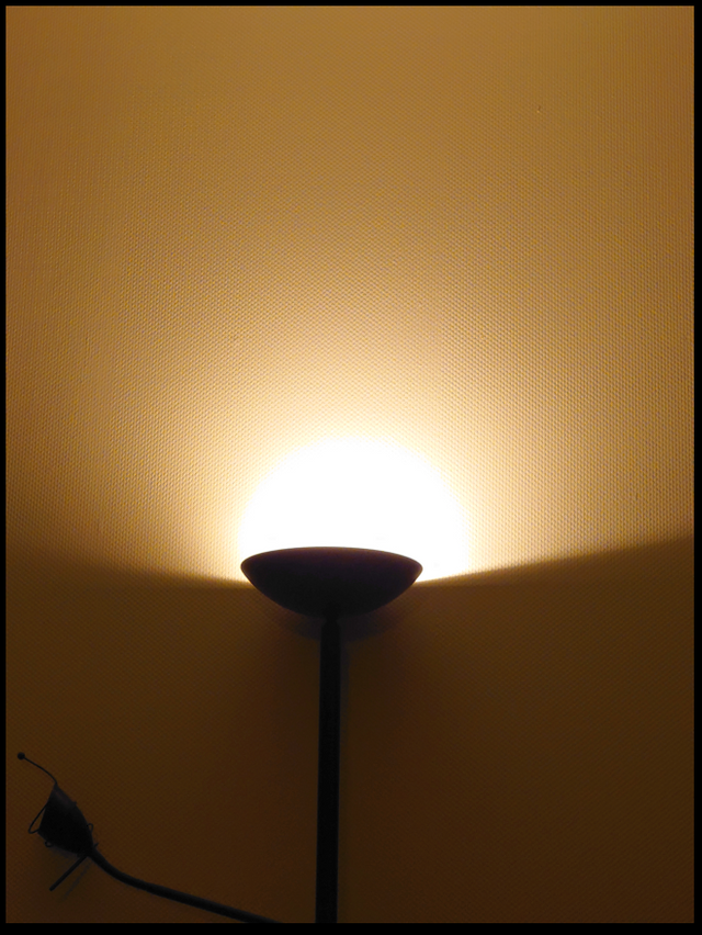
Minimalistic subject photography - post processing #18
Minimalistic subject photography - post processing #18

photo: ty-ty (2020)
This is my contribution to @bambuka’s photo contest - post processing #18.
Please let me tell you some remarks:
1.)
As the photo contest is dedicated to +post processing*, I felt free to undertake some post processings. But these are not more than two small („minimalistic“) steps: I gave a little more light for the darker half of the background, and I surrounded it with a small black frame which corresponds with the black elements within the photo. This frame has not exactly the same amount of pixels at each side, and this is part of my intention. It is a kind of „spice“, like the pinch of nutmeg sometimes in my coffee. (Please switch from night mode to see it if you want.)
2.)
The photo is obviously minimalistic, but what is its subject? The wall? The light? The lamp? If this would have to be decided by me – which is not the case since each recipient can give her or his own subjectivity to the subject and since this can vary from look to look – than I’d say: the subject of my photo is the absent sun. As every one can see, there is no sun within the picture, but in most cases, that’s just the first, what one sees: no sun.
3.)
There is a secondary subject to be seen, as I dare to pronounce. It is the „branch“ of the lamp. I feel without this element, my photo would be „dead“. The branch gives asymmetry and points outside the photo. The missing junction between „branch“ and „stem“ of the lamp also points beyond the borders of what can be seen but must be real.
4.)
The „stem“ of the lamp is not exactly vertical. I tried to correct this, but then I felt the arrangement to get less interesting. This may be my own viewing and not yours, try it (if you want). For me, this is a hint to a principle for minimalistic photos: Don’t let it get to much static, especially if you have mostly geometric elements; instead of accuracy, look for balance.
5.)
The placement of the „false sun“ amidst the left and right borders is balanced against its placement lower then the centre of top and down. This gives enough space for the „false sky“ and diminishes the weight of the darker area.
6.)
Last not least announces the structure of the wall the photo to be taken inside a room and not composed by overlaying two elements. This I reckon to be important while looking at the absence of the sun and by making sure there is no real horizon and the like.
nicely captured and well explained.
I am at the beginning of my journey with photography, your post is very valuable and will definitely help me. Thank you so much!
Thanks, dear @stef1 !
Your post is manually rewarded by the
World of Xpilar Community Curation Trail
STEEM AUTO OPERATED AND MAINTAINED BY XPILAR TEAM
https://steemit.com/~witnesses vote xpilar.witness