# WoX photo challenge .:. Post processing #7
Today I participate in 'Post processing' challenge again. (If you are fond of the subject, and wanna jump on this, check more details and rules for the contest here). We were suggest photo to edit without any certain guidelines and wishes -- no limts except of our pure fantasy and skills. I decided to make a lesser editing cycle than I ventured into Round #3 of the challenge.
Сегодня я снова участвую в конкурсе "Постобработка"! (Уже седьмой раунд...) Нам предлагалось отредактировать фотографию без каких-либо определенных указаний и пожеланий - никаких ограничений, кроме нашей чистой фантазии, ну и навыков конечно. В этот раз я решил сделать процесс короче, чем в прошлый раз (это был раунд #3), так как с самого начала ясно вижу результат, который хочу получить, и мнне не нужна цепочка экспериментов, проб и ошибок.

Below is the original jpeg file that was suggested to work with.
(copyright by @llllll1ll )
And this is what I came up to (clickable):
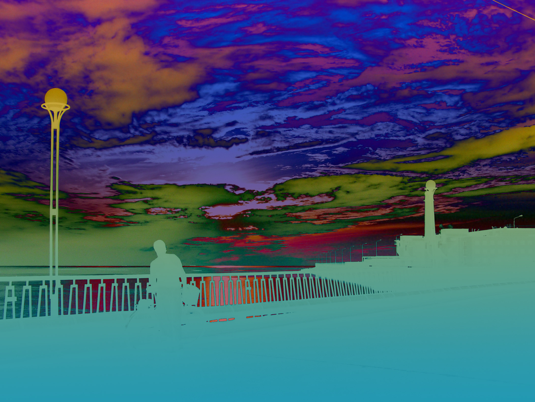
And this was my route.
✪ ✪ ✪
(Forgot to mention: I used PS and nothing except it. To retrace all my steps, you will need Photoshop version 2021 or roughly comparable).
⯮ 🅢🅣🅔🅟 ➊
I made a copy of the background layer, and adjust layer properties to 'Overlay'
This way I am getting images contrasts shamelessly higher. I dont care about the darks!
⯮ 🅢🅣🅔🅟 ➋
...but I should care about the lights, that became overexposed.
So, I make a quick selection (the sky area) to compensate the over-exposition of lights.
Thus, upper part of the image stayed intact (as it was in original). I merge the adjusted layers into a single layer:
⯮ 🅢🅣🅔🅟 ➌
I add a new layer and fill it with gradient fill, as you see in a picture above, consisting of ochre yellow and copper blue-green colours. Yellow goes matching with the sky, blue goes down to match color-less hi-contrast dark shadows.
Now I adjust layer properties to 'Difference'. What does it means? It is sort of 'Subtract' action (but not exactly the said 'Subtract' )
What does difference layer do in Photoshop?
As the description implies, the difference blend mode subtracts the pixels of the base and blend layers and the result is the greater brightness value. Well, when you subtract two pixels with the same value, the result is black. This makes it very easy to see where images are aligned in Photoshop.
It is hard to put in words -> the picture itself will better explain it!
Below: result of blending this colourful gradient with what we got at Step 2.
⯮ 🅢🅣🅔🅟 ➍
Now let me make a step aside: below I created a version that will show the result of layers mixing with 'Subtraction' effect, instead of 'Difference' effect. Feel the difference. This is definitely not what I wanted to finish with, it is rather ruining of a picture than benefitting it with some nice finishing.
One more experiment. Now I changed the blending settings to 'Darken' effect, and look what we have now:
This experiment brought me the idea to change the gradient itself; I simply turned it 180 degrees clockwise, so now I put blue end on the sky and yellow end on the sea / land.
Voyla!
This is what I like... OK, I like both these versions better than the original photo. Depending on the task (possibly design of something...), I could use either one or another. Now I have to decide which one I will sent to participate in the contest... Ok, I desided: the 1st one (which I initially intended to get). Just along the way, I acquired an interesting by-product. Nice!
Hope you enjoyed this little basic guide how not to ruin your image...
And it became a useful knowledge to you. See you next time!
I like the idea of the colour gradient. I've used the tool before, but never for such a large area.
Let's see, I could definitely use it one day. That's the beauty of these contests, sharing of ideas.
Agree, about sharing ideas.
One could not (and should not) invent a bicycle himself... tho venturing into experiments ofc is a good thing! but having cool 'working recipes' imo is a good thing too.
As for gradients: useful tool to use for certain sort of images... which, let say, 'poor' and benefit from adding such an extra... and also which have just a few huge color spots. When the image is picturesque and have a lot of different colors, color gradient is less useful (at least that s what I came to...)
I'm lying in the attic of a neighboring house and watching the target with a thermal imager :-)))) No, it's not the one, mine was supposed to be on roller skates...
Here, yes, this FSH is thorough, layers, gradients. And by the way, you can achieve a similar effect with the help of a tone curve. I'm going to try it now, it's interesting)
=================================================
Лежу на чердаке соседнего дома и наблюдаю в тепловизор за мишенью :-)))) Нет, это не тот, мой должен был быть на роликах...
Вот, да, основательный этот ФШ, слои, градиенты. А кстати, можно добиться подобного эффекта с помощью кривой тонов. Сейчас пойду пробовать, интересно)
Не, масочно не получается :)
В тёмной области остаются детали и ровным цветом не залить в ЛР
Ван Гог в тепловизоре :)
идея в том чтобы сделать быстро-красиво, на глазок, а не выдавливать именно эти разводы в облаках из тюбика по капле. работа с "электричеством" в проводе - супер, лучше всех.
Эта картинка с кривыми получена. Пара минут подвигать точки кривой и превратить её в букву М, например.
Но тут-то обработка под задачу нужна, идею визуализировать.
Так-то поиграть я могу, но вот в голову особо ничего пока не пришло стоящего :) Жду...может осенит)
буква "М " возможна, и "зю" тоже, но инструмент совсем не для этого. если даже он у тебя есть, ну не нужно его совать всюду..
от излишних ее перегибов, только вырастает дискретность изображения, оно на отдельные кусочки все распадается. ты же сам видишь, посмотри на картинку.
таки я его и не сую))) даже не пользуюсь, просто знаю, что оно есть такое.
Там после зю бывает просто забавнобазовыми ползунками пошевелить. развлекаюсь порой, не более))
Congratulations, your post has been upvoted by @dsc-r2cornell, which is the curating account for @R2cornell's Discord Community.
нехило ты заморочился. :)
нехило было в прошлый раз, здесь как раз все по-быстренькому, базовая трехходовочка. но спасиб за комплимент!
Your post is manually rewarded by the
World of Xpilar Community Curation Trail
STEEM AUTO OPERATED AND MAINTAINED BY XPILAR TEAM
https://steemit.com/~witnesses vote xpilar.witness
New competition, "Drawing Trees." Winning Pot 75 Steem!
do you want to know more?
Мне понравилось, что вы предпочли оставить передний план силуэтным. И состояние пейзажа получилось вполне естесственным, хоть и иным. Даже не чувствуется обработки. Так бывает в определённое время года.
Да, как-то так и чувствую глядя на это фото, что оно смотрится органично, так глаз бы увидел. И небо, и янтарный закат, и его отражение - никаких извращений и фотошопа, все так и было :)))))
Но --- с извращениями тоже неплохо получилось (смайлик)