For the Money! / #club100
My entry for the Post Processing contest. Round #27 topic was 'Macro':
https://steemit.com/@bambuka/photo-contest-post-processing-27
This is my first time participating in this contest, so please excuse me if I do something wrong. Also, I ask senior comrades to educate me which tags in addition to #photo-process - the main tag of the contest - it is better to use for a topic like this. I used #education, #lesson, #photoshop, but perhaps you know others that are more correct?
So... in the summer I photographed flowers, dew, and butterflies drinking nectar - all these typical subjects for macro photography are in my archive, and I could present them without any problems. But sometimes I just want to pick up a camera and take pictures, rather for the sake of the process itself and not for the result. This is exactly what happened today: I opened the summer photos, then closed the folder, looked around the space around me and thought about what I would like to photograph.
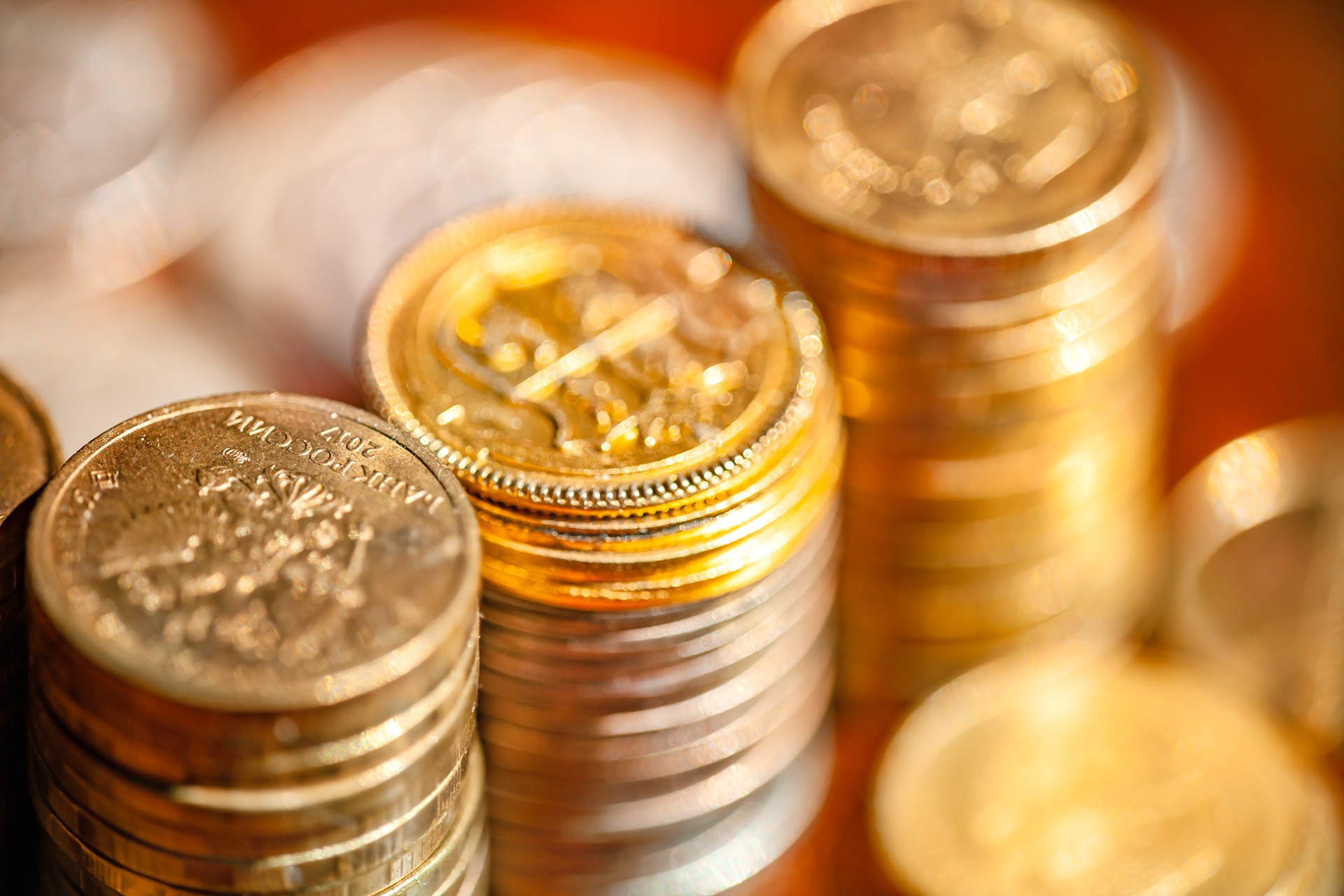
My gaze fell on the coin box, and I did not think more: I stacked the coins into beautiful golden and silver piles, moved them under the sunlight flowing from the window, and took two dozen quick captures. What result I wanted to get: figuratively speaking, I wanted images that would well illustrate such ideas, as "wealth", "treasure" etc. Of course, warm yellow, golden glitter is associated with this, but also crimson red: a color since ancient times traditionally associated with imperial status, luxury, upper class.
Therefore, I used a brown lacquered wooden board for the background, which can be easily converted into warmer and even red color. The coins in the photo I tried to arrange so that the picture would become maximum "bokelicious", glittery, to get more gold sparkles. I didn’t need sharpness and readable information, quite on the contrary, I needed it to be unclear which particular country this coin was, I needed the effect of universality and out of temporality.
So, most part of the job was to arrange the coins and to take correct angle and distance, to get visuals that I wanted to get. This is the final result of my image processing:
But this image did not came out of camera like that. Actually, this is how camera processed it:
With this dissected image you can see what is the exact difference: it is about colors, more pure, shiny... golden.
Below I will explain how I got such an embellished image.
For editing I used a .raw file, which I processed in Photoshop Camera Raw filter (v.13).
Interface looks a bit complex, but we dont need to adjust all the settings.
Actually, the most important is Basic section, and also I used Details, and Calibration sections.
The ideal guide, of course, would describe what is the function of each slider on this screenshot - but then I will never be able to finish my post, hehe. Let's put it this way: I "condensed" the midtones a bit, making them more contrast, and played with the balance of colors, shifting it to the red-orange part of the spectrum, especially in the shadows. If you want to master this magical technology, take these sliders in your own hands, and you will intuitively understand for yourself what each of them does, what is their role in image synthesis.
That was the first step, but not the last. Next one is manual retouching, mostly of shadows and highlights - this part totally depends on the certain image. (I consider it important, but its time consuming; best results swallow your time. But of course, you can get some nice result easier and faster without spending a lot of time on manual retouching. The result will not be much worse!)
It can be done with a special Adjustment Brush. The settings for the brush I used were like in the screenshot above, but it is hard to describe what exactly I did. I tried to create this gif to iluustrate the process, but it did not turned out too vivid:
With this pale red opaque brush, I painted over the parts of these image...
... that had "dirty" shadows, I brightened them, and saturated a bit with color.
After that I used Graduated filter brush to add, lets put it so, some vignetting effect - I made the image a bit darker at its sides and corners. My purpose was rather artsy, it actually isnt such a necessary step.
Final touches. After all above adjustments were summed up, I evaluated the color - it became different, comparing with result at the first step. I wanted to lighten and saturate the image a little, so I reduced the reddish tint in the picture, bringing it a bit to more natural.
After this step I push the 'Open' button, and the file is proceeded to Photoshop.
I evaluated the result, and decided that still some parts of the image are too shady, too dark - to improve image I took the Dodge Tool ...
...and, again, painted over the most annoying shades and midtones areas, to get rid of them. The more the human eye distinguishes details in the shadows, the more attractive this image seems to him (on an unconscious level). All! This is the final step. I'm downsizing the image and saving it for posting.
Did you like my guide?
PS.
Actually.... I wanted to tell you about macro focus stacking know-how; my post could be the guide how this image image processing trick can benefit your coins macro photos .... but I got carried away with something else. So, probably - next time!
You did a good job creating this post :)
The goal justifies the means, but to be honest, I still lack readability on at least one coin. But this is only my impression, and the task was different :)
Camera RAW is something I've used for many years, but then there were much fewer tools and features in this program. Adobe did a good job on it, but now I'm more used to Lightroom.
Everyone has their own preferences, who is used to what, and the main thing here is the result.
By the way, the coins shone, but... I didn't feel the sensation of gold... I don't know why... maybe it is the shade... red gold as the highest praise of quality is not quite suitable here... maybe you need highlights and shadows? I should try to play with gold rings (I don't have gold coins, unfortunately).
But the idea of wealth has been realized Scrooge McDuck would definitely be satisfied)))
Ты хорошо потрудился над созданием этого поста :)
Цель оправдывает средства, но признаюсь честно, мне всё же не хватает читабельности хотя бы на одной монете. Но это только моё впечатление, да и задача была иной :)
Camera RAW, это то, чем я пользовался многие годы, но тогда в этой программе было гораздо меньше инструментов и возможностей. Adobe хорошо поработали над ней, но теперь мне привычнее Лайтрум.
У каждого свои предпочтения, кто к чему привык и главное здесь получаемый результат.
Кстати, монеты засияли, но... я не почувствовал ощущения золота... не знаю почему... может быть именно оттенок... червонное золото как высшая похвала качества тут не совсем подходит... может быть нужны блики и тени? Надо попробовать поиграть с золотыми кольцами (золотых монет у меня нет, к сожалению).
Но идея богатства реализована Скрудж Макдак остался бы точно доволен )))
Да и у меня золотых монет тоже нет, есть фальшивые. Задача стояла получить художественный эффект, и я думаю что он получен. Все относительно, верно? Может быть это не очень золото относительно настоящего золота (которое, кстати, бывает в жизни очень разных оттенков цвета!), но на фоне чего-то другого - воспринимается именно как золото.
Конечно. Они обязательно нужны - для придания объема. Вы считаете, что в этом художественном фото - предназначенном, на самом деле, служить фоном для какой-нибудь текстово-заголовочной блогерской заманухи - мало теней и нужно больше бликов?.. Может и так. Это вполне законный вопрос!
Кстати, я вижу что пост поддержан аккаунтом @photo-process - это аккаунт данного конкурса? я не увидел в описаннии. имеет ли смысл, отдавать % выплат для роста этого аккаунта?
PS. спасибо за интересную тему! я люблю макро.
Yes, and I don’t have gold coins either, only fake ones. The task was to get a certain artistic effect, and I think that it was achieved. (There is a bonus photo added - you can have all the needed detalization there, hehe!) Everything is relative, right? Maybe this is not very gold compared to real gold (which, by the way, happens in life in very different shades of color!), But against the background of something else, it is perceived exactly as gold.
Certainly. They are definitely needed - to give volume. Do you think that in this artistic photo - intended, in fact, to serve as a background for some text-headline blogging lure - there are few shadows and more highlights are needed? .. Maybe so. This is a perfectly legitimate question!
By the way, I see that the post was supported by the @photo-process account - is this the account of this contest? I didn't see it in the description. does it make sense to give % payouts to grow this account?
about highlights and shadows, I was thinking about shooting gold in general, I also want to try, but it's gold. After all, this color in the palette is not presented in its pure form, it is just the highlights and shadows that make it "golden", no matter what the gold sample is))
As a background for the text, the picture is almost perfect, there is a thought and nothing distracts with details.
@photo-process is a purely technical account, I'm not developing its power or influence on something. It's just a place to collect posts related to the party. Over time, of course, he will also become plump, but in any case, all in one bottle :)
про блики и тени это я размышлял про съёмку золота вообще, тоже хочу попробовать, но именно золото. Этот цвет в палитре ведь не представлен в чистом виде, его как раз блики и тени делают "золотым", какой бы пробы золотишко не было ))
Как фон для текста картинка практически идеальна, есть мысль и ничто не отвлекает подробностями.
@photo-process чисто технический аккаунт, я не развиваю его мощность или влияние на что-то. Просто это место для сбора постов, связанных с вечеринкой. Со временем он конечно тоже станет пухлым, но во всяком случае всё в одном флаконе :)
TEAM MILLIONAIRE.
Your comment has been successfully curated by @stef1 at 10%.
Your post is manually rewarded by the
World of Xpilar Community Curation Trail
STEEM AUTO OPERATED AND MAINTAINED BY XPILAR TEAM
https://steemit.com/~witnesses vote xpilar.witness
Thanks a lot for support, Team!
Posted in photo-process