RE: My ArtVenture: Pencil and pastel portrait „Picard“
Hi @stef1! Nice drawing, I see that your mastery of pencil strokes is very good. However, I will show you some things that you should do even better.
In general, you should work more on the transition from dark to lighter tones, these should be more subtle, and not so harsh. Also, take care of the values: the dark tone of the mouth cannot be the same as that of the crease of the cheek or the dimple of the chin.
I can't judge if the resemblance is correct because I don't have the reference image but I think that at your level you should be the one to judge that.
The key, as always, is in observation. You must observe before and after. First, you will observe to draw and then you must observe to see why you are not satisfied with the result.
If you narrow your eyes to observe your drawing and do the same to observe your reference image, you will see the tonal differences and discover where there are things that are not well resolved.
Another way to study and discover errors is to invert the image of your drawing and invert the reference image. You will discover many things that you had not noticed before.
If you shrink your drawing enough you will see that there are several shadows on the face that look like spots, this is because the grey transition is not well resolved.
Finally, do not be discouraged, take each portrait you make as an opportunity to learn.
The great masters of realistic portraiture spend many hours observing their work before considering it finished and it is not because they are admiring their work but because they are looking for their mistakes. This is without counting the many pencil studies that they have previously carried out because they are aware that drawing is the way to know the model and learn from drawing.
Thank you for your analysis Jorge, as always very helpful. You pointed my weakness, I always wonder if on white of the face can be white of the paper that is what I often do. On other hand I often think in that case it is the same colour as the surrounding and if it is all right? Should I try just light graphite instead of white? Another thing is transitional border between medium and dark is it OK to make it sharp?
Yes, I noticed that when the image is small then it is easy to see which areas are too dark because the whole face looks very weird and that helps me to correct some areas.
My unsuccessful drawings do not discourage me but motivate to try again until I am satisfied. I definitely continue to practicing and would be good to have your expertise on my side, as you always do :)
We support quality posts anywhere and any tags.
Curated by : @petface
TEAM 5 CURATOS
Congratulations! Your Comment has been upvoted through steemcurator08. We support good comments anywhere..
Curated by : @bambuka
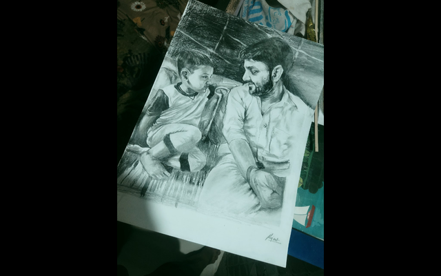
Sir please teach me about drawing this is my work
Hi @rajkharwa! Thank you very much for your interest in my opinion on your drawing.
Realism is very well achieved in your drawing due to the good use of tonal values. You clearly have confidence with pencils. Congratulations!
I like the expressive realism of your drawing.
However, I can't judge your drawing based on how similar it might be to the reference image, since you didn't attach it. Although the drawing is very realistic looking and well executed, I have noticed a tendency to leave the entire left side of the drawing (the right side of the character) lower. The eyebrows are well balanced in relation to the face, but the left eye in the drawing is noticeably lower, as are the left ear, the left side of the nose, and the left corner of the mouth. I suppose those dark spots on the cheek and chin represent certain scars.
If these observations are in your character of reference, you can consider your drawing as very well achieved. If not, I hope these observations are useful to you.
I have noticed the deformation of your drawing due to the incorrect way of taking the photo. You should always take care of the good framing of your drawings. Perhaps the observations I made to your drawing are a consequence of this mistake of yours.
Have a nice day!
Thank you so much sir jorgevandeperre it's a lots for me and i am very happy that you teach me about my drawing.
Sir i dont have any right or appropriate teaching but you teach me about that i am feeling very blessed thank you so much.further i always try to draw how did you teach me.
may god bless us
It my latest one please give me your valuable advice sir jogervandeperre
Hi @rajkharwa, in the assessment of your previous drawing, I made you notice the inconvenience of publishing distorted images. Send a good image of your drawing without distortions and in good resolution if you want an evaluation.