Color and Light : Blue Buddies 4

The time has come to bring this all the way. I've spent a bit of time for you to breakdown some of the last things that we can think about. It's been a long road to get here but I think it was important to separate the steps into digestible chunks. I often put pieces down at different stages so it's good practice to break things up so that they're manageable and so that you can always pick up where you left off.
Blue Buddies 1, Blue Buddies 2 and Blue Buddies 3 in case you'd like to start at the beginning.
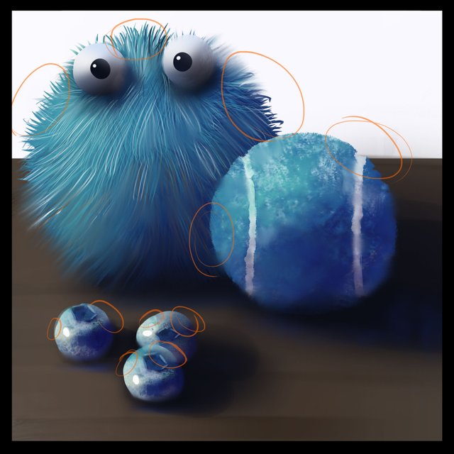
Lets get started with a grey scale of our original reference.
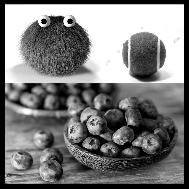
When I'm looking at an image it's helpful to try to think about it in terms of VALUE. Color only makes up about 5% of our visible information so if something doesn't work in black and white it won't really matter what colors we add. In fact, if an image works in black and white you can almost get away with whatever colors you want! (I'll come up with an example in a future study...)
Anyway, I'm getting away from the study here. Let squint our eyes a bit to remove some information.
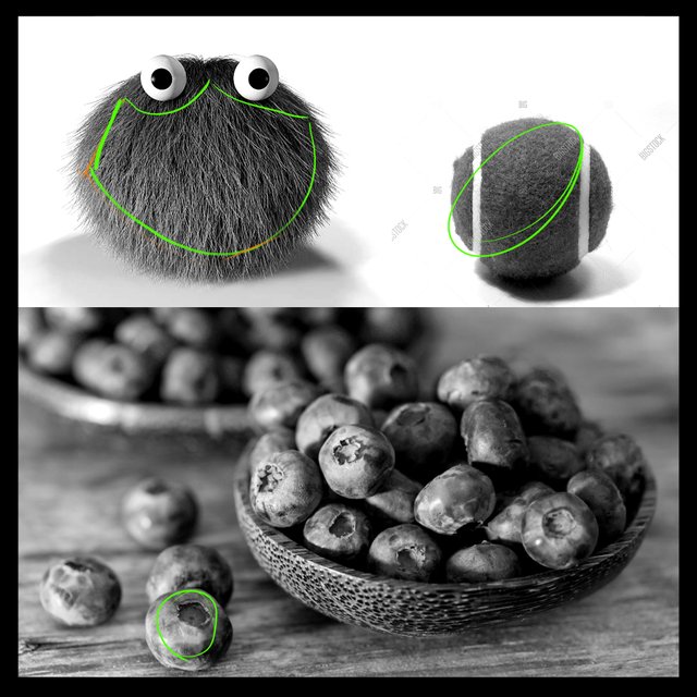
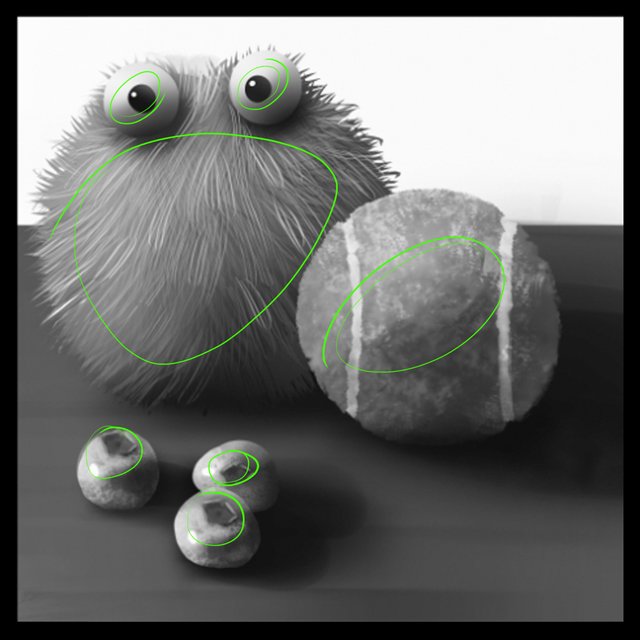
When I squint my eyes a bit I'm noticing that the areas that have the most obvious detail are in the areas I've marked with green. These areas of detail seem like they are along the transitions between the light and dark side of the objects.
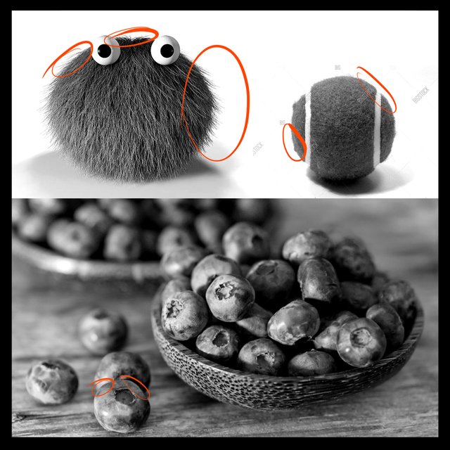
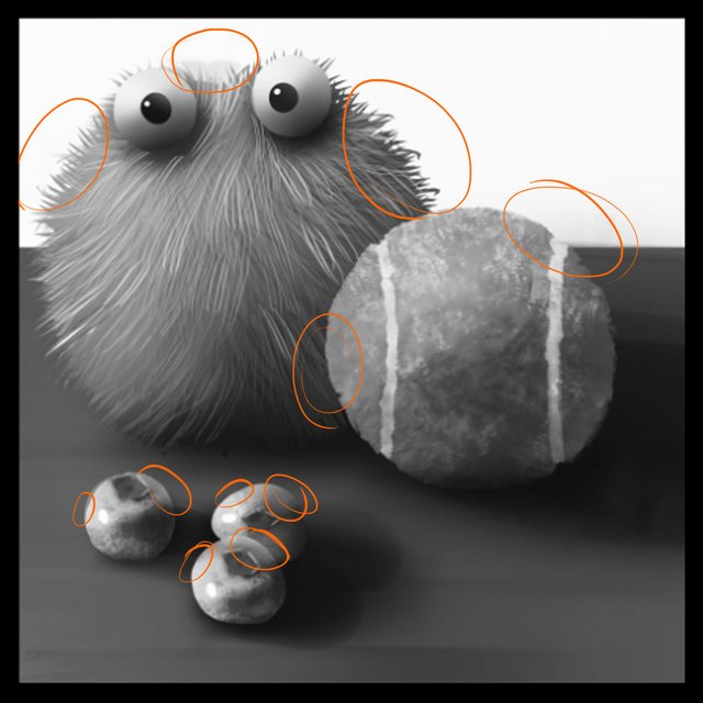
If I squint even more it seems to me that the silhouette, marked in orange, becomes more important to telling me what these objects are made of.
As I've squinted to find the areas of focus and the areas where the silhouette is strongest , I've also noticed that these areas become very soft and kind of blend together so this will be an opportunity for us to soften the image in those areas.
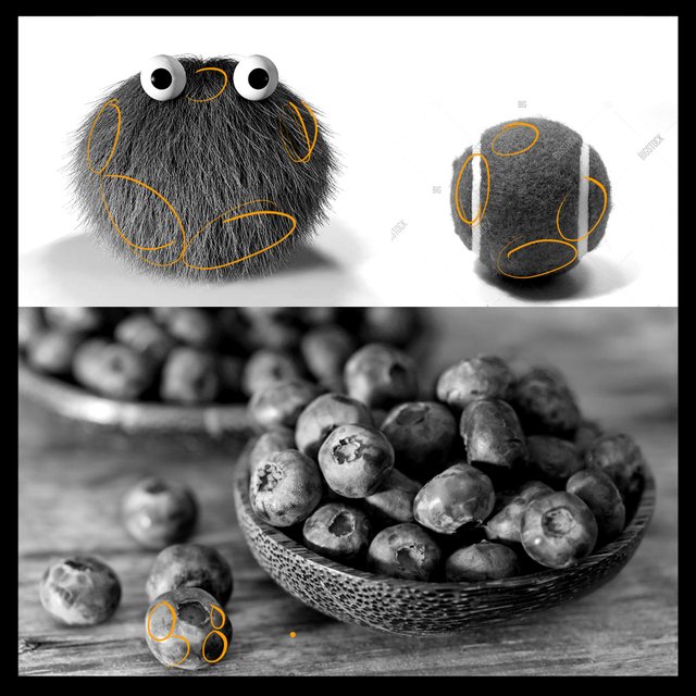
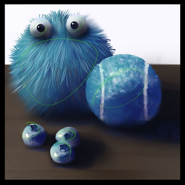
Let's look at our painting from the last post to see where we stack up and where we can improve.
Our areas of detail seems like an area where we can add a bit of oomph here. Overall, our setup is not bad but I think we could push it a little further in these areas.
The silhouettes actually seem pretty good to me! There is a spot at the top of the fluff ball's head that needs a bit of extra fur but other than that, the blueberries are reading pretty well and the tennis ball has a good outer shape to it.
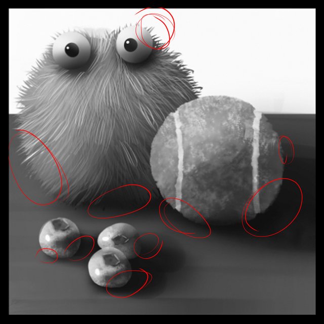
Since we've identified the zones where we have Areas Of Focus and a good identifying Silhouette there's ample opportunity to soften areas to lose details and let the eye rest. I may end up doing more blending and softening around the Occlusion shadows but for now, I've circled zones that I think will be good to soften up.
Lets do it!
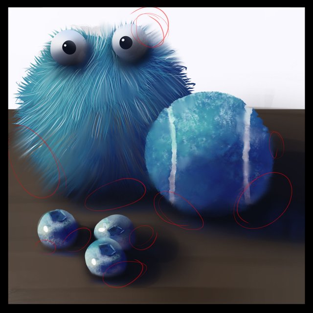
I'm going to soften first and avoid the silhouette zones I selected. I've gone through lots of the occlusion zones and also inside of the shapes a bit in the areas that are not going to be in focus to make the painting less noisy. I think this helps a lot to allow for the viewer to relax when looking at your painting. A painter whom I really admire, Nathan Fowkes, often says, "If everything is important, then nothing is important." and I really hold true to that as much as I can. It's very true that if the whole image is detailed out to the max there isn't much communication between the artist and the viewer.
Softened areas that have been simplified give the viewer and opportunity to "finish the painting."
Next up is our silhouette. It's important for these areas to be pretty crisp and give away what the materials are. We were already pretty much there but the top of the head needed a bit more hairs so I added those being careful not to over do it with detail by softening the hairs as they entered the shape of the furry ball.
Last up is those juicy details! Now that we've set ourselves up with a nice softened place to land these sharp details will contrast against the soft zones so much that our eyes will be forced to look at them in all their glory! Muahahahaha
I got carried away... It is exciting though! We've taken our mostly done image and really gave it even more of a boost by taking some time to take it apart and make it better. There have been lots of steps to get here so I encourage you to take it slow and go back to the beginning to get a real handle on how we got here.
Check out Blue Buddies 1, Blue Buddies 2 and Blue Buddies 3 to start at the beginning.
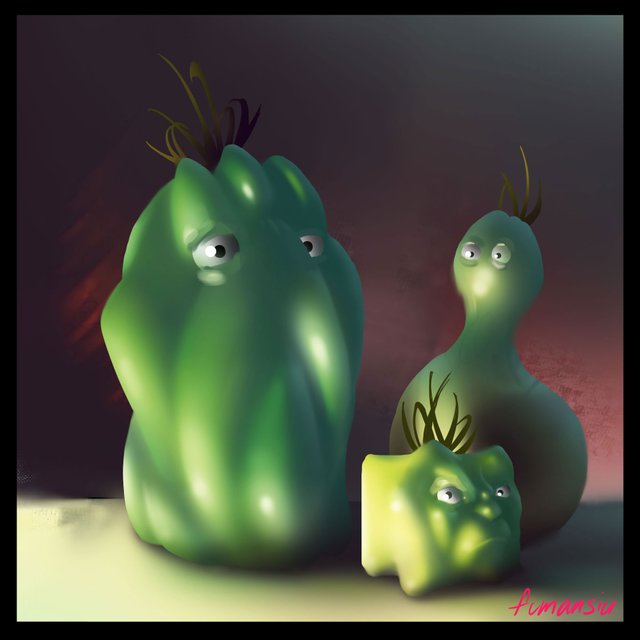
Obviously (maybe not so obvious), the next step is to do it all over again. Twice! Once more of this same image but from memory and then once more again with WILD shapes and some injected creativity to come up with an absolutely ridiculous version that your brain will definitely not forget. I know that I still have not forgotten my Green Alien Peppers.
If you want to go over how I made some of these color choices in this study you'll find a basic primer here.
If you'd like to get started with color studies we've got yellow and green now ready to go!
Yellow Bananas
Green Tomatoes
If you need help getting started drawing, I highly recommend you head over to @jorgevandeperre's blog and start following along his lesson plans. @jorgevandeperre has over 60+ posts now to get started and is even giving out rewards to students who complete homework!
Thanks a ton, see you soon!
Ha ha honestly I had to read carefully to understand every detail, I think that's the idea and observe every detail, good point!
Greetings and success!
Thanks @lanegra2804! There's a lot going on in any painting adventure, I'm doing my best to try and break it down into a simple approach. I realize maybe some of what I talk about isn't that simple, but I hope I make it less scary!
🙃👏
You keep surprising me))
Great!
Thanks for the support buk's
We'll see where this goes... 🙃 As long as we're having fun right? haha!
The main thing is to enjoy the process itself, then the result will be pleasing))
Your work has captivated me, it's wonderful what you created!!!!
Yay! Thanks for having a look 🙃
Hi Erik,it is noticeable that observation is very important and for those one who are attentive it brings good results. I love your blue tutorials and also funny greed family.
By the way, would you please put #woxartschool on second or third place because only 4 tags are visible the rest are not.
Hi @stef1, will do. Glad you like the green family, haha. I added eyes quickly after finishing the blue study for the added "fun factor"
It'll be less exciting but I'm gonna keep doing my art chant. I hope this kind of break down will help other artists!
Congratulations, your post has been upvoted by The Efficient Seven using @steemcurator04. We are supporting quality posts, so keep creating quality posts to get more support. #art theme
Account Used by: @rosz
Your post is manually rewarded by the
World of Xpilar Community Curation Trail
STEEM AUTO OPERATED AND MAINTAINED BY XPILAR TEAM
https://steemit.com/~witnesses vote xpilar.witness