"Tron Fan Club" Logo Contest - My Contribution || By tanzim2
Creating a logo is not an easy task to do, especially if you don't have much experience with graphic design. it may be difficult to know where to start and what styles work best for logos - luckily, I've done the research and found my inspiration.
First I Research about TRON, read their articles and history on the web to find out what kind of design they prefer (if they have one). Think outside of the box and look for things I may not initially think of - sometimes a simple sign is all it takes. I need to be creative when choosing typefaces. There are tons of free fonts online (some are even actually usable). I must be able to create my own unique style and not copy off an existing logo.
So that's how I start designing this logo. From the illustration below you can easily understand what I mean actually. Everything is explained with proper explanations and behind the reasons.
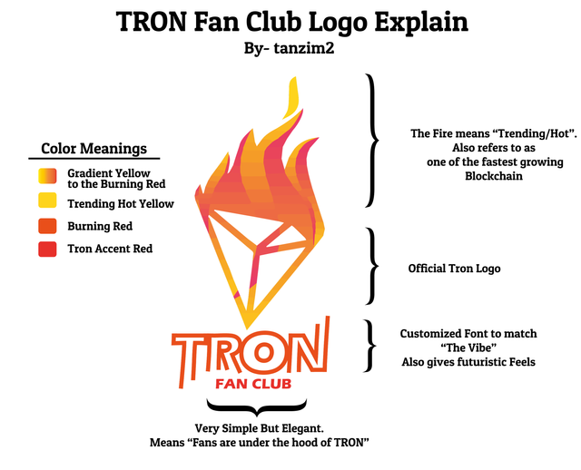

Now I will describe how I made this logo:
- First I made some rough design as you can see in the screenshot. this is only an idea generation, it doesn't mean to be use in the final product.
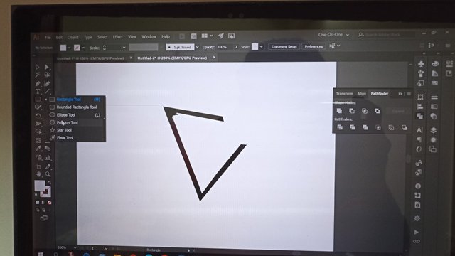
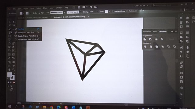
- After that, I open up Illustrator and draw out all the parts of the logo (letters, background, colors and glowy lines). I also added some typography to show how the logo will look like. I don't care about final format - this is just for reference in illustration workflow:
- Illustrator - using elements from previous step as guide for vectoring - then I hatch out all elements with vector layers: letters, background with glowy lines and colors (separated as vector objects), colors for lettering (layers).
- Lastly, I added the gradient to the layer.
- I exported logo as a PNG image and used it on some mockups.
That's it! The process is simple and pretty easy to do.
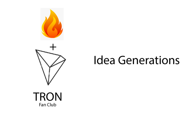
Idea Generation
I initially want to combine Tron logo and fire. then want to use red gradient color. That's how it inspired me -
Visual steps
Step 1
Step 2
Step 3
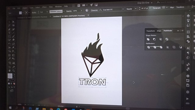
Step 4
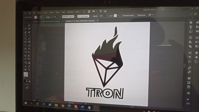
Step 5
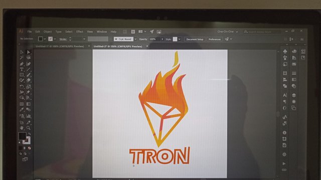
Step 6
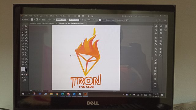
Mockup
The Logo must be suitable for both bright and dark contrast because steemit has both light and dark theme. Here are some visuals-
.png)
.png)
Footers
Default white background-

Transparent Background (Try it with both themes)-

Finally,
Thanks,
@tron-fan-club COMMUNITY ADMIN
@blacks ADMIN
@veigo 【Chief Executive Moderator】
@labib2000 COMMUNITY MOD
@engrsayful COMMUNITY MOD
@sagor1233 COMMUNITY MOD
and most importantly thanks দাদা for creating such amazing community and provide some good opportunity to grow and learn about blockchain environment.
Thank you very much for your participation with this nice logo
@engrsayful Actually I want to win the contest. BTW good luck for the new contestants. My opportunity will be dropped because if this.
thanks vai for complementing
twitter link-
https://twitter.com/tanzim24/status/1500571882839736321