SIZ talent Hunt | Powerpoint Presentation Designing Tutorial-2 | Steemit Post Thumbnail Creation
Assalam walekum to All.Have Blessed Ramadan my fellows!!!
Hopefully you'r all doing Well & Good .
Again Here is my @shama26, SiZ PowerPoint Expert with 2nd Tutorial of Designing in PowerPoint Series.
In this Tutorial, I would like to tell you about
Creation of Simple But professional Steemit Post Thumbnail in PowerPoint
You will learn the following
- You will know about Thumbnail
- 10 Valueable Tips For Creating Steemit post Thumbnail
- You will get familiar to Working Area of PPT
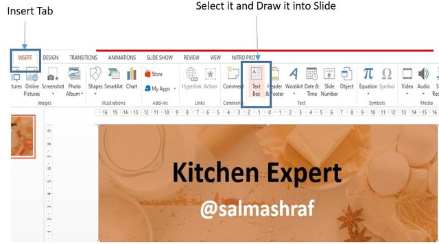
- Learn how to Insert Images,Basics shapes and Text in PPT
- You will be able to create your steemit post Thumbnail effectively
What are Thumbnails?
Thumbnail is an image with a reduced file size used as a placeholder for full multimedia content. It should have to be more compelling and eye-catchy. It is the first View of the idea we get from a preview that influences the reader's decision to open it or not. As a packaging image that encourages people to shop, a thumbnail also looks at the original view of content such as photos and videos or it attracts blog readers. A well-crafted Thumbnail attracts interest and gets clicks. Thumbnail is the face of your complete post. It is an easy way to communicate with the viewer.
Here in the following image, you can see Post Thumbnail. Today we will practice it
I designed This Thumbnail For @salmaashraf 's cooking Post
Why Steemit post Thumbnail is so Important?
You put so much effort into writing your post and organizing it yet you don’t seem to get the recognition. Your fascinating post Thumbnail is one of the best post tools it helps you to get attention to this great platform.
The phrase
"Don't judge a book by its cover”
This does not apply in the Technology era, because we all judge all content on the web with its Thumbnail. But if you want to appeal to your viewers and steemit Communities, having a custom Thumbnail will be a great help.
Here are 10 Pro tips to help you to design your thumbnails professionally
- Enter title text to deliver the context of your post
- Use the best font style
- Always Use a relevant and High-Resolution image
- Your Thumbnail must show Consistency
- Differentiating your post
- Use good contrast in your thumbnail
- Make a different and professional look by using your logo or good color schemes for all your thumbnails
- Avoid Misleading Content
- Post thumbnail as a promotional device for your content. Do not reveal everything, but provide enough details to arouse interest in your audience.
- Be authentic and unique with your thumbnail.
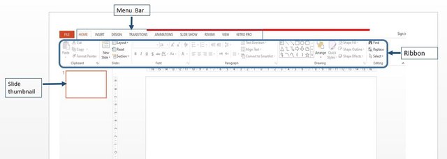
Normal View of PowerPoint
The ribbon
It contains all the commands of PowerPoint. The Ribbon groups items that are most likely to be used together.
Slide pan
It is an actual working area we can say it as Canvas of PowerPoint.
Slide thumbnail pan
It shows all slides we can easily delete a slide or simply add new slides by using slides thumbnail Pan
Let's Practice Create Basic Post Thumbnails.
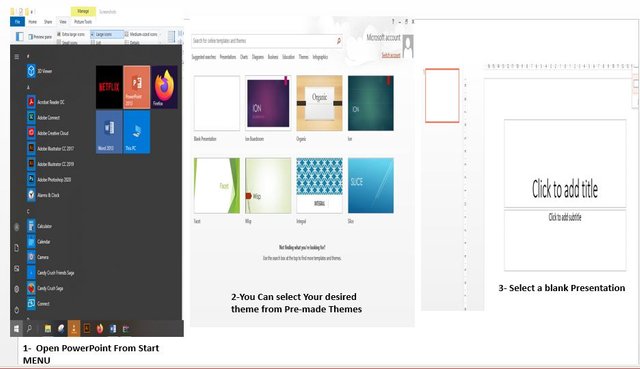
For this tutorial, we’ll start with a Blank presentation.
PowerPoint will open a presentation with a Title Slide. Once the Title Slide is open, you’ll see a slide with two placeholder text boxes for a title and a subtitle
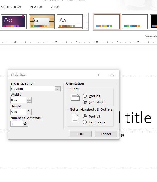
Steemit Thumbnail image size 800 X 480 pixels , so in PPT use Inches or Centimetres as measurement values .
Slide Size
Then select ‘Custom Slide Size’ from Drop Down Menu pop window will appearSet it as Width = 8 inch
Height 5 inch Slide.
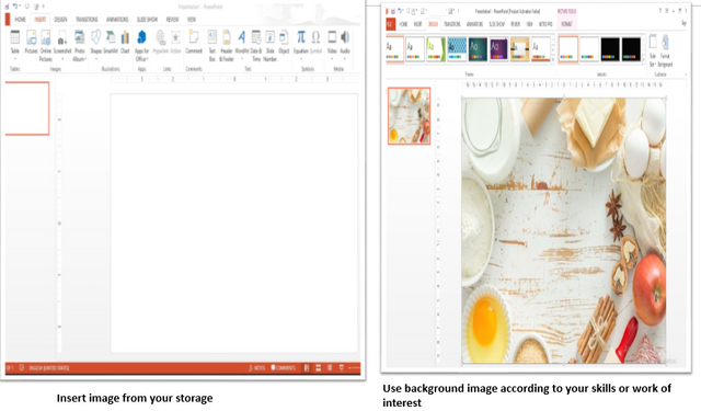
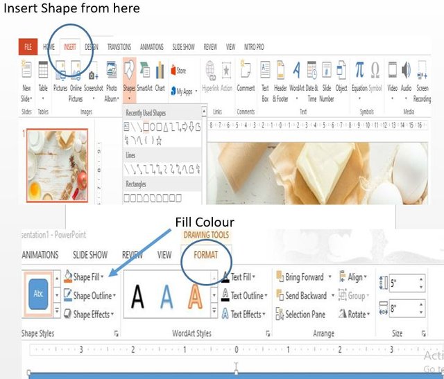
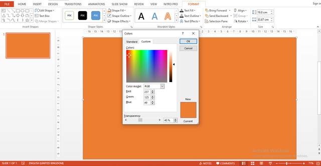
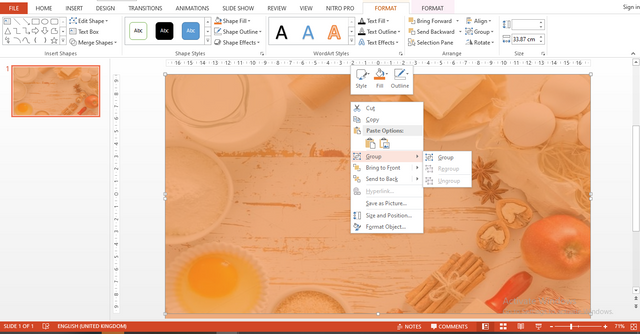
Set the image to fill the overall background of the slide(Keep in mind image should be HD for better results).
(Format tab appears on menu bar with selection of any object on slide )
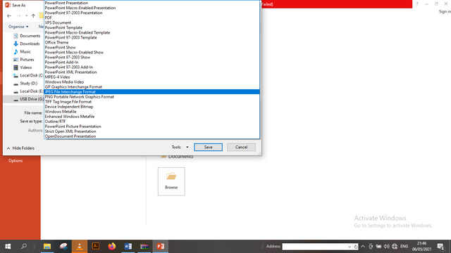
Your slide is saved as Image file .Now you can use it as Your Post Thumbnail .
Now you can add any image related to your niche and skills in it as I have add Chicken Karahi PNG file in it cause it is related to tutorial .You can also use this slide as your Cover Slide as well .
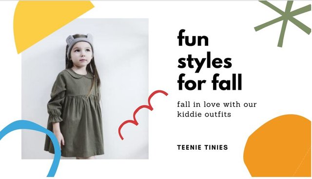
Here is some more my Designed Thumbnail
If you want to learn any them or you want its Template You can comment I will provide you assets Link .Hope you will like it.
This brings me to the end of my This Tutorial . Practice it well and design your Next Thumbnail in PPT . Knowledge is of no value unless you put it into practice.You just need to practice it Practice doesn't make perfect. Practice reduces imperfection,
Next Tutorial Will be on
Types of presentation we can create in PowerPoint
Stay tuned for a new Tutorial .
Stay at Home Keep Follow the Covid SOP .
Thank You for Reading This Tutorial !!!


.png)


.jpg)


.png)

Impressive way of your presentation and thumbnails just wow😍 its very easygoing and clear to understand
Very informative post for PPT understanding...
Keep it up
veery nice
This is something very special and you will do great in coming days on steem platform.
you have made a very good post.
it is a very understandable and useful post for us.
But
in your title Talent spelling is incorrect plz note this
Thank you .
Its corrected
Sorry, the spelling of your title is still incorrect..
(telent) is incorrect.
(Talent) is correct
I am Inspired you are a great powerpint designer .
Too good work
The thumbnail design is very atractive and easy to draw
So inspiring and informative post.keep it up.It made
me helps to understand powerpoint in a very well way.
Dear shama ur work is awesome