Bank of America greatest bubbles in history chart didn’t aged well
Hello my fellow bloggers! In 2018 Bank of America published a chart showing greatest bubbles in history. It was published after the crash of crypto market. As you may guess, it was published to show bank superiority over highly speculative asset that has no real value – Bitcoin. I don’t need to tell you it didn’t aged well…

Source
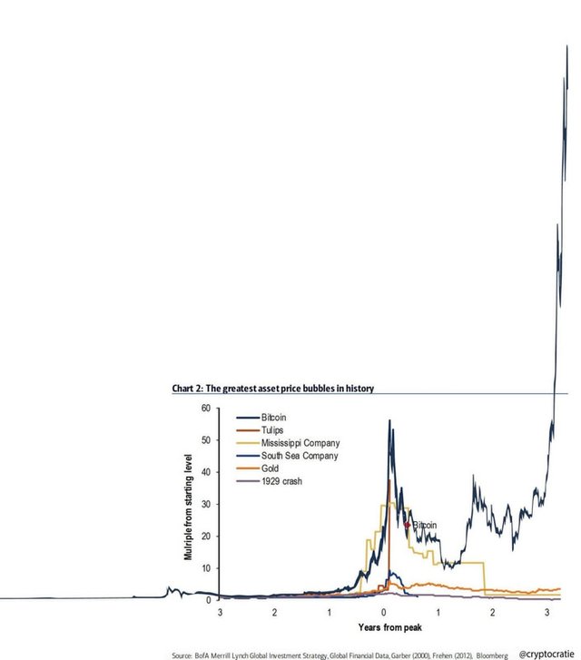
History is an interesting thing. Perspective can change greatly when you zoom out. Everyone who stayed on crypto market for a few years knows this. BTC crash of march 2020 is just a small deep on the chart now. In 2018 BTC chart looked like a bubble burst for those, who doesn’t know what Bitcoin cycle is. The chart seemed smart them, but now it just proves the opposite: how great Bitcoin really is. Twitter user @cryptocratie updated the chart for us:
Source
Save this chart and whenever you see BTC price drop, look at it. It will make hodling a little bit easier. Enjoy the bullrun and trust in Bitcoin!
Disclaimer
I’m not a financial of any kind. I encourage you to check all information yourself and make decision only based on your own opinion. All articles are created for solely entertainment purpose.
If you like this post please vote for it and follow my blog. Feel free to share your thoughts in comment section.