The BRILLIANT use of color in the movie "Her" + ILLUSTRATION by Alejandra Her
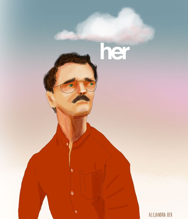
Her poster interpretation by Alejandra Her
There is a movie with a photograph that I fell in love with since I saw it. It has a warm and pastel palette and a futuristic vintage aesthetic that gives the narrative a boost. This film is Her, written, directed and produced by Spike Jonze, and whose characters are played by Joaquin Phenix, Scarlett Johansson, Amy Adams, Rooney Mara, Olivia Wilde, and Chris Pratt. Hoyte van Hoytema was the photographic director of Her.
The plot of the film seems fascinating to me, a reality so palpable to touch now that we could at least consider science fiction.
However, it is not the plot that I want to talk to you, but the color palette, and the use of color in the film.
The color red in Her
Theodore is a lonely and passionate man, an idealist, who finds love in the operating system he uses to organize his life. Unlike his peers, Theodore frequently wears vibrant colors: Red, most of the time. This marks a great difference between him and the rest of the characters: while he dresses in red, which shows his passion, the others wear more subtle colors. This also highlights his dissatisfaction with many aspects of his life and what surrounds him.
Color consistency
What makes this palette stay in the film of such a consistent picture is perhaps the omission of blue in the scenes of the film. Although the blue color in small dots provides an important contrast, and can be seen perhaps in the light of some building, this color was omitted in the scenes, using purple dots in the palette, even so with a warm tendency.
The use of the Helvetica Typography seems very opportune in the poster. While many designers hate Helvetica, this font type is associated to neutral, minimalistic design. And it is minimalism something very present in the movie.
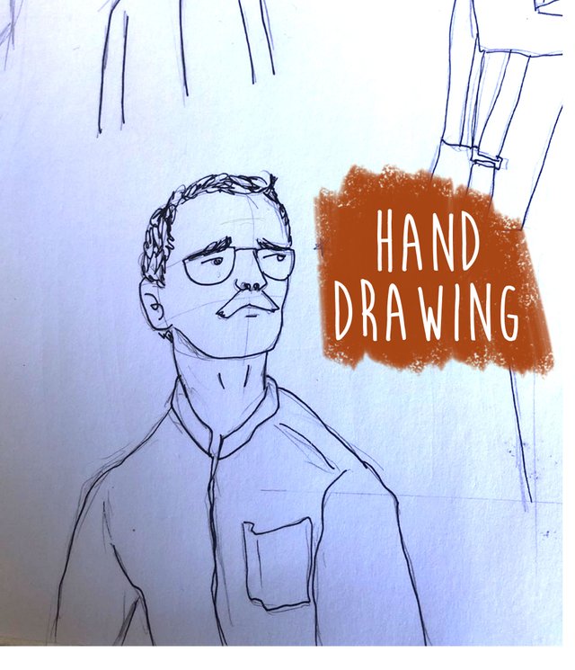
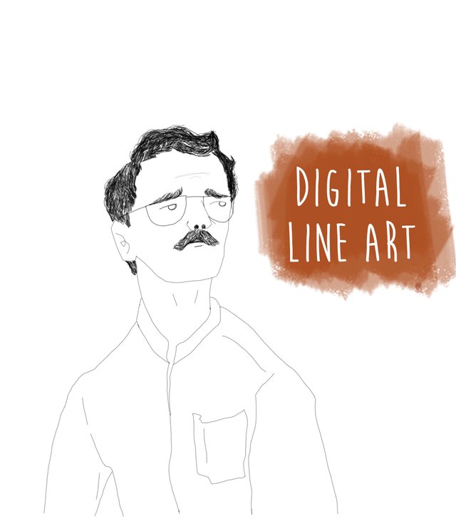
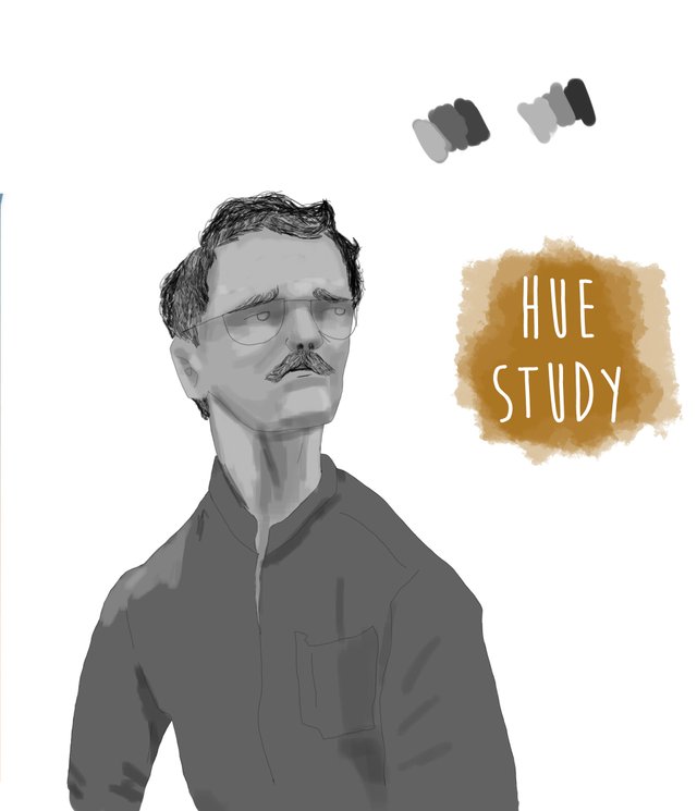
My Illustration
I decided to make this poster-like illustration of the movie using this character aesthetic with unrealistic characteristics. I like the fact that, even by distorting his proportions, we can recognize him in an illustration: the large nostrils, the eyes and his thick neck with low shoulders are not a limitation to know that Theodore is the one there.
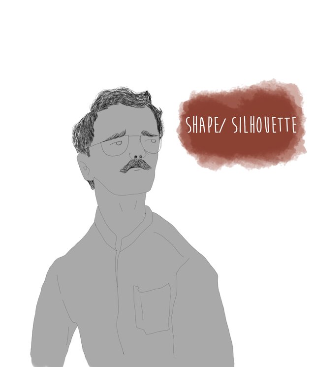
Those who have read my articles will remember that I am a hue study enthusiast. Well, here is a clear example of it: The hue study allows me to deduce that the most vibrant color will be worn by the shirt. Translating this to the color, it is the red that takes the most saturated tone in the illustration.
Here you can watch the poster that inspired me
Thanks for reading.
If you like the article, please repost.
If you like my work, visit my Instagram account

✌🙄
Congratulations, your post has been upvoted by @dsc-r2cornell, which is the curating account for @R2cornell's Discord Community.