SEC | S20W3 | Data Analysis with Excel: (Charts, and data analysis techniques.)
Charts, and Data Analysis Techniques.

Explain what you understand by Excel charts and discuss three (3) types of Excel charts that you know with clear screenshots.
A chart is a visual representation of specific data which helps communicate information in a hraphical format, showing trends and relationships. Charts facilitate our understanding and analysis of more complex data, enabling us to make more informed decisions based on provided information.
The idea of charts and graphs is built around the notion that a picture is worth a thousand words and charts speak louder than words. As a visual aid, they help us assimilate facts easily.
With charts, you need very few words to make your point, and your audience can easily visualize what you are saying and easily identify trends and patterns.
You will definitely need some charts when presenting the result of data analysis during a report for a business or scientific research.
They are effective tools during marketing and advertising and makes a lot of diffrence in the hands of a skilled instructor during training.
To get the best out of charts
- Keep the chart clear and simple.
- Choose the right chart type to represent your data.
- Use colours that match the mode
- Label the chart and include annotations
- Ensure data accuracy
- An interactive chart is often better
Types of charts
The most commonly used charts are bar charts, line charts, pie charts, scatter plots, histograms, heatmaps, flowcharts, organizational charts, etc.
Pie charts:
A pie chart is a graphical representation of data which use a circle, divided into slices or sectors that shows proportional relationships between various categories using percentage.
In the example below, I will be making a conparison of steemians in the verious clubs.
| Club status | Persentage |
|---|---|
| Club 100 | 5% |
| Club 75 | 15% |
| Club 5050 | 60% |
| No club | 20% |
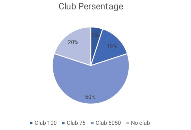 The data used for this example was fabricated
Bar charts:
A bar chart is a graphical representation of selected data that uses rectangular bars to compare different categories of data where more attention is paid on the horizontal length of the bars.
Below is my example showing how a bar chart could be used to visually represent selected data. The data shows countries and their use of the Steem Pro app.
| Country | App Users | Browse Users |
|---|---|---|
| Venezuela | 12000 | 11000 |
| Nigeria | 6000 | 4030 |
| Cameroon | 3250 | 120 |
| Indonesia | 9400 | 10020 |
| Ukraine | 6500 | 6400 |
| Pakistan | 7600 | 9200 |
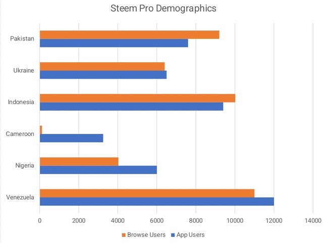 This data was fabricated for this example
Histograms:
A histogram graphically represents continuous data, showing its distribution pattern and frequency. Like a bar chart, the height of the bars is what counts. It is best used to analyze data distribution.
The data below plots post quality against user reputation.
| Reputation | Post Quantity |
|---|---|
| 25 - below | 0% |
| 26 - 50 | 10% |
| 51 - 69 | 25% |
| 70 - 80 | 30% |
| 81 - Above | 35% |
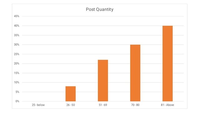 This data was randomly created for this example
Verify that you can read the information regarding chart location and creation in Excel and interpret it correctly using Bar Charts based on the data given below.
Number of Steemians per country.
| Country | Number of Steemians |
|---|---|
| Nigeria | 122 |
| Venezuela | 105 |
| Bangladesh | 98 |
| Pakistan | 84 |
| Indonesia | 80 |
| India | 76 |
| Colombia | 50 |
| Philippines | 45 |
| Indonesia | 40 |
| Bangladesh | 38 |
| Cameroon | 30 |
| Italy | 28 |
| Argentina | 25 |
| SriLanka | 20 |
| Chile | 15 |
| Brazil | 9 |
| Romania | 4 |
| Tunisia | 2 |

Using WPS office on my Galaxy-A15.
Step 1
Select the data table
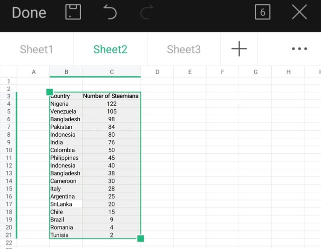
Step 2
Select the office button
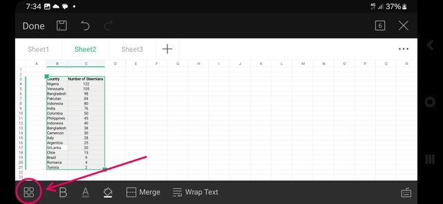

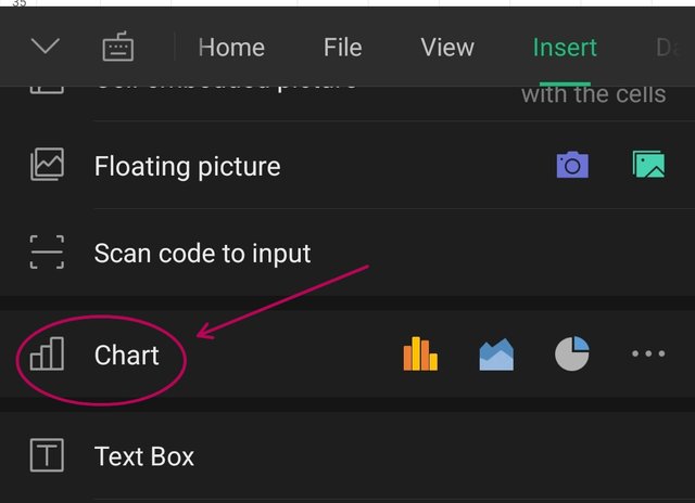
Select bar chart under chart type
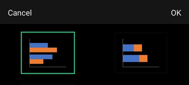
And click ok
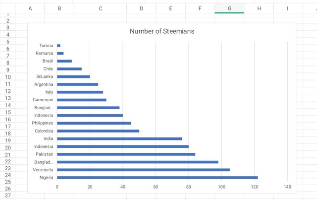 This data was provided by the instructor for this exercise
Briefly discuss Data Analysis Techniques In Excel and tell us how we can organize data in Excel for analysis.
Data analysis is the process of organising data so as to easily extract insights, patterns, and other meaningful information from the data with the goal of identifying trends, predicting possible outcomes and influence decision.
To accomplish this, you may use a statistical methods or apply data visualization with charts and graphs. you may also do some data mining in the process. In its symplest form, you may simply have to sort, arrange, or alter the sequence of data to ascending or descending order.
To organise data for analysis
Follow simple data sotting rules like formatting only the headings, avoiding empty cells in the table, keeping an empty row or column around the table, and having only one table in a worksheet.
Using the data given in question 2, arrange the names of countries alphabetically using data sorting techniques. Screenshots are needed.
Here is the data before sorting
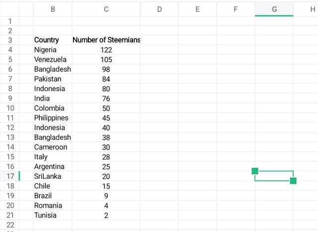

Select data

Select country which tells the system which column to sort

Select sort in ascending order

And this is what you get
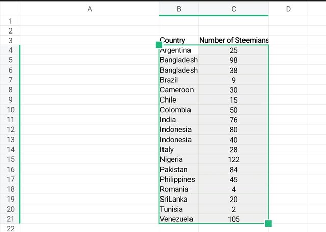
Conclusion
The value of data analysis was clearly shown in the last exercise. It was only after sorting the data that i could observe that both Bangladesh and Indonesia appear twice with different populations. This fact was not obvious when the data was not analysed.
All pictures are my screenshots of a spreadsheet using the WPS Office on my Galaxy-A15. Edited with phone app and PhotoStudio App. I am inviting @eliany, @udyliciouz and @kesybliss to participate. And a big thank you to my instructors for this well packaged lesson on data analysis.
#spreadsheet-s20w3 #steemexclusive #burnsteem25 #learnwithsteem
#club5050 #nigeria
#spreadsheet

Excel is a useful tool for data analysis that allowing you to easily visualize and compare data by creating different charts Such as bar charts, line charts, and pie charts. Pivot tables can also be used to make large amounts of data concise and understandable, bringing out important information quickly. More complex analytical methods such as trend analysis, conditional formatting, and regression analysis help you better understand trends and patterns in the data.
In offices and business sectors, Excel is used for creating reports, financial analysis, and planning. For example, viewing sales data in chart form makes it much easier to analyze, track project progress, and review budgets. This can make business decisions more effective and accurate.
This is a very beautiful summary, thank you for your supportive comment, i really appreciate.
My Twitter link 👆
https://x.com/manuelhook41759/status/1840311169568895000
Upvoted. Thank You for sending some of your rewards to @null. It will make Steem stronger.
good information.thanks for shearing with us.