NEW LOGO PROPOSAL FOR STEEMIT PHILIPPINES

Hi guys, especially to everyone here in the Steemit Philippines community, i decided to propose a new logo/icon for this community let's say for some minor reasons first is that the one currently being use falls under Attribution 4.0 International (CC BY 4.0) which means every time you used it you need to attribute the author or artist, this also includes that you should indicate even some minor changes you made in it i think it includes changing the colors or even size of it.
Secondly i think it should come from someone who is a member of the Steemit Philippines Community tho you can argue with it. The last reason is that there is a major problem with the position of the color as you can see the color blue is on the right side which is the usual misconception when placing the Philippines flag in a vertical orientation.
This was Baa's proposed logo 4 years ago and is being used by most here on steemit ph. As you can see the blue color is on the right side and the red color of the flag is on the left side, now I'll further explain why it is wrong.

According to http://www.isdpe.com.pk/
If in a hanging stance, the red field will be to the left (from the observer's point of view) during times of peace and the blue field will be there during times of conflict. If in a hanging posture, the red field will be to the left (from the observer's point of view) during times of peace and the blue field will be there during times of conflict.
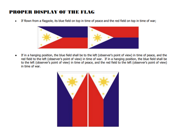
Which means baa's logo indicates that we are currently at war. When I was in elementary school i often made this mistake, i think it is a great opportunity as well that we learn something like this as it is also important to us as a Filipino citizen.
MY DESIGN CONCEPT
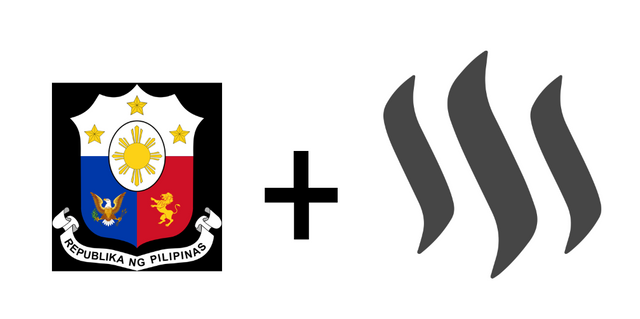
Basically, I just combine the old republic of the philippines logo and the steem logo. Mas binigyan ko lang siguro ng minimalist na design which is angkop sa generation natin ngayon.
LOGO/ICON PRESENTATION
So ayun gumawa ako ng variations nya kapag may kulay at kapag all black, i think nabasa ko sa isang tips ng sikat na graphic artist na masasabi mong okay or maganda ang pagkakagawa mo ng logo or icon kung maganda padin syang tignan kapag all black or monochrome yung kulay lang niya then tsaka mo gawan ng kulay. Also an art piece daw ay mas magandang tignan kapag limited lang yung kulay or color palette na ginamit sa buong art piece.




DIFFERENT LOGO SIZES IN PNG
So ginawan ko ng iba ibang sizes yung logo ranging from 16px to 1024px which is yung mga normal or kadalasan na sizes na ginagamit sa mga apps sa phones or even sa computers.




Icon Mockup if used by SteemitPH Curator
![]()
DOWNLOAD LINK OF THE ICON/LOGO👇
Just click that "download here" and voila meron na kayong kopya ng mga logos at icons sa iba ibang variations kung may problema ay magcomment lamang kayo dito sa post at pwede kong ayusin.
cc: @juichi, @loloy2020 , @steemitphcurator
I like the first design with the colors.
Thanks, i just actually showcase if it is in blackandwhite, very much appreciated tho
Hey bro, glad to see you here !
Welcome back !!!
thanks bro, what happened to promosteem?
Thank you for your effort Juls, we are glad to have you again. The community needs someone like you.👏
thanks @juichi for the warm welcome :)
so ito na gagamitin ko this week😊
I like this logo sir..
And we are back @julstamban. After years of hiatus, we are back.
@beyonddisability
Luzon Mod