CR from Argentina: Mapping analysis for Southeast Asia updated to April 25th
Mapping analysis for Southeast Asia updated to April 25th
Image edited from my own map.
Mapping analysis for Southeast Asia | Steemit users: total and status, updated to April 25th
Sorry, I couldn't update it before due to an inconvenience with the software installed on my computer (QGIS).
Hello everybody!! I've been working on this new project, and I'm glad to share once again this map, today updated to April 4th, and exclusively for Southeast Asia! This was a request from @steemcurator01 after reading the report shared by @anroja.
I've obtained the data from his last report Laporan Steemian Aktif Di Asia Tenggara Dalam Minggu Ini [19 - 25 Apr 2021]
and then I built the maps on QGIS 3.10.3 for desktop.
I utilized as a base map, an online shape from Google Satellite (this is Google Satellite for mapping analysis. You can upload it directly on QGIS), and the vectorial shape for the countries that belong to hub.arcgis.com, this is a website wherein you can download vectorial data for cartography legally and free.
Source of the data
As I mentioned before, I took the numbers shared by @anroja in the report shared below:
Previous mapping analysis
Cartography for April 25th
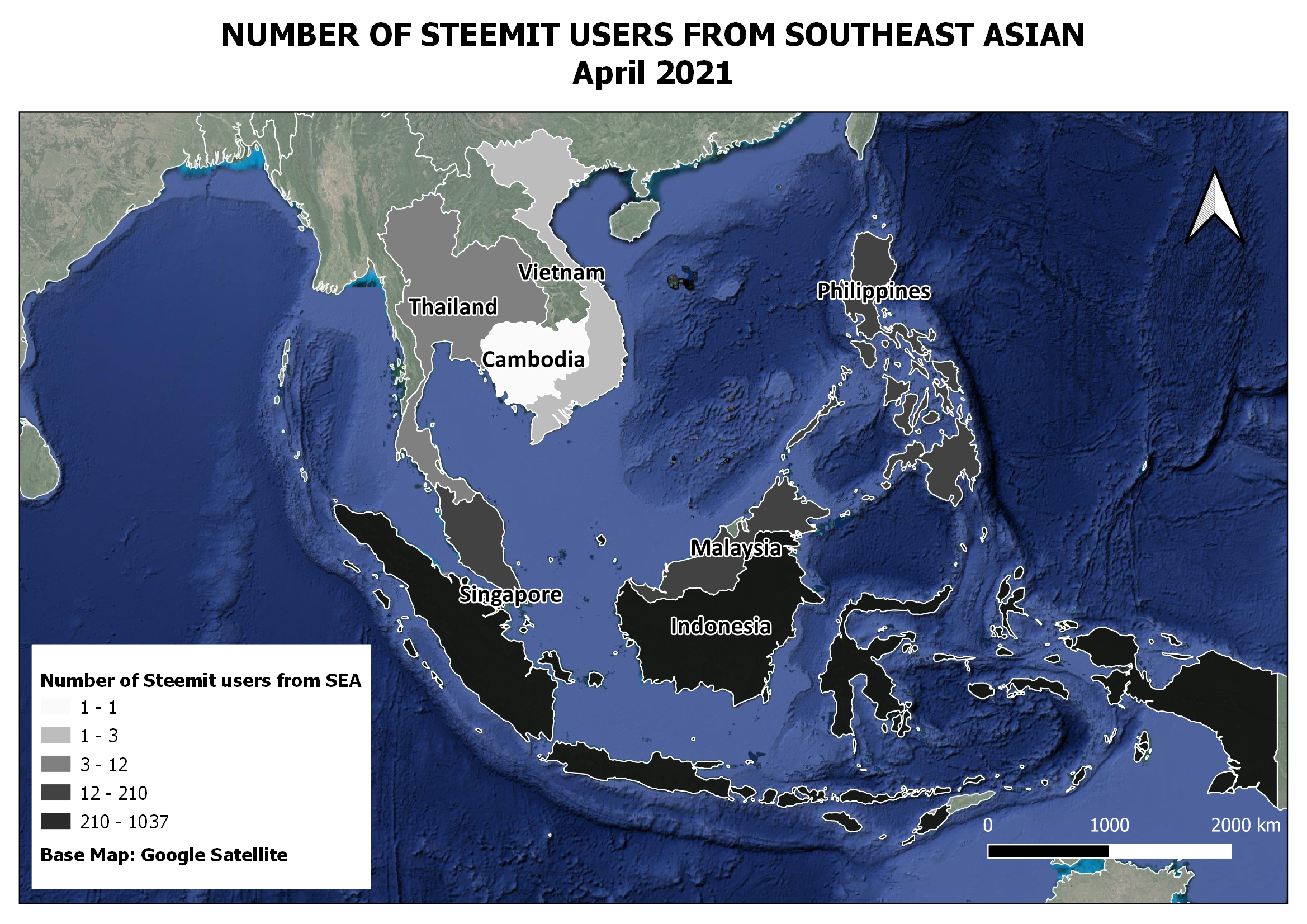
This is the total number updated until April 25th, 2021.
You can take a look at the references, but darker colors mean more users, and lighter ones, a low number of them. You can see that Indonesia and the Philippines are in contrast with Cambodia and Vietnam. As @anroja mentioned in his report, there is a remarkable increase in the total of users comparing this with the last report, and also there are more users active, as you will see in the next map.
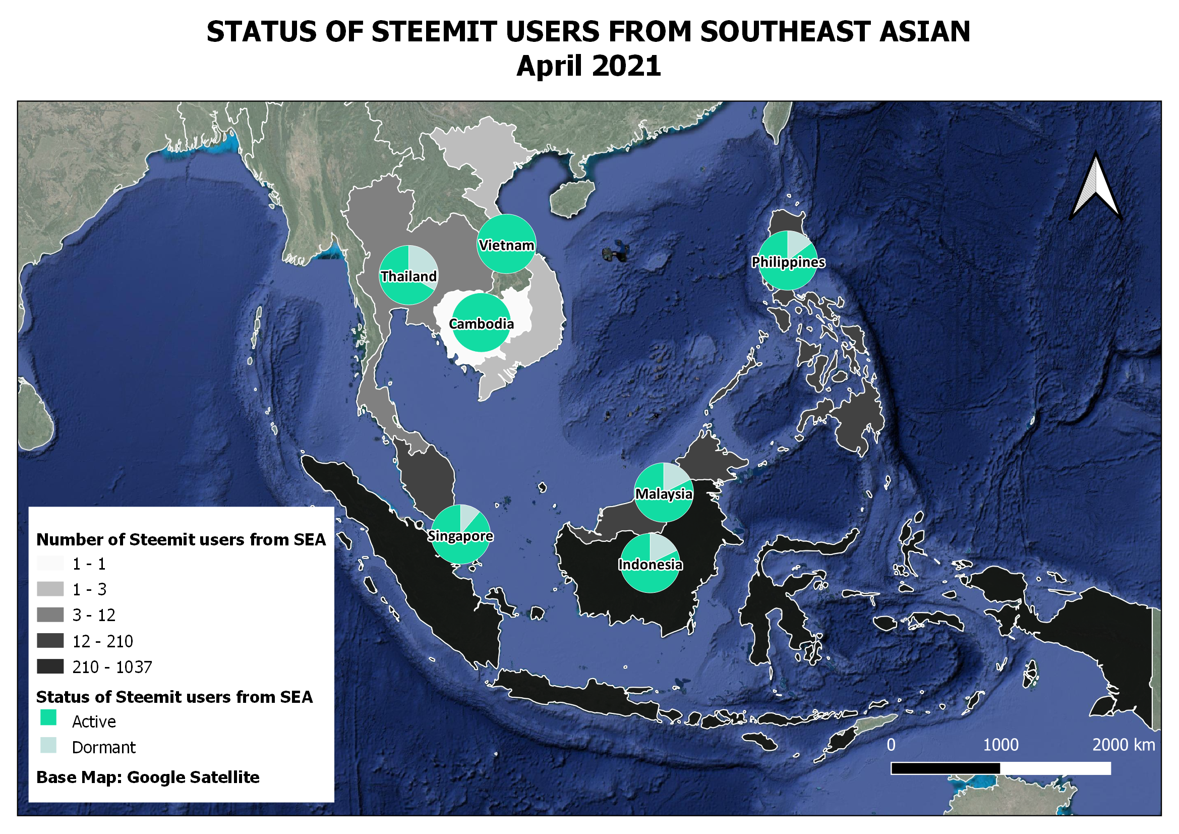
This is the status updated until April 4th, 2021.
In this map, it happens the same, shiner colors mean active users. Please, observe the first map or the base colors to read this map well. You can also help with the table.
I've changed the colors as you can see, now I used a greyscale. I'm open to listening to your opinion about it. Which color do you prefer?
Base table to build the map
| Country | Active | Dormant | Total |
|---|---|---|---|
| Indonesia | 852 | 185 | 1037 |
| Phillippine | 179 | 31 | 210 |
| Malaysia | 14 | 3 | 17 |
| Thailand | 8 | 4 | 12 |
| Singapore | 8 | 1 | 9 |
| Myanmar | 1 | 3 | 4 |
| Vietnam | 3 | 0 | 3 |
| Cambodia | 1 | 0 | 1 |
| Total | 1066 | 227 | 1293 |
Method used
- Jenks or natural breaks
This method is very useful when it comes to data with huge differences between numbers as in this case. You have numbers like 1037, 210, and 17, so you ask the software (QGIS in this case) for classes based on natural breaks, and here is the result. The program builds a bar chart to identify the cut of the classes, and open and close each one wherein the chart indicates to do it.

For detailed information about SEA users, please take a look at @anrojas 's report
CRs, if you have the statics, I can build the maps for the different regions if you want to.
Thank you very much for reading!!
Have a beautiful day
With love,
Belén
Cc.
@steemcurator01

Terima kasih banyak @belenguerra telah membuat peta penyebaran steemian di Asia Tenggara, ini sangat luar biasa
You are welcome my friend!! :)