Steem Environment Logo Interpretation by @breeze.com
Introduction
Hello environmentalists , special greetings from me. First time i am dropping a post here , so excited to be part of this beautiful contest. Everything about nature is my passion not because nature is good but because nature is dying and needs our help and do you know who is helping to kill nature? Man!!!.. So protecting nature is an obligation and not charity venture🤠🤠
To begin with, A logo is a graphic mark, emblem, or symbol used to aid and promote public identification and recognition. It may be of an abstract or figurative design or include the text of the name it represents as in a wordmark.
Source
Thus , a logo is any artistic work comprising of images and/or text that represents and it is use to promote any business, institution, social gathering etc. Most logos are designed by graphic designers but with the evolution of knowledge any person can design one. The quality will now matter on the individual.
Contest proper
Unlike most logos Steem environment logo is a simple well designed logo which gives a straight forward message without twisting anything .Most logos carry on them images that do not directly or even relate to what they claim to represent.
I did not design this logo but I will do a vivid description of the logo.
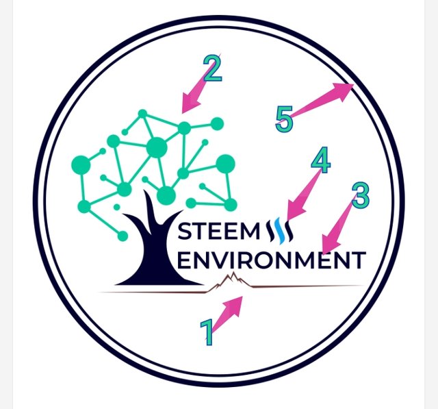
The steem Environment Logo contains in it The natural landscape , with much priority given to to plants and with the title of the community boldly linked written on it, powered by steem .All these in circled by two black circles one thinner than the other other one .This circles could also represent the globe. The steem environment logo is placed on a transparent background .Thus, it will take the color of what ever surface it is placed on.

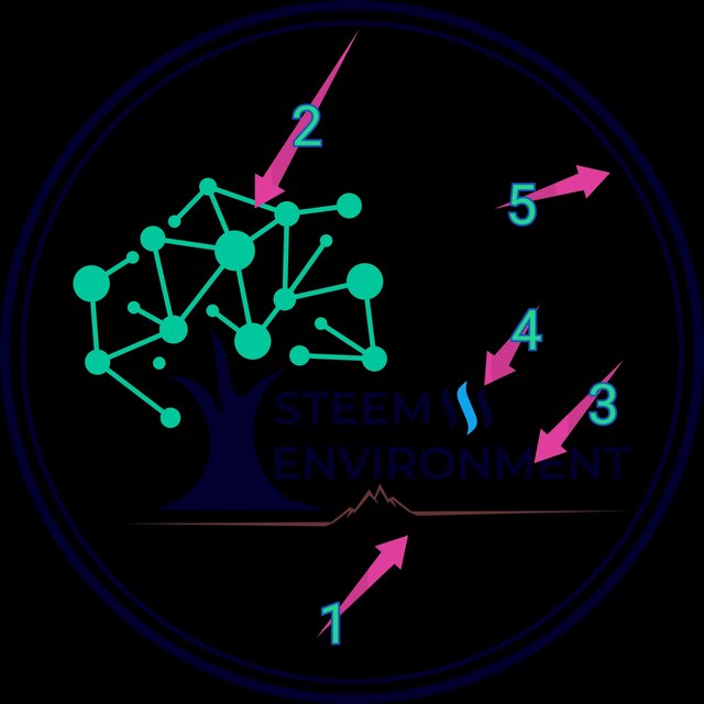
Steem Environment logo downloaded

Steem Environment Logo screenshot
As clearly observed above the components of the logo include;
1- A natural scenery
2-Plant , which seem to be the priority
3- Name of community boldly written
4- Steem logo (indicates it is powered by steem )
5-Two black circles, the inner one thinner than the outer outer one( This could represent the globe in which all the other components belong )
Basically , the logo has 3 colours black, green a and blue . The background is transparent meaning it will take the colour of any surface placed on as earlier mentioned .
Observation, Recommendations and Conclusion
The logo has been beautifully designed with most of the components that represent the community clearly indicated. The graphic is awesome and the colours clearly match .
One thing i love about the logo is that it is not crowded but carries the information related to the community .
Recommendation
However, i recommend a background can be inserted so that it becomes easy for second users to download and use that is if they are granted permission .As indicated above in the first image i wanted to label the futures after downloading but could not see them clearly since the background was transparent overshadowing the other features .
NB: About this, i think my browser is the issue i have just done another download and it appears awesome and great.
Check
Conclusion
Categorically, i put to this community that the logo is fantastic and i hail the designer/designers of that wonderful piece.
Kudos !
Long live Steem for the environment and vise versa
Inviting ;
@robless
@stephzinkeng
@tenguatangah
@bihnadine
@monjuapollonia
@wase1234


.png)
Halo my friend @breeze.com
Thank for sharing your content on steem-environment.
Thank you we move forward.
Steem on..
Good job @breeze.com
Thank for sharing your content on steem-environment.
It is my pleasure Sir .Thank you for going through the post
You are welcome, friend
This is beautiful!
Thanks for mentioning me because it's due to your mentioned that I Hy subscribed to @steem- Environment
Like you have said they did they very best in their design . It's a picture of many words
You are perfectly correct dear . Participating in contest is a great way to make a community known..
..