"SEC20/WK4: Graphic Design Hands - On practical 1"

Edited using canva
The three weeks that concluded this graphics designing course exposed me to colour grading, principles of graphics designing, and typography. These three techniques are like formulas needed to make a great product. They serve as guides to us on making perfect thumbnails or designs graphically, which can be business cards, flyers, or invitation cards.
Without these three formulas and many more, graphic design is nothing. These are the backbone or foundation of graphic design, if I may say.
| Principles of Graphics Designing | Colour Grading | Typography |
|---|
A perfect graphically designed flyer |
|---|
This is illustrated in the product I made by reacting these three concepts and balancing them in such a way that they blend. I actually thought I would be able to bypass one of these concepts, but I couldn't because these are concepts or rules governing the graphics designing ecosystem. This contest just reminded me of when I used to do Steemit promotion earlier this year.
 |  |
|---|
I do make use of Canva designs, not taking into consideration these three concepts and the details involved. I just did it for first impression sake. Now that I've gone through this course, I've seen how to be a perfectionist in this and why it's very essential to consider details and relevance in design and not be easily carried away by the beauty of the design or colours emitted.
Whatever you produce tells if the information you're selling will actually sell. What captures many isn't just about the design and colours that make the design but how well it is designed.
It's just like admiring a cloth sewn by a tailor because of the colour of the material and design, but you fail to see that he has made mistakes in sewing. To replicate this design, these are the steps I took to ensure I give details and relevance and make a duplicate of this as instructed but basically in my own style.
My steps in replicating this design |
|---|
To replicate someone's thumbnail or design may not be that easy. You have to take into consideration the details in the design, purpose of the design, elements involved, and principles governing the overall outlook of this design.
Understanding these helped me have a glimpse of what to do even with the aid of the tutorial. I started by logging into my Canva application.
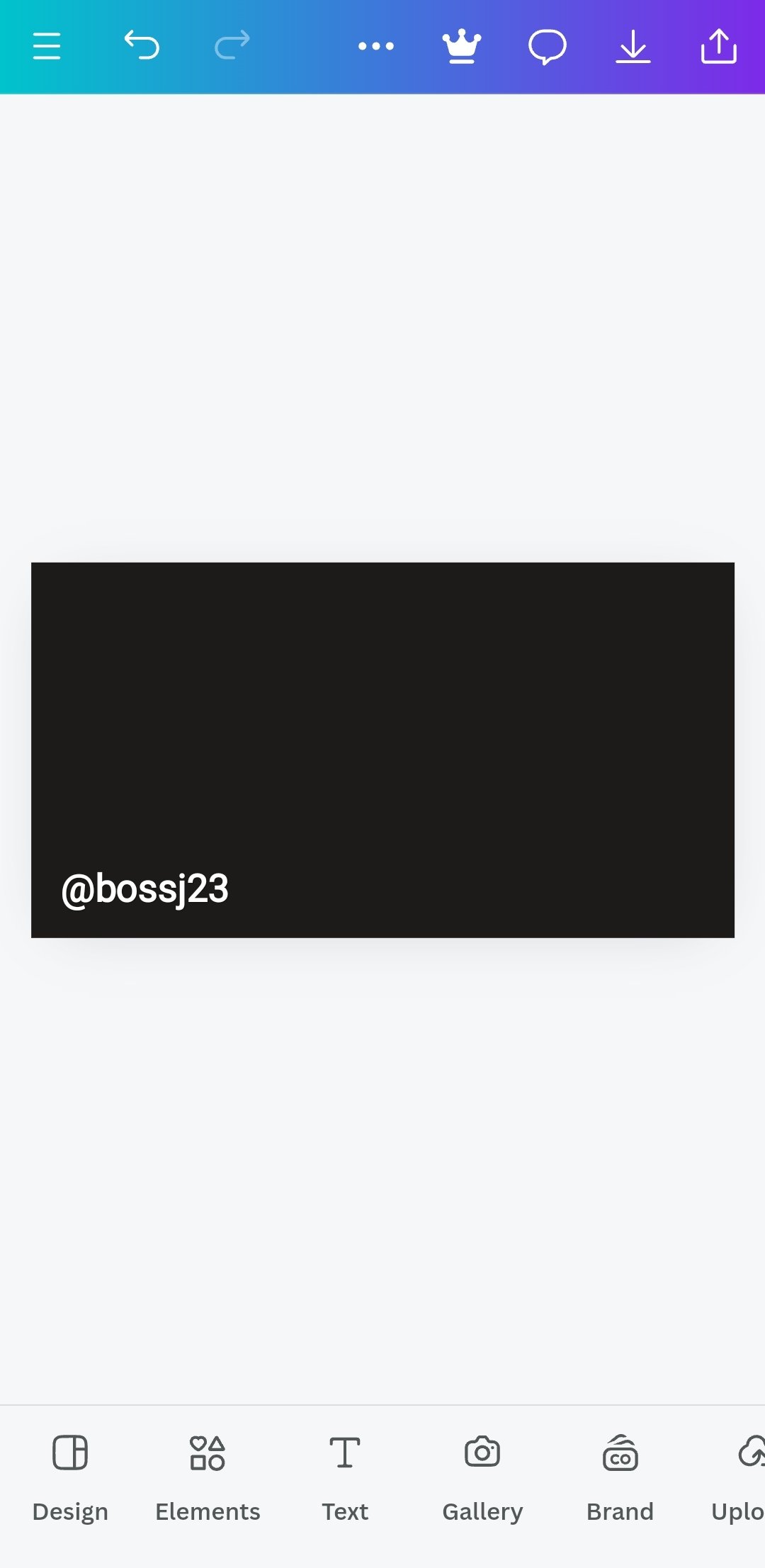
- After logging in, I clicked on the plus sign and then used the search button to get the exact size of the original copy, which is rectangular. After ensuring this, I looked for a perfect and free rectangular pattern to work on.
 | The rectangular box |
|---|
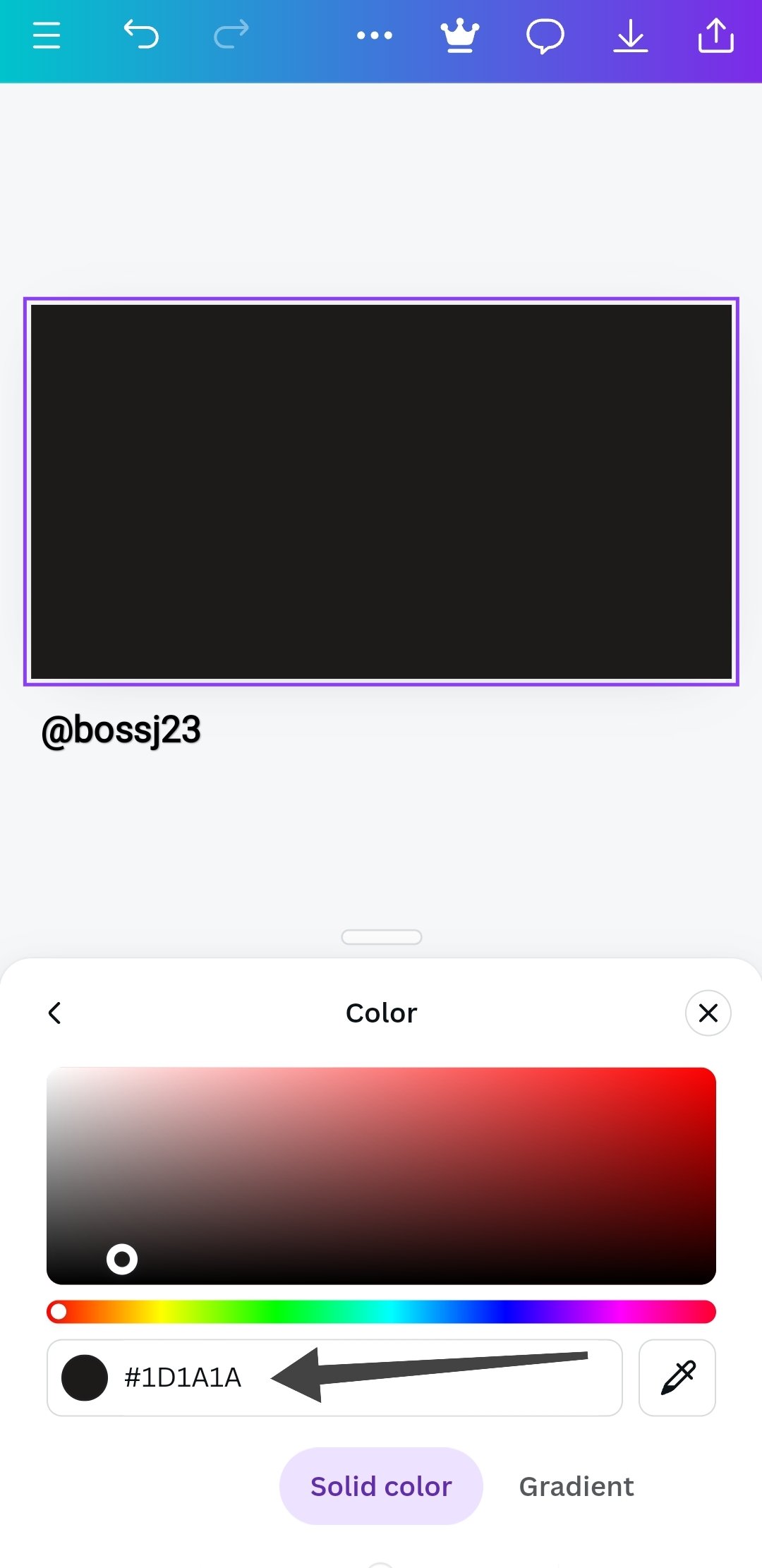
- Getting a background colour for my rectangle was necessary. So I tapped on the rectangle to highlight and then clicked on the COLOUR icon. When it popped up, I chose a black colour, which was applied immediately.
 |  |  |
|---|
- After the colour application, I took to adding a picture to serve as a watermarked background other than the initial black colour I added. The picture was added to replace the rectangle's background colour. To add the picture, I tapped the area or space out of the rectangle to highlight. I then clicked on the Gallery icon to select pictures. It took me to my gallery, and I selected a fitting picture for what I wanted talking about and then clicked on ADD TO PAGE.
 |  |  |
|---|
- It was automatically added, but I needed to extend it to fit the box. If I actually highlighted it at first, it would have shown me REPLACE, which would have been easier other than dragging to fit. After adjusting it, I clicked on the TRANSPARENT icon. You don't need to highlight the box if you want to see this. When the scale appeared, I adjusted it to 8 to be a watermarked background picture.
 |  |  |
|---|
- After adding the watermark, I choose to add elements by Clicking on the ELEMENTS icon to select a circle for my work. I choose to add elements first before adding typography. I added the circle element and then changed its colour to white.
 |  |  |
|---|
- I then used one of the said pictures as an illustration. I added this by inserting it into the box and into the circle element I added. The colours didn't rhyme at all. I had to use the colour grading technique to make this work. I clicked on the circle element to highlight and then clicked on COLOUR. When the palate opened, I clicked on the COLOUR PICKER and placed it on the image on the circle, i.e., the yellow wear, to get that colour for me. Once I clicked on Done, it was added. That's how I was able to have that colour.
 |  |  |
|---|---|---|
 |  |  |
- After this, I adjusted the picture to fit into the circle and then moved to adding text. This was done by clicking THE TEXT BUTTON, and I then clicked on the ADD heading, and it was added. I changed it to my writing.
 |  |  |
|---|
- It didn't stop there, I applied TYPEFACE. I changed the text font by clicking on the FONT ICON and then typed IMPACT on the search button, then sent it. It brought out that font, which I used.
 |  |  |
|---|
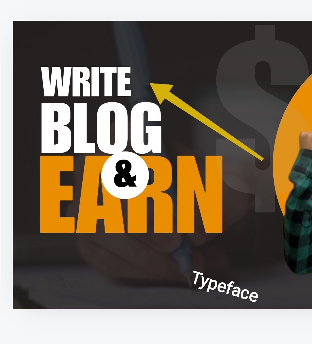
- After some panel beating, I played with TYPOGRAPHY by adding an element to a text to beautify it. I then watermarked dollars in the background and added a dollar sign on the Polo of the man in the picture.
 |  |  |
|---|---|---|
 |  |
- hierarchy principle helped me in arranging the text well in such a way that it would be aligned from the smallest to the biggest. This was also assisted with perfect colour grading. Some people don't pay attention to the arrangement of this and choose to place it anyhow.
When designing a graphic, you need formulas to work well, and these formulas are the concepts involved in perfecting this design.
- That was how I was able to create and replicate the original flyer given for this challenge. Replicate the design above using the following guidelines below.
This product was possible with the concepts mentioned above. If you noticed, I made mention of Hierarchy, typography, colour grading, and typeface. These are the formulas that helped me produce such beautiful output. Let me talk briefly about these principles and concepts.
I'll start with the first thing taught us in the course of this lesson, which are the principles involved in graphic design. I used three principles to endure; this came out smoothly.
Hierarchy like I said, is the first principle I used in aligning my texts to appear on the same page but in such a way that it appears as if it's going from a lower position to a higher position. If you notice from the screenshot below, you'll see that the edges are aligned perfectly, but the length of the words differs. It's more like a step, so to speak.

I ensured I placed the words to make a vacancy in their last letters. This was to ensure I got a step that is hierarchically from a lower level to a higher level. This hierarchy principle gives dominance and priority to certain elements in terms of positioning.
- The emphasis principle is what I also used in making some words stand out, like EARN. I made it bold, added a typeface, and then used a visible colour to highlight the text. It makes it unique from other texts or words in the thumbnail. This attracts the viewer's eyes more to the earn than other written words.
- The contrast principle I also used to point out the distinction between elements that have similar design. This contrast was made in the font size of the texts. I made each of them have different sizes from the other. They may be similar but different, as the contrast is in the sizes and lengths.
- Typography was used to beautify the text found in the last line of this picture. This was done after adding the text. I just inserted the element and moved the asset to the family.

| Typeface was used in changing the font from the standard to IMPACT font. | |
|---|---|
| Colour grading |  |
These were the combinations I made to produce this replica. Let me know your own view about this in the comment section. To validate my ownership, I've written my usernames in all pictures and screenshots made. Applications are best done when the theories are understood and the basics are made firm.
Cc,
@lhorgic
I invite @goodybest, @ngoenyi, and @dove11.
Upvoted. Thank You for sending some of your rewards to @null. It will make Steem stronger.
https://x.com/bossj23Mod/status/1843068852579532928?t=MKqnCrk3eGSs6F7Uh69Siw&s=19
Appeal to community members: