STEEM Graphics Contest | WEEK 4: STEEM Rocket - A few concepts [ENG-ITA]
You can find the ITALIAN translation after the English text.
All the uses of the contents herein - and their derivatives - are strictly prohibited without the explicit consent of the author, except for dissemination without modification through social media channels. To read more about other exceptions, consult the LICENSE and README note clicking here.
Hello!
Today I would like to join the fourth edition of a contest organized in the Steem Marketing community, and about which you can read more clicking on THIS LINK. If you are a graphic designer apprentice, or you dabble in graphic design, and if you want to create some STEEM or TRON-themed ones, try to take a look at the contest rules and decide if you want to participate. The theme of the week is STEEM Rocket. We are near the finish line: harry up, if you want to join.
CREATING
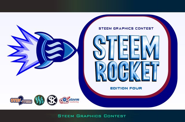
As mentioned, the theme of the week is "Rocket". The idea that popped into my head was the obvious figure of a rocket decked out with the Steem logo, but we'll get to that later. First, let's take a look at the graphic design of the "Steem Rocket" lettering, which you have seen a preview in the cover image of the post.
To create it, I used a somewhat cartoon-style font, the Lugate font. I then juxtaposed various layers and added different color transitions in the foreground gradient. As you can see in the image below, I kept a light blue tone for almost all the elements.

In this case, the writing was positioned on two lines, a choice that didn't convince me, thinking about the second element which I will show: a divider. So, I disassembled the elements and created a version of "Steem Rocket" lettering on a single line, mixing it with a background with multiple color transitions and a shadow useful to increase the contrasts between the background and the text. Below, the result.

And then let's move on to the key elements: as far as the Rocket theme is concerned, a figure of a Steem-branded rocket couldn't be missing. I created a rocket on my own, even if the features are those of a common rocket, very similar to many others you can find surfing the web. I then inserted the Steem logo on the body of our rocket, and created some color variations: each one has a dominant tone, for example yellow, red, or blue. Only in one case, I made an exception, mixing yellow and red.
Below I have created a very short presentation of the rockets obtained. Continue reading the article if you want to know how to download them.
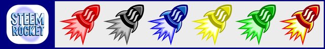
Finally, I created a simple background where I applied our rocket, just to give an idea of the possible use.

THE END
And nothing more. I hope my post was inspiring and that you enjoyed it. If it did, please leave an upvote. ;)
As for the previous posts I published to join the inititative launched by @promosi-steemit and that you find at the following link:
My Steem Graphics edition participation
My Steem Go Green edition participation
My Steem City edition participation;
you can use the images you find in this post to create other graphics in Steem-based blogging platforms only, but the resolutions are obviously limited. You can find a folder with downloadable files in my REPOSITORY on GitHub.
You may not use these contents inside or outside the Steem-based blogging platforms as logos and/or trademarks, or following or for other advertising and/or marketing destinations outside the Steem-based blogging platforms (unless permisssion is given).
If you would like to obtain graphic designs similar to this ones but in more professional vector formats, you can contact me by following the website indicated on my profile. I marked my graphic design creation activity with the name Digitall Project, and you find all the channels through which you can contact me on its website.
Sources used to create the graphic designs:
- Personal contents;
- Lugate Font;
- Next Sphere Font.
Greetings and... bye to the next graphic design!

This post join the Penny4thoughts experimental project.
Below, the ITALIAN translation.
Tutti gli usi dei contenuti presenti in questo post – e dei loro derivati – sono strettamente proibiti, fatta eccezione la diffusione senza modifiche attraverso canali media e social media. Per altre eccezioni, consulta la nota di licenza cliccando qui.
Ciao!
Oggi ho deciso di partecipare alla quarta edizione del contest di graphic design organizzato nella community Steem Marketing, riguardo a cui puoi trovare più informazioni cliccando su QUESTO LINK in lingua inglese. Se sei un aspirante grafico o ti diletti nella realizzazione di graphic design, e se vuoi crearne qualcuno a tema STEEM o TRON, prova a dare un'occhiata alle regole del contest e decidi se vuoi partecipare. Il tema di questa settimana è STEEM Rocket. Siamo davvero agli sgoccioli, fai in fretta se vuoi partecipare.
CREIAMO
Come detto, il tema della settimana è "Rocket", che ho tradotto con la parola "razzo". L'idea che mi è saltata in testa era l'ovvia figura di un razzo addobbato con il logo Steem, ma lo vedremo più avanti. Prima diamo un'occhiata al graphic design della scritta Steem Rocket, di cui hai visto un'anteprima nell'immagine di copertina del post.
Per realizzarla, ho utilizzato un font dallo stile un po' cartoon, il Font Lugate. Ho poi accostato vari livelli e ho aggiunto diverse transizioni di colore nella sfumatura in primo piano. Come puoi vedere nell'immmagine qua sotto, ho mantenuto un tono che tende al celeste per quasi tutti gli elementi.
In questo caso, la scritta era posizionata su due righe, una scelta che non mi convinceva per la realizzazione del secondo elemento che mostrerò: un divider. Ho così scorporato gli elementi e ho creato una versione di Steem Rocket su una sola riga, miscelandola a uno sfondo a più transizioni di colore e a un'ombreggiatura utile ad aumentare i contrasti tra sfondo e scritta. Ecco qua il risultato.
E quindi passiamo agli elementi chiave: in quanto a tema Rocket, non poteva mancare una figura di un razzo marchiato Steem. Ne ho creato uno appositamente per conto mio, anche se le fattezze sono quelle di un comune razzo molto simile a tanti altri che si trovano sul web. Ho poi inserito il logo Steem sul corpo del nostro razzo, e ho creato alcune varianti di colore: ognuna ha un tono dominante di riferimento, per esempio giallo, rosso o blu. Solo un caso fa eccezione, poiché ho miscelato del giallo e del rosso.
Qui sotto ho creato una brevissima presentazione dei razzi ottenuti. Continua a leggere l'articolo se vuoi sapere come fare ad averli.
Per ultimo, ho creato uno sfondo sfumato dove ho applicato il nostro razzo, tanto per dare un'idea del possibile utilizzo.
FINITO
E nulla di più. Spero che il mio post sia stato d'ispirazione e che ti sia piaciuto. Se lo ha fatto, mi raccomando, lascia un upvote. ;)
Come per i miei precedenti post di partecipazione a questa iniziativa lanciata da @promosi-steemit che trovi ai link:
La mia partecipazione all'edizione My Steem Graphics
La mia partecipazione all'edizione Steem Go Green
La mia partecipazione all'edizione Steem City;
le immagini che trovi in questo post possono essere utilizzate come divider o per farcire i post che pubblichi nelle piattaforme di blogging basate su Steem, ma le risoluzioni sono ovviamente limitate. Puoi trovare queste immagini singolarmente all'interno della repository che ho creato su GitHub.
Devo però ricordarti che: non puoi utilizzare queste immagini in veste di loghi o marchi ufficiali all'interno o all'esterno delle piattaforme di blogging basate su Steem, o per altre destinazioni pubblicitarie e/o commerciali al di fuori delle piattaforme di blogging basate su Steem (a meno che non te ne venga dato il permesso).
Se volessi avere accesso a graphic design simili a questi in formati vettoriali professionali o a risoluzioni maggiori, puoi contattarmi seguendo il sito presente sul mio profilo. Ho contraddistinto la mia attività di creazione di graphic design con il nome Digitall Project, ed è sul sito a suo nome che puoi trovare tutti i canali attraverso cui contattarmi.
Fonti usate per creare le grafiche:
- Risorse personali;
- Lugate Font;
- Next Sphere Font.
Ti saluto e... al prossimo graphic design!
Questo post partecipa al progetto sperimentale Penny4thoughts.
Lo stile cartoon a me piace molto! E anche i piccoli razzi colorati!
Qualche feedback positivo c'è, meno male :D Grazie per esserti fermata sul mio post.
TEAM 5 CURATORS
This post has been upvoted through steemcurator08. We support quality posts anywhere and with any tags. Curated by: @chant
Thank you very much :)
Heres a free vote on behalf of @se-witness.