RE: 🎨 Mobile Navigation Design Patterns: #proposal-86 Update
Thanks for sharing your thoughts, they're always good to read.
The plan is to gain consensus amongst the witnesses and subsequently update steemit.com with these changes.
the models that make most sense are those that substantially draw from the shrinking pool of people who have only recently become web users.
I've mentioned before that my MSc dissertation was about the use of icons in computer systems. Part of this research was using real world iconography to see how some consistency could be applied on computers. It was very interesting.
My initial approach with layout / structural changes was to be as "light touch" as possible but following feedback from one of my earlier posts, I quickly learned that users want more, and a significant redesign would be a welcome change (hence the amount of effort behind this post). My priority at the moment is mobile because I think that there is so much consistency in design on Desktop now, that I think the solution will be easier.
I looked at PeakD and as a completely new user, I found it horribly overwhelming - I could probably write an entire post about why. I know that it's a different interface for using Hive so I wanted to browse content and see what it's all about. The primary calls to action on the landing page are "How it works" or "Join now". The former tells me how to use my credentials to log in (credentials that I don't have because I don't know if I'm interested) and the latter shows me that I need to pay $1 to join. There's a free option further down the page, out of initial view. Neither of these helped me achieve my goal.
So I looked in the burger menu and was confronted by this:
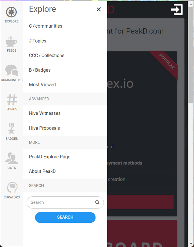
C /
#
CCC /
B /
This is just confusing. Then 5 out of the 7 navigation options don't do anything. I'd had enough by this point and gave up, wondering why that dApp's so popular.
On further viewing, I see that they're trying to be clever with section titles - "C /" indicating "Communities", "B /" indicating "Badges" but these unnecessary additions were confusing without adding any obvious value.
I also find the requirement to log in when just wanting to browse sites annoying. Twitter and Facebook both force this too and I feel it's a significant barrier to usage and adoption. There's probably been lots of research on this which I've not searched for yet.
I see that eBay has opted for a "full screen" / "Cards" approach to their navigation which works well at guiding people into deep levels of content - they've also got a powerful search feature. It's a good example of how they understand the nature of the content that they want to present, and allow users to dive into something very specific (via the burger menu) when they know what they're looking for, or suggest items and categories for people who just want to browse. Amazon's approach appears to be similar.