👨💻 #Proposal-86: Change Log - Community Pinned Posts
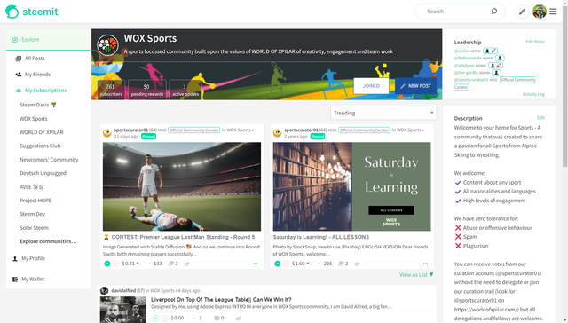
In this post, I'll be documenting the code behind the changes to the Pinned Posts Carousel on the Community page.
In my next post, I'll document the changes to the Community Banner and Community Settings. (I had originally planned to cover everything in one post but having now completed documentation of the Carousel, it felt like too much to cover in a single post).
📌 Pinned Posts Carousel
PostsList.jsx
This is the file that needed the most updates for implementation.
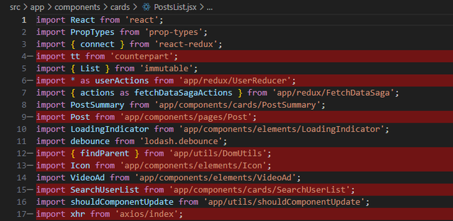
As per my previous deployment to steemit.com, I took the opportunity to tidy up the page and remove unnecessary imports and code snippets.
The list of posts are already passed to this page and within that, there's a setting which indicates whether the post is_pinned.
I use this setting to filter the posts and retrieve a list of pinned posts which gets stored in the pinnedPosts variable and since the carousel needs to know how many elements there are, this value gets stored in pinnedPostsCount.
I also use the is_pinned information to add an isPinned Class to the existing summary array to allow additional styling within the CSS.
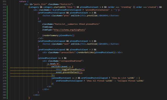
When it comes to rendering the carousel, a new code block has been added at the beginning of output:
This sets the condition for when the code block is displayed. category indicates that you're browsing a posts list (rather than being inside somebody's profile) and this is further specified by category.startsWith('hive-') which indicates that the user is within a community. We also check if there are any pinned posts (using the previously mentioned pinnedPostsCount variable) and that the sort order is one which currently pins posts to the top of the screen (i.e. Trending and New (created)). (Hot, Payouts and Muted do not prioritise pinned posts.)
If these conditions are met, a new div will wrap the pinnedPosts to be displayed.
This section reuses the existing code to output a list of posts - outputting the pinnedPosts subset that was previously defined. This is the "base / default" which then gets additional code wrapped around it if other conditiions are met.
An additional className of pinnedPosts has been included which is used as the hook in the updateSlide function discussed later.
If there are 2 or fewer pinned posts, there is no benefit to the page of introducing a carousel so the additional styling and functionality are only available for more than 2 pinned posts.
The arePinnedPostsCollapsed variable is used to determine whether the existing "List" view is used or if the user has selected to view them as a carousel.
By default, this value is set to false and requires the user to click "Collapse Pinned"...
If the Carousel view is already used, arePinnedPostsCollapsed will be set to true and the user has the option of "View As List". If this link is clicked, the togglePinnedPosts() function is initiated (more on this later).
In order to rotate through the options within the carousel, icons indicating "Previous" and "Next" are displayed, along with a series of dots to allow for a quicker route to a pinned post.
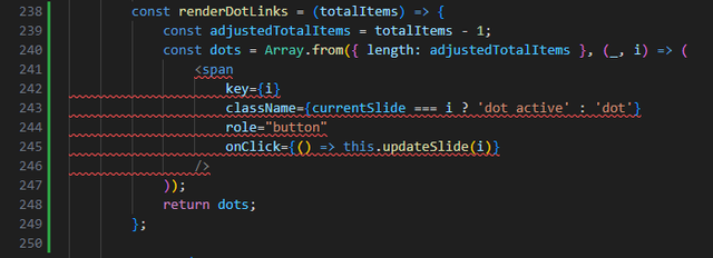
When "Previous" and "Next" are selected, the prevSlide and nextSlide functions are called respectively. The dots are rendered via the renderDotLinks constant which is passed the pinnedPostsCount variable (so that it knows how many dots to display).
This function renders a series of clickable dots which when clicked, calls the updateSlide(i) function (more on this later). The reason the number of dots is adjusted (adjustedTotalItems) is because 2 posts are displayed on screen at any time. If the total number of dots weren't decreased by 1, clicking the final dot would only display 1 post on screen.
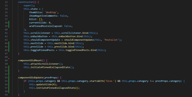
The current slide (i.e. position of the carousel) is stored within the state variable currentSlide. This is reset to zero upon a page refresh or navigating to another community.
These functions simply call the previously mentioned updateSlide function, sending it the current slide +/- 1.
This function takes a variable (index) which is telling the carousel which slide needs to be highlighted. To do this, the function first looks at how many slides there are in total (lines 123 and 124), adds the slide index and then takes the modulus of this (line 126). This is required for when "Previous" or "Next" is clicked when at the lower or upper bound respectively.
This value is updated in the state (line 127) and the carousel moves to the appropriate slide via some dynamic CSS magic (lines 128-135).
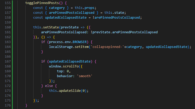
As mentioned previously, the user has the option to view the posts as a list or in the new carousel via the click of a link.
This is achieved via the state as well as using local storage.
When this function is triggered, it looks at the existing state and sends a messge to update this with the opposite boolean value. This then sends a value to a local storage property, using the category as an identifier so that when the user revisits this page, the collapsed state is remembered.
By storing the community as well as the collapsed state, the user can choose a different setting for each community (e.g. they might want to only collapse pinned posts in communities that have 20+ posts pinned or those that aren't updated regularly).
If the toggle is collapsing the posts (line 167), then the user is scrolled to the top of the screen so that the carousel is visible rather than being shown 20+ posts later.
The final element to talk about on this page is upon initial load:
As previously mentioned, the default state of the page is for the carousel to start at the first element and the pinned posts not to be collapsed (as per existing).
When the page loads, we call the initiatePinnedCollapsedState to determine whether the carousel value has been set. If the page updates, we first check to see if the state has changed and if it has, then we also call this function (the check for change of state saves for any unnecessary page rendering).
This function simply checks local storage to see if a value for this community is saved (arePinnedPostsCollapsedStored) (line 147).
If it is, this value is parsed and stored in arePinnedPostsCollapsed and if not, arePinnedPostsCollapsed is set to false (i.e. the default view).
If this value differs from the value in the current screen state, then the state is updated and if not, nothing is updated.
PostSummary.jsx
Since the Carousel uses a much larger image than the List View, this requires the image returned to have different (larger) dimensions:
PostsList.scss
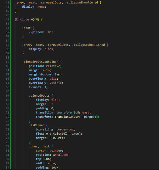
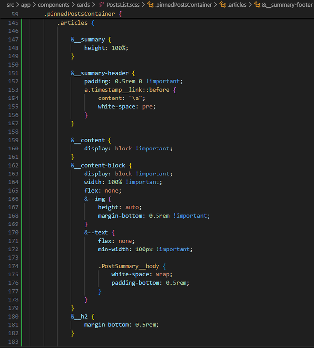
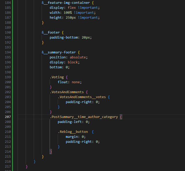
Singificant additions were required to display the carousel and its associated elements. Some new styles were required (the next, previous, dots, etc.) as well as changes to existing styles that we could target via the pinnedPostsContainer wrapper.
New Styles
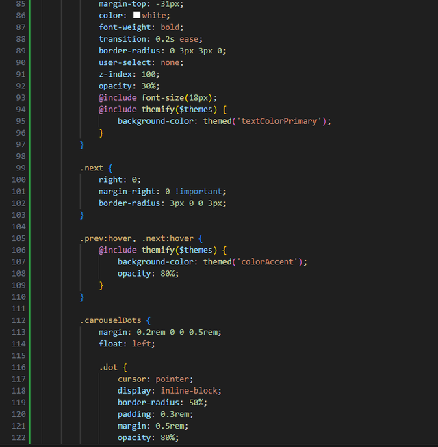
I don't intend to explain every style but I'll pick out some key elements:
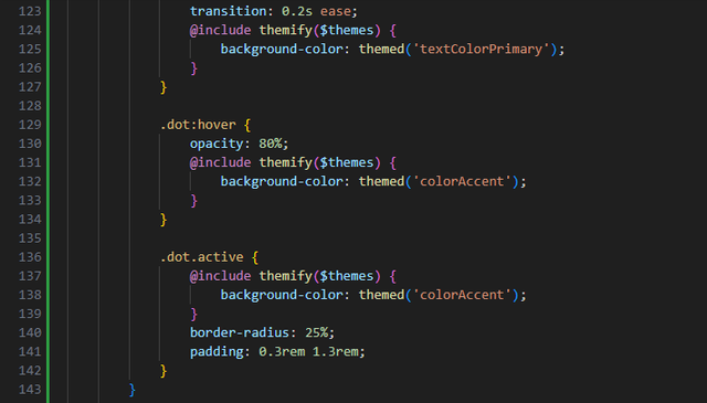
@include MQ(M) - The carousel has only been implemented for wider (desktop) displays.
@include themify($themes) - Where possible, the theme (light / night mode) has been used to determine the colours of elements.
transform: translateX(var(--pinned)); - This is the CSS magic that was previously mentioned. This CSS translation determines where the carousel is positioned.
Updated / More Targetted Styles
These are the styles that overwrite the "default" list view. This allows for the existing HTML to be used with new CSS styles overlaid.
These changes have been pushed and are now available on my development branch.
If any of these changes require further explanation or you're a future developer that has any questions, then please leave a comment below.










I have finally been able to integrate the changes into my test branch.
Your current changes can now be tested at steemit.moecki.online or steemit.steemnet.org.
I really like the toggle collapse function, especially the fact that the settings are saved for each community. Language strings would certainly need to be created for the final version. Or should it remain in English for everyone?
One suggestion: I would centre the CarouselDots. If there are only a few pinned posts, they otherwise hang on the left side.
<div class="carouselDots">That's all I noticed at first glance. I will continue testing.
By the way, I had no problems at all with your previous changes
Goodness, these translations are time consuming! None of the content on any of these pages had been translated so it all needed doing! Just the Settings screen left to do now.
Good point - I'd forgotten about doing this. I'll add it to my to-do list (hopefully tomorrow).
I think that when I initially experimented with this, the central alignement didn't look right because of the "Show All Pinned" label. It meant that centre wasn't in the centre, it was just left of centre because that element's width is less than 100%.
This is how it would look if it was centered (without trying to adjust the "Show All Pinned" label.
I love it when things go smoothly! The next iteration is now available on GitHub so it should just be minor changes from now.
That's right. I had thought about that too. But I found it less ‘wrong’ than the left alignment. In the end it's ‘just’ a matter of taste. :-)
I can't wait until I get my unlimited Internet bandwidth at five G's next and my social security next year and I am going to sign up for some of these projects like yours
The main elements you have mentioned, the defects or weaknesses may be:
@include MQ(M):@include themify($themes):transform: translateX(var(--pinned));:These problems can arise when the code is not tested extensively or in different browsers.