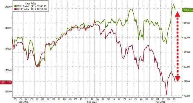
A curious trend in the relative movement of the NASDAQ and Dow Jones indices.
On the attached chart, you can see a curious trend in the relative movement of the NASDAQ and Dow Jones indices.
The NASDAQ is an index of technology companies that rarely pay dividends, and the price of their shares is primarily determined by their expected growth prospects. This includes all the favorites of the general public: $TSLA, $PYPL, $BIDU, $NVDA, and the like.
In contrast, the Dow Jones index consists of the largest companies, mostly representing traditional sectors of the economy: $V, $JPM , $KO .
The chart tells us that the shares of innovative companies are systematically losing favor with the respected public, and the divergence of the indices has reached a value that the financial world has not seen for almost 30 years.
What can this mean in practice? If you practice the value principle of investing, choose a company based on its fundamental value and the dividends paid, you will soon be among the beneficiaries of the emerging change in market sentiment.
If your portfolio consists entirely of growth companies and expectations of a fantastic transformation of the surrounding reality, then perhaps now is a good time to rethink your strategy.
By the way, $MSFT, $AAPL, $INTC, and $CSCO are included in both indexes. They could probably be a consensus choice if your hearts are set on changing, but you don't want to be on the wrong side of the market.
In general, the trend reflected in the chart confirms my expectations of a return of interest in tangible objects, raw materials and stable large companies-the pillars of the industrial economy.Do not be shy to like it if you agree with the information provided and find it useful. If you see a fatal error of the author, quickly correct it in the comments!