How To Write Legibly : Handwriting Improvement Pill For Students On Campus
I happen to have a friend on campus, so brilliant. But, his handwriting is as bad as it gets, that you could barely read through till the end, or understand most times when he writes something.
I bet most of his written works gives our lecturers lots of stress, likewise, if they have to read and award marks to his works, in a test, an assignment or an exams.
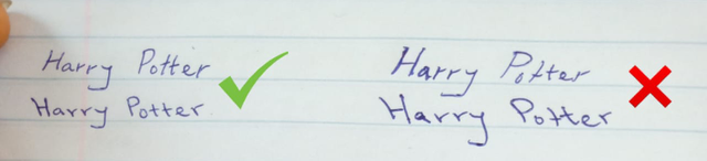
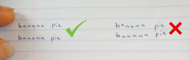
A neat and legible handwriting is easy and attractive to read.
A good handwriting shows consistency in the following :
- Form
- Spacing
- Size
- Slanting
- Alignment
Let's get started on each of these items mentioned on the list :
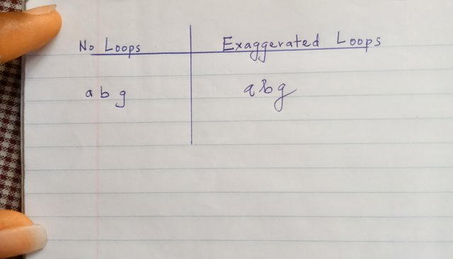
1. Form
• Stick to one letterform throughout your entire composition.
• If your writing is cursive, don't necessarily exaggerate the loops.
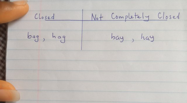
• The 'main body' of these letters; a, b, d, g, o, p, and q, should always be completely closed.
• If not completely closed, it can be mistaken for an entirely different letter and can easily confuse the person(s) reading it.
2. Spacing
Letter spacing
• Write your letters close to each other, but ensure they don't touch each other.
Word spacing
• Your word spacing should be as wide as lowercase letter 'n'.


• If you have trouble estimating and maintaining uniform spaces between the words, try using physical spacers such as a pen or a ruler.
3. Size
UPPERCASE LETTERS
• Uppercase letters should be taller than lowercase letters.
• The size of all your uppercase case letters should be consistent in your writing.
lowercase letters
• lowercase letters can be categorized into 3 distinctive groups:
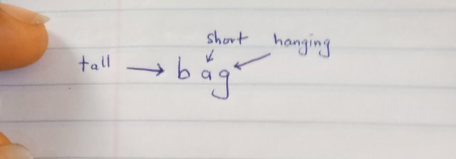
- tall letters
- short letters
- hanging letters
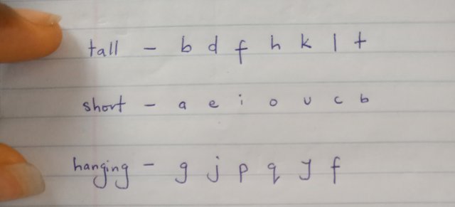
• There should be consistency in the size of all your lowercase letters.
• tall letters have ascenders.
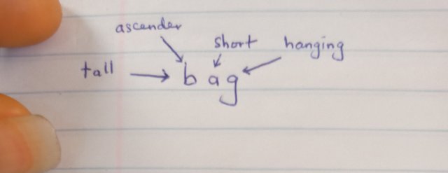
• ascenders should be clearly visible.
• ascenders size should be consistent.
• hanging letters have descenders.

• descenders should be clear.
• descenders size should be consistent.
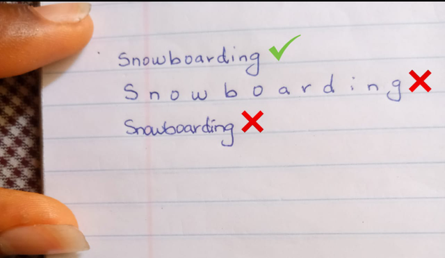
Tangled letters

Make sure your ascenders and your descenders are not excessively long, to prevent your letters from tangling.
4. Slanting
• Be consisitent with one type of letter slant.
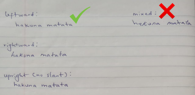
• Always ensure not to over-slant your letters, as it makes them difficult to read.
5. Alignment
• Be always sure to place your letters parallel to the provided horizontal line of your writing sheet.
Other helpful tips include :
• Hold the pen near its writing tip, so you'll have better control over your stroking
.jpeg)
• For a smoother writing surface, place a pad of paper underneath the sheet that you'll be writing on.
Neat and legible handwriting is very important in school, especially if you're writing an exam, homework, project, or other piece of work that are intended for others, to be read and evaluated.

source
Oh me no live the spirits, thanks for sharing this here..
Keep posting quality contents
Thanks, Boss 🙏