SEC S20W2 - Mastering Flutter's Widget Tree, State Management, and Essential Widgets
Good night friends, today is Monday 8th Ashwin 1431 A.D., 23rd September 2024 A.D., 18 Rabiul Awal 1446 A.H., how are you all, hope everyone is well and having a very nice day. I want to thank @mohammadfaisal to organize this course in SEC season 20 which is named "SEC S20W2 - Mastering Flutter's Widget Tree, State Management, and Essential Widgets" and today i am participating on the 2nd part.
Create a Simple Layout with Column and Row Widgets. Create a simple UI that displays three text widgets vertically using a Column. Inside one of the Column children, add a Row that contains three icons aligned horizontally. Add some space between the text widgets using SizedBox. |
|---|
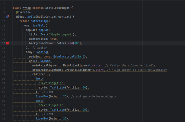
Here’s how I create a simple Flutter layout using Column and Row widgets, along with SizedBox to add space between the text widgets and icons:
Explanation:
- Column: Used to arrange the three Text widgets vertically.
- Row: Used inside the Column to arrange three Icon widgets horizontally.
- SizedBox: Adds vertical space between the Text widgets and the Row.
- MainAxisAlignment & CrossAxisAlignment: These properties control how the widgets are aligned within - the column and row.
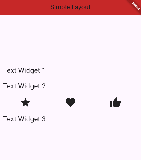
While runing this, we will see three text widgets with space between them, and inside the column, there is a row that displays three icons horizontally.
Build a Stateful Counter App. Create a StatefulWidget that displays a number in the center of the screen. Add two buttons, one to increase the number and one to decrease it. Update the state of the app when the buttons are pressed. |
|---|
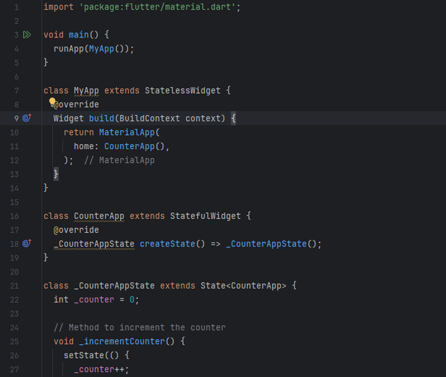
Here’s how I build a simple Flutter app that implements a counter using a StatefulWidget. The app displays a number in the center of the screen, along with two buttons to increase and decrease the number.
Explanation:
- StatefulWidget: This widget can hold and update state, which is needed to change the counter value.
- _counter: An integer variable initialized to 0, which holds the current value of the counter.
- _incrementCounter() & _decrementCounter(): These methods update the counter's state by calling setState(), which triggers a rebuild of the widget with the new value.
- Scaffold: Provides the basic structure for the app, including an AppBar and the app body.
- Column: Used to arrange the counter display and the buttons vertically.
- Row: Aligns the increase and decrease buttons horizontally.
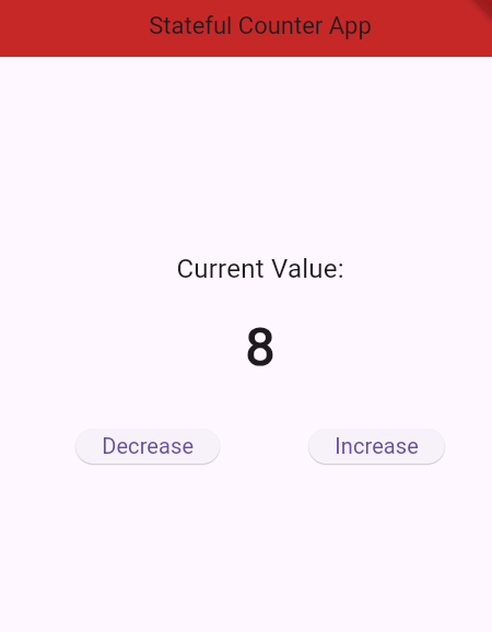
While running this app, We will see the current counter value, which you can increase or decrease by pressing the respective buttons.
Create a List of Items using ListView. Create a list of strings (e.g., a list of fruits). Display this list in a scrollable ListView. Each item in the list should be displayed as a Text widget inside a Container with padding and margin. |
|---|
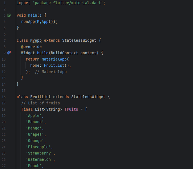
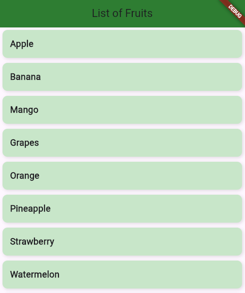
Here’s how I create a scrollable ListView that displays a list of items, like fruits, with each item inside a Container for padding and margin:
Explanation:
- List of fruits: A simple List
<String>that contains the names of various fruits. - ListView.builder: Efficiently creates a scrollable list by building only the visible items on the screen. The itemCount property is set to the length of the list (fruits.length).
- itemBuilder: For each index, a Container is created that contains a Text widget to display the fruit name.
- margin: Adds space around each Container.
- padding: Adds space inside the Container around the text.
- BoxDecoration: Adds background color, rounded corners, and a slight shadow effect to make the items visually appealing.
While running this code, we will see a scrollable list of fruits, where each fruit name is inside a nicely padded and styled Container.
Explore Flex and Alignment with a Responsive UI. Create a layout where three Container widgets are displayed in a row. Use Expanded to make one Container take up twice the space of the others. Use alignment properties to center the content within each Container. |
|---|
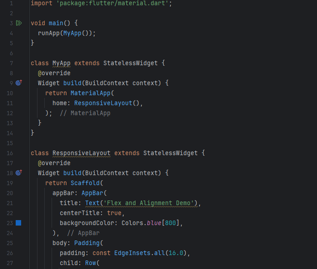
Here’s how I create a responsive UI using Expanded, Flex, and Alignment in Flutter. In this example, three Container widgets are displayed in a row, with one of them taking up twice the space of the others. We’ll use Expanded to control the space distribution and alignment properties to center the content inside each Container.
Explanation:
- Row: The main container uses a Row to align the three Container widgets horizontally.
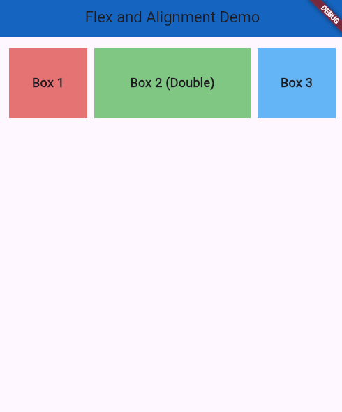
- flex: This property defines how much space a widget should take relative to its siblings. For example, flex: 2 means the widget will take twice the space of a widget with flex: 1. Three Expanded widgets are used, where the middle container takes twice the space (flex: 2), and the first and third containers take equal space (flex: 1).
- alignment: Alignment.center: This centers the content (text) within each Container.
- SizedBox: Adds space between the containers for a cleaner look.
- Padding: Adds padding around the entire Row to provide some breathing room for the layout.
While running this we will see three containers displayed in a row. The first and third containers (Box 1 and Box 3) take up equal space. The middle container (Box 2 (Double)) takes up twice the space of the others. The text within each container is centered both vertically and horizontally.
Profile UI: Build a simple profile screen layout using various Flutter widgets. The screen should include a round profile image, social icons in the horizontal alignment, text as name, and buttons representing his different skills and attributes. These all should be aligned using the layout widgets discussed. Use SizedBox where needed. |
|---|
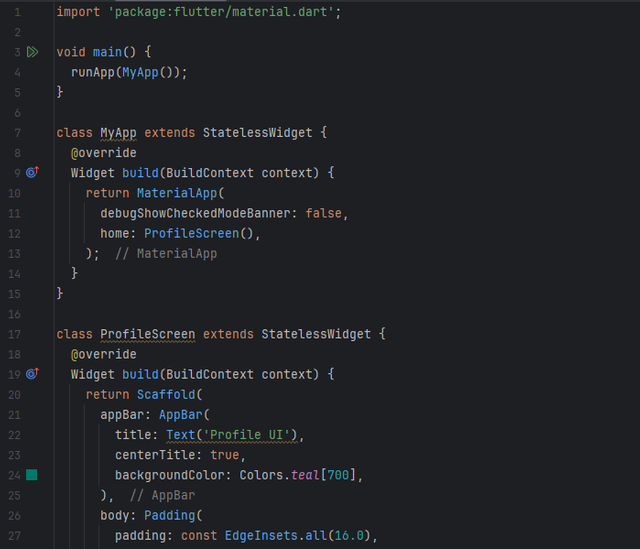
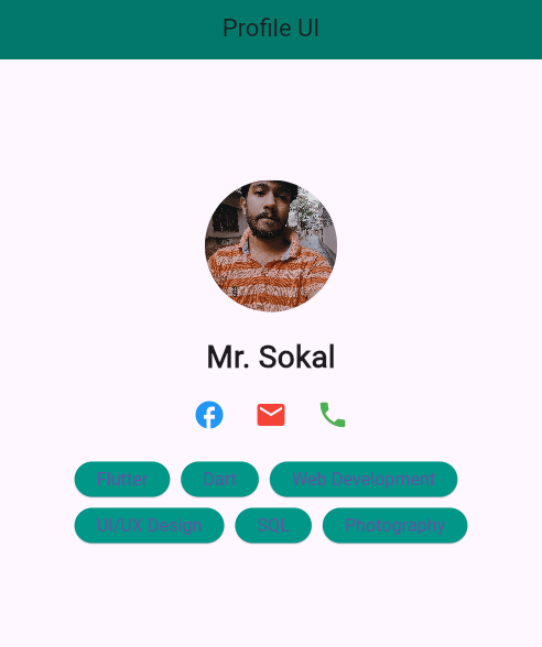
Here’s how I build a simple profile screen in Flutter using various layout widgets like Column, Row, Container, and SizedBox. The layout includes a round profile image, social icons aligned horizontally, a name, and buttons representing skills and attributes.
Explanation:
Main Function & MyApp Class: The main() function calls runApp(MyApp()) to start the app. MyApp returns a MaterialApp that loads the ProfileScreen.
ProfileScreen Class: Uses Scaffold to create the page structure. The AppBar shows a title, and the body contains the profile content organized using a Column.
CircleAvatar: Displays a round profile image using a URL (replaceable with local images).
Text: Displays the name “John Doe” with a large, bold font.
Row: Aligns three IconButton widgets (Facebook, Email, Phone icons) horizontally with some spacing.
Wrap: Displays multiple ElevatedButton widgets for skills (Flutter, Dart, etc.). The buttons wrap into multiple lines if needed.
_buildSkillButton(): A helper function that creates consistent, styled buttons with a teal background and rounded corners.
While runing this, we wll see a profile with an image, social media icons, and skill buttons.
.jpg)
