Let's learn and teach, expand the scope of knowledge.
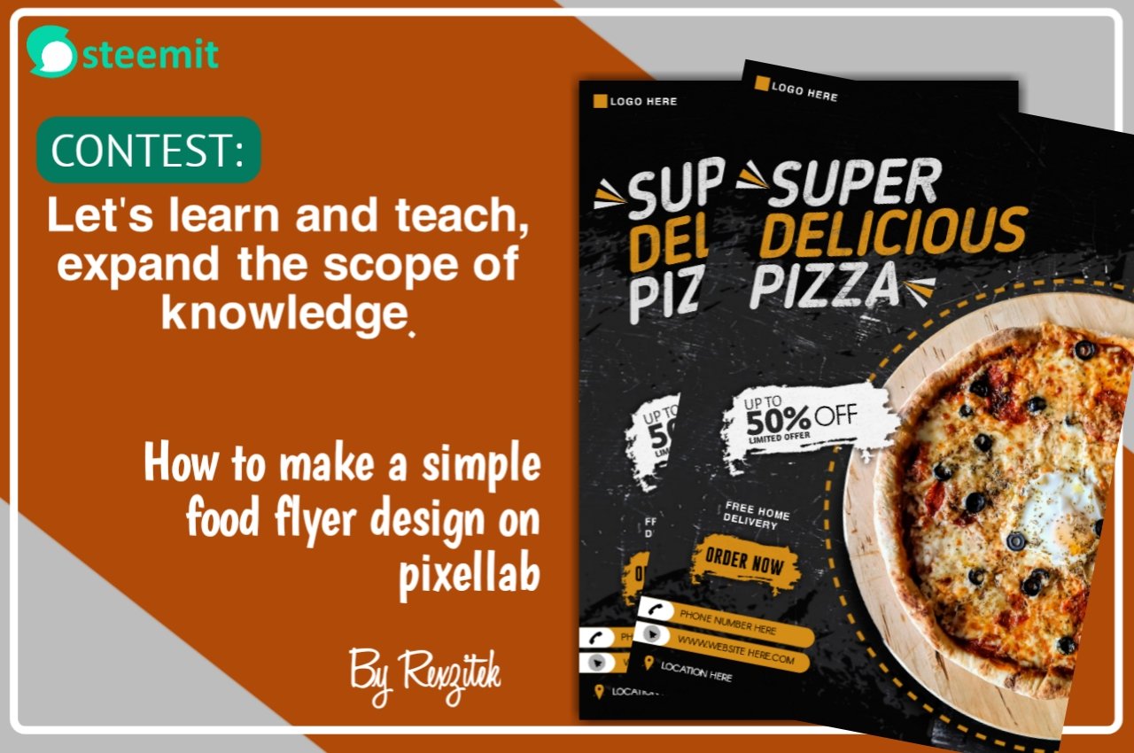
Designed by Rexzitek
Hello friends!!!
It's my pleasure to be a partaker of this "teaching and learning contest". Talking about knowledge, today, i'll be showing us a step by step process on designing a simple food flyer design with pixellab.
Without further ado, let's get right into it.
For this food flyer design, we are going to be making use of the following :
- Pixellab (mobile app)
- Photoroom (mobile app)
- Png source websites cleanpng or Pngwing
- Knowledge of color theory and psychology
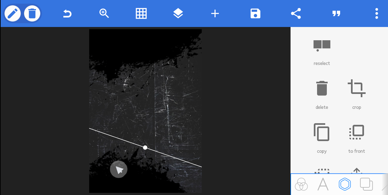
PIXELLAB
PixelLab is a graphic design mobile application, that allows users to create appealing visual graphics. This is done by creating shapes, adding images, adding text, overlays, effects, and more. Pixellab app is available for both Android and iOS devices.

A screenshot of pixellab app interface
STEPS IN DESIGNING A SIMPLE PIZZA FOOD FLYER
Step 1:
We start with a blank design space. After that, we set the design dimension to (1100 by 1600) pixels.

Starting stage (black design work space)
Step 2:
We import a background by clicking on from gallery, from the fourth tab below.(You can use any suitable background of your choice)
Adding background texture
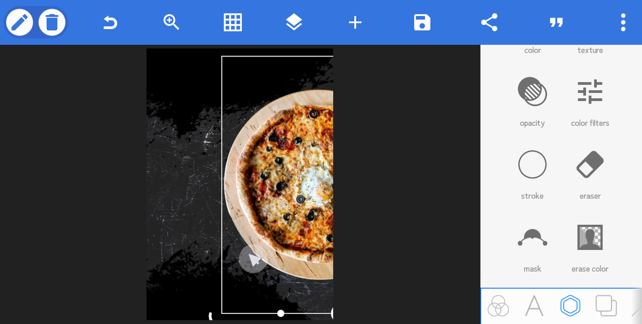
Step 3:
We go to any free image source website Unsplash, and get any suitable pizza image of your choice.
Step 4:
Convert the image to a png image file (no background image), to get the pizza image specifically. i recommend Photoroom mobile app for that. The app can be gotten from the google play store or apple store.

A screenshot of photoroom app interface
Step 4:
Import the png pizza file by clicking on from gallery from the plus icon on the top left hand corner of the pixellab app interface.
Added a picture of a plate of pizza in png format
Step 5:
Download dashed circle line from png website Pngwing, import it into the design and change it's color as in the image below.

Created dashed circle, with the text at the top
Follow the process below by adding texts, png images, shapes and colors.

Adding element and texts

Adjusting and alligning elements properly

Final work
Step 6:
Save your design as ultra.

*Final work ready for delivery
CAUTIONARY GUIDE IN ACHIEVING AN EYE-CATCHING DESIGN
Color theory and psychology (How to use colors):
As a designer, in order to achieve a quality food flyer design, one needs to have a good understanding of the theory and psychology of colors.
Color theory is basically how colors interact with each other. It is also the study of how they are perceived by the human eye. Color theory deals with concepts like color contrast, color harmony, and color temperature. it's basically, understanding how colors work together, and how they can affect the way they are seen and felt about things.
Without having a good knowledge about color theory, a good and eye-catching design can't be achieved.
Color psychology is basically deals with the meaning of colors and how they affect our moods, behaviour and feelings.
Aligning design elements appropriately:
In order to achieve a good and quality design. Proper alignment of each element is very crucial. A client, wouldn't be satisfied with a poorly aligned design after delivery.
In conclusion, an accurate aligned design, combined with good color combination attracts the eyes of potential clients.
Hope you learnt a thing or two from my teachings. Thank you for reading and God bless.
X share:
https://twitter.com/Rexzinach/status/1770927031271739847?s=19
Newcomer Team Curation Guidelines For March 2024
Curated by @suboohi
Note:
Join Newcomers' community group 👇
https://discord.gg/w39BuwDkcC
We invite all newcomers from 0 to 3 months of existence in steemit to use hashtags #newcomer and #country.