"SLC21/WK2: Introduction to Logo Design
 |
|---|
Have you ever wondered what logo is ? How to create it ? What is used for ?How important it is?; . If the answer to these questions are Yes , please donate your precious time to go through this my participation in a contest Organised by @lhorgic entitled:-"SLC21/WK2: Introduction to Logo Design. Let's dive in.
Discuss Logo design based on your understanding about the topic. |
|---|
However, with the little knowledge I know , logo is like the face of a brand let me just say a small picture or symbol that represents a particular brand. It’s the first thing people see and remember about a particular business or company. There are a lot of logos all around the world.Logos are very simple but more powerful, and they tell a lot of things about the brand without using any long note or words by the company. Pepsi is one of the powerful and unique logo design have seen.
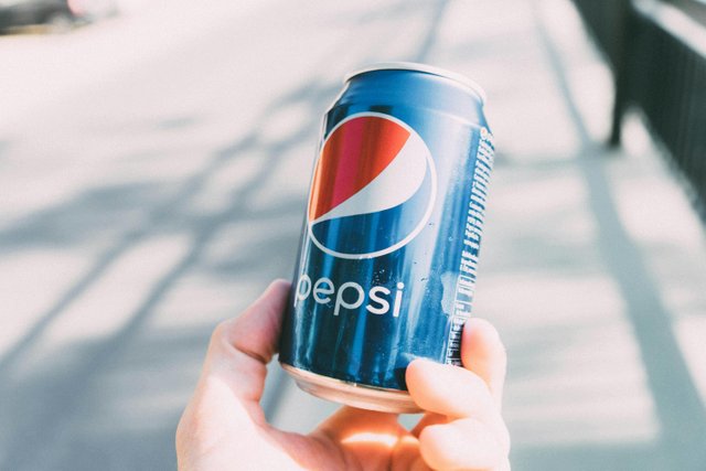 pexel
pexel
In the picture above the can drink there is not just produce by anybody. With the simple logo and design it surely reflect Pepsi brand. That one of the benefits of logo design on a brand.
Discuss extensively the role and impact of logo to a brand. |
|---|
Here it comes a lot of role and impact of logo to a brand:👇
Roles of logo
Brand Identity: A unique logo helps a lot of people and customers to recognize and remember a particular brand. When we see a particular Logo, immediately the brand will comes to our memory. A good logo makes a brand stand out from other brands of it's kind and the competitors all around.
Professionalism: However,a well-designed logo makes a particular brand look professional and trustworthy. It shows that the brand is serious about its business. It will help the brand not to look so local to it audience or customers.
Marketing Tool: Logos are used in all marketing materials, from business cards, flyers,websites etc.They help in creating a consistent and constant brand image. Because it will not be and easy task for a brand to differentiate itself from other brands without a logo.
Emotional Connection: A good logo can create an emotional connection with the audience. For example, a charity’s logo might or can use a very soft colors like purple,pink or yellow with a friendly shapes to show warmth and trust to the audience.
Impact of a Logo
First Impressions: A logo is often the first thing people see about a brand. So a strong logo can make a great first impression to the audience or customers.
Brand Loyalty: A logo can help in building brand loyalty. Customers who have positive experiences with a particular brand will associate those feelings and interest with the logo continuously.
Differentiation: To have a very special unique logo,the logo we are creating must makes the brand stand out from other competitors. By creating a standout and standard logo it will makes the brand different and special.
Memorability: Having in mind how long will the customer remember that particular brand will help us to create a simple and memorable logo. This is very important especially in a crowded market or bussiness area where many brands are competing for attention. So the simple and memorable logo will attract the customers for a longer period of time.
Explain and demonstrate visually the do's and don't when it comes to Logo design. You can do more research to be outstanding and kindly ensure not to use my specimen logo. |
|---|
We all know in life there is do's and don'ts ,same thing here when creating a logo. Creating a logo involves more than just picking any colors we see and any shapes that is available. There are some important things to do and things not to do in a logo. Below are are the do`s and don't
Do’s
Research Your Audience: Firstly just Understand who your audience is , what they want and what attracts and important to them. This will help you design a logo that is resonable and in desired with them.
Keep It Simple: A simple logo is easier to recognize and remember. Let's take for example that dangote logo the eagle stand out as strong and quality icon to the brand and with the simple name of the brand dangote will just make the logo easier to recognize and remember.
Make It talented: Your logo should look good in different sizes and on different materials. It should work on a business card as well as on a billboard, Pen,book, bottles, mobile phone etc.
Use the Appropriate Colors: There are many beautifull colors we can choose but let us have in mine that colors have different meanings and can evoke different emotions. Choose colors that match the brand’s personality. For example if the dangote logo was made in a color like these I don't think it will be appropriate.
Understandable: If your logo includes text, make sure it’s easy to read and understand and not a long note to be read . Avoid expensive fancy fonts that might be hard to see clearly.
Let's do some practical in Canva app to understand the do's in creating a Logo design.
Let me create a logo design of a fashion brand call gucci. How do I go about? That's when I'll apply all the do's;
Do's in practical
After researching my audience and founding out that they love quality and eye catching fashion dresses and style.
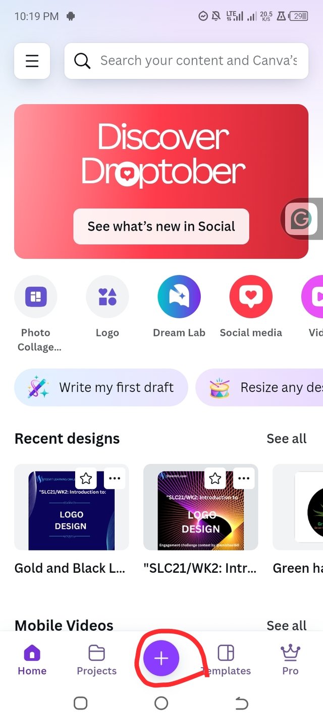
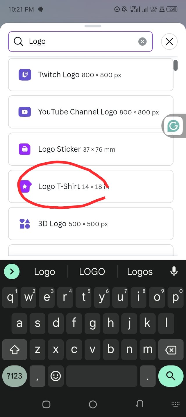
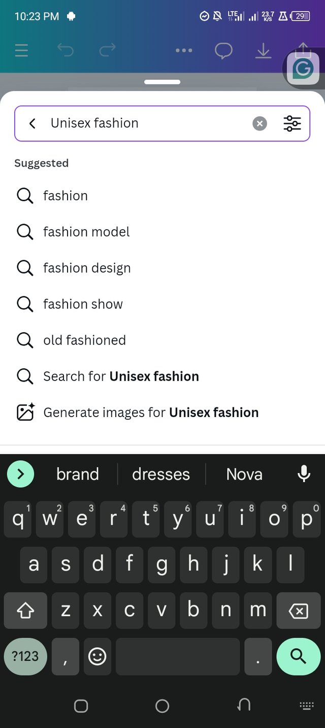
I open my canva app then click the plus icon and search for a my logo dimensions and a unisex fashion image that will attract both male and female. As seen in the pictures below👇.
 |  |  |
|---|
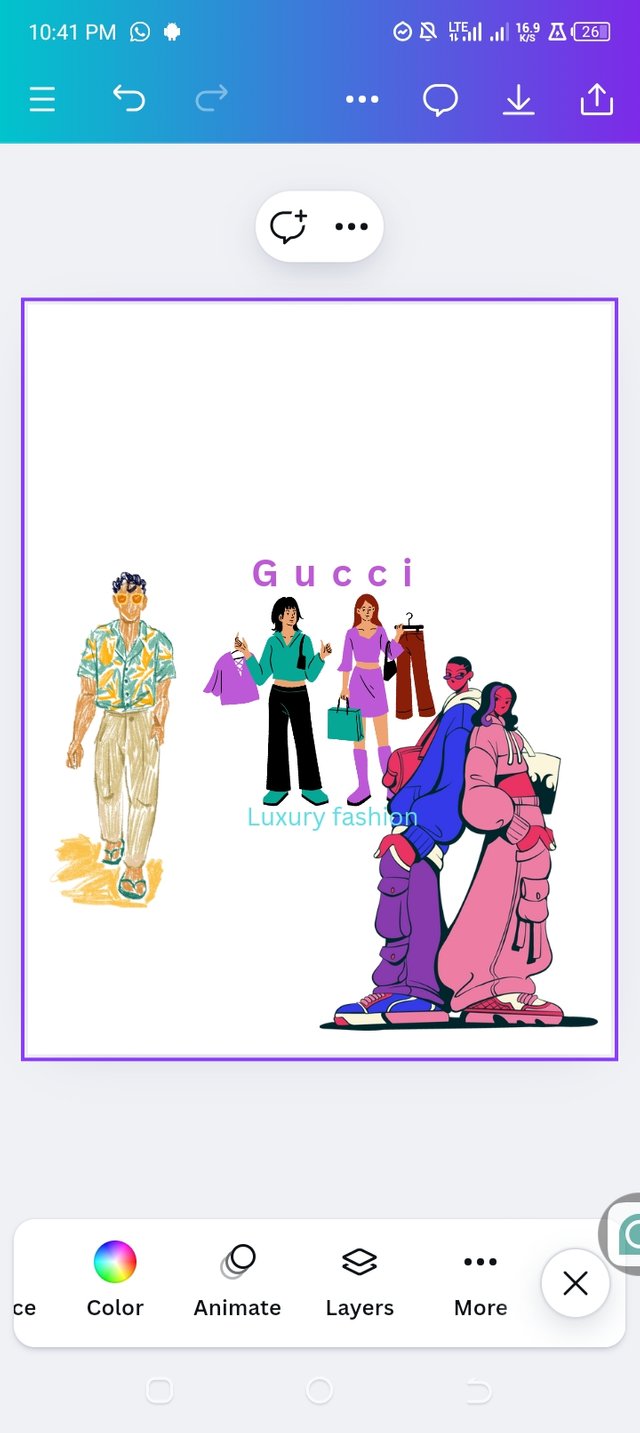
Have just finished with one do's which was researching on what my audience needs. Now the second till the last do's follows which are :- Keep it simple, make it talented, appropriate colours and understandable text. After combination of all the do's,here is the outcome of the logo creation do's.

As we can see it's simple, unique,talented and colours that suit and simple text of the brand name and slogan for a better understanding.
Don't
Don’t Copy Others: This is another barrier in creating logo. People love copying others because the don't have the idea the need in creating original logo.So just note that Your logo should be unique and not copymade . Avoid copying other logos, as this can lead to legal issues and confusion to customer.
Don’t Use Too Many Colors: Using too many colors can make your logo look cluttered. Stick to a simple color methods
Avoid Trends: Trends come and go, but a logo should be timeless and ready to sustain in many years. Avoid designing a logo that will look outdated in a few years.
Don’t give deaf ear to Feedback: Get feedback from others and be open to making changes don't stick to your likes. Sometimes, a fresh feedback can help in improving the design.
Don'ts in practical
- Avoid Complications: A complex logo can be hard to recognize and remember. So just Keep it in a simple way and clean. Don't insert too much element or images or icon.👇
 ❌ ❌ |  ✅ ✅ |
|---|
Design a simple logo with the knowledge you have gotten from this lesson by assuming that a client gave you a job to design for his brand (business). |
|---|
Let’s just assume that I just finished my training in graphic design an a client which is my friend asked me to design a logo for his new organic food store called “Green Harvest.” What will i do a that moment. Let's watch and see:
Step-by-Step Design Process
Understanding the Brand: The name of his brand is Green Harvest and this green harvest is an organic food store. So the logo am about to create should show and details freshness, health, and nature.
Sketching Ideas: I will Start by sketching some ideas on my mind. Thinking about symbols that represent organic food, like leaves, fruits, or vegetables.
Choosing Colors: Green is the best color that matches my choice because it represents nature and health. I might also use brown to represent the earth.
Selecting Fonts: I will Choose a clean and easy-to-read font. I'll do well to avoid over decorative fonts that might be hard for the customers to read.
Creating the Logo: Now I have to Combine my chosen elements into a simple and attractive design.
Let's do the practical and see out it will goes over here am going to use my Canva app for the design.Here’s a simple logo design for Green Harvest:
First of all after launching my Canva app
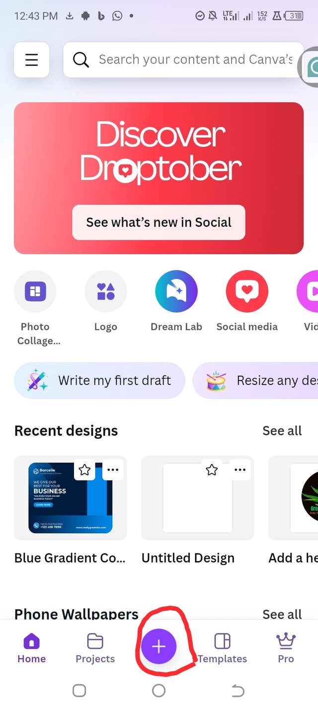
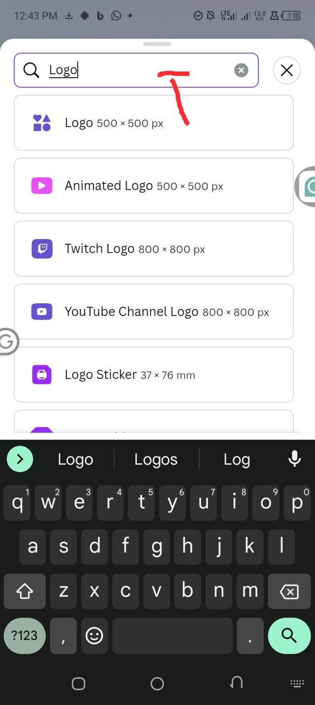
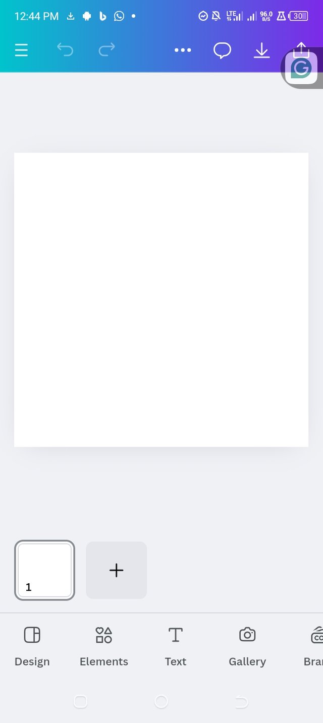
I click the plus ➕ sign on the bottom of the home page which leads me to searching of what am about to do. I click search bar and then search for logo,and I took the dimensions of the logo I need as seen in the pictures below 👇.
 |  |  |
|---|
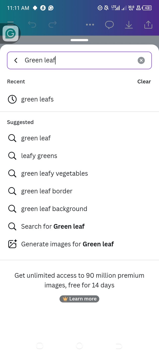
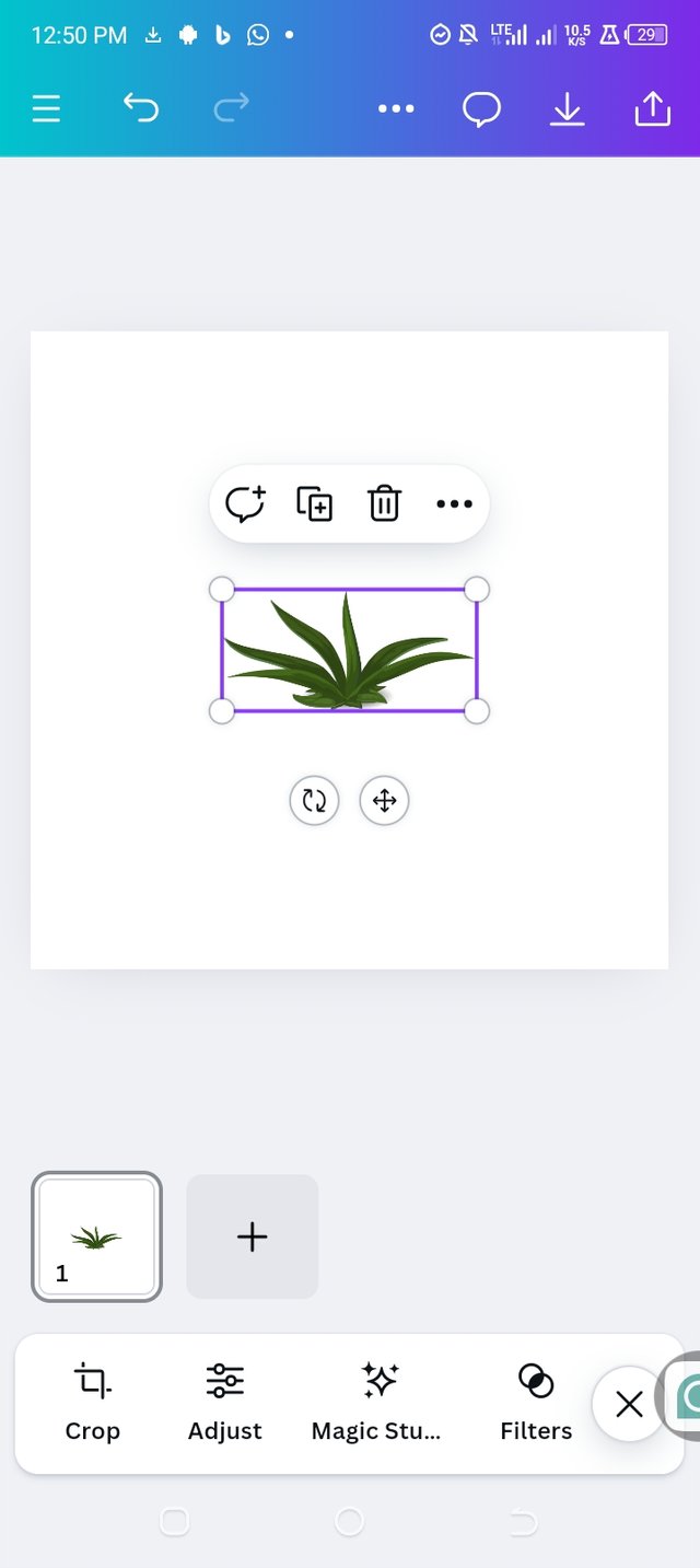
After launching my blank work page, I click the elements icon which I need to search the elements am using. Having in mine that am to create a content for my client who dealt with natural organic products,I need to search for a symbol. I choose green leaf Symbol because green leaf 🌿 represent nature and health.As seen in the pictures below 👇.
 |  |
|---|
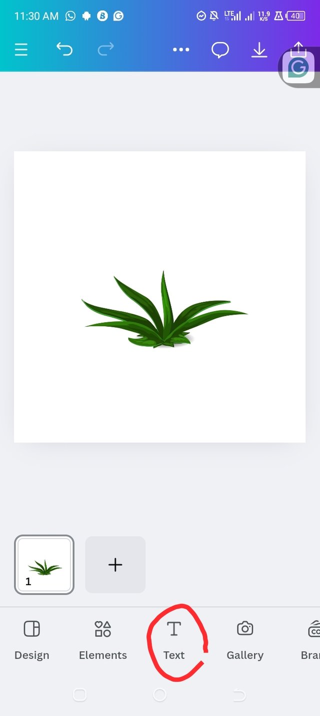
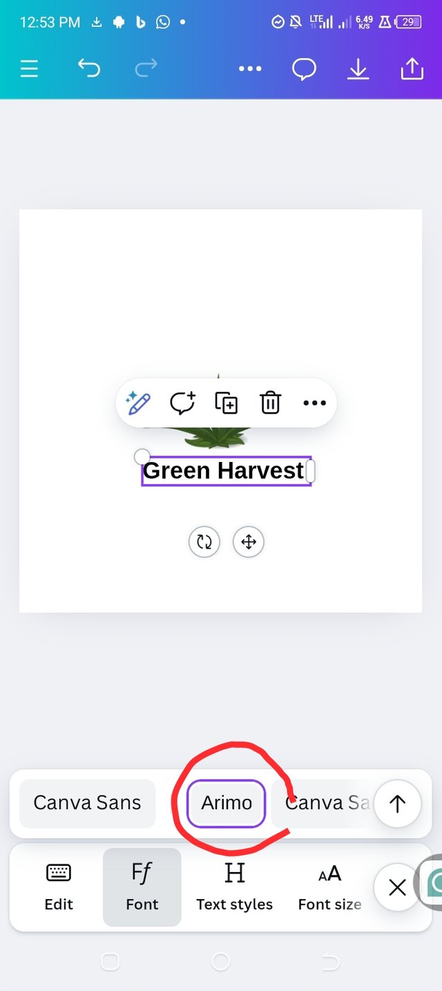
Now I have to insert the brand name and the slogan. At this point I need to be more careful. I click the text icon and I then insert the brand name which is Green Haverst and Better for you, better for earth as the slogan. I later go for fonts which I choose a clear text font to ensure readability. As all seen in the pictures below 👇.
 |  | 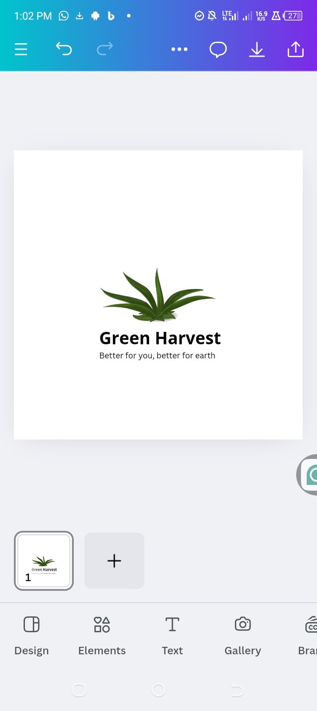 |
|---|
Now it time to choose Colors , so I go for Green and brown to convey freshness and earthiness. I choose the brand name color to be green while the slogan colour to be brown. As seen in the pictures below 👇.
 | 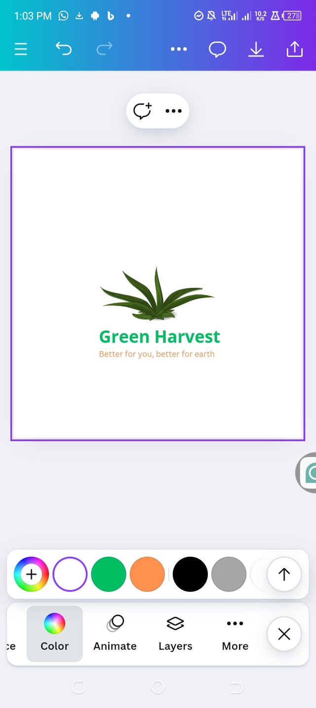 | 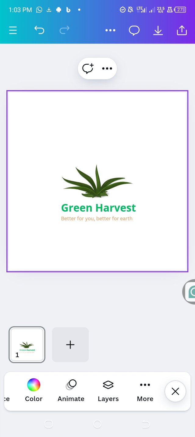 |
|---|
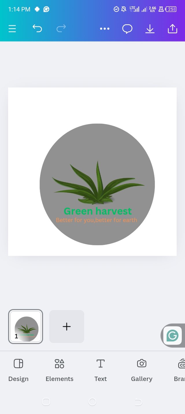
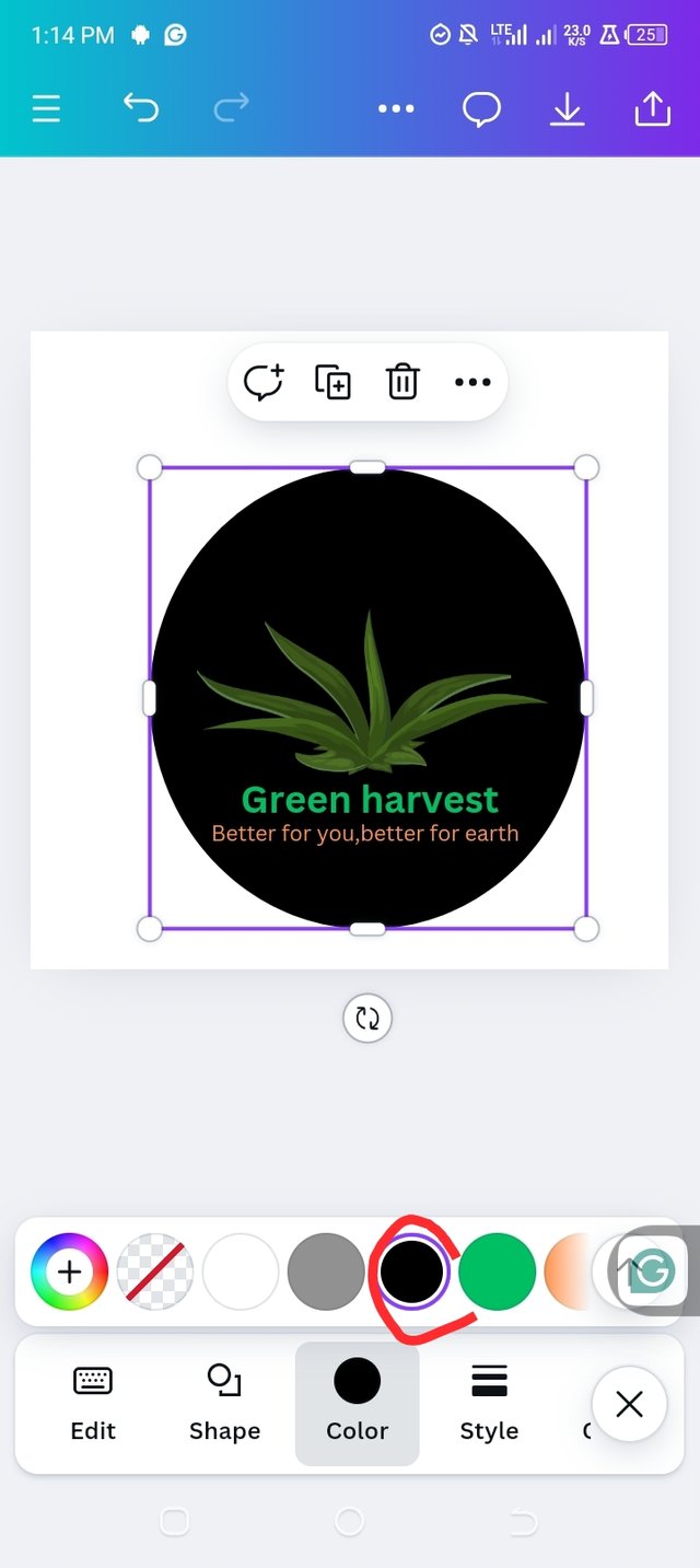
Finally I had to insert a shape and a background color Which I chose circle Shape I choose the shape since the earth is spherical in shape which is more close to circle and black color for the soil which the organic products are brought up. As seen in the pictures below 👇.
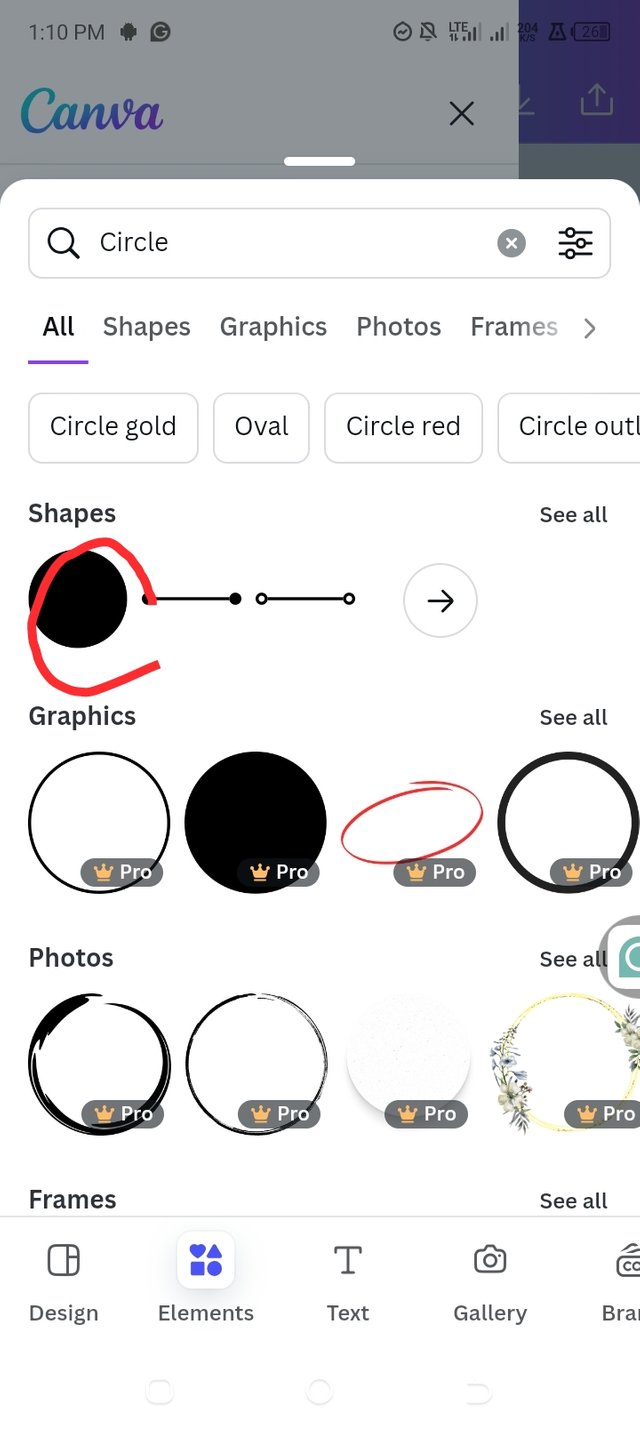 |  |  |
|---|
And here is the final look of the Green harvest logo design for clients which deal with organic products.👇

This logo is simple, memorable, and conveys the essence of the Green harvest brand.
Conclusion
A logo is an important part of any brand all around the world. It helps the brand to create audience catching impression,and it helps to build the brand loyalty, and differentiates the brand from its competitors.So by following the do’s and don’ts of a logo design, we all can create a logo that is simple, memorable, and effective. Whether designing for an organic food store or any other business, the principles remain the same which is: understanding the brand, keeping it simple, and making it multifunctional.
Thanks 👍 All for your time |
|---|
@ruthjoe,
@saintkelvin17,
@goodybest
to participate.
Cc:
@lhorgic
%20-%202023-08-25T221709.806.)
This post as been promoted on X 👇
https://twitter.com/emishael60/status/1854264886030975355?t=0VSaWUp87JQVufYUWH2Hng&s=19
For those who are worried about the design first, your post will be of great help! Share more new ideas. Good luck for the contest.