SEC-S20W2: "Color Theory and Application"
My Understanding of Color Theory
If you are a designer or just love design, then you should know what “Color Theory” is. Perhaps you are asking yourself what it is and why it is such a big deal? Let me explain it to you in layman’s terms. Color Theory is simply the study of how colors work in relation to each other. This theory is useful when designing because it will assist you in identifying which colors are complementary and which are not.
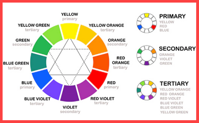
Suppose you have red, blue and yellow. These are called primary colors. When you combine the two, you are able to get other shades. For example, when you combine red and blue, you get purple, when you combine blue and yellow, you get green and when you combine red and yellow, you get orange. These new colors are known as secondary colors. However, when you combine primary and secondary colors, you get what are known as tertiary colors such as yellow-green or blue-purple.
But that’s not all. Do you know that there are colors that are easy on the eyes and those that are very bright? This happens because colors can be divided into two categories: There are warm colors and cool colors. Colors that are warm in nature such as red, orange and yellow create a feeling of energy and enthusiasm. On the other hand, cool colors such as blue, green and purple create a feeling of relaxation and stability. These are ideal when your design is to develop a sense of calmness and tranquility.
Another important concept in Color Theory is “color harmony.” I am sure you have come across designs where the colors seem to be well coordinated, right? That is because those colors complement each other well. This means they complement each other and the whole thing looks quite nice. To do this, many people turn to the color wheel. The color wheel is a circular diagram which contains all the colors in a particular order. From it, you can easily determine which colors will complement each other.
Choosing and Discussing Two Color Schemes
For this task, I’ve chosen two color schemes: These are the complementary colors and the triadic colors.
When we discuss complementary colors, we are actually discussing colors that are located opposite each other on the color wheel. These colors complement each other because when they are used together, they make each other stand out. The benefit of this is that your design is going to be very lively and attractive.

|

|
|---|
So, let me introduce you to triadic colors. Triadic colors are three colors that are evenly spaced around the color wheel. The benefit of using this combination is that your design looks very balanced and vibrant without any single color dominating the others. This scheme is perfect for making your design colorful, as all three colors are equally prominent.

|

|
|---|
Extract a Color Hex Code Using Canva
For this task, I downloaded an image from the Freepik website, and you can see it below.

Next, I will explain how to find the hex code of the window color in this hospital image using Canva.
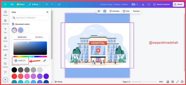
- Step 1: First, visit the Canva website, choose any custom size and create a new design. I chose a 1080x1080 size. Next, minimize the browser and drag the downloaded image into your Canva design as shown in the image below.

- Step 2: Then, zoom in the image to have a better view of it. Then, click on the color icon and under the Document colors, click on the plus sign to add a new color.
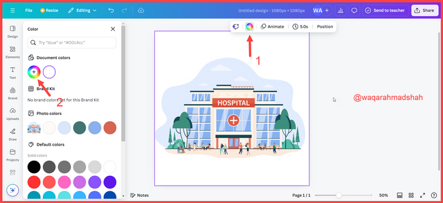
- Step 3: Now, click on the color picker icon and you will see a circle with gridlines that can be dragged around as depicted in the following images.
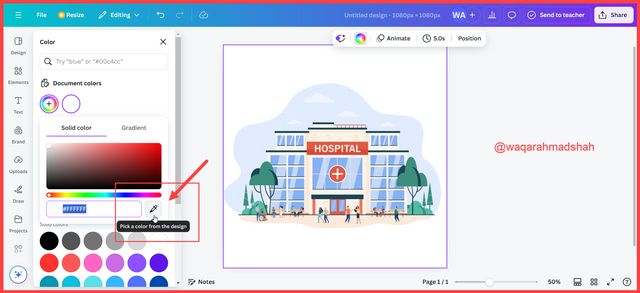 |  |
|---|
Step 4: Drag the circle over the hospital window in the image and click. This will show the hex code of the color of the hospital window which is #88BF10 in this case.
Identify Colors from Hex Codes
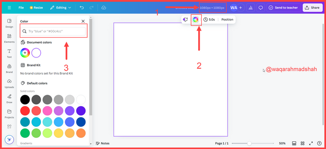
I completed this task in three steps:
- Created a new custom design in 1080x1080 size.
- Clicked on the color icon.
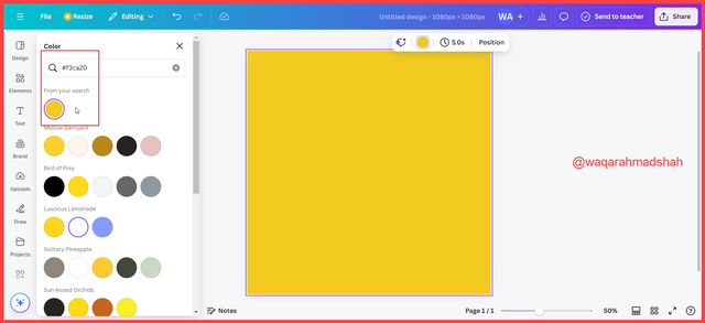
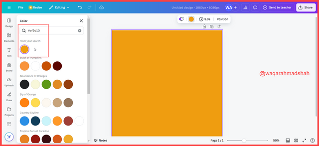
- I copied the hex code into the search bar under the color tab.

And that’s how you can learn Color Theory and use colors in your designs without any problems!

Hello @waqarahmadshah thank you for participating in this week's lesson. We have assessed your entry and we present the result of our assessment below.
Feedback:
• You have clearly defined Colour theory the way you best understand it and I appreciate the remarkable effort you put into it.
• Your didn't attempt the second question well, you were asked to clearly demonstrated how much you understand the use of those scheme by choosing any two of the schemes taught and then combine your colours using the colour wheel.
• Finally, Your practical looks really nice in it presentation, looking very organized and comprehensive. In all, you did a good job. I hope you keep it up. Weldone.
Regards
@lhorgic❤️
¡Holaaa amigo!🤗
Los colores complementarios tienen la facultad de darle ese toque refrescante a nuestro diseño porque, sin necesidad de salirnos de la paleta de colores que estamos usando, podemos lograr un Match visual con un toque diferencial y, te confieso que eso lo comprendí con esta clase ya que, muchas veces me negaba a utilizarlos.
Te deseo mucho éxito en la dinámica... Un fuerte abrazo💚
Your post taught me to think about color in a new way. Indeed, color plays a huge role in shaping the world around us. Good luck for the contest.
Upvoted. Thank You for sending some of your rewards to @null. It will make Steem stronger.
TEAM 5