SEC20/WK5: Graphic Design Hands - On practical 2
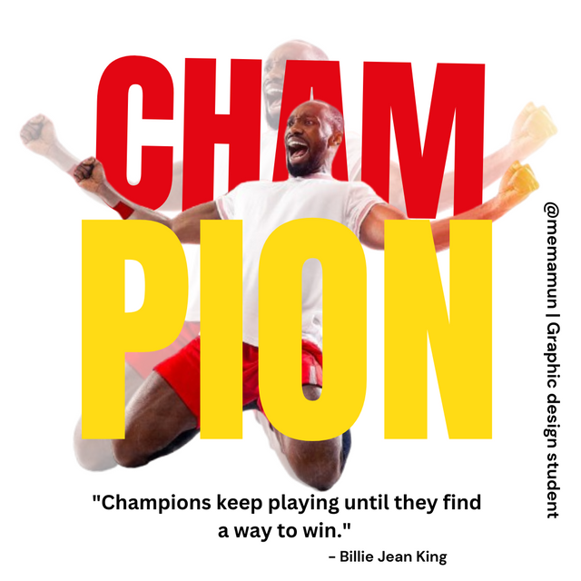
Alhamdulillah, as the days go by, I can learn different design things by I Canva. I would like to thank the platform, who gave us such an opportunity. Courser also taught us very well. Since the beginning of the contest, I have been trying every time to join there. To this day, I've been able to learn and have a good time.
Also, applying everything I have learned since the beginning of the week, it has become possible for me to design something better than Agar very nicely. I don't know what my design will look like to others. But I feel like I've improved a little bit. And I will continue like this Insha Allah. I invite a few of my friends over before I start work. They are. @patjewell @solaymann @max-pro 🥰

Homework Task
I learned the contest about graphic design. Besides, I will do this design work through the Canva app on mobile. So I opened the app on my mobile and started working. Let's look step by step.
Step-01
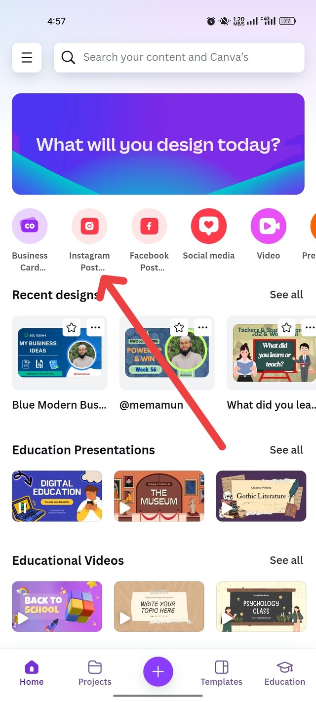
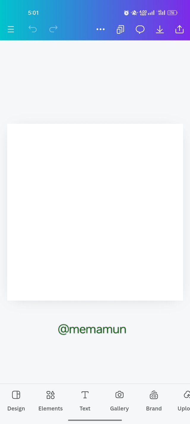
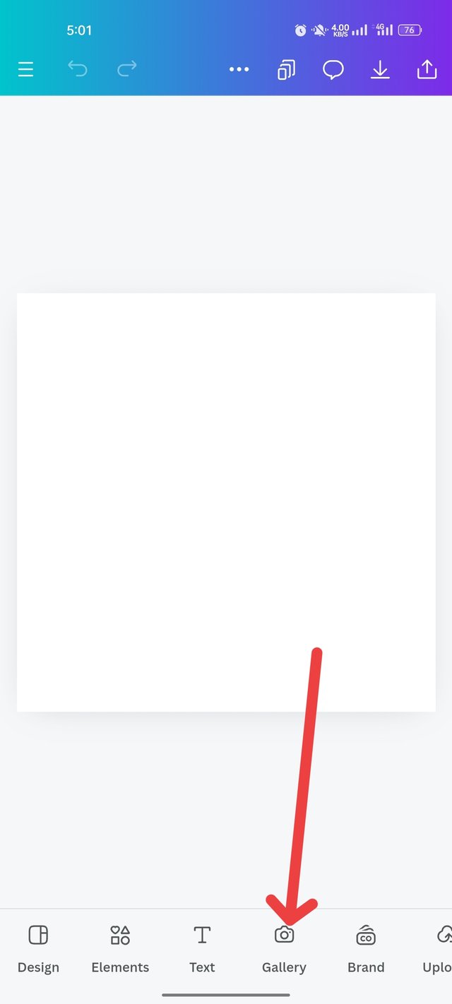
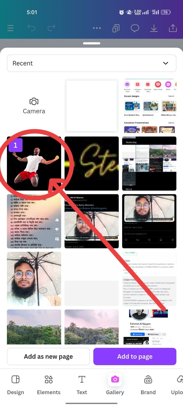
I open it with a size of 1080px×1080px like an Instagram post on Canva. Then came the white color design. Then click on the gallery to take the PNG image.
 |  |  |
|---|
Step-02
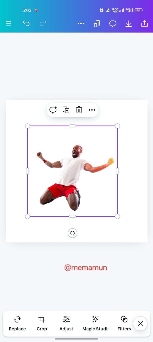
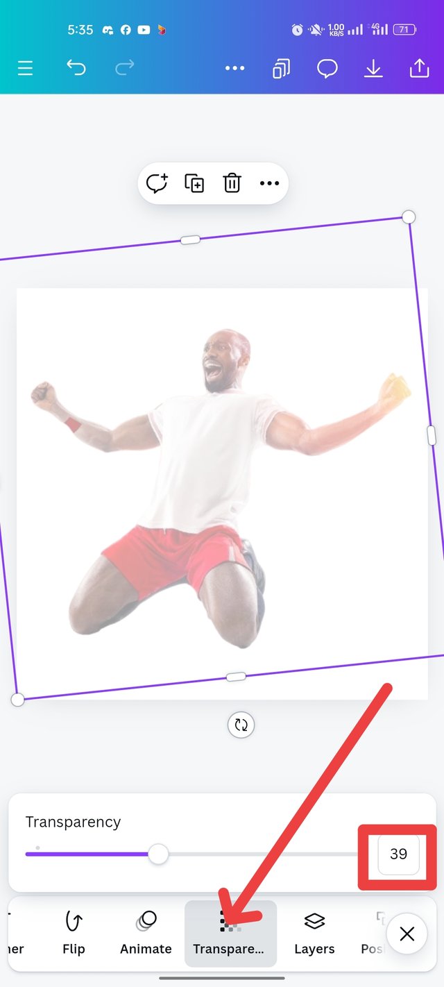
The image appears in the arrow. I click Add to Page at the bottom. Then it opened. I balance that too. Click on Transparency to blur the image. Then I put it at 39%.
 |  |  |
|---|
Step-03
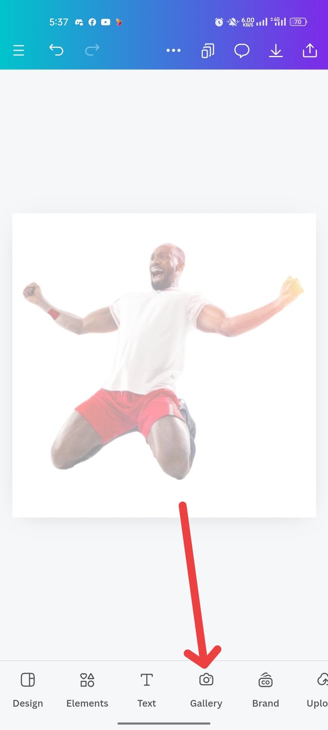
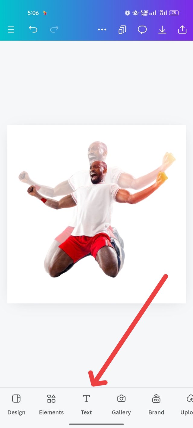
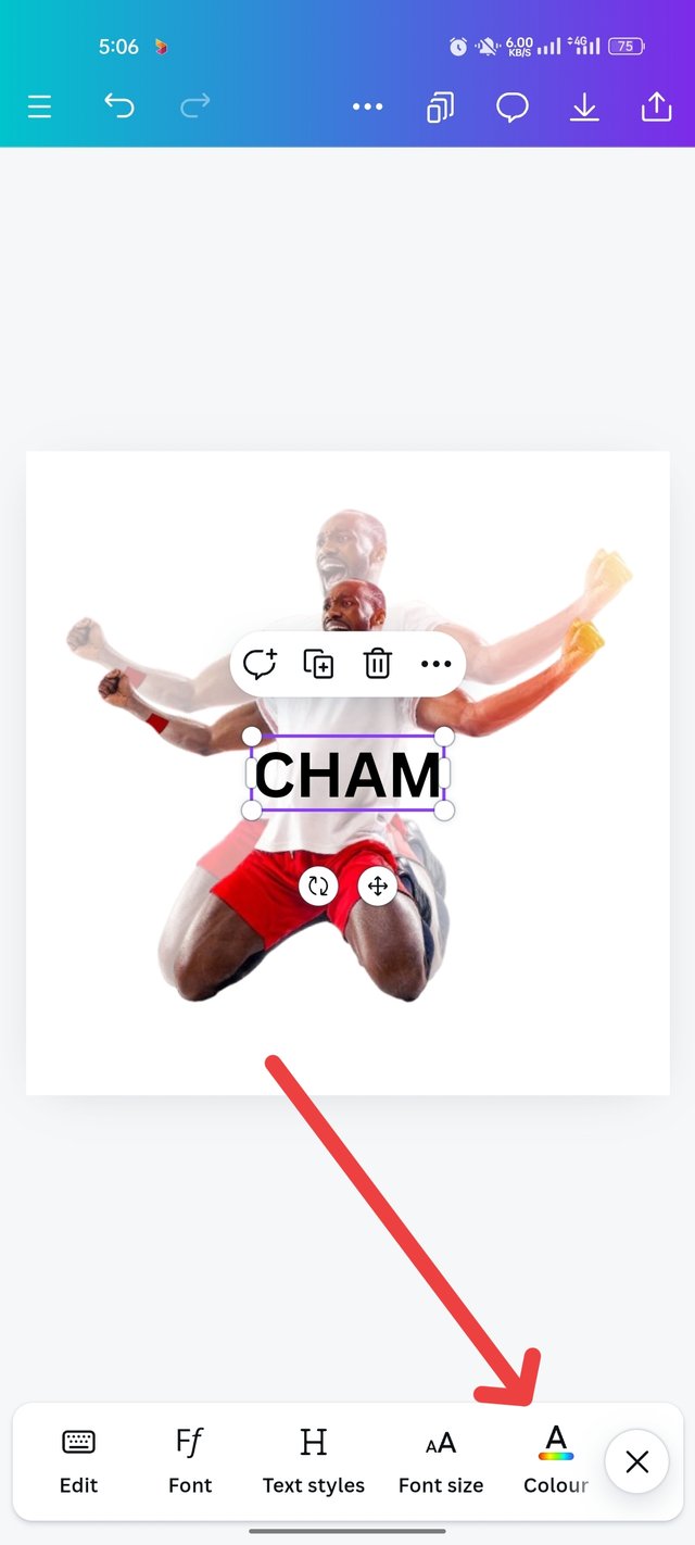
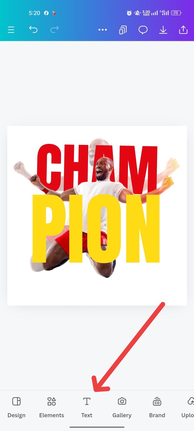
I click on the gallery again to design. Then click on the previous image again and bring it to the design. Then put it in the right place. Balancing around the design is not correct. Then click on the text to write CHAM on the image.
 | 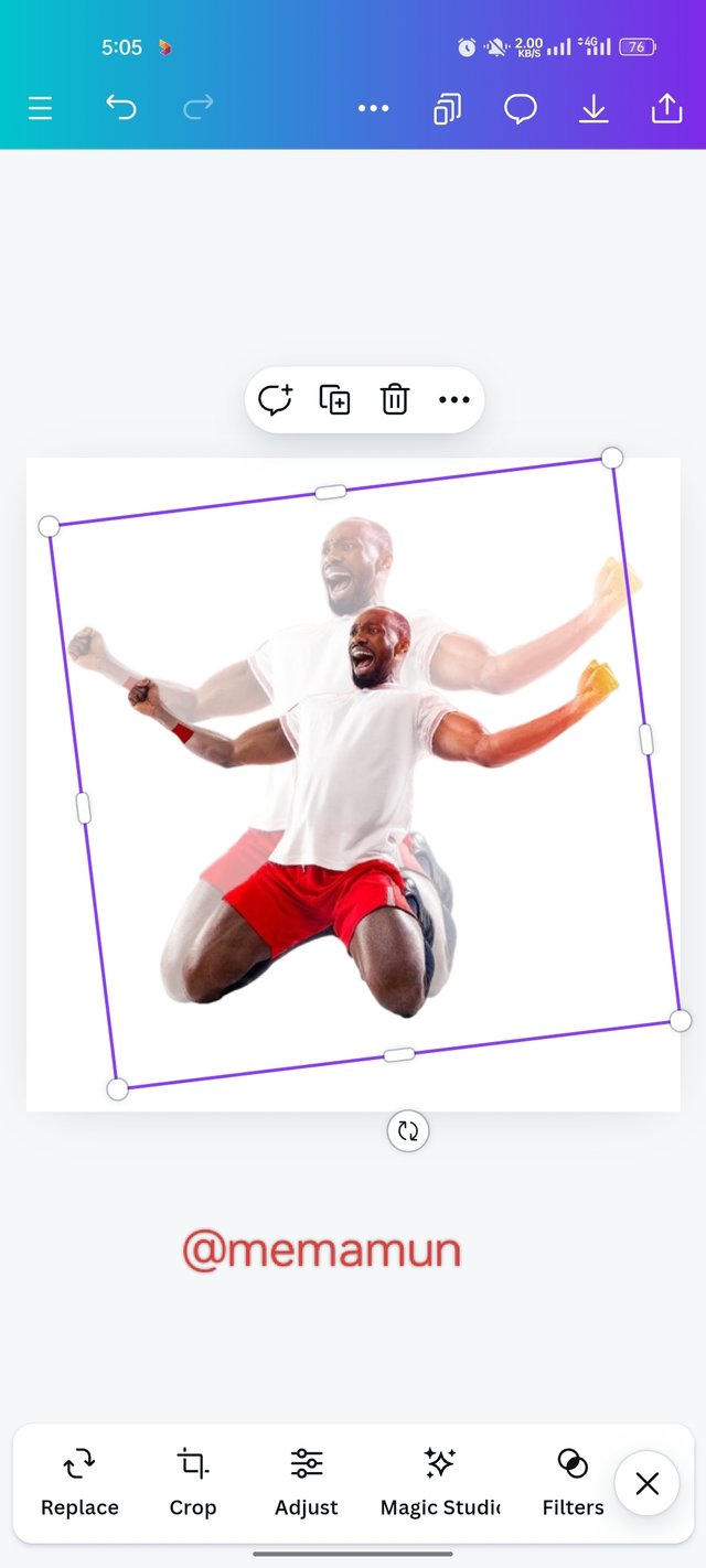 |  |
|---|
Step-04
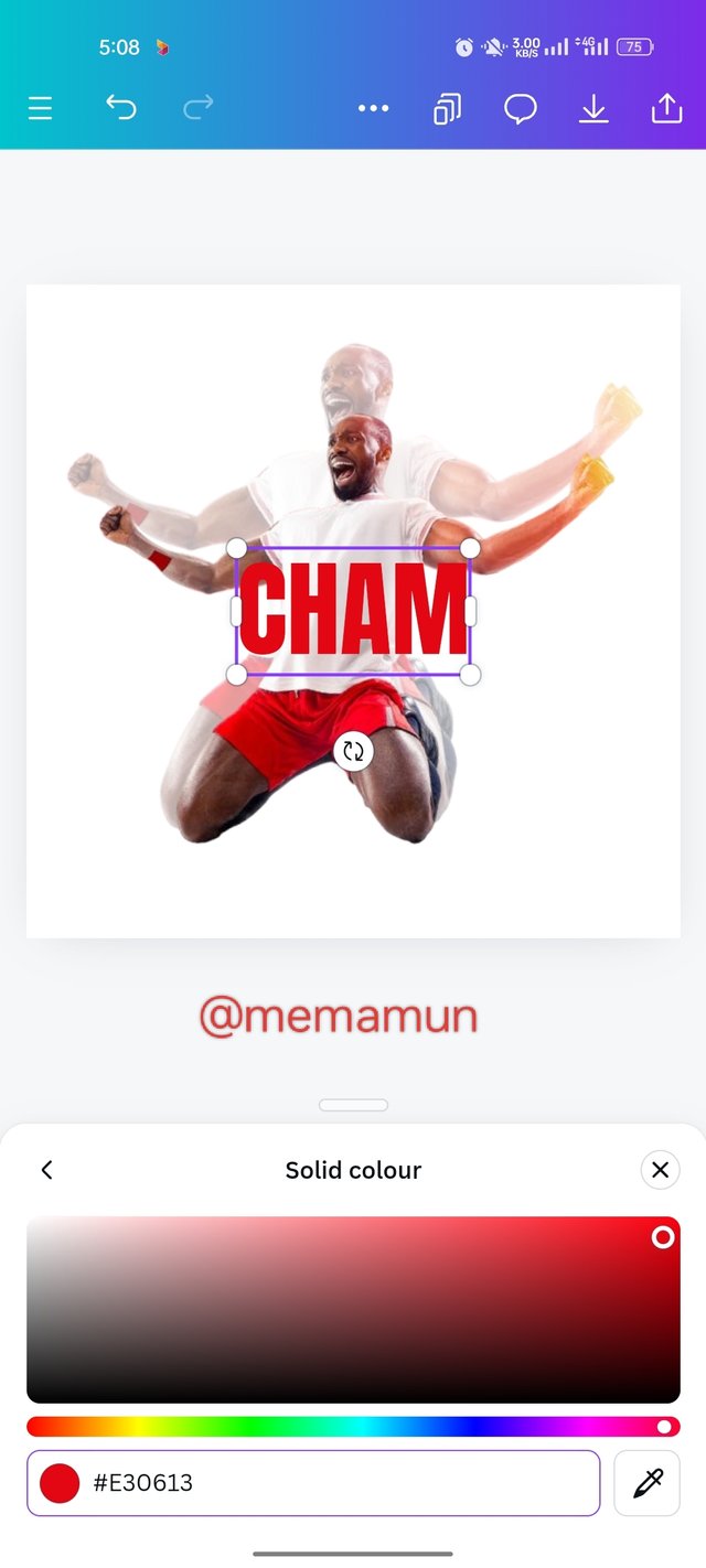
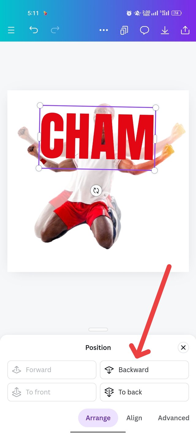
After clicking there, I took the text and brought it to the image. Then I made the article red with a red coat. I also arrange the text with anton fonts. By combining both color and front, I will give the first image behind the text. That's why I click background.
 |  |  |
|---|
Step-05
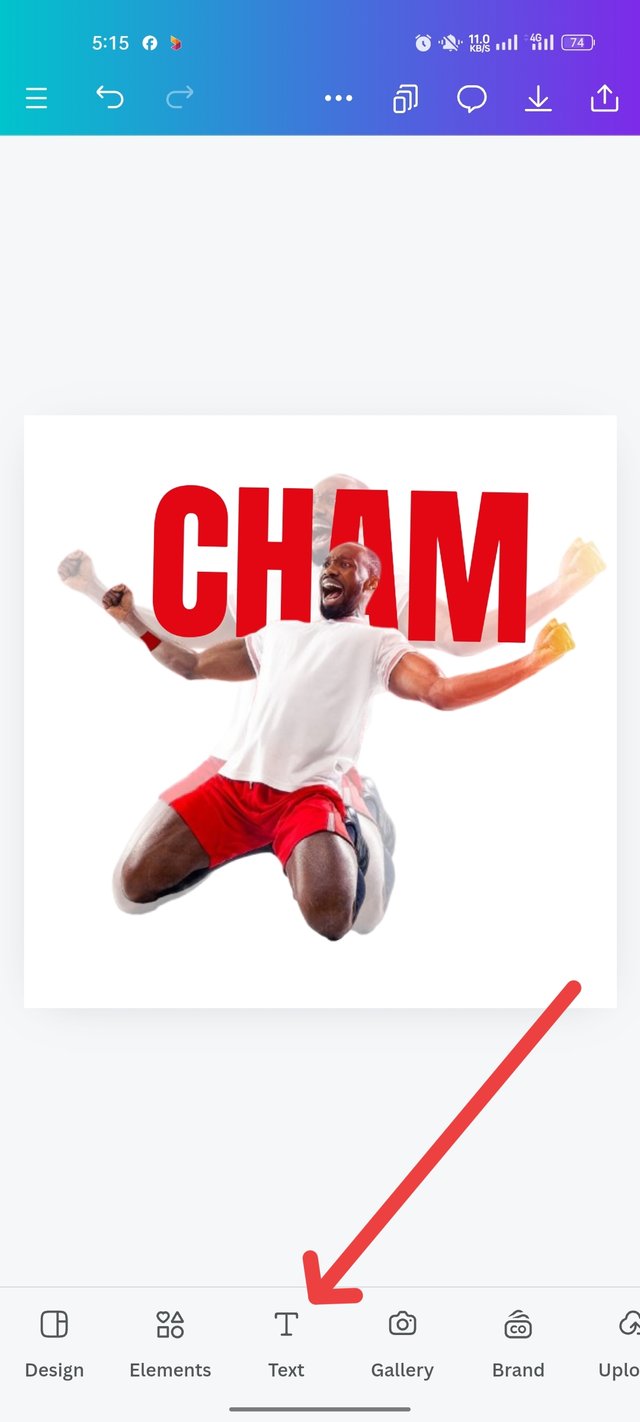
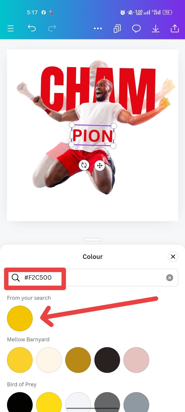
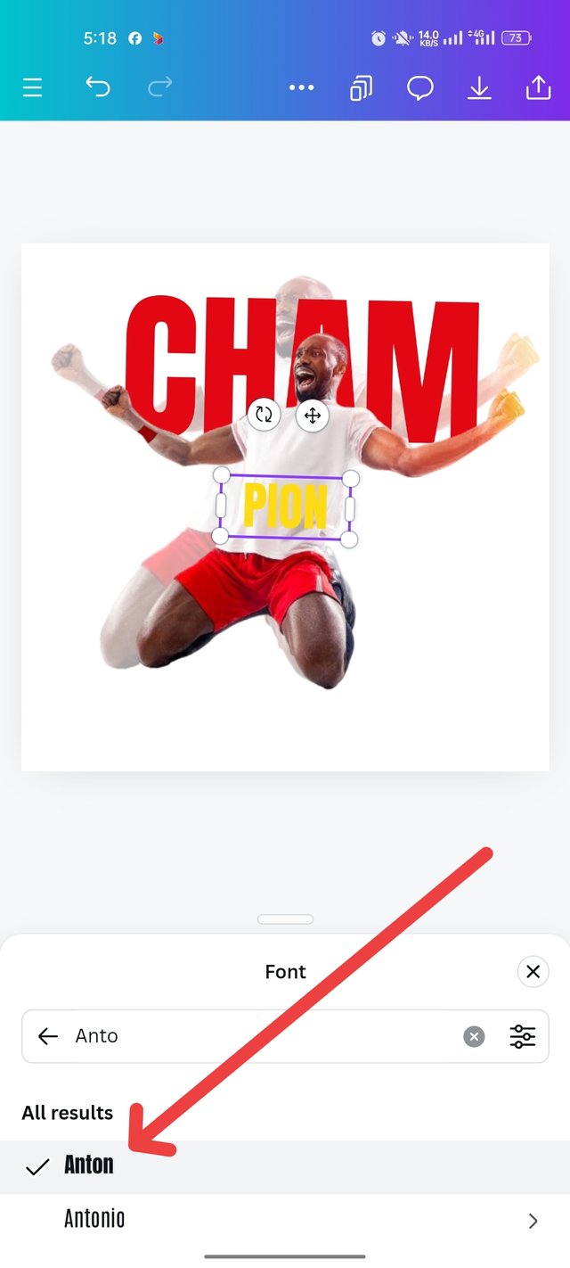
As you can see, the text has gone into the background. Then I brought the word champion's PION separately, from the text option. Then I colored it with a yellow code. Click on the anton front to thicken the text.
 |  |  |
|---|
Step-06
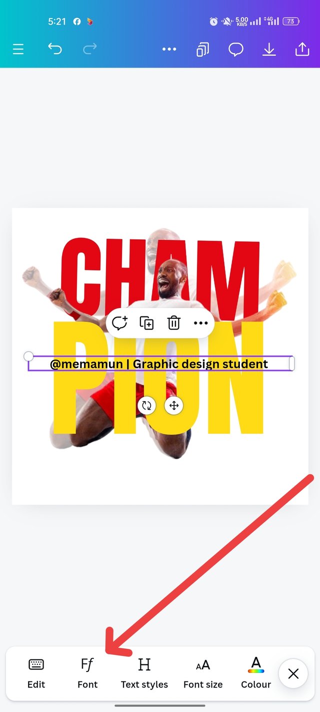
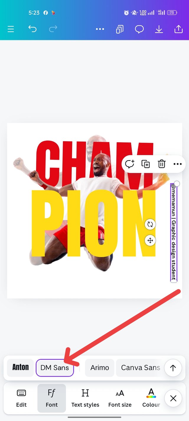
After clicking on that place, the text is complete and I balanced the word peon in a nicely desired place. Then I clicked on the text to enter my own name. Then "@memamun | Graphics Design Student" writes the text, sizes it with DM sens font and puts it in the site position.
 |  |  |
|---|
Step-07
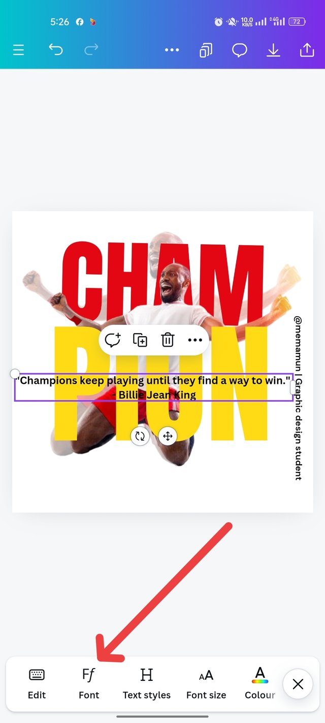
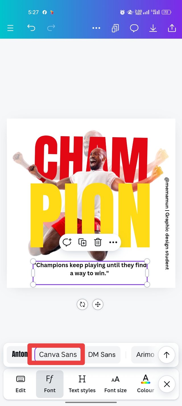
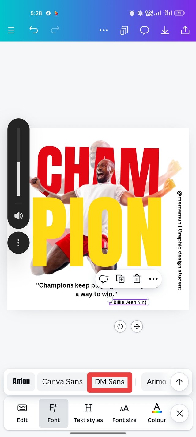
Then I collected a quote and clicked on the test again. Then I arranged it into a Canva Sense font. And I balanced it and arranged it neatly below. I have also arranged the name of the author of the quote separately, by DM sans font. Then my design was done.
 |  |  |
|---|
Finally Design
 |  | Design Completed by @memamun |
|---|

the principle i have engaged in my design:
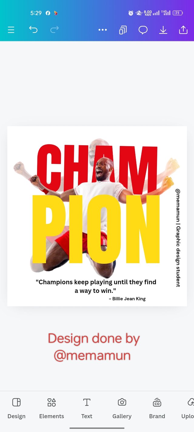
Emphasis - I have presented the design in such a way that the audience can easily understand it, the color combination, font size everything is presented in a way that is easily understood, and emphasized the design, like I have written Cham Pion in the design in red and yellow and has written it larger than the other texts, which easily attract the attention of the audience.
Balance is very important in a design, I have balanced all the subjects such as font, size, color combination, light and dark, background, image, balance with one another. And the design is done. For example, I have used red and yellow colors on a white background, which is bright colors and font size, balancing the space in a way that is easy for the audience to understand.
hierarchy - one of the basic principles of graphic design, in my design I have highlighted the font size and colors, especially CHAM PION these words yellow and red so that these two texts are highlighted, and easy to understand.
Color contrast- Color combination is very important in design, which color to use in a theme and select and design, highlight the design. It depends on the designer's ability to pick colors, undoubtedly red and yellow colors are beautifully highlighted over white. So it can easily attract the attention of the viewer.
typography - I chose a typography where I used a larger font to text the red and yellow parts CHAM PION. And to write the black color message below, I used a small size font so that the highlighted part is easy to understand.
Design size - There are different design levels for each platform, for Facebook, YouTube, Instagram profiles, I have to create designs according to that dimension, my design dimension is 1080px×1080px.
Alignment – I have beautifully assembled and balanced all the elements of the design, and the characters and text of my design are centered, the elements I used support my design.

This was my design today and the homework I tried to make it look beautiful. Everyone will be well, stay healthy, see you again InshaAllah any other post. Allah is Hafez.

Upvoted. Thank You for sending some of your rewards to @null. It will make Steem stronger.
@damithudaya Thank dear 🥰