CRYPTO ACADEMY / SEASON 3/WEEK 2-HOMEWORK POST FOR PROFESSOR: (@reminiscence01) ON INTRODUCTION TO CHARTS //BY:@zeeshanakram//
Hello steemians how are you i hope you will be fine. Alahmdulilah I am also fine with the grace of Allah Almighty. I am very thankful to Professor @reminiscence01 for this informative lecture. So let start:
Question No: 01
Explain the Japanese candlestick chart. (A screenshot of chart is required)?
Ans:
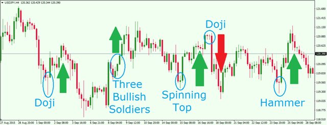
Japanese candlestick is a sign of value or price that reflects that the value's ups and down in first glance, But volatility in the market behind various variations in prices that makes it more emotional than a regular bar chart. The use of the Japanese candlestick start a man which name was munehisa Homma in the 1700's. Japanese candlestick is also called currency chart. That can give us more suitable information about price of assets rather than others charts.
The centre part of a candlestick is known as body. We can say it "body" that can represents the distance between the open and close of security. The Chart is made up with many cables which has two colours. The colours are the sign of representation of different things. A timeline is called set for the formation of the candle stick, so Japanese chart candles usually show current prices. Suppose that, if the time frame on the chart is 30 minutes, it means that a new candle is lit every 30 minutes. That is, each candle represents a time interval.
A good price indicates towards the body of two colours like a green or white candle, whenever on the other hand while a negative price indicates a red or black candle. Traders can choose their own colours to show the ups and downs of modern trading platforms. Whenever a candle is lit, the initial value of the asset went below the candle and the closing price is found above it. In a recession, the initial value of the asset will go at the top of the pile and the closing price will be at the bottom.
There is a big difference between in price or value. The upper part of the body and the peak of the trading period are called upper shadow. The price difference between the low price of the body and the low price of the trading period is less than the shadow.
source
The brightness of a candle depends on the closing price about assets. If the candles are too tight, the actual body is usually white. The closing price is always at the top and the opening price is at the bottom of the body.
Questions 2:
Describe any other two types of charts? (Screenshot required)
Ans:
I would like to describe detail about line chart and Bar chart:
Line Chart:
There are two types of scales that can be used in line charts:
- Linear
- Logarithmic
This type of chart is shown as a line to see how the price of cryptocurrencies changes. The price chart is based on the current close price of Bitcoin. The line chart was created by Charles Dow. Line diagrams use simple lines, hence name charts provide simple information about an asset. Line charts looks like simple shape of charts used in currency trading .An important feature of the line chart is that it helps to reduce the population of the chart and then shows the degree of cooperation and resistance of the chart. The price scale is divided into two equal parts in equal lines. The encryption price is based on one percent change in the login chart, so changes in two prices are absolutely different but equal to one percent with the same vertical change.
Here i tell you The line chart does not reveal items such as opening price, up and down value of an asset, it only shows the closing price therefore we can also say that it is a security chart. It consists of a single line that is produced by adding to the closing prices of each day or period.
Bar chart:
source
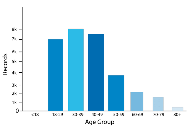
The bars are drawn in a chart with the vertical axis on the horizontal axis and the value over time. There are price charts with bars, these charts have the most charts and are considered, Opening, lowest and closing prices are shown each time with each chart bar. Chart is once the most popular next chat used by traders in currency trading. A bar chart is made made up of bars. Chart is once the most popular next chart used by traders in currency trading, By entering the chart, each opening shows different prices like , the high price, the lowest price and the closing price of an asset for a specific time.
Disposable limit is defined as the difference between the highest and lowest price. In liquid mode, when a period is higher than open and red when the period is less than open price. Each of these is a sing of 1-hour period in the market.
Question 3: .
In your own words, explain why the Japanese Candlestick chart is mostly used by traders?
Ans:
According to my opinion Japanese candle charts are one of the most basic tools for any trader, and learning how to read these types of charts is essential to success. Candle chart pattern analysis with a little experience and introduction can play an important role in almost any investment strategy. Pattern analysis can be used to assess the future volatility of an equity by looking at its price action over time.
The Japanese candle chart is very colourful chart. You can easily see what is happening, each color represents the purchase or sale of an asset. So traders do not want anything to push them for analysis, which is why they prefer Japanese candle charts. The Japanese candlestick chart tells the trader and gives him a idea of the market style of an asset. Inform them of the future value of the asset. This is one of the main reasons why traders prefer this chart to others.
Suppose that if we Compared to bar charts, Japan Candlesticks provides idea of price changes in market. They show a graphical representation of supply and demand that follow prices over time. Candlestick charts are more difficult for many traders to read than line and bar charts even though they provide similar information.
Question 4:
Describe a bullish candle and a bearish candle identifying its anatomy? (Screenshot is required)?
Ans:
Bullish candle:
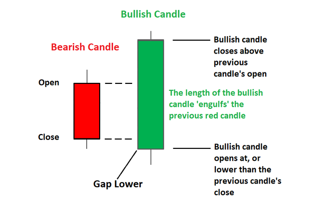
If we talk here about market After the market downturn, bullish patterns may appear, indicating a change in prices. This marks the opening of a long opportunity for traders to take advantage of any growing trend. Other trading analysis tools, such as trend lines, movements, oscillators, or volume indicators, can be used to validate candlestick patterns and show buying pressure.
If we read about the prices then The opening price, the closing price, the down and down and everything in the day are in the quick candlestick, which is the sign the value of a given day. Whether the starting price or the higher price is determined by the color of the candle body. The chart uses the same formula every time you look. From 1-minute candles to monthly candles, traders can use candle charts. We can also say that bullish trend is also uptrend. In bullish trend, the candles are facing upwards and its color is green. When consumers invest their money in coins, demand increases and prices will be rise.
Bearish Candle:
source
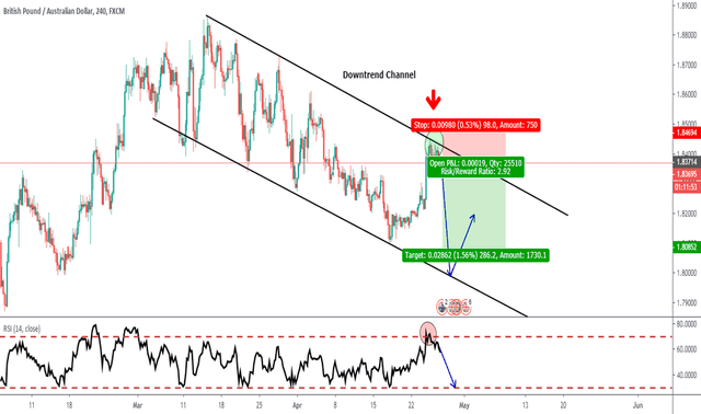
A bearish candle, the initial price is usually higher than the closing price, indicating that the prices fell at the same time.
There are four components of its body:
- The high price,
- Opening price,
- Closing price,
- Low price
The bearish pattern displays after an upward price move. Candles show a decrease in price. The low price represents the lowest price and from time to time the high value of the asset is higher. If the price continues, it is called a bearish trend.
Conclusion:
First of all I have learned a lot about Candle stick chart in detail with great information . Then i learned about bar chart and line chart are discuss. In short, the the whole lecture was very informative for me. All of these charts show stock price. But we think there are Japanese candles for our purpose. And thanks to that, we can read the Japanese candle chart, we already know what the price has done in the past, how to interpret it and try to predict what will happen in the future. . Very different from the slow we learn. I am very thankful to the professor @reminiscence01 for delivering the lecture.
Hello @zeeshanakram, I’m glad you participated in the 2nd week of the Beginner’s class at the Steemit Crypto Academy. Your grades in this task are as follows:
Recommendation / Feedback:
There are a lot of confusion in your work and mistakes. It seems like you copied from another post and flipped the words. I was finding it difficult to understand your points. Thank you for submitting your homework task.
thanks a lot sir for checking my homework. Next time i will try my best and also try to improve grammatically errors. Thanks
Yaaar yaaad se capsule lete ana plz
mama ye pharmacy ha