[Basics to trade cryptocurrencies correctly | Part 2] - Crypto Academy / S6W3 - Homework post for professor @nane15.
Hi guys, welcome to this week's SCA lessons. I will be attending lessons presented by professor @nane15 on Trading Cryptocurrencies correctly. So let's go straight to the task ahead...

Explain your understanding of charts, candlesticks, and time intervals. (Use your own words and post screenshots).
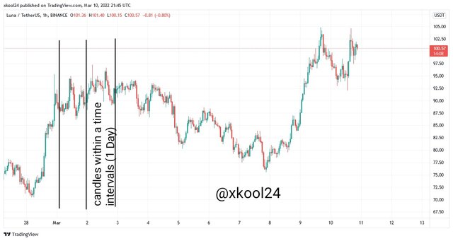
Price Chart
This is a major component of technical analysis when it comes to using chart analysis in demonstrating price action. It happens to be a graphical representation of all market activities of an underlying asset which may be observed in the form of symbols, lines, graphs, etc. Market activities that are a composition of all buying and selling activities or demand and supply pressures, can only be represented by the use of a chart to show the strength, direction, and volume inherent.
The Overall and collective information of any given underlying asset is clearly represented in a chart that does not only capture the time frame or period in use but as well as other parameters like the momentum in which demand and supply pressures are observed. Therefore there is always a direct correlation of what is represented on the chart vis-a-vis the activities that drive this underlying asset with more emphasis on the current price of the asset.
Let us also remember that the chart also has historical data of data previously collected for an asset which can be made available at any given time. In addition, data like the previous close, open, high, and close of any given asset can be generated from the chart relative to the use of candlestick patterns which are built in a chart for this. It also serves as a platform where indicators can be introduced to help smoothen the performance of trade engagement for a trader.
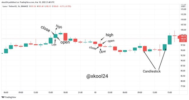
The Candlestick
Candlestick is another commonly used element found in the chart analysis. This time they represent time periods or frames in which trade activities can be tracked. For instance, when a tuning period is set at 5-minutes, this simply means that each candlestick formed represents trade activities for every 5-minutes. This is observed for 15M, 39M,45M, 1hour, or 1Day. Therefore price action relative to buy and sell activities are completely represented their b how candlestick is formed.
The formation of the candlestick helps in the calculation of most of the price indices which help in price forecasting and derivation of current price value at any given time. Therefore, in the formation of a candlestick, we should be looking out for the Opening price, High price, Low price, and Closing price. We also have the Wick can either be in the bullish or bearish candle as well as at the top, bottom, or both ends of the candlestick.
When we open the tradingview site and click the candle icon option from the top toolbar, we will discover the types of this candlestick observed therein. They include the candles, Hollow candles, Heikin Ashi (Japanese candlestick), etc. Though they serve the same purpose they all have distinctive features that are distinguish them.
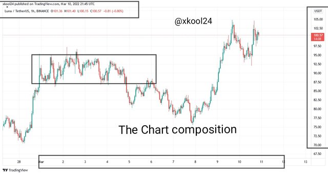
Time Intervals
Just as slightly mentioned and explained above, the Time Intervals simply represent the data and Time indices observed at the bottom of the chart. If we look very well, especially on the tradingview site, we will calibration on the bottom with dates (day, week, month, and year) as well as time (Minutes and Hours). And candlesticks. are observed to fall within this time and dates partition.
This concentration of different features I. The chart makes it a lot easier to simplify information required from an underlying asset at a glance. Candlesticks. are formed under a time frame or period and a multiplicity of this candlestick are found within time intervals in a Chart.
Explains how to identify support and resistance levels. (Provide examples with at least 2 different charts).
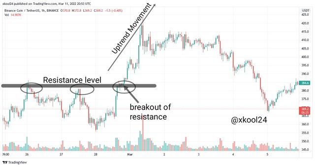
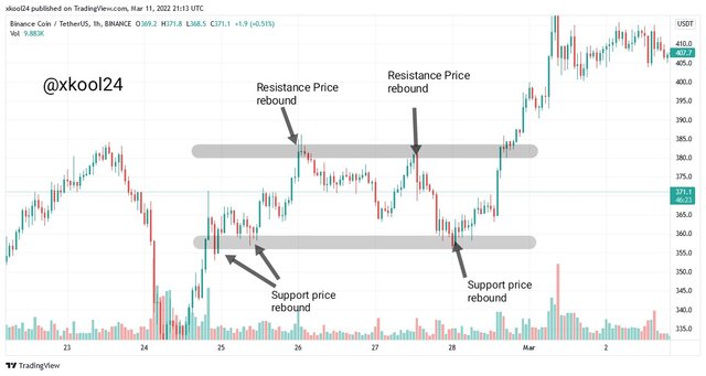
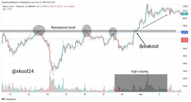
Resistance Levels
This is one of the price zones observed on any given trade and represented in a Chart analysis which hence displays levels where prices are unable to make trend continuation. They are primarily found when the trend is in the Uptrend direction but later with sellers activities causing trend exhaustion which retests at this price come and hence a trend reversal.
The resistance zone is characterized by selling pressure outweighing the activities of buying pressure in this given level. Price trends are unable to break through this level which results in the downward movement of the trend. For a level to be characterized as a strong resistance zone, it must have retested price trend severally which means that sellers are in charge of this level. Therefore at every attempt, the price trend is unable to move across and above this particular zone.
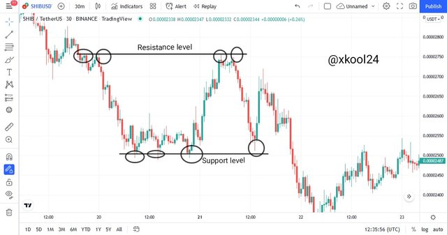
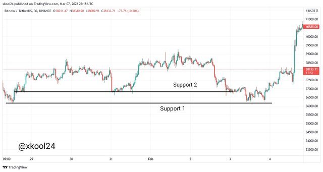
Support Levels
This is another price zone but at this time it is found when the trend is heading bearish with the more selling pressure pushing process down but this retested at a particular level where buyers activities seem to be higher than sellers pressures. More buying pressure at this level tends to push up prices upward and hence the rebound we observed at this level.
A strong support level is characterized by a strong retest of the price at this level with the price trend not Moving below this level rather reversing to the opposite direction.
Identify and point out Fibonacci retracements, round numbers, high volume, and accumulation and distribution zones. (Each on a different chart).
- Fibonacci Retracement
This is a trading tool used in a Chart analysis for the purpose of making the best of trade. It is from the Fibonacci sequence which has a representation of horizontal lines drawn from end to end to capture both high and low points as well as taking into cognizance support and resistance levels. While placing the tool, we have to identify the support and resistance levels before setting it up in a Chart analysis relative to Uptrend and Downtrend scenarios.
In an Uptrend Scenario, while using the Fibonacci Retracement, we should place the first point at the previous support level on the chart analysis and expand our capture to the observed high of price trend. This clearly works with the identified market structure inherent in the underlying asset where the previous Higher Low would be the first point to place the tool and expand to capture the attained Higher High price trend.
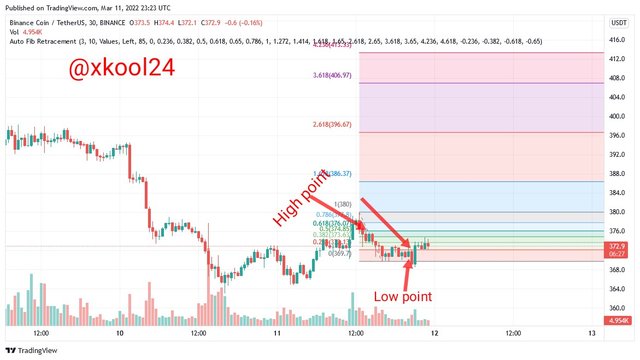
In a Downtrend Scenario too where the price trend is in the downward direction, the Fibonacci tool should set the first point at the previous resistance level and as well capture the observed Low of price trend. This also clearly works with the identified market structure inherent in the underlying asset where the previous Lower High would be the first point to place the tool and expanded to capture the attained Lower low price trend
- Rounded Numbers
Just as the name implies, the use of round numbers in trading has to do with market psychology whereby there is a preferential use of rounded or while numbers rather than the use of fractions or decimals. Hence the usage of these rounded figures has been observed to have an influence in the direction of price movement as there are much executions of orders as soon as the trend gets to the points (rounded numbers) and therefore price tilted to another direction.
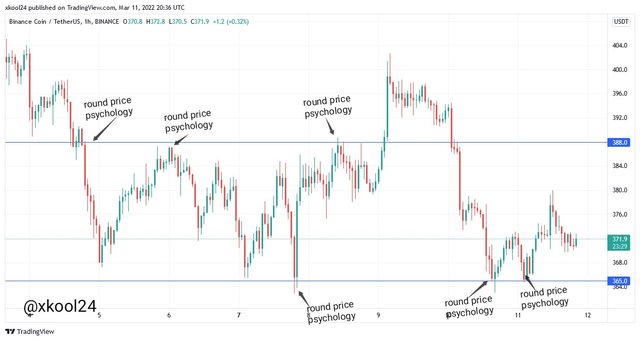
Usually, this choice of using rounded numbers in trade can be observed in either seller's or buyers' open orders which have a ripple effect on price movement to the Uptrend or Downtrend.
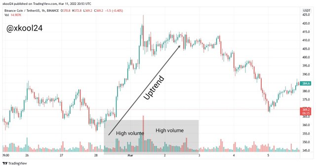
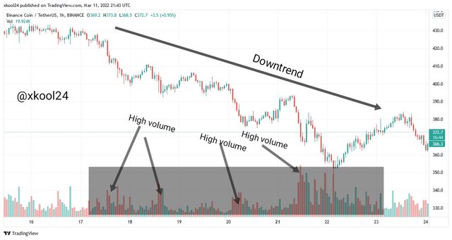
- High Volume, Accumulation, and Distribution
Volume traded in any given market tried to relate to us the buy and sell activities inherent in that underlying asset at that given time. This is directly proportional to the concept of Accumulation and Distribution which hold in effect the matrix of buying (gathering) and selling (sharing) which are measured in the unit of volume.
Each time I come across the term Accumulation and Distribution, I quickly remember the concept of the Composite Man (Institutional Man) whose activities are hitherto observed to affect the activities of trade and price movement.
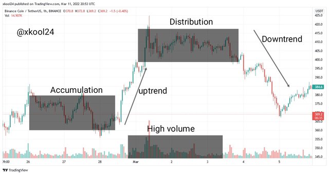
In the Accumulation level scenario, this composite Man or traders are observed to be in the acquiring stage where there is higher buying pressure of a given asset. The effect of this concept gradually increases the value of the given asset to a point that price tend is observed in an Uptrend direction. This also has a direct effect on volume traded which also increases. Therefore when Demand > Supply; the price appreciates.
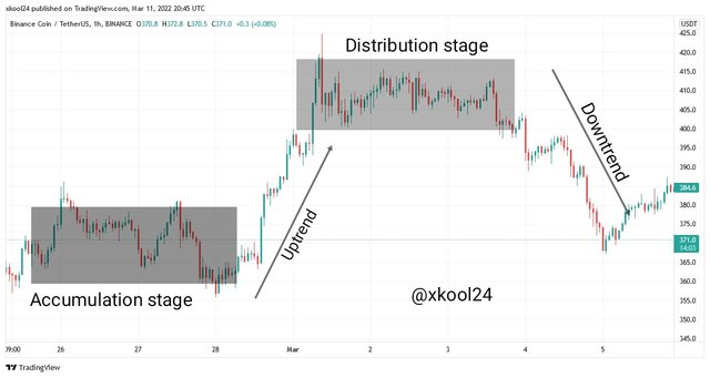
Whereas in the Distribution scenario, we see a situation where the accumulated asset is been distributed at this level. This simply means that we are having more Supply activities in the market. And when we have Supply>Demand; price depreciates. We would also see volume traded also increase in this case.
Explains how to correctly identify a bounce and a break. (Screenshots are required.)
Identifying a break or bounce in a typical chart analysis may be observed either in support or resistance levels.
Identifying a Break of Support or Resistance
Just as the name implies, this is a scenario where price trend is observed to cross above or below support or resistance levels this simply means that after a series of price retesting on given support or resistance level, there is a significant buying or selling pressure that deters trend exhaustion that hitherto drives trend continuation. Therefore the prevailing price zone could not retest price action, hence the price break.
Identifying a Bounce of Support or Resistance
Just like the scenario painted for a break of support and resistance levels, the Bounce of Support and Resistance occurs when the activities in those price zones (support or resistance levels) are stronger enough to allow the price trend to continue in its direction. In this case, there is a case of trend reversal given to the stronger repel from buying and selling activities.
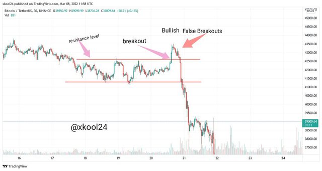
Explain that it is a false breakout. (Screenshots required.)
False Breakouts
We cannot talk about break and bounce without having exceptions on both. This is a situation whereby the forces that broke across the support or resistance levels could not continue in the trend direction. In this case, what we observe is trend reversal to the opposite direction as there is trend exhaustion. The prevailing underlying activities that have been sustaining price trends are unable to continue this course and hence the trend reversal to the opposite direction.
Explain your understanding of trend trading following the laws of supply and demand. It also explains how to place entry and exit orders following the laws of supply and demand. (Use at least one of the methods explained.)(Screenshots required.)
Trend Trading using Laws of Demand and Supply
Trend trading using the laws of demand and supply simply tell us the underlying activities that gears buy and sell pressures which hence influence the price movement of an asset. We ordinarily know that when Demand if any asset increases, there are most likely chances to create scarcity and pressure higher than selling pressure. This, therefore, increases the value of this given asset. This also goes for scenarios where we have more selling pressure than those demanding this item. When supply outweighs demand, we will definitely have a decrease in asset Price.
In an Uptrend Scenario where prices are observed in an upward direction, this simply tells us that this high volume traded which means that there is a high demand of this asset that hence causes the appreciation in asset value. That is to say, an increase in value demanded simply entails that the price value of that asset would increase which means this should be represented in an Uptrend.
In a Downtrend Scenario, the demand for assets is observed to be on the low side and Supply on the increase. Volume traded, in this case, is also seen to be on the increase because of the volume of assets traded in excess of supply than demand. Price trend j s observed in the downward direction due to high selling pressure.
Using the Breakout Strategy
Using the Breakout Strategy in making an entry and exit orders would also follow careful reading on the use of support and resistance levels in chart analysis. The breakout strategy is characterized by volumes of trade done relative to Uptrend or Downtrend Scenarios which determine the buying and selling pressures inherent in price action.
When we have a breakout strategy, we should be looking at Breakout from a Trend Retest or Trend continuation. In the case of a Trend Retest, we have a situation where price trend crosses above or below the resistance or support levels, had a pullback due to some market forces, and then before continuing in trend direction. Whereas in the Trend continuation, we have a crossover above or below the resistance or support levels with a strong and thick candlestick break which shows there's enough strength to continue with retesting.
For the Trend Retest Breakout Strategy, our BUY setup for a bullish trend scenario is done when the trend crosses above the last higher high point before retesting. Stop-loss set at the retest point and Risk-Reward ratio set at 1:2.
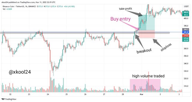
The image above clearly shows the breakout strategy. As soon as there was a breakout of price trend from the resistance level and with a valid break confirm with the volume traded at this level as soon as the double-thick candlestick, a buy entry order was executed.
Open a real trading operation where you use at least one of the methods explained in the class. (Screenshots of the verified account are required).
Trading in BNB/USDT pair (45Mins Time Frame)
I will be using my tradingview site to make a good representation of my chart analysis with the use of the breakout strategy and volume indicator. The essence of the volume indicator is to guide me on the demand and supply pressures relative to price movement.
In this case, we have a rising and high demand pressure with an uptrend price movement observed. Price was seen retesting at both the support and resistance level before making a rebound to the upward direction.
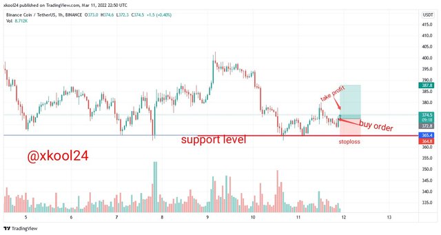
From the tradingview site, we can see the pair of crypto used and. With the breakout point identified.
My Buy entry Order was executed give to the trend reversal observed after the trend was retested on the support level. My stop loss was set at the base of the support level with the Risk-Reward ratio set at 1:2.
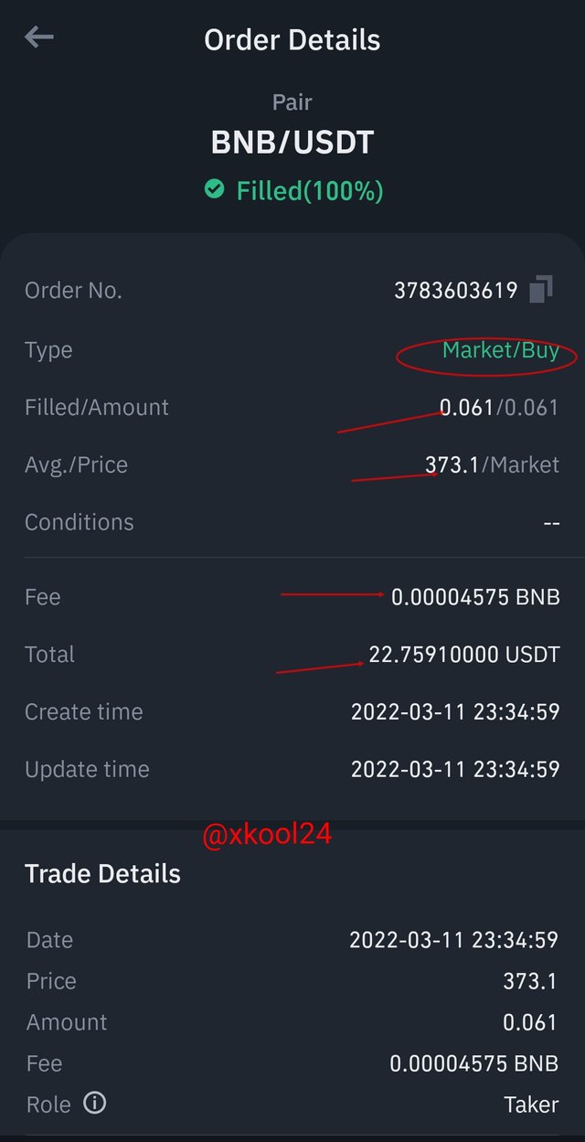
BUY ENTRY ORDERS
Filled Amount: 0.061
Market But price: 373.1
FEE Charges: 0.00004575
Total asset used: $22.75910000USDT
Stoploss: 364.8
Take profit: 387.8
After executing my Buy position, this market was observed closely so as to make a good Sell position.
SELL ENTRY ORDERS
Filled Amount: 22.84450000USDT
Market But price: 374.5
FEE Charges: 0.00004573
Total asset used: 0.061 BNB
Profit from trade: $0.0854
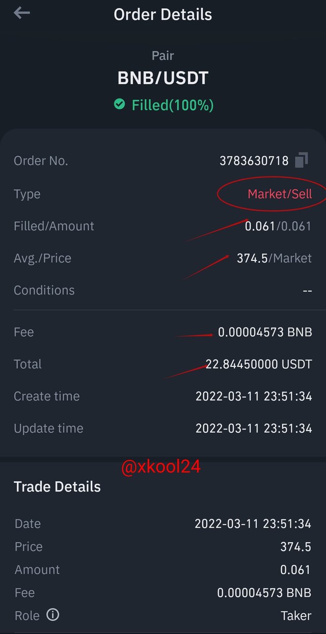
From the trade, we were able to make a profit of $0.0854 with the shortest possible time.
Conclusion
The Chart analysis happens to be a conglomerate of all other features that houses some elements used during trading. The candlestick, indicators as well as time and dates are some of the elements that guide traders while using the chart analysis. The breakout strategy which can either be observed in the form of trend retest or trend continuation is all trade signals available to traders for trade positions. They are observed to occur in price zones which are the price support or resistance areas.