Crypto Academy / Season 4 / Week 1 - Homework Post for professor @sapwood | Onchain Metrics by @whitestallion


Introduction
Hello friends and welcome to my assignment task by professor @sapwood, where I talk about Onchain Metrics, I hope you enjoy my assignment 😊😊.

Question 1
What is a HODL wave, how do you calculate the age of a coin(BTC, LTC) in a UTXO accounting structure? How do you interpret a HODL wave in Bull cycles?
What is a HODL wave
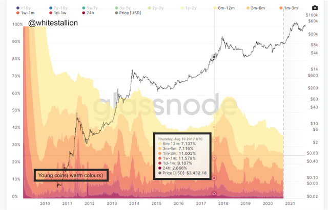
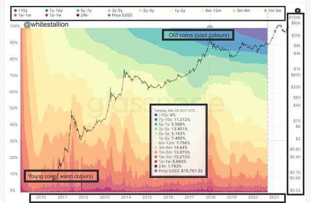
a HODl wave is an on-chain metrics indicator that gives you Macro information on the lifespan, transaction, and supply of a crypto asset by calculating the number of long and short-term holders in possession of a particular crypto asset and their transaction Footprint.
source
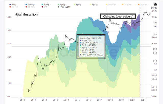
The HODL wave chart is segmented into different age periods Starting from the creation of that crypto asset to the current date, you can see from the picture above is a time sequence of Bitcoin starting from 2010 to 2021. this helps to identify a particular region of interest for information seekers. The HODL wave chart is divided into Young (warm colors) and Old (cool colors) coins.
NOTE: The picture used above is a HODL wave UTXO chart of Bitcoin

How do you calculate the age of a coin(BTC, LTC) in a UTXO accounting structure
The Hold wave of a coin is calculated using the UTXO ( Unspent Transaction Outputs), but also this is display on the HODL wave chart using the Warm (young coins) and Cool ( old coins) colors.
What are Warm colours( Young coins)
The warm colors portray the number of unmoved coins or coins that have not been transferred in or out of a holder account within a period of 24 hrs to 6-12months. Day to day traders are the most active contributors to the Young coins ( warm colors) because of the active transactions that are constantly going on in the market, this makes the coins stay young, but when they exceed a 6-12 months period they will be gradually considered as Old coins (cool colours).
What are Cool colours (Old coins)
The Cool colors indicate the number of unmoved coins that have not been transferred in or out of a holder account or address within a period of 1-2 years to 7-10 years. Investors buy these coins in a bear market or when the coin still has a low value and hold them for long periods ( 1-2 0r 4-5 years or more ), this makes the coinage thereby turning them from young coins (Warm colors) to Old coins ( cool coins).
NOTE: The picture used above is a HODL wave UTXO chart of Bitcoin

How do you interpret a HODL wave in Bull cycles?
Let's take for example If there are Only 3 Refinarycompany responsible for the Production of Fuel in Nigeria which has a population of about 200 million citizens. If one day these companies stop selling fuel to retailers for 3 months, the retailers will in turn decide to hoard their fuel from consumers. This will automatically make the price of fuel increase. it is a simple case of supply and demand.
The scenario painted above also can be applied to the HODL wave bullish cycle, because when investors with large pockets begin to purchase a coin over a period in large quantity, with the intent to hold them for a period of 1-2 or 4-5 years these coins would become aged. If this process continues within a period the supply of that coin would reduce thereby making it scarce for other buyers.
This situation would automatically trigger a bullish cycle because of scarcity thereby making the price of the coin increase. Looking at the HODL chart This would be interpreted when the Bandwidth of the aged coins begin to increase with down spikes thereby initiating the Bullish cycle.
NOTE: The picture used above is a HODL wave UTXO chart of Bitcoin

Question 2
Consider the on-chain metrics-- Daily Active Addresses, Transaction Volume, NVT, Exchange Flow Balance & Supply on Exchanges as a percentage of Total Supply, etc, from any reliable source(Santiment, Coinmetrics, etc), and create a fundamental analysis model for any crypto[create a model for both short-term(up to 3 months) & long-term(more than a year) & compare] and determine the price trend (or correlate the data with the price trend)w.r.t. the on-chain metrics? Examples/Analysis/Screenshot?
Daily Active Addresses
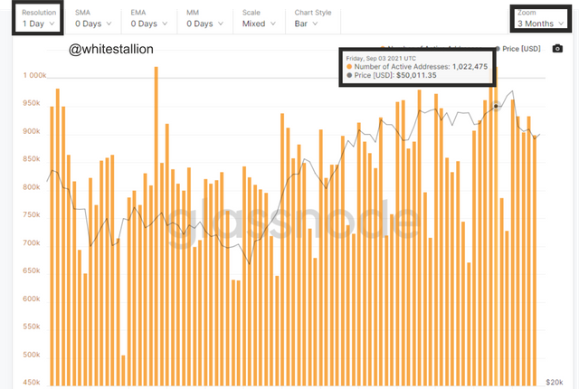
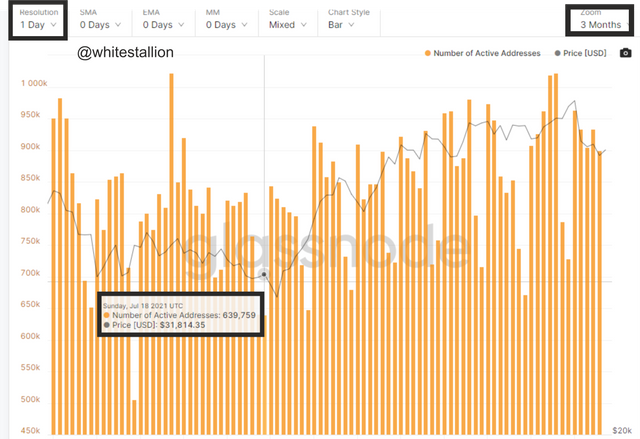
The daily active address or the DAA is an on-chain metrics indicator the shows the number or amount of daily active holders of a crypto asset and their transaction footprint. it shows the number of holders of the crypto asset in coloration to the price movement.
A Short term Scale over 3 months
a. Left picture
The picture above displays the daily active address of bitcoin holders with September being indicated, the active addresses was reaching a high of over 1 million this was also in coloration with the price which was at a high of about $50k
a. Right picture
The right picture above displays the chart of active addresses holders with July 18 being indicated. At that period the number of active addresses was above 600,000, this was also in correlation with the price which fell to around %31k.
A long term Scale over 1 year
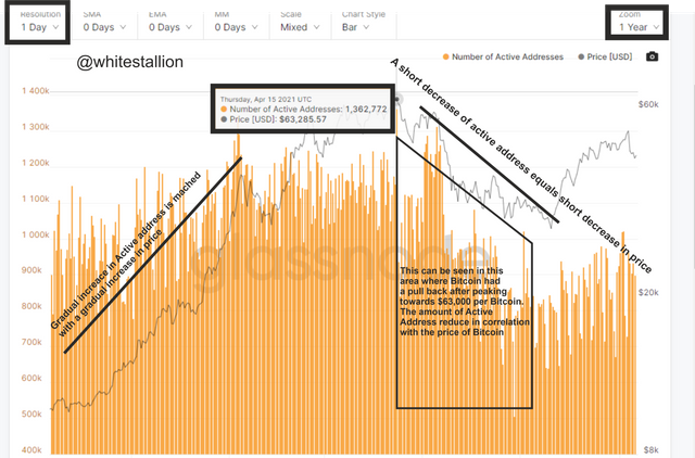
The on-chain metrics chart above displays 1 year of active addresses. This Chart shows a clear correlation between the Bitcoin price and the number or amount of active addresses which was at a high of over $60k, at that period the number of active addresses also peaked at over 1.3 million. This clearly shows that the higher the number of active addresses the higher the price of Bitcoin, this is also visible with the pullback that occurred in the market.
NOTE: The picture used above is a HODL wave UTXO chart of Bitcoin

Transaction Volume
Transaction volume on the on-chain metric illustrates the overall transactions or coin exchanges that are being executed in the market with respect to the price of the crypto asset. The increase or decrease of the chart (Transaction volume) depends on the supply and demand of that crypto asset.
Transaction Volume under a 3 month period
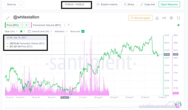
Over the 3 months, there was a little amount in transaction volume that occurred around 16th July, this was as a result of a low supply of Bitcoin, because of this low supply there were bullish spikes that followed in the price increase of Bitcoin as a result of the scarcity.
The Transaction volume does not match or correlate with the price increase or decrease of Bitcoin, because looking at the chart above it is clear to say that there was a massive decrease in transaction volume while there was an increase in Bitcoin price.
Transaction Volume under a 1 year period
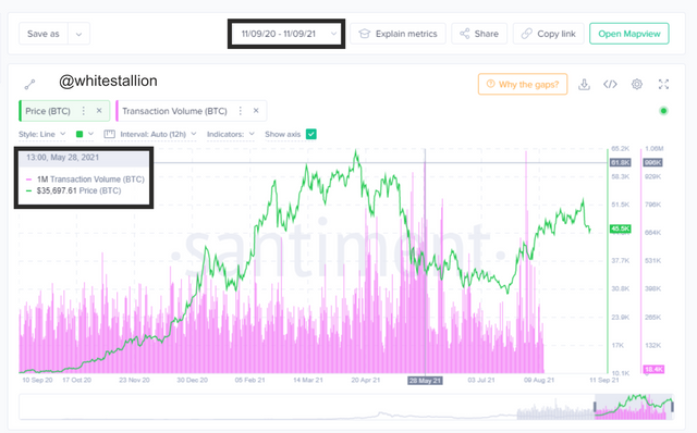
From the image above there was a massive sell-off of Bitcoin at around 28th May, but this could have been due to various reasons which may include a panic to sell-off due to the massive increase in price which peaked at around $63k. Also, the increase in Transaction volume may be due to the high supply of Bitcoin which has been liquidated into the market by miners.
NOTE: The picture used above is a HODL wave UTXO chart of Bitcoin

NVT
The Network Value to Transaction or the NVT is an on-chain metrics investment tool that gives signals by dividing the market cap of a crypto asset with Transaction volume. This investment tool helps investors to give a detailed view of the underlying value of the asset thereby identifying when there is a potential bubble in the asset's price.
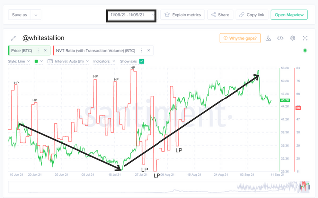
The NVT chart reading in the on-chain metrics can be used to identify bubbles with High peaks which shows when an asset has been highly over-valued and also a Low Peak which identifies when the asset has been highly undervalued.
NVT under 3 months
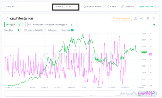
Over 3 months, the chart is set to be over-valued in the areas marked with HP in the above image, which has triggered a lot of sells out and caused a decline in the assets price value, similarly, the areas marked with LP are areas which suggest an under-valued period in the market, this, in turn, triggers an uptrend in price movement.
NVT under 1 year
Over 1 year the chart of the NVT seems not to give a detailed signal about the over-valued and under-valued periods of that asset. This shows that to use the NVT to ascertain HP and LP another indicator should be merged with it.
NOTE: The picture used above is a HODL wave UTXO chart of Bitcoin

Exchange Flow Balance
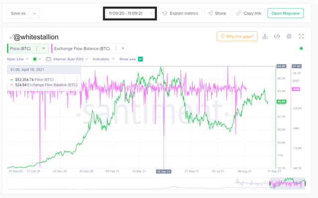
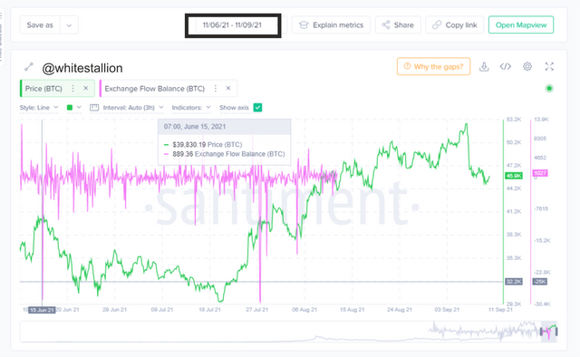
This type of on-chain metrics measures the inflow and outflow balance of a particular crypto asset. Inflow exchanges indicate a sell or bearish signal because that is when coins that are stored in decentralized wallets are being transferred to exchanges, which is where they can be exchanged for a fiat currency or other crypto assets. ALso and Outflow indicates a Bullish trend because crypto assets are being transferred from exchange platforms to decentralized wallets where they are stored.
Exchange Flow Balance under 3 months
source
Over a short-term period the Exchange flow balance tends to give false signals because, under short periods, only active day traders seem to be engaged with buying and selling thereby putting out incorrect signals.
Exchange Flow Balance under 1 year
source
For a bullish trend to occur over an asset, that asset must be scarce thereby creating an increase in price or value over that asset. When coins are being transferred from the exchange platforms to the wallets this indicates that holders are gearing up for the market, this, in turn, creates an uptrend signal in the market.
NOTE: The picture used above is a HODL wave UTXO chart of Bitcoin

Supply on Exchanges as a percentage of Total Supply
The supply on exchanges as a percentage of total supply is an on-chain metrics indicator that creates an inverse correlation between the price movement and the price trend. When a crypto asset is being transferred in and out of an exchange platform it contributes positively or negatively to the total supply of that asset by affecting the price. Therefore an inflow into exchanges suggests a decrease in price trend while an outflow suggests an increase in price trend.
Supply on Exchanges as a percentage of Total Supply under 3 months
source
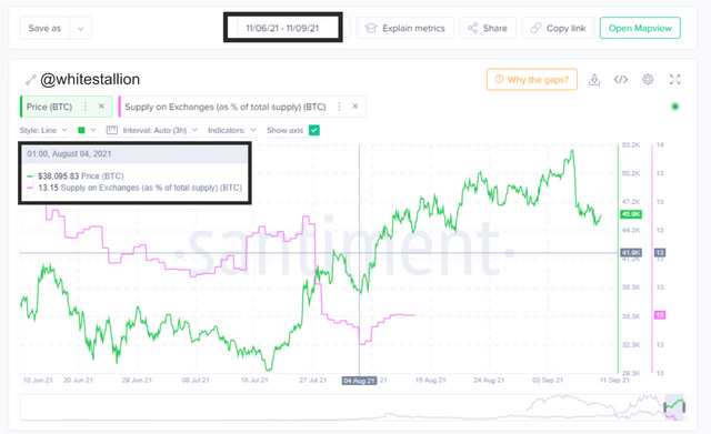
Looking at the 3 months, the price of Bitcoin on the 4th of August was at $38k while the exchange supply percentage was 13.15. overtime as the exchange supply percentage decreased the price of Bitcoin increased.
Supply on Exchanges as a percentage of Total Supply under 1 year
source
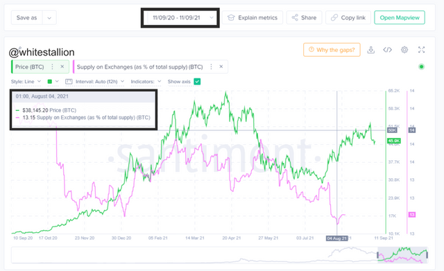
On the 4th of August Bitcoin was at $38k while the exchange supply percentage was at 13.15, but over time, as the exchange supply percentage began to decrease the price trend of Bitcoin started to increase.
NOTE: The picture used above is a HODL wave UTXO chart of Bitcoin

Are the on-chain metrics that you have chosen helpful for short-term or medium-term or long term(or all)? Are they explicit w.r.t price action? What are its limitations? Examples/Screenshot?
On-chain Metrics
The On-chain metrics investment tools are good for long-term investors who have a large capital. because it gives a detailed view of an asset's lifespan, value, and transaction behaviors starting from the creation of that asset to its current market value.
when using the on-chain metrics under a medium-term the indicators still would give outcomes that a not entirely clear and this could pose a risk to investors who would always need clear and precise data before executing an investment, therefore it is advisable to make use of other trading indicators to achieve a better result
Under the usage of the on-chain metrics within a short period, maybe around 1 day to 3 months the indicators tend not to portray clear data about that particular asset, that is why it is ideal to combine its usage with other trading indicators to receive a better outcome.
In general, I think making use of the on-chain metrics for a long time purpose is much better and helpful because it gives you the complete lifespan information about that asset.
On-chain Metrics and Price Action
Price action is an interpretation of the overall exchange that goes on between traders in the market which in turn affects the increase and decrease in value of that asset based on supply and demand.
On the other hand, On-chain metrics is a comprehensive data representation of the backend activities that affect the price trend bed by the principles of supply and demand of that asset.
On-chain Metrics Limitation
a. Unclear data outcomes
The on-chain metrics tend to always portray unclear information mostly for short-term investors because there is limited data within that time frame.
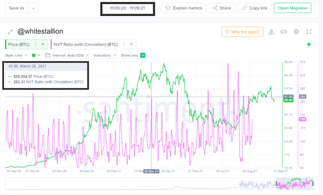
Below is an example of the NVT indicator which portrays the over-valued and under-valued periods of Bitcoin. The area marked suggests an Over-valued period of Bitcoin which is supposed to trigger a bearish signal but instead, a lot of investors with deep pockets kept investing which then triggered a bullish signal that affects the price of Bitcoin to rise to around $63k.
source
Limited data
The best way to make use of the on-chain metrics is to use the long-term data outcomes, but this cannot be possible when other coins ( except Bitcoin) has only a lifespan of 10 years. This would create an unclear and limited data outflow because of a less time frame.
NOTE: The picture used above is a HODL wave UTXO chart of Bitcoin

Conclusion
The On-chain metrics provide a detailed analysis of the lifespan of an asset-based on the transactional behavior of the active holder addresses which is affected by the demand and supply of the asset. The on-chain metrics contain useful indicators that are most helpful to long-term investors. It also poses a lot of limitations for long-term traders or investors.
