Crypto Academy / Season 3 / Week 2 - Homework Post for @reminiscence01
Image Source: snappa
Explain the Japanese Candlestick Chart? (Chart screenshot required)
Japanese Candlestick Chart
As the name implies, a Japanese candlestick chart is a technical analysis chart that makes use of Japanese candlestick as it means of identifying movements in the financial markets. These candlesticks represents the timeframe with which a trader is using to analyze the market. For instance, in a 5 min timeframe, the candlestick opens and closes every 5 minutes. This same logic can be applied for 1 hour, 4 hour, Daily etc. timeframes.
The Candlestick in the chart gives information of the four most important elements of a trading period, which includes: open, close, high price and low price. The opening and closing price are seen on a thicker body, while the high price and low price are seen on a thinner body, up and down or either side of the body.
Brief History
The concept of candlestick charting was started by a Japanese named Munehisa Homma in the 18th century, he was a rice trader. As he was doing his rice trading activity, he came to an understanding that the market price of rice was influenced by the emotions of other traders, and at the same time he also put into cognizance the impact of demand and supply on the price of rice.
Homma had to develop the candlestick using a graphical representation to display the way the price moved, by using different colors to show their different movement. As a result traders could clearly see the movement of price and then be able to make decisions based on short term direction movement of the price.
He dominated the rice market and was popular because he discovered the candlestick method. By the 1870's, when the Japanese stock market started, technical analyst in native Japan put the candlestick methodology of Homma into their system for trading.
An American by the name Steve Nison was able to introduce the technique of using the Japanese candlestick to the west through his book "Japanese Candlestick Charting Technique."
The use of the Japanese candlestick chart is now very popular among traders who use technical analysis to analyze the markets.
The Japanese Candle Stick
The space/area between the opening price and closing price is known as the Real Body, then the price excursions up and down of the real body are known as the Shadows or Wicks. The real body gives information of the opening and closing trade prices, while the shadows gives information of the highest (high) and lowest (low) price that the market trade reached at the period the candlestick was active.
The range of the price for a given candlestick is the distance between the upper shadow or highest price and lower shadow or lowest price. The way to determine the range, is simply by subtracting the lowest price from the highest price of the candlestick formed.
Different objects are used to associate with the candlestick movement. The candlestick is considered to be hollow or not filled, when the opening price is at the bottom of the candlestick and the closing price is at the top. Also the candlestick is considered to be solid or filled when the opening price is at the top of the closing price, that is, the opening price is at the top and the closing price is at the bottom. These objects, that is hollow or solid, gives information of the direction of the candlestick for that period considered.
Colors can also be styled on the candlestick in order to get information of the direction of the movement of the market correctly. The common colors used are white or green, which shows that the opening price is below the closing price, this indicates a bullish candle and black or red, which shows that the opening price is above the closing price, this indicates a bearish candle. However, any color can be assigned to the candlestick, depending on the preference of the trader. A candlestick may also not have a body or shadow/wick, it can open and close at the same price.
The candlestick can also be used to determine the current price as they form, and also show whether the price moved up or down over the duration and range of the candlestick.

Describe any other two types of charts? (Screenshot required)
Line Chart
.png)
A Line Chart
Generally, a line chart is used to give information of changes of something over a period of time. It consist of a horizontal axis which is typically a time scale and a vertical axis which can be earnings or price changes. A store owner can decide to plot a line chart to get information of his daily earnings for the past 30 days.
However, in trading a line chart is type of chart that uses a continuous line to represent the historical price action of an asset which are connected by a series of data points and are represented in a graphical manner.
The line chart is the most basic graphical representation of financial asset when compared with other types of chart, it only gives information of an asset historical closing price over a given time period. Line charts can be used on any timeframe, but is commonly used on daily timeframe, which shows the day-to-day price changes.
Purpose of Line Charts
The use of a line chart gives a trader a very clear graphical representation of the price of an asset, it helps the trader to have a good visualization of performance of the asset's price over a given period of time. This is made possible because line charts make use of only the closing price of an asset, thereby reducing the noise usually common in trading charts such as open, high, low and then forming a continuous line. Investors and traders alike make use of line chart because it uses the closing price of an asset which is seen to be the most important piece of data related to a security.
Traders can also use other types of charts such as bar charts etc. along with line charts to get better perspective of the market.
Pros & Cons of Line Chart
Pros
It helps reduces the amount of information a trader has to know when analyzing an asset's price. Using a chart that give so much information can lead to confusion, due to getting multiple signals from an asset and thus it ends up making trading decisions complicated. But with the use of only line charts, a trader can easily identify key data points such as trends, support & resistance levels and patterns that are recognizable.
The use of line charts is ideal for beginners to start with because of it's simplicity. A beginner can learn how to read basic chart data by using line charts and thus improve his chart reading skills, before learning how to use more advanced charts techniques such as Japanese candlestick patterns or point and figure charts.
Cons
A line chart give limited information for some traders to use as part of their trading strategy. For instance, a trader needs to know the high price of an asset for the previous 4 hours, so he needs to get information of the open, high and low of the asset price.
Also traders looking to back test their trading strategy would need more information than the closing price that the line chart provides.
Bar Chart
A Bar Chart
A bar chart has multiple bars in it which indicates the price of an asset, each of these bars illustrates how the price of the asset has behaved over a given period of time. A bar in the bar chart typically shows the open, high low, and closing (OHLC) price. You can also adjust it to display only the high, low, and close price of an asset (HLC).
It is a style of chart which technical analyst employ to monitor prices of asset, so that they can make good decisions in trading.
Some of the information traders look out for using bar charts includes:
- Trends
- Trends reversals
- Volatility
- Price movements
How to use Bar Charts
A bar chart has multiple bars in it that give details of price of an asset. Therefore it is a collection of price bars, and each of the price bars give information of the movement of price within a given period.
The opening price is denoted by a small horizontal line on the left of the vertical line, the closing price is also denoted by a small horizontal line but at the left side of the vertical line. If the open price of the asset is above the close price of the asset, there would be a small horizontal line at the left of the vertical line above, and a small horizontal line at the right of the vertical line below. Conversely, if the open price of the asset is below the close price, there would be a small horizontal line at the right above, and a small horizontal line at the left of the vertical line below.
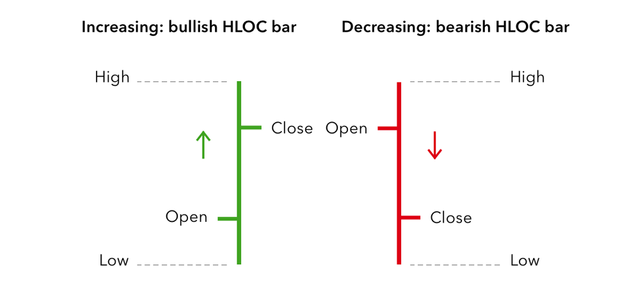
Image Source: google
Traders can also use color coding on the bars as a means of gaining clear views of the action of the price of the asset. Typically, traders use red and green colors as their color coding mechanism. If the open price is above the close price, then the color would be red. Also, if the open price is below the close price, then the color would be green. Color coding is an available option in most trading platform.
Traders can also analyze an asset based on the timeframe of their choice. For instance, a day trader can choose a 1 hour chart, then the bars on that chart would indicate the action of bars within 1 hour.
Deriving Information from the Bar Chart
The bar chart shows the open, high, low, and close prices at any timeframe, with this there's a lot of information that traders can derive and then utilize.
If a bar is long, it shows that there is a big difference between the high and low price of that period. This shows an increase in volatility for that period. And when the bar is short, is shows that volatility was not much.
Large distances between the open and close of the price bars, shows that there was a significant move of price made by the traders. If the open is far above the close price, this signifies that sellers were very active during that period and this could give an indication of more selling in the future. When the open is very near the close, it shows less enthusiasm and conviction in the price movement for that period.
Traders can also use the location of the close of the bar to get valuable information. For instance, an asset rallied high which is shown as the high on the price bar, but then the price closed well below the high point of the bar. This means that towards the end of the price action that period, sellers came into the fold. This goes on to show that the asset was less bullish than if it closed very close to the high point.
Lastly, by way of color coding the bars on the chart, the customary colors used by traders are red and green. If the close is below the open, the bar would be red, and this signifies a bearish bar. A succession of bearish bars indicates a downtrend.
In your own words, explain why the Japanese Candlestick chart is mostly used by traders
Candlestick charts are visual aids to for forming opinions and decisions with respect to trading activities such as stock, commodity, currency, crypto currency and options trading in the financial market.
By viewing the candlesticks in the chart, the opening, closing, highest and lowest prices as well as the range for the candlestick becomes apparent.
Candlestick chart is the main basis for Technical Analysis, which is a tool for measuring the sentiments of the market at a given time. For instance, when the candlesticks in a chart is white/green and a succession of other candlestick is white/green and the price is high relative to the previous time periods, then the market is bullish. When the reverse is the case, then the market is bearish.
Describe a bullish candle and a bearish candle identifying its anatomy? (Screenshot is required)
Before i go into details of a bullish and bearish candlestick, i shall talk about a candlestick and it's anatomy.
What is a Candlestick (Japanese)?
A candlestick is an object on the trading chart which gives information of the action of the price of an asset within a particular time period.
The candlestick has two very important feature to it, the close and open price of an asset. Depending on the location of the close and open price on the candlestick, you can get information of the movement of the price of an asset.
Anatomy of a Candlestick
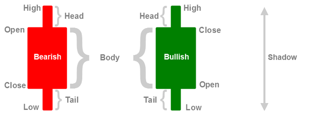
Bearish and Bullish candlestick-Image Source: google
A candlestick has on it a
- Body: the body consist of the open and close of the candlestick.
- Head: shows the highest point (high) the candlestick reached.
- Tail: shows the lowest point (low) the candlestick reached.
Bullish Candlestick
A bullish candlestick is one which shows the increase in price of an asset. In a bullish candlestick, the close of the candlestick is above the open of the candlestick. That is, the closing price of the candlestick is higher than the opening price of the candlestick. It is usually denoted in green or white color, however a trader can use what he prefers.
Bearish Candlestick
A bearish candlestick is one which shows the decrease in the price of an asset. In a bullish candlestick, the close of the candlestick is below the open of the candlestick. That is, the closing price of the candlestick is lower than the opening price of the candlestick. It is usually denoted in red or black color, however a trader can use what he prefers.
Bullish & Bearish Trends
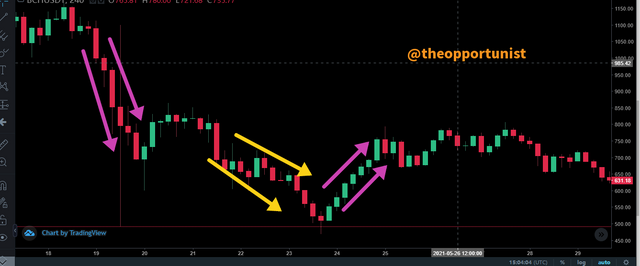
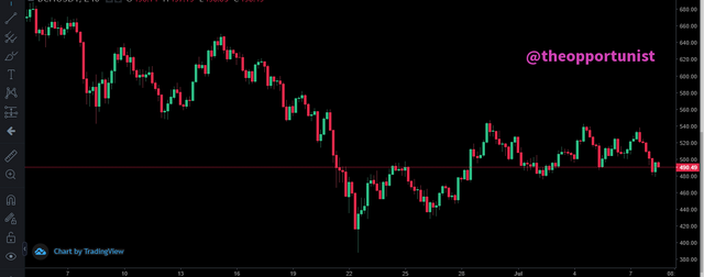
A candlestick chart indicating different trends
A succession of bullish candlesticks denoted by green color indicates that the price of an asset is increasing at a given period of time, this is often regarded as a Bullish trend. Conversely, a succession of bearish candlesticks denoted by red color indicates that the price of an asset is decreasing at a given period of time, this is often referred to as a Bearish trend.
From the image above the purple arrow shows different trends that occurred in this crypto asset. The first set showed that the price decreased through the successive red candlesticks. The second set of purple arrows indicates that the price increased through the successive green candlesticks.
However, there are times when as the market decreasing or increasing, bullish or bearish candles are formed within them. The yellow arrows gives an example of when the price of the asset was decreasing, some bullish candles still formed in between.
Hello @theopportunist, I’m glad you participated in the 2nd week of the Beginner’s class at the Steemit Crypto Academy. Your grades in this task are as follows:
Observations:
This is slightly true. The wick explains the interaction between the buyers and the sellers. For a bullish candle, if the wick is longer than the body of the candle, this shows that sellers are in control of price after the buyers pushed price to a certain level, sellers came back and push price further down.
Recommendation / Feedback:
You have done a great work in explaining Japanese candlestick chart in details. Thank you for submitting your homework task.