SteemitCryptoAcademy Season 3: Week 2 Homework (by @reminiscence01) | Introduction to Charts
Hello Steemit Crypto Academy,
Ever since I entered the coin market, I have been struggling to understand candlestick charts. Although I made an effort to interpret it, it was not enough. I usually follow the price movements in the coins with the line chart. However, after this assignment, I learned more about candlestick charts. In this sense, I would like to thank Professor @reminiscence01 for addressing this issue.


Introduction
Having data on a subject makes that subject more realistic. But how are these data interpreted? In this sense, it is important to present the data in the form of charts. Interpretation of technical analysis tables, explained in more detail, is of great importance for all investors.
There are many types of charts. Among these, the most frequently used chart is the candlestick chart. The most important reason why this chart is popular is that it gives us a clear perspective. Many traders can only trade using candlestick charts. In this post, I will try to answer Professor @reminiscence01's questions about Japanese Candlestick Charts.
1. Explain the Japanese Candlestick Chart? (Chart screenshot required)
The candlestick has a long history. Munehisa Homma first used it. Japanese Candlesticks, which are used extensively in price charts today, were developed in the 18th century. A Japanese candlestick is a type of price chart that shows the opening, closing, high, and low price points. This chart was popularized among Western traders in the 1990s by a broker named Steve Nison.
Unlike other charts, it has a more detailed shape. Especially in recent years, with the emergence of Bitcoin and altcoins, the candlestick chart has started to attract great attention. Even people who do not have enough knowledge in technical analysis can invest thanks to the candlestick chart.
To read Japanese candlestick patterns, it is necessary to know the three parts of the candle. These; color, body and wick. Its color shows the direction of the movement within the period, its body shows the market's opening and closing levels, and the wick shows the high/low range.
The green candle indicates that the market is moving upwards. In this market, the closing price is higher than the opening price. Therefore, the market is under the control of the bulls. The longer the body of the green candle, the stronger the buying interest.
Figure 1. Example of Candle Stick
Source: ig.com
A red candle indicates more selling in the market. The Red Candle market is under the control of the bears as the closing price is lower than the opening price. The longer the body of this candle, the stronger the selling interest.
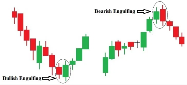
There are 18 Japanese candlestick patterns; Spinning top, Green marubozu, Red marubozu, Doji, Hammer, Inverted hammer, Hanging man, Shooting star, Engulfing, Harami, Harami cross, Homing pigeon, Tweezers, Morning star, Evening star, Three white soldiers, Three black crows, Three inside up, Three inside down, Rising three, and Falling three.
2. Describe any other two types of charts? (Screenshot required)
When we read an article, our eyes are always looking for graphics. Because we can better understand the subject of the article by interpreting these graphics. Graphs are much easier to read than a table of numbers. With a graph we can easy to identify the following:
- Easy interpretation of change over the years
- Historical development of important events
- The relative strength of investment, security, or coin relative to the overall market.
There are many types of charts. The most well-known of these are; column, bar, line, pie, scatter, surface, radar, etc. To answer this question, I will give an example of column, bar, and line charts. I will use the data from my master's thesis to plot the graphs.
It's always easy to interpret a column chart. How much increase or decrease can be seen in which years.
Figure 2. Column Chart
Global Renewable Energy Investment (Solar, Wind, Biofuels, Other), (2004-2020, $ Billion)
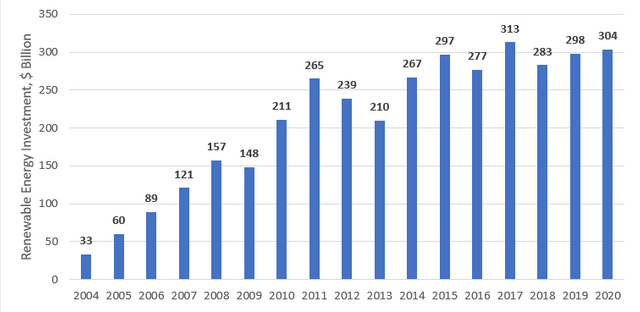
Source:BloomberNef
The bar chart also has an image similar to the one above. Here, the image is more prominent.
Figure 3. Bar Chart
Global Investment in Energy Transition by Sector (2004-2020, $ Billion)
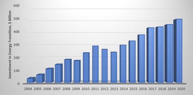
Source:BloomberNef
I use a line charts very often. It is easier to interpret. Here, the fluctuations in the data can be clearly seen.
Figure 3. Line Chart
Oil Prices (2004-2019, Brent, $/bbl)
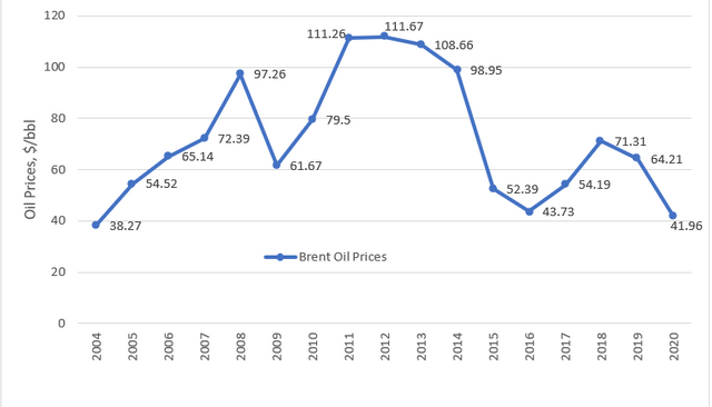
Source:Statista
3. In your own words, explain why the Japanese Candlestick chart is mostly used by traders.
Candles have been used a lot lately as a charting method. There are many reasons for this. These;
- more visually appealing than bar charts.
- easier to read and interpret.
- has facilitated the interpretation of the coin market.
- makes it easy to see the relationship between the opening and closing and the highest and lowest price movements.
- shows market movements in great detail.
- allows a trader to use pattern analysis to identify future price movements.
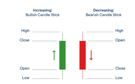
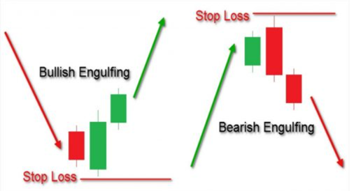
4. Describe a bullish candle and a bearish candle identifying its anatomy? (Screenshot is required)
Bullish Candle
The bullish candlestick chart consists of a high, low, true body, open, closed, upper shadow, and lower shadow. It opens below the true body and closes above, showing the price increasing upwards.
This pattern usually occurs during a downtrend and marks the beginning of an uptrend. For a Bullish candle, the bottom of the candle body shows the opening price, and the top of the candle body shows the closing price.
Source:Letsforex
Bearish Candle
A bearish candle is an indicator of a downtrend. A bearish pattern is a sign that the market will be in a downtrend. The downtrend occurs when the bears are in control.
Bearish candles are reversed. The upper part of the body is the opening price, and the lower part of the candle is the closing price. After a price goes up, a downside engulfing pattern is formed. This market indicates lower prices to come.
Source:egm analytics
Conclusion
Graphic interpretation is very important for technical analysts. However, nowadays, especially with coins, many people have started to interpret graphics. The most used chart type is the candlestick chart. Candlestick charts, which have a more detailed narrative than other chart types, have a long history. I would like to thank professor @reminiscence01 for helping me better understand the candlestick charts that are still on the agenda since the 18th century.
CC:
@reminiscence01
Hello @sinerjii , I’m glad you participated in the 2nd week of the Beginner’s class at the Steemit Crypto Academy. Your grades in this task are as follows:
Recommendation / Feedback:
You tried to answer the questions in your own words. However, i expected you to explore more in the last question. Thank you for participating in this homework task.
Thank you so much, Professor, I will consider your suggestion.
Bende brginner ödevlerini yapacaktım bi türlü başlayamadım. Başarılar.. 🙏🙏
Ortalama bir gününüzü vermelisiniz bir ödev için. En azından benim bir günüm gidiyor. Kolay gelsin şimdiden.
Evet gözümü korkutuyor. Teşekkürler..
Ancak içerikler basit. Beginner seviye birçok kişinin yapabileceği düzeyde hazırlanmış. Bu sezon formatını beğendim crypto academy'nin.