Steemit Crypto Academy Season 4 Homework Post For Task- 10 Candlestick Patterns Submitted By @simeon00 Date: 08-10-21
Question (1a) Explain the Japanese candlestick chart? (Original screenshot required).
(b) In your own words, Explain why the Japanese candlestick chart is the most used in the financial market.
(c) Describe a bullish and a bearish candle. Also, explain it's anatomy. (Original screenshot required).

Answer (1a)
The Japanese candlestick chart, was an old system that was developed or invented in Japan by a rice trader named Homma when he noticed some fear of uncertainties on the part of buyers and sellers(traders) concerning the market behavior in connection with price movements, and how this strong feeling had largely affected the markets.
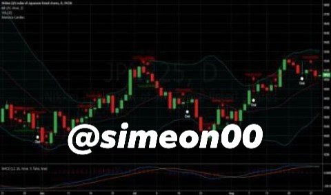
Up to that point in time, the common belief or idea was that the markets were completely controlled by forces of supply and demand. In fact, the Japanese candlestick chart was one of the initial market charts in the world, and also it is among the largest used chart in the financial market, used for implementing good technical analysis, as can be seen in the chart below which depicts technical analysis.
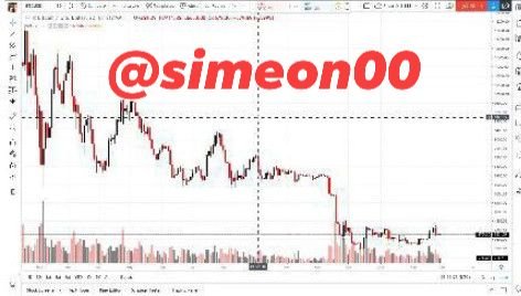
The Japanese candlesticks show price movements in a graph by employing various colors to show the distinctions. The candlestick chart is very beneficial in Cryptocurrency transaction, helping to show how traders feel about the current market behavior and trend, and also who controls the price. The candlestick chart can be employed or used to notice price action patterns and make trading decisions for the future based on them.
Reference
As has been mentioned earlier, a candlestick depicts in a graphic form, the emotions of traders (buyers and sellers) or their interactions, and this includes their strong feelings of fear of uncertainties in the market, indicating different price features during that period.
Usually, a candlestick is made of four parts and they are - open, high, close, and low, each of them showing or describing a particular point in price movement.
This shows the beginning of price movement. As the movement of price is noted within a specific or exact time, the price is marked and built upon.
This part of the candlestick shows the highest price entered within a particular time.
This aspect of the candlestick indicates the lowest price registered within a defined or stipulated time.
This part of the candlestick shows the last price recorded or entered in a candle. It shows the end of the candle within a stated time. The other parts of the candlestick are the shadow and real body. The shadow describes the uncertain movement of price, areas that price moved through but was unable to close, thus, illustrating the competition between both traders(buyers and sellers).
But the real body of a candle shows the difference or gap covered by price within a stipulated period. It is the distance between opening price and closing price, it also shows the strength of the candlestick. The bodies of a candlestick are often connected with color in other to facilitate it's identification. Traders can opt for how to establish their charts with colors and tools depending on their specifications and trading systems.
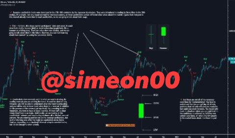
Check out the screenshots of Japanese candlestick charts below.
Part 1
Part 2
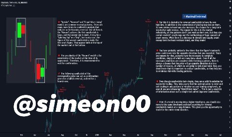
The candlestick is believed to be bearish or bullish based on the closing price. If the price closes above the opening price, it is believed to be bullish(normally depicted by a green candlestick), and if it closes below the opening price, it is believed to be bearish(depicted or portrayed by a red candlestick).

Answer (1b)
The Japanese candlestick chart is the largest used chart in the financial market for the following reasons:
Japanese candlestick is more common than the usual bar charts given the fact that it presents a more comprehensive price action information, and also it is among the most precise tools used for controlling price movements within a certain period of time.
The candlestick chart is one of the most popular and largest used technical analysis tools, for it permits the buyers and sellers(traders) to take the steps outlined below such as:
- Simply assess the price action of an asset. In this case, a single look at the candlestick chart is enough to help a trader ascertain or detect instantly what is happening with the price of an asset.
- Simply notice price movement as to whether the price of an asset is in an uptrend or a downtrend. In this case, the candlestick enables traders to see or notice the market trends at first sight so that they can fastly conclude whether or not the price increase is part of a trend.
- Finally, the candlestick chart permits the traders to identify different market patterns. There exist multiple market trading chart patterns which can assist traders forecast the future price movements. The candlestick permits or enables buyers and sellers to notice those market patterns and gain from them.
Reference

Answer (1c)
With regard to a bullish candle, the engulfing candlestick pattern happens in a downtrend, thus indicating that buyers have assumed price control and in such a situation, the price normally changes or reverses in the opposite direction.
Check out the screenshot image below of a bullish engulfing pattern.
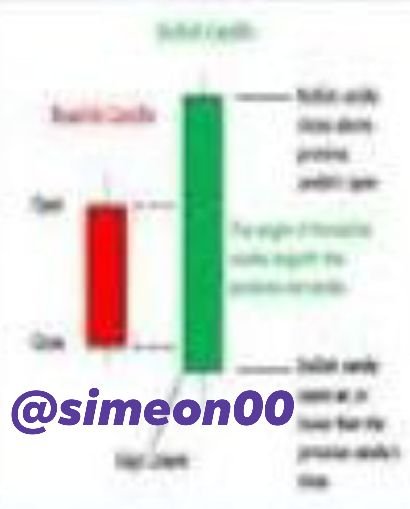
In addition, from the analysis of the candlestick that we have already considered earlier, the bullish engulfing candle has a close above the open of the previous candle, which is the bearish candle.
The screenshot below depicts how the bullish engulfing candle looks like in a chart.
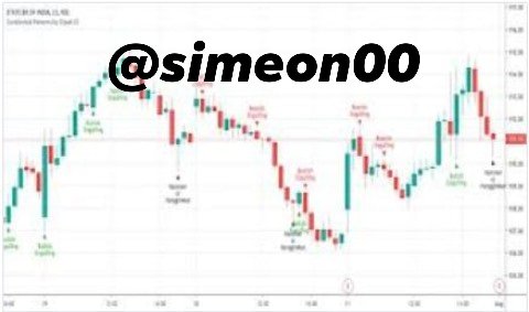
From the above chart, it can easily be spotted how price reversal in the opposite direction took place after the formation of a bullish engulfing pattern, thus indicating that buyers have assumed price control.
A bearish candle is one of the two candle bodies that make up the engulfing pattern and it happens in an uptrend, thus giving a sign of change in the uptrend. In the case of a bearish candle, buyers have ceased to control the price which becomes apparent that sellers have assumed control of price and at this point, the price normally changes or reverses in the opposite direction.
check out the screenshot image below of a Bearish engulfing pattern.
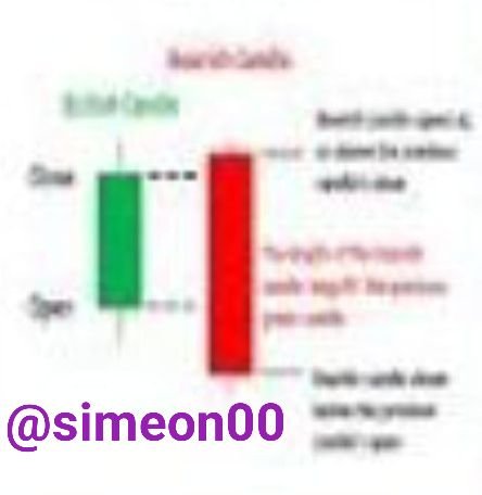
Considering the analysis or anatomy of the candlestick just done earlier, the bearish engulfing candle has a close below the open of the previous candle, which is the bullish candle.
Check out how the bearish engulfing candle is represented in the chart below, and of course the chart depicts the bearish engulfing pattern.
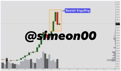
From the above chart, it is obvious how price changed in the opposite direction after a bearish engulfing pattern was formed, meaning that sellers have assumed price control.

While investing in Cryptocurrency is not easy, however, it requires that an investor obtain enough knowledge needed to make a good decision on trading.
In fact, from the lecture, it is apparent that the candlestick chart is the fundamental or primary aspect of technical analysis every beginner should understand before moving into investments in Cryptocurrency.
Cc:
@reminiscence01