[Basics to trade cryptocurrencies correctly | Part 2] - Crypto Academy / S6W3 - Homework post for professor @nane15


explain your understanding of charts, candlesticks, and timeframe.
Price Charts
Price charts are known to be graphical representation of the data comprising the activities of buyers and sellers in the market. The price chart represents the prices in a 2 Dimensional fashion based on predetermined period of time. This means that the data is represented on the x, y axis with the x-axis being the time and the y-axis being the price.
This price charts represents data in the market based on line charts, candlestick chart, heikin ashi, bar charts and others. The most commonly used is the candlestick charts which represents the actions of buyers and sellers in the markets using candlesticks. The candlestick represents four main informations which include;
The open price
The close price
The high price
The low price
The main purpose for the creation of charts is for the analysis of past actions and movements of the prices to predict the future movements. With the usage of candlesticks now, one can then say, it is quite very to identify the trend of the markets with just a single glace.
Candlesticks
As earlier explained, the Japanese candlesticks is the most used type of charts representation. The Japanese candlestick represents the movement of prices based on the current market price and the time. This is done in a similar manner across the different timeframes used.
An advantage the Japanese candlesticks have over the others such as the line chart is that, it represents
The open price
The close price
The high price
The low price
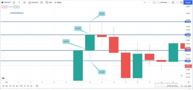
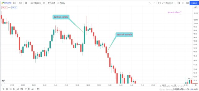
The screenshot above shows the various data represented by the candlestick as mentioned above. The candlestick shows the action of the buyers and sellers which is represented according to their dominance. In the case where we have the bearish candle formation which by default is represented by red colour, it shows the sellers where dominant at that point in time. In the case where we have a bullish candle which is represented by a green colour by default, it means the buyers where dominant at that point in time.
We have an advantage when using the candlestick because we can easily predict the price movement when we have some certain formations. These formations include; shooting stars, bullish and bearish hammers and many other candlestick chart pattern formations such as double tops, double bottoms, flags and many others.
Time Intervals
The usage of time intervals is an important aspect in the charts. I will be using the Japanese candlestick to explain this out thoroughly.
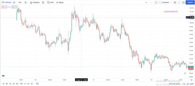
Normally each candlestick represents a particular action between the buyers and the sellers in a defined period. This means that if you are using a 15 minute timeframe, a complete candle will form after a period of 15 minute. If using a timeframe of 1 day, a complete candle will form after a period of 1 day. This candles explain everything which has happened in that day.
Using the 1 day timeframe as shown below, the highlighted 7 candles explains the price movement in that particular week. In this, we can begin by looking the general trend by seeing that the prices made a general uptrend during that week. The open of the next candle is located at the same level at the close of the previous candle. We always some exception which is seen in the case of gaps formations. The gaps are caused by high injection of volume in the market which could be by financial institutions and whales.
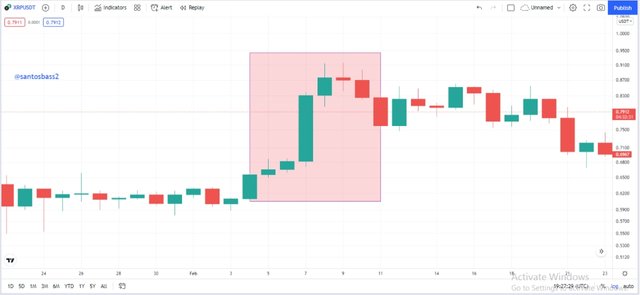
This means for proper analysis it is required to choose your timeframe wisely which should also be done using based on your trading capital. You should not have a trading capital of $10 and using a leverage of 4X you want to use a 1day timeframe, NO!!!
With a trading capital of $10 you should be looking at the 5 minutes timeframe for analysis if using a leverage of +5X.
explain how to identify support and resistance levels.
Identifying Support and Resistance Levels.
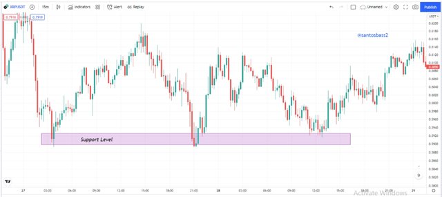
Beginning with support levels, I will identify the various support levels we can find using the candlestick chart pattern. Support levels are known to be key levels where we see the activities of buyers in the market. The support levels are key levels in which are buyers are noted to act on, as the wait for the prices to touch this level, buy orders are placed. It is most often seen as support levels turn to resistance levels after the break of this level.
We draw the support levels by interconnecting the various peaks using a line as seen below.
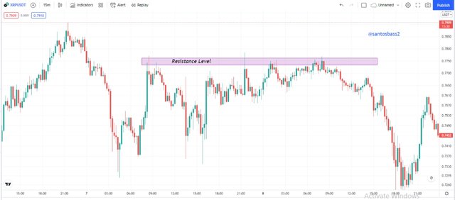
The resistance level is the exact and mirror image of the support levels. The resistance levels act as areas where we see the prices is being prevented from making an uptrend each time the level is hit. The resistance level is a level known to be controlled by sellers in the market as each time the level is hit, the prices is seen to make a turn back downward.
An interesting aspect of the resistance level same as the support level is that each when this level is broken, there is the possibility for the prices to make a retest on this level which might turn to a support level. And the more and more this level is touched, the weaker the level it turns to be. The resistance level is drawn by the interconnection of the various peaks as seen below.
identify and point out the following; Fibonacci
retracement, round numbers, high volume and accumulation and distribution zones.
Fibonacci retracement is known to be an important tool used in the technical analysis. Developed by the famous Fibonacci and named after him, the Fibonacci has key levels in which we can always trace them movement of the prices each time we have a pull back. The Fibonacci tool is made up of levels which are mathematically calculated by added the previous 2 numbers to successfully get the next.
This include; 1, 1, 2, 3, 5, 8, 13…
Therefore we can the various level by the division of each successful two and the 50% level is placed as the mid value of the levels.
The levels include; 0, 0.23, 0.38, 0.5, 0.61, 0.78 1
Lets now talk about placing the Fibonacci tool. Placing the Fibonacci in an uptrend, we need to begin by identifying if we have an uptrend. Then we identify the last swing high at the end of the trend at the previos support level on the chart. We then draw the fibo level from the previous support swing to the top swing.
In a downtrend as seen above, the procedure is the exact opposite of the formation above. The level is drawn from top to bottom. That is from the previous resistance level to the last swing low point of the chart.
The round number utility in trading is an important aspect. The round number is oriented towards the fact that most traders will like to think in a simple manner rather than a complex one. This is a general aspect actually in the human behaviour. The round numbers is seen to be more of liquidity levels.
Explaining this, an example of round numbers include; 400. 450, 100, 120, 5000 etc while examples of unrounded numbers include; 323, 432, 4909. 8494. 232 etc.
In this aspect, most traders when setting the stop loss and take profit levels will go for the rounded numbers since it is more simple to guess.
From the chart above, we see the support and resistance levels act more on the rounded numbers level, which sets as good take profit and stop loss levels.
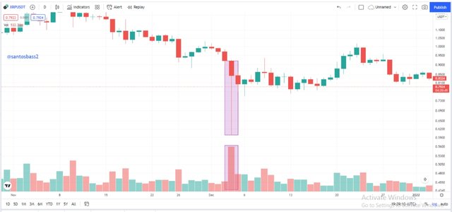
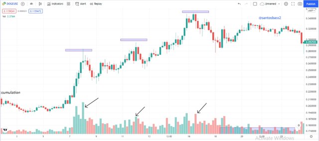
Accumulation and distribution are notably to be two parts of the market structure which has its complete as setup as the accumulation, uptrend, distribution and downtrend.
The accumulation and distribution is being controlled by the strong hands in the market as well. The accumulation marks the beginning of an uptrend which is signified by a high volume and the distribution marks the start of a downtrend which is accompanied by high volume as well as the traders are preparing to exit their positions.
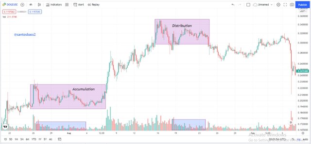
As seen on the screenshot above we see the sideway movements in the area of the accumulation and distribution of the prices. We can from below how it is accompanied by a high volume.
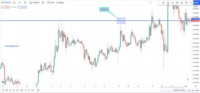
explain how to correctly identify a bounce and a breakout.
Identifying Bounce and Breakouts
One we have noted the identification of support and resistance levels, it is now important to identify the areas we have a bounce which are known as the entry levels. The bounce is seen as the prices just touch one of the levels which could be a support or a resistance level. This touch is seen with a reversal after the touch and buy order can be placed in the case of a support level or a sell order in the case of a resistance level.
We can see the bounce in the analysis below;
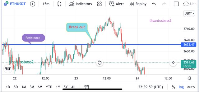
In the case of the breakouts, it is seen as the support or the resistance level is broken. Most traders seems to always wait as this level is been broken. This is because a high volume is always accompanied with the break as the prices make an aggressive move.
It is common to see the break and the prices makes a sudden reverse and retest on that level again which further pushes the prices to a greater level again.
explain what a false breakout is
Fake Breakouts
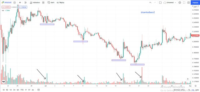
I will now go the aspect of fake breakouts. Financial institutions and whales in the market always use this support and resistance zones as liquidity levels. These levels are used to collect the stop loss of retail traders through the process of stop loss hunting. The stop loss hunting seeks to create fake breakouts and finally reversing thereby increasing the sample space of that support or resistance level.
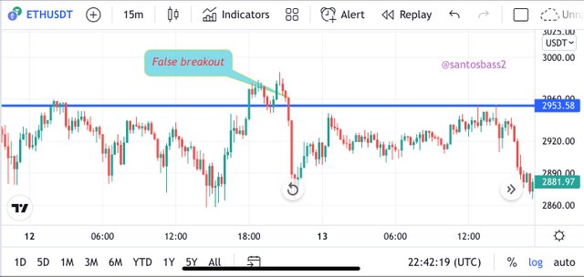
An example is the chart above where I have point out some false breakouts. This is seen as the level is broken and traders start entering their positions just for the prices to finally reverse.
explain your understanding of trend trading following the laws of supply and demand. Also explain how to place entry and exit orders following the laws of supply and demand.
Trend Trading following the laws of demand and supply
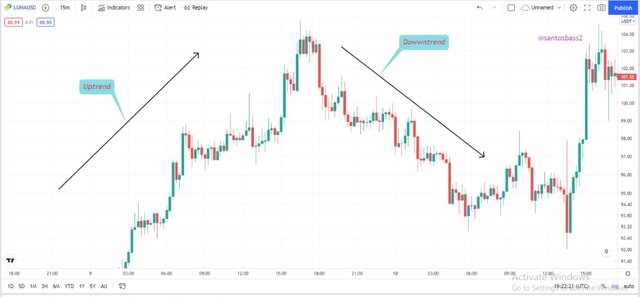
Following the law of demand and supply, we see that the prices are solely controlled by this. When we have demand exceeding the supply, we see the prices making a general uptrend showing dominance in the market by buyers.
From the chart above, we see a general uptrend formed by the formation of higher highs and higher lows. This is seen through the action of buyers being dominant as there is more demand in that particular asset.
From the setup above, we see a general downtrend which is formed by lower lows and lower highs. This means that we have the sellers being dominant in the market than the buyers.
Now I will use 3 criteria where we can find suitable entry and exit positions while trading with the trend. That will be using the Elliot waves in the break-retest-break strategy, entry after a pull back and a market trap.
Retracement following Elliot waves abc
I will begin with the stratergy for retracement following the Elliot waves abc. This is also known as the break, retest, break stratergy. It thus happens in both uptrends and downtrend. I will use the case of the uptrend to explain which reflects the direct opposite of what happens in a downtrend as well.
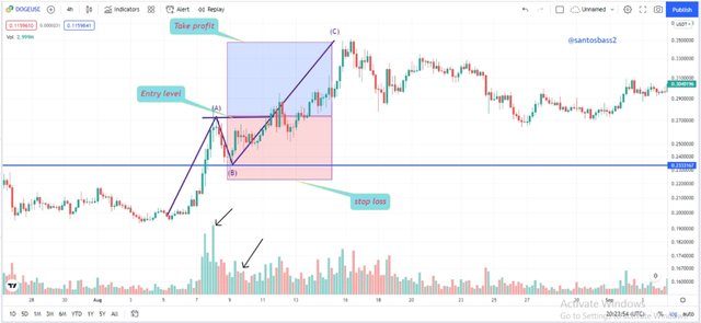
The formation of the Elliot waves abc is seen as the prices makes a break of previous support level, then makes a swing and later retest on the broken level. The stop loss is placed below the broken level and the take profit using a risk to reward ratio of 1:1 or 1:2.
Entry after pullback
The next strategy I will explain is the entry after a pullback. With this we are going to use the formations of volumes to enter when we have a low volume and exit when we have a high volume. Let’s take a look at the chart below.
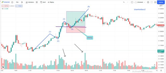
In the above chart, we have an uptrend formation which shows an entry level when we have a pullback or a retracement of the prices. We do this following the bullish candlestick on high volume which is seen above the last plotted peak.
We then see the exit at the place a little below the last minimum traced in retracement using a risk to reward ration of 1:1 or 1:2
Market Traps
The last strategy I will explain is the market traps. The market traps is seen when we have a sharp reversal in the prices after touching one of the key level which could be support or resistance level. We mostly see the market being manipulated by the strong hand such as financial institutions and whales to get the stop loss of retail traders.
We can use this is our favour to enter our each time we have a pull-back.
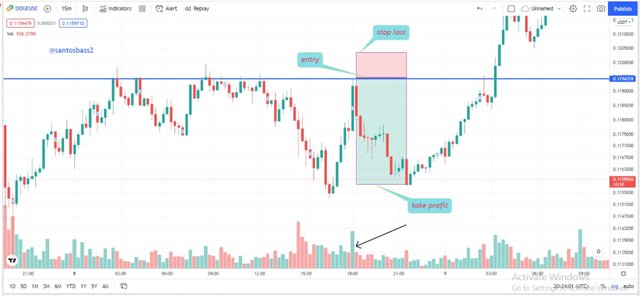
From the above analysis, we see the action of support level as it is being broken when the candle closes out the resistance line but the prices later make a pull-back starts a bearish move. It is an opportunity to enter a sell order with the stop loss placed above the resistance line as seen above.
open a live trade where you use at least one of the methods explained in the class
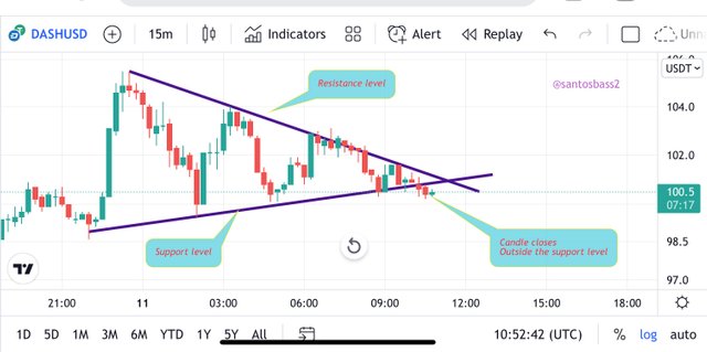
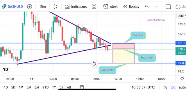
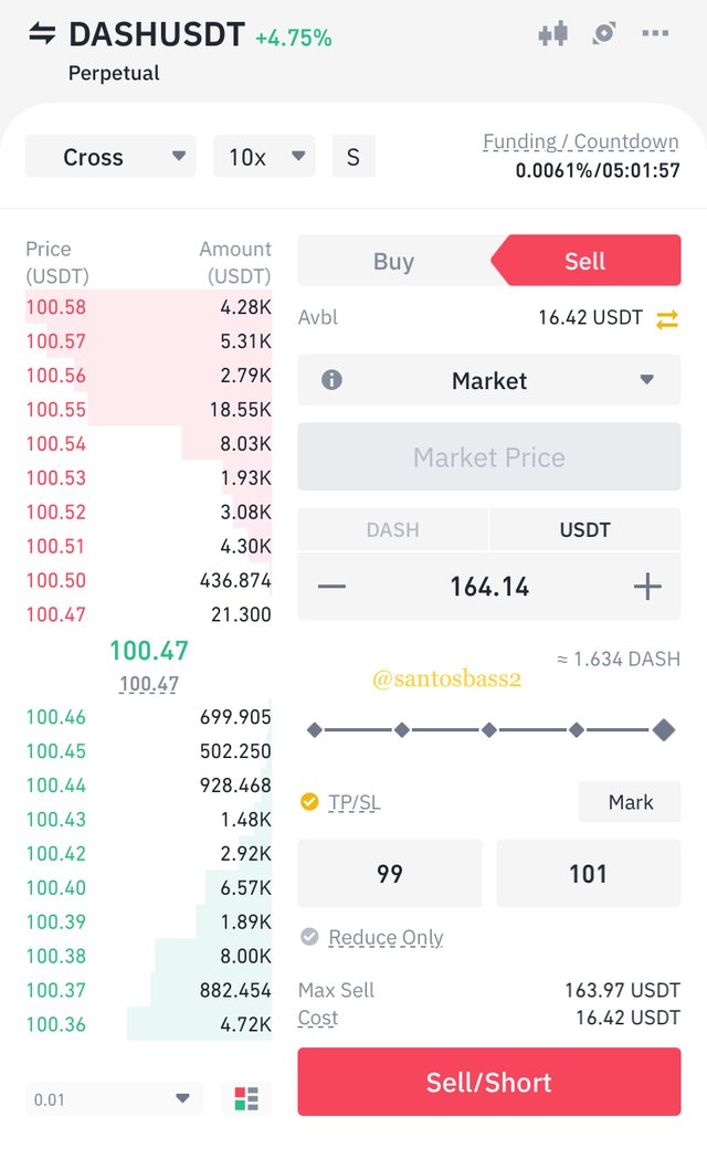
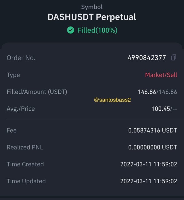
Live trading the dashusdt
I will use the aspect of support and resistance and rounded numbers learnt in this class to take my trades.
My support and resistance levels happen to be trendline resistance which I am waiting for a breakout. The breakout is seen to happen outside the support level as a bearish candle closes outside the support level. I then take a sell order.
The stop loss is placed a few pips above the breakout using rounded numbers while the take profit is place to a risk to reward ratio of 1:2. Using the Binance exchange I will use a leverage of 3X to execute my trade as seen below.
Conclusion
For the conclusion, I have explained the basis of using the chart such as the candlestick chart. I have also explained the usage of support and resistance to find entry and exit positions since it explains more of the actions of buyers and sellers in the market.
With the usage of strategies such as elliot waves, rounded numbers, market structures, we can clearly take market entry and exits.