Crypto Academy / Season 3 / Week 2 - Homework Post for [ @reminiscence01||Introduction to Charts
.jpeg)
Greetings to the Crypto Academy Community.The academy series has continued to be a learning ground.I thank you professor @reminiscence01 for the class.
INTRODUCTION
Some people go to school to study Economics, Business Administration and other financial and management courses.In the crypto space,we still have to study the market trends using charts.The Charts have graphical data which represents price summary for the selected time frame.This Chart analysis will help the trader to know the best time for entry and exit point.
Charts could be Candlestick,Bar Chart,Line Chart,Volume Chart among others.

QUESTION ONE
Explain the Japanese Candlestick Chart
This chart(Japanese Candlestick) was developed by a Japanese rice trader,Homma who used it to dominate the rice market.The Japanese Candlestick is used to perform technical analysis such that a trader can analyse it to know the direction of prices or price movement and then make informed decision on how to trade.
The Japanese Candlestick Chart is chart for representing price over a fixed period of time.One can use the Candlestick to represent or interpret price within a given period of time say 1 minute,25 minutes,1 hour etc...The Japanese Candlestick shows useful information about sentiments or reversal.
One Important point about Japanese Candlestick is that it is time-bound.It can be used for any time frame.It could be set to anytime .For instance,if it was set for 10 minutes,It means that it would take 10 minutes for all the Candles to form.Thus means that the Open,high,low and Close will be captured within the selected 10 minutes.
It is important to note that many traders prefer the CandleStick to other ones because it is easier to understand and interprete.
Essential Features of The Japanese Candlestick
The Japanese Candlestick has the open,high,close and low for the selected time frame.
•Open:This is the starting price when the Candlestick was open.For instance if I set it for 10 minutes,the Open is the price at the beginning of the 10 minutes time frame.
•High:This is highest point or price reached by the Candlestick within the selected time frame.
•Close:This is the point or price attained by the Candlestick at the end or closure of the selected time interval.
•Low:This is lowest point or price attained by the Candlestick within the selected time frame.
Other parts of the Japanese Candlestick are the real body and the shadow.
The real body is the distance moved by price starting from the opening price through the closing price.The body of the candle has a colour.Although any colour could be used.
On the other hand,the shadow is a region of unsettled price,in this area,the price could not close for the selected time frame.
Bullish and Bearish Candlestick Pattern
A Candlestick pattern could be Bullish or Bearish.Let me explain.
~2.jpeg)
•Bullish Candlestick:This is a situation where the closing price is greater than the opening price.It means that there are more buyers than sellers.The body of the Candlestick at this period is usually green.(not compulsory though).
•Bearish Candlestick:This is a situation where the closing price is less than the opening price.It means there are more sellers than buyers.The body of the Candlestick at this point is usually red.(not compulsory though).
QUESTION TWO
Line Chart and Bar Chart
•Line Chart
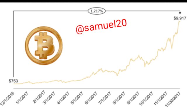 sourceLine Chart for BTC
A line Chart is another way of analysing prices.It offers a quicker analyze to long term trend.It is a way of representing price history using a single continuous line.It is important to also note that the line Chart indicates the past price and where the price closed over a period of time.
Basically,we can say that the line chart shows just the closing price for the selected time frame and so it is not ideal for day traders because it records only records the closing price for the selected time frame.
Furthermore,take note that in a line chart,the closing price for each selected time frame is connected to the next closing price through a continuous line.
Features of Line Chart
•The price values is on the vertical.
•The time value is on the horizontal.
•It shows only the closing price for each selected time frame.
•It does not show opening price,highest price and lowest price for the selected time frame.
Advantages of Line Chart
•It is ideal for beginners because it is not complex.
•Makes easy to identify support and resistance.
Disadvantages of Line Chart
•It does not contain enough information like the high,low and opening price.
•Not suitable for daytime traders.
•Bar Chart
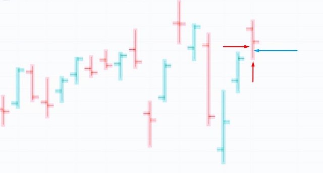
The bar chart to an extent looks like the the Candlestick.This is due to the fact that the bar chart has the four features of Open,High,Low and Close which are also found in the Candlestick.
In a bar chart,the opening indicated on the left side of the bar whilst the closing price is indicated on the right side of the bar.The high and low are indicated on the vertical length of the bar.
.png) sourcebar chart:almost like candlestick
sourcebar chart:almost like candlestick
If the vertical length of the bar is so high,it means that the difference between high and low is big,which translates to higher volatility.On the other hand,if the length of he vertical bar is short,it means that the difference between the high and the low is small(less volatility).
Whenever the Opening price is greater than the Closing price,it means that there is a bearish market and the bar is mostly coloured red.Whenever,the Closing price is greater than the Opening price,it means that there is a bullish market and the bar is mostly coloured green.
The bar chart clearly shows where the price started,highest high,where the price ended and the lowest low for the selected time frame.
QUESTION THREE
Why The Japanese Candlestick Chart is Mostly Used by Traders
We all know that every successful trader takes opportunities without delay and success comes when good analysis and preparation meets opportunity.So for a trader to make good market decisions,the trader must do thorough technical analysis and then waits for an opportunity to show up.The Japanese Candlestick Chart offers a trader the rightful and comprehensive information needed to analyze and understand the market trend.Why do I say so?
Traders have preference for the Japanese Candlestick Chart because it clearly shows the opening price,the highest and lowest price as well as the closing price of an asset within the selected time frame and so it is easier for the trader to predict or forecast the next move in price,whether to buy or to sell or to hold.
Furthermore,the Japanese Candlestick Chart provides detailed and accurate information on the price movement through a graphical display of the demand and supply for the selected time frame.When demand is higher than supply,there would be increase in price and vice versa.
The Japanese Candlestick is ideal for both short-term and long-term purposes and so virtually all traders(both daytime and long time) can use it for proper and reliable analysis.
QUESTION FOUR
Bullish and Bearish Candle
A Candlestick is chart used to perform market analysis.It is usually set to a time frame:minutes,hour,daily, weekly,monthly etc depending on the choice of the trader.There will always be an Open, high,close and low for each selected time frame.
For Instance I select 1hour Candlestick.It means the candle will form in 1 hour.The Open,high,Close and Low will all be captured within the selected 1-hour time frame.
Bullish Candle
This is a candle where the Closing price is greater than the opening price.This means that the price started on a low and closed on the high.It means that the buying pressure is greater than the selling pressure and so the price will Increase resulting to a bullish trend.In this case,the candle is always coloured green or blue.The most important thing to note is the opening and closing price and not colour of the candle.
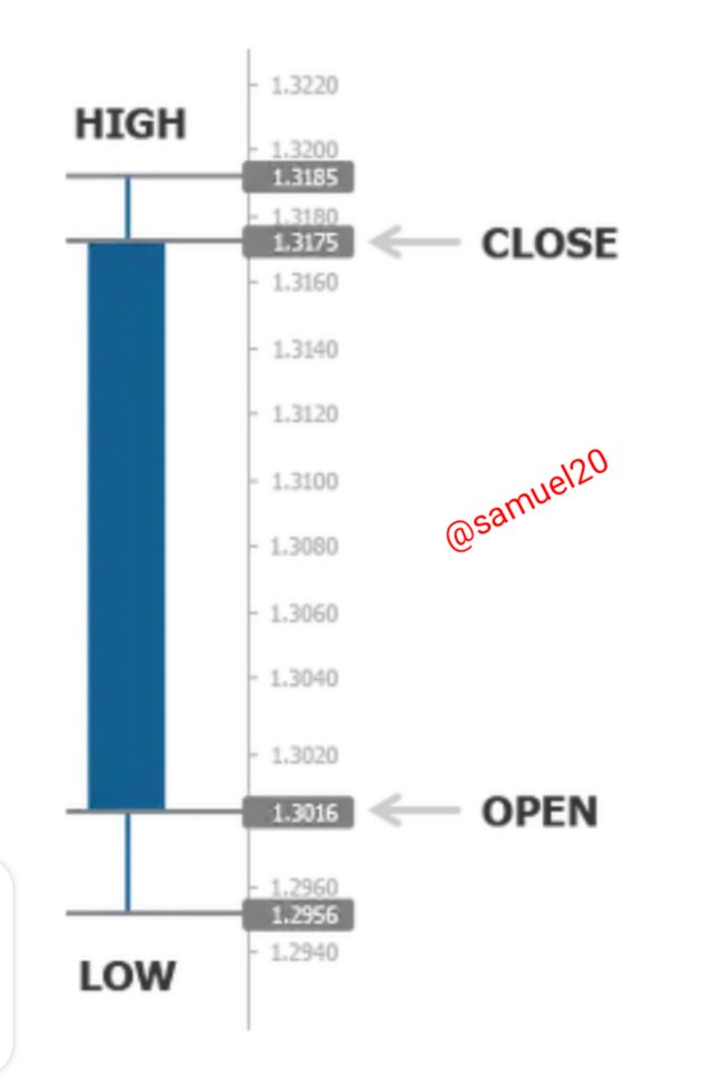 source
From the candle above,the price opened at 1.3016,got to a highest level of 1.3185,lowest level of 1.2956 and closed at 1.3175.You can see that the Closing price(1.3175) is greater than the Opening price(1.3016).This is a Bullish Candle.
Bearish Candle
This is the opposite of the bullish candle.It is a situation where the Closing price is less than the Opening price.This means that the price started on the high side and ended on a low.This suggest that the selling pressure is greater than the buying pressure and so price will decrease resulting in a bearish trend.It is usually coloured red(though colour is not necessary).
The most important thing to note is the opening and closing price and not colour of the candle.
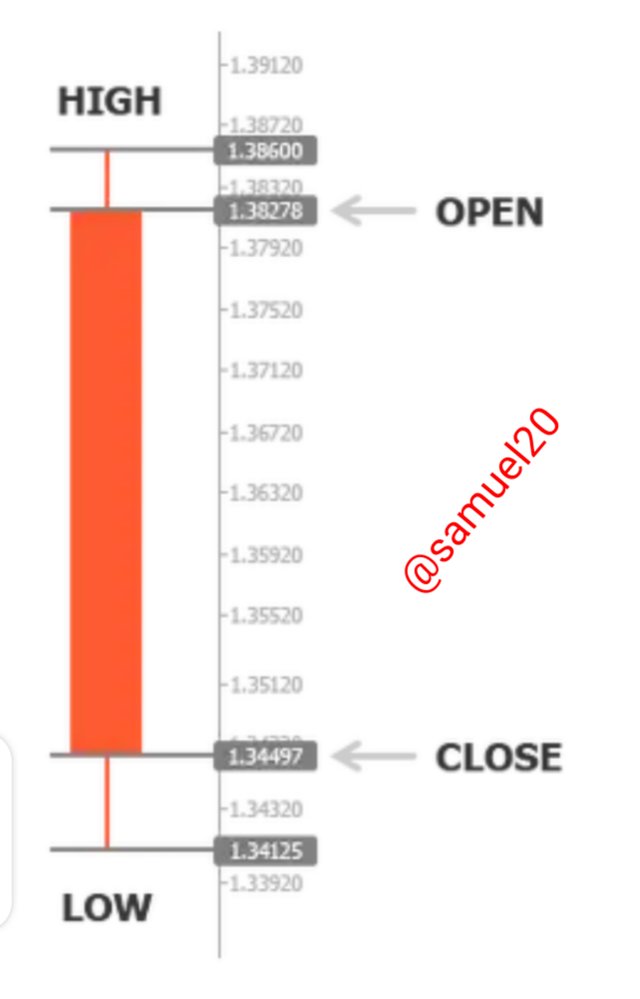 source
From the Candle above,the price opened at 1.38278,got to a highest level of 1.38600,lowest level of 1.34125 and Closed at 1.34497.You can see that the Closing price (1.34497) is less than the Opening price (1.38278)....This is a Bearish Candle.
CONCLUSION
Charts are used for making proper market analysis as to know the price movement(high or low) which would help the trader to make informed decision on when to buy,hold or sell.
There are lots of charts such as candlestick chart,bar chart,line chart etc that are used to study market trends for a selected time frame.