CRYPTO ACADEMY / SEASON 3/WEEK 2-HOMEWORK POST FOR PROFESSOR @reminiscence01 ON INTRODUCTION TO CHARTS BY @ruthjoe
Hello steemians,
Its an another week of cryptoacademy and am happy to be here, thank you so much @reminiscence01 for a well delivered lecture on introduction to charts. Am here to answer to question that followed after the lectures.
QUESTION 1: EXPLAIN THE JAPANESE CANDLESTICK CHART(CHART SCREENSHOT REQUIRED)
The use of Japanese candlestick came from Japan by a man whose name was Rice trader munehisa Homma in the 1700's, hence the name Japanese candlesticks.
Japanese candlestick chart is a currency chart, that gives a more detailed information about the price of an asset than any other chart. The Japanese candlestick chart is one of the popular charts used today in the world of crypto.
The chart is made up of several candle sticks with two colours. The colours of the candle representing different things. One of the colours represents a buy/bullish in price and the other colour representing a sell/bearish in price.
A time frame is set on the chart for the candle stick to form, therefore the candles on the Japanese charts generally represents the price action of that time. For example if the time frame set on the chart is 30mins, it means that at every 30min a new candle will be formed. ie each candle represent a time frame.
Whenever a candle is bullish, the opening price of that asset is found below the candle and the closing price is found at the top. While for bearish, the opening price of the asset is found at the top of the candle and the closing price will be found below.
The chart below is a Japanese candlestick chart showing price action for asset EUR/USD
Fig 1A: is a Japanese candlestick chart with its time frame set at 30mins. That means it took 30mins for each of the candles to be formed, therefore, every 30mins a new candle is formed on the chart.
Fig 1B : is a Japanese candlestick chart with its time frame set at 5mins. That means it took 5mins for each of the candles there to be formed, therefore for every 5mins a new candle is formed on that chart.
The chart fig 1A has a longer time frame than fig1B.
As you can see from both fig1 A and B there are two colours of candles on each chart. Orange colour candles and blue colour candles. The blue colour represents a buy/bullish and shows that the price of asset EUR/USD increased having more traders who were buying than traders who were selling. While the colour Orange represents a sell/ bearish and it shows that the price of asset EUR/USD dropped or went down, having more traders who were selling than traders who were buying.
The point shaded green has the same time frame for both chart A and B which is 60mins.
Fig 1
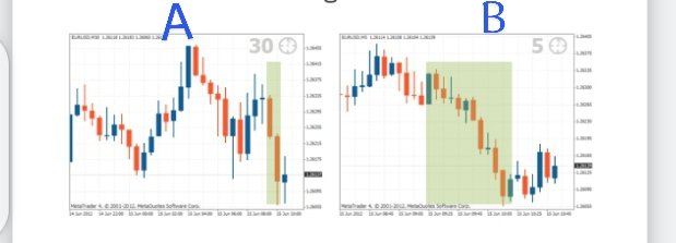
Image source
QUESTION 2: DESCRIBE ANY OTHER TWO TYPE OF CHARTS( SCREENSHOT NEEDED)
I will be discussing about two charts namely : The line chart and the bar chat.
THE LINE CHART
The line chart was founded by Charles Dow. The line chart gives a simple information about an asset with the use of simple lines hence the name line chart. A line chart is seen as the simplest form of chart used in currency trading.
One important significance of the line chart is that it helps reduce crowd on the chart and then it shows the support and resistant level on the chart.
A line chart does not show things like opening price, high or low of an asset, It only shows the closing price of an asset, therefore it can also be called a security chart.
SCREENSHOT OF A LINE CHART
Fig 2
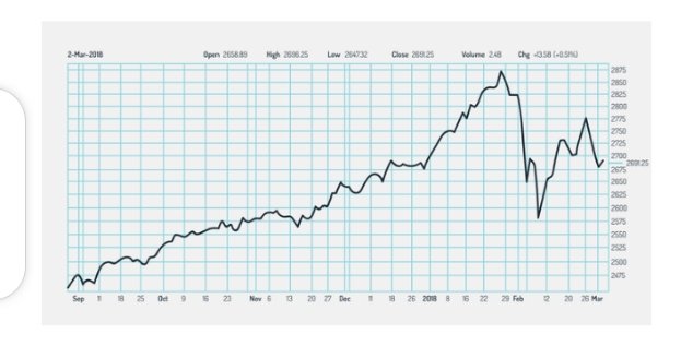
From fig 2,: line chart is showing the price action of the asset. A single line is seen moving from left to right. The function of this single line is to link the daily closing price of the asset daily. Fig 2 is not crowed or noisy therefore the line chart above makes the trend on the chart to very easy to see, that is another importance of the line chart.
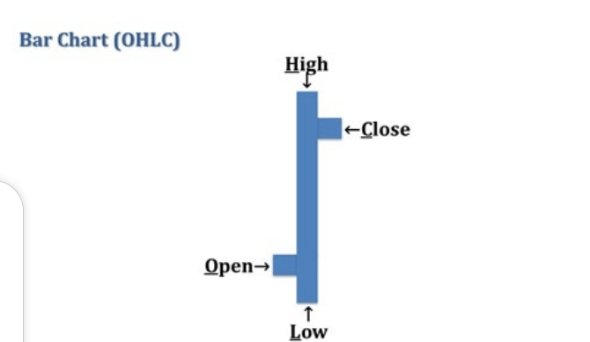
A BAR CHART
A bar chart is the next popular chat used by traders in currency trading. a bar chart is made made up of bars. On a bar chart, each bar shows or represents the opening, highest price, lowest price and closing price of an asset for a particular time.
Fig 3
Source
From fig 4 below, the opening and closing price in the chart is shown by a horizontal line that is short. The opening price of he asset is represented by a dash found at the left side of the vertical bar. While the closing price of the asset is shown by a horizontal line at the right hand side of the bar.
Whenever the left dash which is also known as the opening price is lower than the dash found at the right hand side the bar is shaded with a green colour signifying increase in the price of the asset as shown in fig 4. While where there is a decrease in price of the asset, it is shaded with the colour red.
SCREENSHOT OF A BARCHAT
Fig 4
Source
QUESTION 3: IN YOUR OWN WORDS, EXPLAIN WHY THE JAPANESE CANDLESTICK CHART IS MOSTLY USED BY TRADERS.
The Japanese candlestick chart is a very detailed type of chat and the reasons why it is mostly used by traders include the following.
The Japanese candlestick chart is mostly used by traders because it helps them to know the current price of an asset in the market Just by looking at the chart:
The Japanese candlestick chart is a very colourful chart,you can easily see what is going on, each colour representing when the asset is buying or selling. So traders would not want something that would stress them analysing, thats one reason they prefer the Japanese candlestick chart.It gives traders direction on where the market is heading to without so much stress, to prevent loss in trading .
Japanese candlestick chart helps the trader and give them a detailed idea on the market pattern of an asset. Making them know the future price of an asset. This is one of the most reasons why traders prefer this chart over others.
QUESTION 4: DESCRIBE A BULLISH CANDLE AND A BEARISH CANDLE IDENTIFYING ITS ANATOMY (SCREENSHOT REQUIRED)
SCREENSHOT OF A BEARISH AND A BULLISH CANDLE
Fig 5
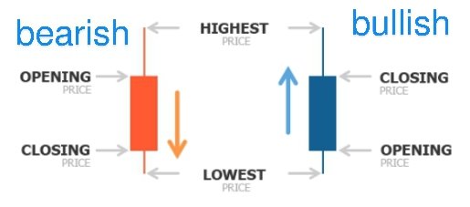
Image source
A Bearish Candle : from my fig 5, a bearish candle there is orange in colour. A bearish candle shows that the price of an asset dropped. It also means that the market is selling.
Anatomy of a bearish candle
A bearish compose of the following:
Highest point: The highest point of a bearish candle is the highest point the price of the asset got to while selling in a particular time.
Opening : The opening price for an asset at bearish is usually found at the top of the candle. This shows the time the movement of the price of asset began. For a bearish it is the point where price began to drop down in a particular time.
Closing : The closing price for an asset at bearish is usually found at the bottom of the candle. Closing price shows the time the movement of the price of an asset ended or closed.
Lowest price: The lowest point of a bearish candle is the lowest point the price of the asset got to while selling before it closed in a particular time.
A Bullish Candle
A Bullish candle from my screenshot in fig 5 is represented with the colour blue. A bullish candle shows that the price of an asset went high, therefore the market is buying. The length of the candle shows how long it kept buying.
Anatomy of a bearish candle
A bearish candle is composed of the following.
Highest point: The highest point of a bullish candle is the highest point the price of an asset got to while buying in a particular time
Opening point : The opening price of an asset at bullish is usually found below the candle. It is like the take off point where price began to rise in that particular time
Closing: The closing point of a bullish asset is found at the top of the candle. Closing point shows the time the movement of price of the asset ended or closed.
Lowest point : for a bullish asset the lowest point shows the lowest price the asset was buying or was bought in a particular time.
CONCLUSION
It has been an amazing time learning about charts. Charts are important basic tools used for trading and it is essential for traders or aspiring traders to know how to use and interpret them as it will determine how far one can go with trading.
This post has been rewarded by @bright-obias from @steemcurator04 Account with support from the Steem Community Curation Project."
Keep posting good content and Keep following @steemitblog for more updates. Keep on steeming as well as improving your content to get more attention. Thank you, Steemit Team!
Thank you so much for the support