[ Crypto Trading by Identifying Support and Resistance ]-Steemit Crypto Academy | S6W3 | Homework Post for @shemul21
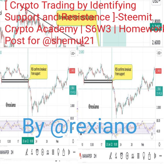


Hello steemians, welcome to my homework task for professor @shemul21. This task is a question and answer task based on the lesson on support and resistances. We know that support and resistance maps the basics or the foundation of technical analysis in trading the financial markets as a whole. Without much waste of time let’s get into the explanation and answers to the various questions as stated by my professor.


The support and resistance marks the bases of technical analysis and understanding this tools or areas on a price chart is very important to a cryptocurrency trader. The support and resistance are areas on the price chart whereby the price got to a certain value or value range and played a pause such that the price stays at that point and reverses back and when prices break these areas a trader sees great entry opportunities in the market. It’s either buyers are putting pressure on the market for the sellers or the sellers are putting pressure on the market for the buyers making the price to only get to a particular point and reverses.
The support and resistance can be identified and marked as a line or a zone on the price chart where the price trades to a certain value or zone and maintains that position before reversing such that this may repeat with time. On a scale of being perfect, we can only consider the support and resistance we place as having some level of certainty over market breaks. We can liken such areas or zones on our price chart as the supply and demand areas or prices. To be sure an precise that your like or zone is that of a support or resistance area, you have to make sure the price touches that zone or line at least three times. If such areas are revisited on higher time frames, you can consider them as strong support or resistance area and they are bent on forming a good supply and demand area on the price chart.
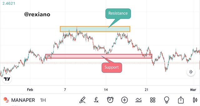
We can see from the screenshot above how I drew a support and a resistance on a ranging market such that the prices goes up and ends at a particular zone (resistance) and they come down and ends at a particular zone (support). This gives the trader the advantage of trading both ways until the market experiences a breakout to either side.


The support and resistance levels can be detected to occur in different ways on the price chart such that we may have a sloping price that still forms support and resistance levels. In a normal price moving in a range we will have the support and resistance levels as horizontal lines just like the one on the screenshot above. The support and resistance have some certain rules on drawing these lines. These I have described below.
1). Determine if you are drawing your support and resistance lines on the wicks or body of the candles and maintain one.
2). Clear the chart so it’s completely clear for you to see well.
3). Zoom the chart such that you can see the tips well before drawing lines
4). Your levels should touch at least three candlesticks
Basically we have three types of support and resistance that exist. These are; Horizontal support and resistance, Dynamic support and resistance, and the Sloping support and resistance. I will describe each of this type below.
The horizontal support and resistance tend to be the easiest ones to identify ok a price chart and are often used on a ranging market. It should be noted that a previous resistance when broken can become the next support. This also means that when a support is broken, it becomes a new resistance for the asset. To identify these on a price chart you look at the price history of the asset and notice where the price seems to have pause always. This pause can be on both ways meaning the price may cross the level and moves upward but will definitely come back to bounce on the same level or cross the level to the downside only to return and bounce in this level and head for the downside again. The screenshot below gives a better understanding of what I’m trying to explain.
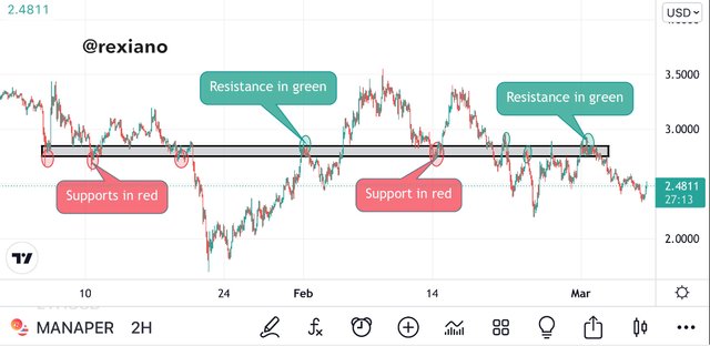
We can see the consistency in market price hitting the top (resistance) and bottom (support) levels several times. When the price trades below this leve it forms a resistance and when the resistance is broken, the price trades above this level turning the previous resistance into a support. The market breaks the resistance and head upward and after some bullish movements, the price failed to maintain its course and so the bears took it down and breaking the suppose support to the down side.
We can make several example of such market movements detecting when and where to make entry as soon as the support/resistance is hit or broken.
When the price of an asset is in an uptrend or a down trend, to identify the trend direction traders always draw trend lines. In the case of an uptrend the trend line will be drawn connecting the progressive higher lows that form (this forms a support to the upper slope) while in the case of a downtrend traders draw a trend line connecting the lower highs such that a sloping like is seen on the price chart ( this forms the resistance on a downslope). In some cases the price may trade in a zone such that the resistance and support can be plotted at once. This means we can have a scenario where a line will connect higher highs and higher lows in an uptrend. I’m such cases we have support and resistance forming a wedge. There are basically two types of sloping levels; the uptrend and downtrend slopes.
For the uptrend slope we have a bullish market such that the higher lows form an inclined line heading to the upper part of the price chart. A line is drawn connecting the candlesticks joining together either at the candle bodies or wicks of the higher lows.

The above screenshot describes the formation of a support level in an uptrend such that any breakout is quickly identified by the trader. We can see how the trend line (support) links the higher lows of the uptrend forming a line to the upside.
The downtrend slope is formed when the price trades forming a series of lower lows and lower highs such that the lower highs form an inclined line to the downside which will connect lower highs continuously. This formed slope is known as the resistance of the price trend which upon prices touching this line they are rejected during correction and sent to the downside to continue the trend.
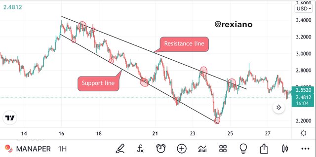
As seen from the above screenshot, I’ve drawn the resistance line connecting lower highs as seen from the downward move of the price. We also have a support line below joining lower lows. Upon any breakout to the upside as seen at the end of my resistance line, the trader makes a good entry position for a possible bull run. On the other hand, when the price hits the resistance slope, the trader can make an entry to a Short position.
When the market is flexible, it can make corrections at certain points which marks the beginning of pullbacks.
The best tools used to identify these points are the moving average indicators. I’m this case I will use the Exponential Moving Average indicator. When I add three EMAs on the chart, when the price touches the smaller period EMA for example the 20 period EMA it identifies a healthy market movement and if the price touches the mid period EMA such as a 50 periodEMA, it may take a longer time to return to this line and so it indicates a longer price movement which may signify a bull/bear run depending on the side to which the price was previously trading. When the price trades and touches the largest EMA period such as the 200 period EMA, it will signify a possible trend reversal or test a certain critical level and continuous the previous trend. From these moving average lines we can get good resistance and support detection known as the dynamic support/resistance on the price chart.
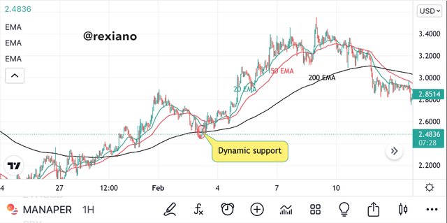

We can see from the screenshots above how the price trades and touches the three average lines then move away for some period of time before returning to the lines again. This depicts a strong support and resistance level as seen on both screenshots.
With the above description of support and resistance on the different types we can now carryout this activity with clarity during technical analysis. A good thing to take note about is the fact that at different time frames the support and resistance have different significance. We have to always test the 1D, 4H, and 1H timeframes to understand the relevance of a suppose support or resistance before taking them into consideration when carrying out our intraday trades.


Trend breakouts are identified mostly when the support or resistance level is broken and the price moves above or below this levels. When the price of an asset trades far away from the support after crossing it to the downside, it’s considered a breakout and if this happens to the resistance and the price trades far away upward it’s considered a breakout from the resistance level. Nonetheless, this breakouts can be false and true depending on the rate of continuation of the breakout process. By this, we can categorize breakouts into successful and false breakouts. I will describe each breakout process below.
A successful breakout from the resistance and support can occur as a trend continuation to r trend reversal.
Continuation Breakout:
The continuation breakout occurs when the price was primarily trading in a particular direction such that it formed a support or resistance where the price slowed down in movement forming either of these levels. After the slow down, the price breaks the support or resistance and moves to the same direction as the previous price movement.

Reversal Breakout:
This type of breakout happens when the price trades in a particular direction and the bulls or bears pushing the price to that direction tend to lose strength and are unable to push the market further into that direction such that the price forms a resistance/support ending up with the price moving in the opposite market direction. The screenshot below is a good example of such reversal breakouts.

These are trend breakouts that takes place and later found to be false such that the price trades into the previous range. This type of breakout can happen as a reversal for or a trend continuation breakout but seen to be false.

We can see on the chart above how the price broke through the support/resistance line indicating a breakout such that the trader could’ve taken a wrong decision by opening the opposite position. Most often this happens due to liquidity injection and can cause a trader to lose funds. To avoid such false signals from support or resistance breakouts, we have to add another indicator such as the RSI to filter the noise and comply with each true or successful breakout in order to avoid wrong trading signals.


As seen from the false and true breakouts we can notice that there is the need for filter indicators when using breakouts signals as entry opportunities. Using the Relative Strength Index and the trading Volume to filter this signal will help a lot.
The RSI indicator is an indicator known to identify the price movement and momentum of the market based on buying and selling pressure. This indicator has a center point which acts as the zero level and above it is the buying pressure zone while below is the selling pressure zone. When the price trades higher than 70, we know that the asset trades in the overbought region while if the price trades below the 30 levels we know that the asset trades in the oversold region. When we have the price in the overbought region, there’s a possibility of sell offs for the bulls to take profits and when it’s in the oversold region, there’s much buying done such that the market value begins to rise.
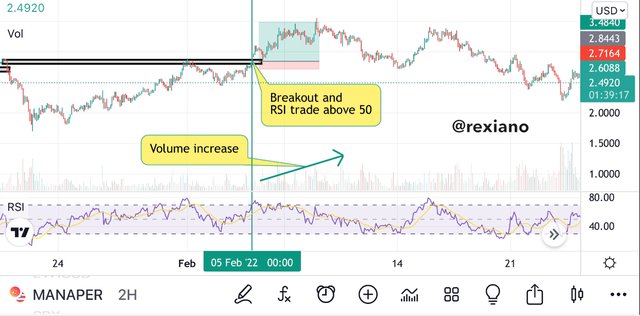
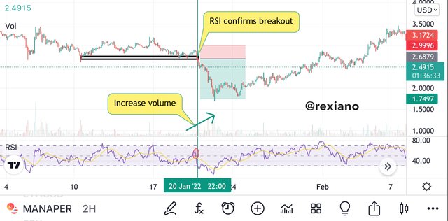
The middle band of the RSI which stands as the zero level can also acts as a support and resistance identification point. Therefore when the price breaks our support, the RSI has to trade below the 50 level and towards the oversold region. If we have a broken resistance, the RSI has to trade above the 50 level such that the price on the RSI trades into the overbought region. In these cases we have a successful breakout confirmation from the RSI indicator.

The screenshot above shows clearly how the RSI confirms our breakout point from the support line on the price chart. We can see how the RSI trades below 50 after the breakout. Whenever the RSI doesn’t conforms the breakout, it should be considered a false breakout signal and should be avoided.
Looking at the trading volume when confirming support and resistance breakouts can be done very easily. During price consolidation or when prices trades in a range, the trading volume is minimal and during breakouts we have high volume peaks. To confirm breakouts and determine entries using the trading volume alongside the RSI indicator is made very easy to every trader.
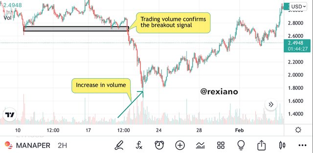
We can see how the trading volume increased after the same breakout that was confirmed by the RSI indicator above.
A buy signal is seen when the price breaks a resistance and heads upward indicating a bull run and the trading volume increases to confirm this. Looking at the RSI, if it trades above the 50 level therefore we have a full confirmation to make a long position entry.
To make a sell entry we have to make sure that the price broke through the support and the trading volume increases from that point. If the RSI further confirms this by trading below the 50 level into the oversold region, we make an entry for a short position. This is seen on the following screenshot.
To make trade entry one has to take key note on setting a stop loss just above or below the broken resistance or support respectively.


I will analyze the MANAUSDT pair on Binance platform via tradingview.
Observing this pair on tradingview I discovered that it was trading in a current downtrend movement and has strong resistance on a 1D, 4H and the 1H timeframe which I used for this analysis. Drawing a trendline maps my resistance with the lower highs touching the resistance like in different points.
On observation of the price chart, I see a breakout from the resistance line heading for a bullish market. Confirming this with the RSI indicator it shows that the RSI is trading above the 50 level. The trading volume is not yet quite clear as to if it’s on an increase o already but looking keenly at the trading volume I could see how it begins a rising trend. In consideration of these confirmation, I made an entry for a Long position. The screenshot below can show the analysis and the following screenshots show the trading activity on my Binance account.
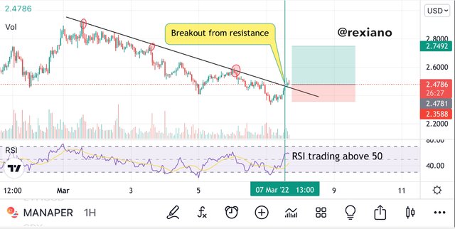
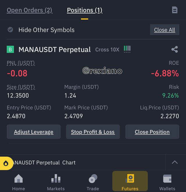
We can see that the trade in progress shows a negative effect but no need to worry because the timeframe I am using is 1H and this has an effect on the time it will take for the trade to complete its action. At the moment of the Binance screenshot, the price was taking a reatrcement to the resistance line such that it has to retest it and then later move upward to our target point. This breakout was confirmed also from the formation of two candlesticks outside the resistance line.


The limitations of the support and resistance criteria of technical analysis lies on the fact that they are also known to provide false signals. This makes the criteria or strategy dependent on secondary indicators to be used as filter indicators. For example, using the RSI indicator as a filter indicator requires that the trader have a good knowledge of this indicators in order to be able to identify successful breakouts for entry opportunities.
The support and resistance levels only provides the trader with information about passed market activity but doesn’t readily predict what can happen in the market. For example of a certain news about a cryptocurrency asset moves about and causes investors to buy off or sell off that asset very sharp such that the is a sharp breakout on the support or resistance level. This will be very difficult for the trader to identify. Another case is that of liquidity injection from whales, this always disrupts market movement and can cause a trader to loss funds if such a trader depends solely on the signals from the support and resistance breakouts.


The support and resistance marks a vital component of technical analysis in trading cryptocurrencies and so knowing how they function is of utmost importance. Drawing these levels on the price chart is very simple and will give the trader a clearer view of the market activities currently going on. Since the price action is a graphical representation of the market psychology of all investors and traders working on a particular asset, the trader through support and resistance level identification has an upper hand in detecting supply and demand areas or price values.
It’s known that no trading strategy is 100% true but by applying other indicators to assist in filtering the noise from breakouts on resistance and support levels will make the trader have an edge over the market. Notwithstanding, it’s always good to check the current fundamental analysis aspect of a particular asset before carrying out this strategy and placing trades.