Effective Trading Strategy using Line Charts -Steemit Crypto Academy | S6W1 | Homework Post for @dilchamo


Hello Steemians, it is great to be here again in the Steemit Crypto Academy Season 6. I'm glad to be part of the lesson given by professor @dilchamo on Effective Trading Strategy using line charts. The lesson was informative and I will be performing the homework tasks in this post.
Understanding Line Charts and it's Uses
Before I explain Line Charts, let me give a brief explanation of Charts from the trading perspective. Charts help to presents the market reactions, price data, supply, and demand of assets graphically. With this, traders can analyze the historical price data and be able to predict future prices. Line Chart is one of the technical charts in the crypto market today for data visualization of price.
Line charts are preferred by most traders because of their simplicity to read and understand. The line chart represents and connects historical price data points using a single line that continues in the future by connecting the closing prices of an asset.
Unlike other complex charts in the market today which presents several price data points like the opening, closing prices, highs, lows, etc. This makes it difficult for traders to understand and predicts future prices.
Lines charts only connect the closing prices of an asset using a simple line. This makes it very easy for traders to make good use of price history and data points to make good trading decisions.
Uses of Line Charts
Line charts are very useful in the market today in making trading decisions. It is considered an important technical analysis tool in the data visualization of historical prices. Line charts can be used by traders to understand price changes and also areas of supply and demand in the market. The closing price of the asset is an important factor of price and this forms the basis of line chart representation. Traders can easily obtain key price information like trends, support, and resistance in the market as line charts helps to filter out noise in the market.
Identifying Support and Resistance levels Using Line Charts
Support and Resistance areas are important technical analysis tools every trading strategy is based on. These areas represent where there are high selling and buying pressures in the market. Traders always utilize support and resistance areas for price reversals and also continuations.
Unlike candlestick chart that is complex to visualize because of their candle wicks and boy, the line charts connect the most important price data points which is the closing price. Here, traders can easily identify key support and resistance levels in the market.
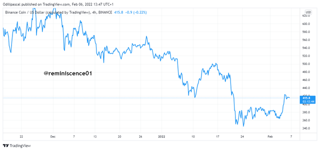
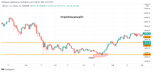
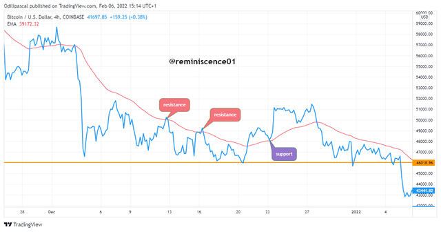
Support levels are mostly areas of high demand in the price is an asset. This level serves as a strong buying power as price always reverses to the upside when it approaches the support level. The support also serves as a risk management tool as traders utilize these levels to take profit positions for a sell trade. The reason is that the price is always expected to reverse at a support level. But that is not always the case as the price can also break the support level to continue decreasing during a strong bearish market. An example of a support level on a line chart can be seen on the chart below.
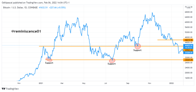
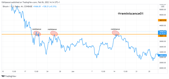
Resistance level represents an area of high supply in the price of an asset. This can be triggered by high selling off and take profits by traders. The resistance level serves as a strong selling power as the price is expected to get rejected when it comes to this level. A resistance level can be broken to become support during a strong bullish trend. An example of a resistance level on a line chart can be seen on the chart below.
Identifying support and resistance on the line chart is very simple. This can be done by connecting the previous swing highs and swing lows with a horizontal line. This line can be drawn into the future as a reference point to make trading decisions. When price breaks the support and resistance level, it signals a continuation of the original trend and also allows a trader to open a trade position in the direction of the breakout.
Difference between Line charts and Candlestick Charts
The line chart is simple as it is represented with a line. This makes it difficult for traders to derive more price information from the market. Though this might be good for some traders as it filters and cancels out noise found in other technical charts.
The line chart only connects the closing price of an asset using a line. The Japanese candlestick on the other hand represents valuable price information by displaying the opening price, high, low, and closing price of an asset over a defined period. The candlestick chart can be utilized to reveal the interaction between buyers and sellers in the market.
An example of a candlestick chart is shown below.
Looking at the candlestick chart, the colors of the candles can determine whether the buyers or the sellers are in control of the market. Also, the buying and selling pressures can be determined using the formation of the candles. Understanding the candlestick is difficult especially for a novice trader.
This makes the line chart a better option because of its simplicity to read and understand. Line charts work well for long-term traders who do not care about the noise and dynamics of price, rather the direction of the price is most important to them and this is why line charts are best preferred for this purpose.
Combining a Suitable Indicator with a Line Charts
In this section, I will be combining a line chart with moving averages. Moving average is a trend following indicator that is represented using a line on the chart. This makes it more suitable to be used with a line chart as a confirmation tool to determine the market trends. The moving average also serves as dynamic support and resistance on the chart.
Also, the crossing of prices above and below the moving average serves as a trend reversal signal to traders. Furthermore, the closer the price trades around the moving average, the weaker the current trend. Also, the farther price is away from the moving average, the stronger the current trend. We can obtain good trading signals when we combine we use the moving average on a line chart.
Support and Resistance Using Moving average on Line Chart
We have established that the moving average serves as a dynamic support and resistance level on the chart. During a strong trending market, price retraces to the moving average to find support and resistance before the continuation of the original trend. This offers traders a signal and opportunity to enter a trade position in the direction of the original trend.
Looking at the BTC/USD chart above, we can see how the moving served as a support and resistance levels on the line chart. During a downtrend, the price retraces above and finds resistance at the moving average line. After that, the price reverses down to continue the downtrend. Similarly, during an uptrend, price retraces down to the moving average line to find support for a continuation of the uptrend.
Identifying Trends and Trend Reversal using Moving average on Line Chart
From the section, we established that when the price is trading above the moving average line, it indicates an uptrend as seen on the chart below. Also, when the price is trading below the moving average line, it indicates a downtrend. A break above or below the moving average line signals a trend reversal and this gives traders an early entry opportunity to open a position in the direction of the new trend.
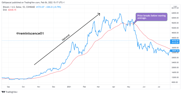
Looking at the chart above, we can see how BTC/USD was in a strong uptrend as the line chart is seen away from the moving average in an upside position. After some time, we see price trading close to the moving average which signals the weakness of the bullish trend. At this point, traders lookout for a reversal which was confirmed as the line chart breaks below the moving average.
Traders can combine the moving average with the line chart to obtain valuable trading signals to make good investment decisions in the market.
Understanding Bullish and Bearish Trading Opportunities Using the Line Chart
Understanding the direction of the market is paramount in trading cryptocurrencies. Only then can a trader look for a trade position in the direction of the trend. Trading against the direction of the market is very risky and can lead to losses. Therefore is necessary that a trader identifies the direction of the market before making any trading decision.
In the previous section, I have explained how to identify the direction of the market (Trend) using the moving average on a line chart. Now let's look at how we can obtain Bullish and Bearish trading opportunities with it. Professor @dilchamo has explained one method of identifying trends which is the use of Ascending and Descending Triangles.
Bullish Trade Opportunity Using Moving Average
Here, price is considered to be in an uptrend when it is trading above the moving average. Similarly, When price breaks above the moving average, it also signals a trend reversal from bearish to bullish. Traders can utilize this information to look for bullish trade opportunities.
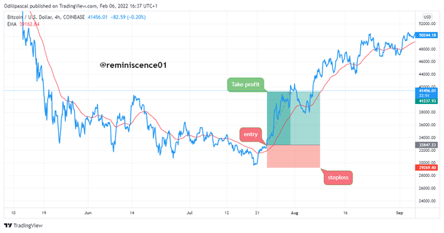
In the BTC/USD chart above, I have identified a bullish trade opportunity using the moving average on a line chart. Here, I noticed that price broke above the moving which shows that the trend has shifted from bullish to bearish. After that, a trade position was opened with a stop loss placed below the moving average line. We can see that the trade was successful and yielded more than a 1:3 risk-reward ratio.
Bearish Trade Position Using Moving Average
Here, the price is considered to be in a downtrend when it is trading below the moving average line. Similarly, when prices break below the moving average line, it also signals a trend reversal from bullish to bearish. Traders can utilize this information to look for bullish trade opportunities.
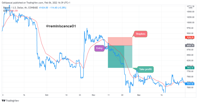
In the chart above, we can see how a bearish trade opportunity is identified on BTC/USD using a moving average. Here, the price broke below the moving average line which signals a trend reversal from bullish to bearish. After that, the price went back up to find resistance on the moving average line. A sell trade opportunity is opened as the price reversed downward with a stop loss placed above the moving average line.
Advantages and Disadvantages of Line Chart
Advantages of Line Chart
- Line Chart is very simple to read and understand. It appears on the chart by connecting the closing price points using a line. This makes it very easy for traders to interpret the line chart.
- Unlike other types of technical charts, line charts make use of only the closing data points of price. This helps to smooth the trading signals and also cancel out noise from price fluctuations.
- The line chart helps traders to easily identify key Support and Resistance levels in the market. Unlike candlestick charts which are complex and difficult to identify these levels because of candle wicks, the line chart filters out this noise by taking into consideration only the closing price. This helps to find key support and resistance levels compared to the candlestick chart.
Disadvantages of Line Chart
- The line doesn't provide enough information for traders to make a good trading decision. The closing price of an asset is not enough to determine and predicts price movements. An example is the distance between the high and the close of price is very important to determine the buying pressures and the selling pressures in the market.
- The line chart is mostly suitable for higher timeframe and long-term traders. Using line charts in intraday and lower timeframe comes with a lot of noise due to price fluctuations. This makes it difficult for traders to profit from using line charts.
- A wide range of previous data points is required to reveal market information. This is different from a candlestick where a trader can determine price reaction using the open, close, high, and low of the candlestick.
- Important price information like gaps are not revealed inline charts. Therefore, the line chart does not reveal all the activities and reactions of price fluctuations.
Conclusion
Lines charts are one of the technical charts in the financial market today. It is mostly used by traders because it is easy to read and understand. Also, the line chart helps to smooth and filter noise from price fluctuations. Also, line charts help to reveal key price information when combined with technical indicators and other technical analysis tools.
The line chart is not suitable for all trading strategies as it doesn't provide enough price information. There are so many technical analysis charts and I believe each of them has its pros and cons. Therefore, it is necessary traders analyze these and chose the one that best suits their trading style.
Note: All images used in this post are my personal charts copied from Tradingview, unless stated otherwise.
Thank you professor @dilchamo for this amazing lesson on Line Chart.