Steemit Crypto Academy Season 3 Week 2 ||Beginners Course| Introduction to charts by @preshymukel
_1625650274887.jpg)
I want to thank Prof. @reminiscence01 specially for this wonderful lecture, it was delivered with great simplicity. I must confess that I really enjoyed the lecture.
Here's my entry;
Question:
- Explain the Japanese Candlestick Chart? (Chart screenshot required)
- Describe any other two types of charts? (Screenshot required)
- In your own words, explain why the Japanese Candlestick chart is mostly used by traders.
- Describe a bullish candle and a bearish candle identifying its anatomy? (Screenshot is required)

INTRODUCTION
What is a chart?
A chart is a graphically representation of informations. The data on a chart are represented with symbols such as graphs, lines, pictures, diagrams etc, for visualization of data.
Charts are very essential in the finance market because they are used to demonstrate/show the price movement of stocks in the finance market. It also records the history of the price movement of a stock and it's volume, thereby helping traders to ascertain if the stock is appreciating and will do well in future or not. Technical Analysis in trading involves the use of charts.
The types of charts in finance market are; bar chart, candlestick chart, line charts, Renko chart, point and figure chart ect. All of these types of chart are used to forecast the price movement of a stock.
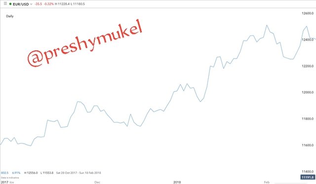
1. Explain the Japanese Candlestick Chart? (Chart screenshot required)
A Japanese rice merchants named Munehisa Homma invented the Japanese Candlestick in the 1700s. In the 1990s a Western trader Steve Nison popularized it's use.
The Japanese Candlestick Chart is a type of price movement of a stock chart represented by candlesticks, it shows the opening, closing, high and low price points of a stock for a specific period of time.
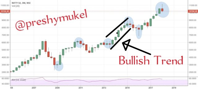
The Japanese Candlestick Chart is the mostly used by traders for technical analysis.
_1625656315645.jpg)
.png)
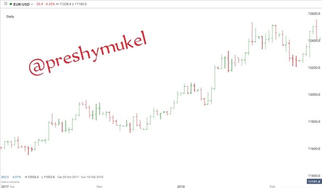
Japanese Candlestick Chart consist of the following;
1. The Body
The body shows the market opening and closing. It covers the price distances of gain and loss.
- Opening: It indicates the beginning of price movement.
- Closing: It indicates the end of a price movement.
2. The wick
The wick indicates the high and low range of the price movement.
- High: The high is the shows the highest price record at every price movement.
- Low: It shows the lowest price record at every price movement.
- Upper shadow (wick): Is the distance of price from top of the body to the high.
- Lower shadow (wick): It is the distance of price from bottom of the body to the low.
3. Colour
The colour shows the price movement direction at each point in time. Whether bullish or bearish.
- Green colour: This indicates upward trend of stock price which shows a bullish candle.
- Red colour: It indicates downward trend of stock price which shows a bearish candle.
2. Describe any other two types of charts? (Screenshot required)
I'll be explaining the line chart and bar chart.
Line chart:
Line chart is also a graphically representation of data. line chart is a very simple chart that usually shows only closing price of a market. The chart is usually recommended for beginners' since it's very simple and easy to read.
The line chart is represented with continuous lines and they are mainly used for daily trading.
Line chart is usually not detailed.
Bar Chart
Bar chart is also used for technical analysis for the movement of price.
Bar chart usually indicates the opening, high, low, and closing prices of each market trend duration.
Bar charts assist traders in the analysis of trends, spotting of potential trend reversals, and monitoring of price movements and volatility.
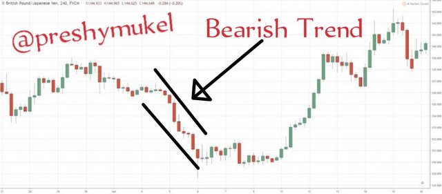
3. In your own words, explain why the Japanese Candlestick chart is mostly used by traders.
The reasons for the widely use of the Japanese Candlestick chart is as follows;
Japanese Candlestick chart helps in quick analysis of price trend because it provides visualize informations.
Japanese Candlestick chart can be used to determine the direction of the market price if it is appreciating or depreciating through the shape and colour of the candlestick.
Candlesticks can also be used to keep track of previous price movement.
The colour of candlesticks help traders ascertain the current price state, if it is bullish or bearish.
Candlesticks also shows who's influencing the market either buyers or sellers at any point in time.
4. Describe a bullish candle and a bearish candle identifying its anatomy? (Screenshot is required)
Bearish Candle
The Bearish candlestick indicates a downward movement of the price of a stock.
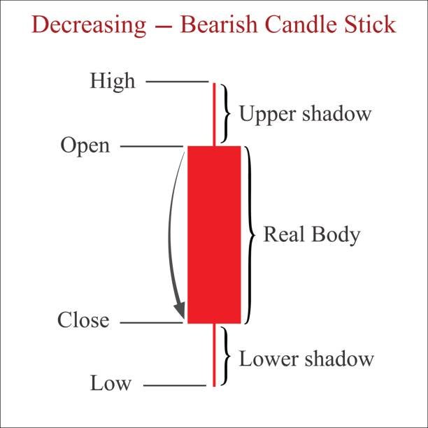
A typical anatomy of a bearish candle consist of the following;
An opening: Which indicates the beginning of a price movement. It is seen at the upper part of the candlestick.
A closing: The end of a price movement. It is seen at the lower part of the candlestick.
High: The highest price recorded of a price movement.
Low: The lowest price recorded of a price movement.
An upper and lower shadow: Which indicates the distance of price from top of the body to the high and from bottom of the body to the low respectively.
It is usually represented with red colour.
The bearish candlestick is characterized by the close being lower than the open, and this shows that the value of the stock is experiencing a decrease.
Bullish Candle:
A bullish candlestick represents an upward movement of the price of a stock. When a bullish candle appears it indicates a flourish in the price of a stock.
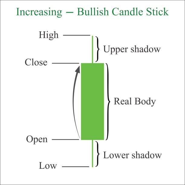
Anatomy of a bullish candlestick also consist of the following;
An opening: Which indicates the beginning of a price movement. The open is located at the bottom part of the candlestick.
A closing: The end of a price movement. It is seen at the upper part of the candlestick.
High: The highest price recorded of a price movement.
Low: The lowest price recorded of a price movement.
An upper and lower shadow: Which indicates the distance of price from top of the body to the high and from bottom of the body to the low respectively.
It is usually represented with a green colour
Bullish candle close is higher than that of the open, thereby showing an increase in the price value.
CONCLUSION
The invention of charts lead to technical analysis which is a very important tool in the trading market. Charts help traders and investors to be able to ascertain the right time to buy or sell a coin. It is therefore mandatory for every trader/investor to acquire the know of technical analysis.
Thanks for reading through my post.
Best regards: @reminiscence01
Hello @preshymukel , I’m glad you participated in the 2nd week of the Beginner’s class at the Steemit Crypto Academy. Your grades in this task are as follows:
Observations:
While this is true, know that more emphasis should be layed on the closing price of the asset because that is where all the information lies about the asset.
Recommendation / Feedback:
You did great. Thank you for performing this homework task.
Greetings Prof. @reminiscence01
It's the 7th day of my post and it has not been curated. Please kindly attend to it.
It will be curated.