Steemit Crypto Academy Season 3 Week 2 - Beginner's Course || Introduction to Charts || Done By @preshdan || 100% Power-Up
I want to express my profound gratitude to Professor @reminiscence01 for his explicit and detailed lecture on Charts and on the same vein, I welcome every one of you to my blog meanwhile, let's get started.
1 Explain the Japanese Candlestick Chart? (Chart screenshot required)
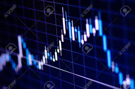
Candlesticks (also called Japanese candlestick chart) are a technical analysis tools used by traders to chart and analyze the movement of price of securities. It is a kind or type of price chart that displays the opening, closing, high and low price points for each particular period of time. The candlestick charting concept was developed by a Japanese rice trader named Munehisa Homma, but popularized among Western traders in the 1990s through Steve Nison, a broker. Japanese candlestick charts are the way; most common among the general public; to rapidly analyze price action, especially with technical traders. They presents information much more visually than traditional line charts, displaying a market's lowest point, highest point, opening price and closing price at a glimpse.
Candlesticks graphically displayed the nature of price movements by using various colors to indicate the differences. Traders can make use of the candlesticks to establish the identity of price action patterns and make choices or judgements based on the short-term price direction. In addition, it is a fashionable financial chart used to depict price movements of a derivative, security, or currency.
Similar to a bar, candlestick portrays all four relevant and crucial pieces of information for that day which include: open and close in the thick body; high and low in the “candle wick”. Being packed with information in a dense manner, it probable to portray patterns of trading over short periods of time, many times, a few days or a few trading sessions.
Most frequently, candlestick charts are used in currency price patterns and equity technical analysis.

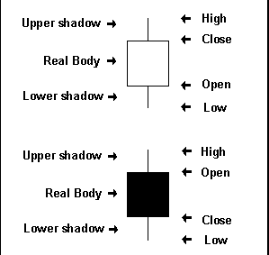
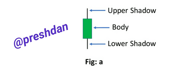
An individual candlestick contains a central portion which displays the distance between the open and the close of trade, this area is referred to as the "body". The "upper shadow" shows the price amount of space between the "High" and the top of the body for the trading period. The "Lower shadow" is the price amount of space between the "Low" and the bottom of the body for the trading period
Most of the time, the "Real body" is white in the circumstances that the candlestick closes at a price higher than it opened. In a case like that, the closing price is found or located at the top of the real body and the opening price at the bottom.
Supposing that trade closed at a price lower than it opened for the period of time, the body is most of the time filled up or black in color. Here, the closing price is found located at the bottom of the body while the opening price is at the top. Contemporary candlesticks now substitutes the white and black colors of the body with increased quantity of colors like as red, green, and blue.
2 Describe any other two types of charts? (Screenshot required)
Bar charts are made up of multiple price bars, alongside each bar explaining the movement of prices over a specified period time. An individual bar shows high, open, low, and closing prices in a typical manner, in spite of the fact that this may be modified to display only the high, low, and close.
Bar charts are used by technical analysts to monitor the action of price, which assists in trading decisions. Bar charts permits traders to monitor volatility and price movements, analyze trends and identify potential trend reversals.
Facts About Bar Chart
- Bar charts visually portrays the high, close, low, and open prices of a security or an asset over an adequately commented period of time.
- The high and low prices for the period is represented by the vertical line on a price bar.
- The open and closing prices are represented by the left and right horizontal lines on each price bar.
- Bar charts may be colored coded. It can be colored black or green if the close is above the open, and the bar may be colored red supposing the close is below the open.
The volume chart also known as Price By Volume (PBV) is a horizontal histogram that is plotted on a security's chart, which displays the volume of traded shares at a definite price level. Many times, volume chart histograms are discovered on the Y-axis which technical traders uses in predicting areas of support and resistance.
Price by volume charts display total volume at stated price levels over a time period. This implies that the forecasted support and resistance levels in the future might be out of date.
Facts About Volume Chart
- Price by volume charts are used to explain high buying and selling interest at definite price levels.
- They serve as indicator of price levels over a determined time period.
- They are broadly used in combination with other forms of technical analysis
3 In your own words, explain why the Japanese Candlestick chart is mostly used by traders.
Many reasons abound why traders mostly use Japanese Candlestick chart, below are a few of them;
- A Long Proven Technique
For nearly 250 years, traders has been assisted by candlestick charts to comprehend the price action in markets. The first use of candlesticks widely is ascribed to Homma Munehisa a Japanese rice trader in the 1700s (it is for this reason that is called Japanese candlesticks). In the city of Sakata 1750, Homma started trading in the rice market. It is also for this reason that when studying candlesticks, one may hear references to “Sakata’s Methods” or “Sakata’s Rules”.
The Homma's analyzed decades of rice prices, making comparison with yearly weather conditions, in the course of time became a hero in the rice trading industry. Candlesticks evolved from his trading methods in the rice markets and nowadays, this exceptional analytical tool is beneficial to all traders and analysts.
- A Psychological Portrait
Obviously, prices most of the time are influenced by hope, greed and fear. A few form of technical analysis is necessary to be employed in order to understand these unstable psychological factors. Candlesticks allows for reading the changes in the market’s determination of value, which in another way is known as investor sentiment. Candlesticks performs this by displaying the interaction between sellers and buyers, which many times is reflected in price movement. Consequently, candlestick charts makes attainable an insight into the financial markets which does not exist with traditional bar charts.
- Superior to Traditional Charts
Traditional bar charts by themselves have little meaning, whilst on the contrary candlestick charts shows the action that occur in the market that day being well specific. A view at the action of price in an equity over time permits traders to use pattern analysis in determining the probability of the future movement that equity. Following a small amount of practice and getting familiar, candlestick chart pattern analysis may play an immanent role in any investment methodology.
- Easy to Understand
Candlesticks visually makes attainable a clear and easy-to-identify set of patterns which are highly correct and exact in predicting market trends. By using candlesticks, together with some fundamental technical analysis, traders easily begin to perceive patterns come into view in the market — and more importantly, traders can begin to take advantage of these patterns when trading.
The pleasant and impressing thing about candlesticks is they don’t take too long to be mastered. The patterns, with practice, can be memorized somewhat quickly, and despite that this doesn't take some effort, the profit brought by potential understanding these tools is actually invaluable.
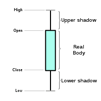
4 Describe a bullish candle and a bearish candle identifying its anatomy? (Screenshot is required)
As explained earlier, the horizontal lines represents the open and close (figure a). Both lines are boxed once added to the chart. The box is called Body. The lines stretching from the body shows the extremes of price movement during the day. These are referred to as shadows. The shadows above the body is known as the upper shadow while the shadow below is known as the lower shadow. The length of the shadows are significant and has important implications to the strength of reversal moves.
If the close is higher than the open the body is green and is said to be a Bullish Candle (figure b)
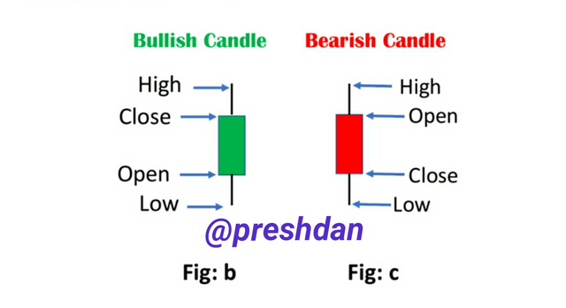
If the close is however lower than the open, the body is red and thus is called a Bearish Candle (figure c).
It does not necessarily mean that a green body represents that the price was up for the day or that a red body represents that the price was down for the day. The body color is only to clarify where the close was compared to the open.
The closing price therefore ascertain definitely whether the candlestick is bullish or bearish.
Written by:
@preshdan
I am grateful Professor @reminiscence01 for such a lesson, thanks for reading through.
Cc:.
Hello @preshdan, I’m glad you participated in the 2nd week of the Beginner’s class at the Steemit Crypto Academy. Your grades in this task are as follows:
Observations:
Please remove this chart with website address. You can use your own chart or use copyright free images.
Recommendation / Feedback:
Thank you for submitting your homework task.
Thanks prof, the correction has been done