Season 5 Beginner Course // Candlestick Patterns.// Steemit Crypto Academy S5 - Homework Post for Task 10 by @ oshimadu
Hello everyone , today i will represent about season 5 task 10. The lecture presented on candle patterns and Japanese candles is well explained by Professor @reminiscence01 and after reading, it is very important as it depends on our entry and exit into the financial market.

Image designed by canva
Entire question
1a) Explain the Japanese candlestick chart? (Original screenshot required).
b) In your own words, explain why the Japanese Candlestick chart is the most used in the financial market.
c) Describe a bullish and a bearish candle. Also, explain its anatomy. (Original screenshot required)
01 Explain the Japanese candlestick chart?
.jpeg)
The Japanese candlestick chart is the representation of the price of an asset in the market. This is one of the most widely used charts in the world, and it is one of the oldest. It is very popular and well known for its simple way of being explained , and it shows us a clear picture of the price movement of an asset in real time. If we want to carry out a technical analysis, we can use this graph as a tool because it shows us a very simple structure to explain .
This chart is made up of candles that tell us how the price of an asset behaves. We find red and green candles, however, the colors can be modified to suit the operator. In general, the red candles indicate that the price is falling, and the green candles indicate that the price is increasing. By understanding these types of charts well, we will have the opportunity to improve our technical analysis and consequently when operating in the market we will have a greater probability of success.
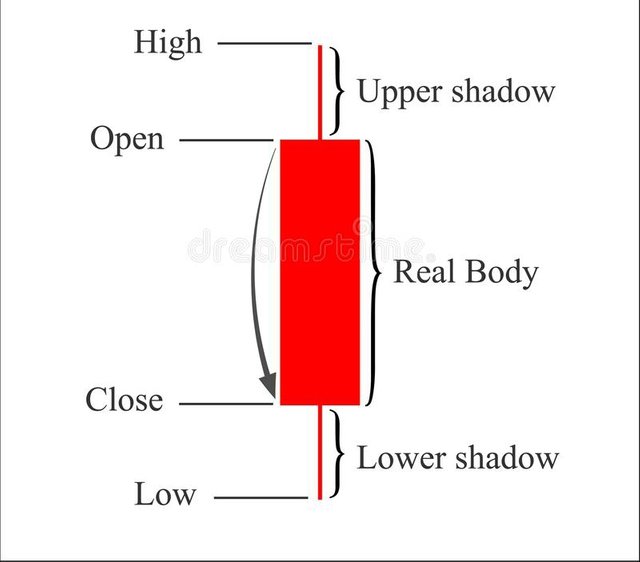
The anatomy of a Japanese candle shows us important details about the price movement. These candles show us the opening price, the minimum price, the maximum price and the closing price. Graphically this can be observed in the body and in the wicks (shadow)of a candle.
We can also change the timing of this chart, that is, a candle can represent the price movement in minutes, hours, days, weeks, and more. The candles also show us information about the trading volume. Each candle is formed just from where the previous one ended, that is, the opening price of a candle is located at the same point where the previous candle had its closing price.
For this I will use binance and see the following example from the TradingView platform with cryptocurrency pairs BTC / USDT:
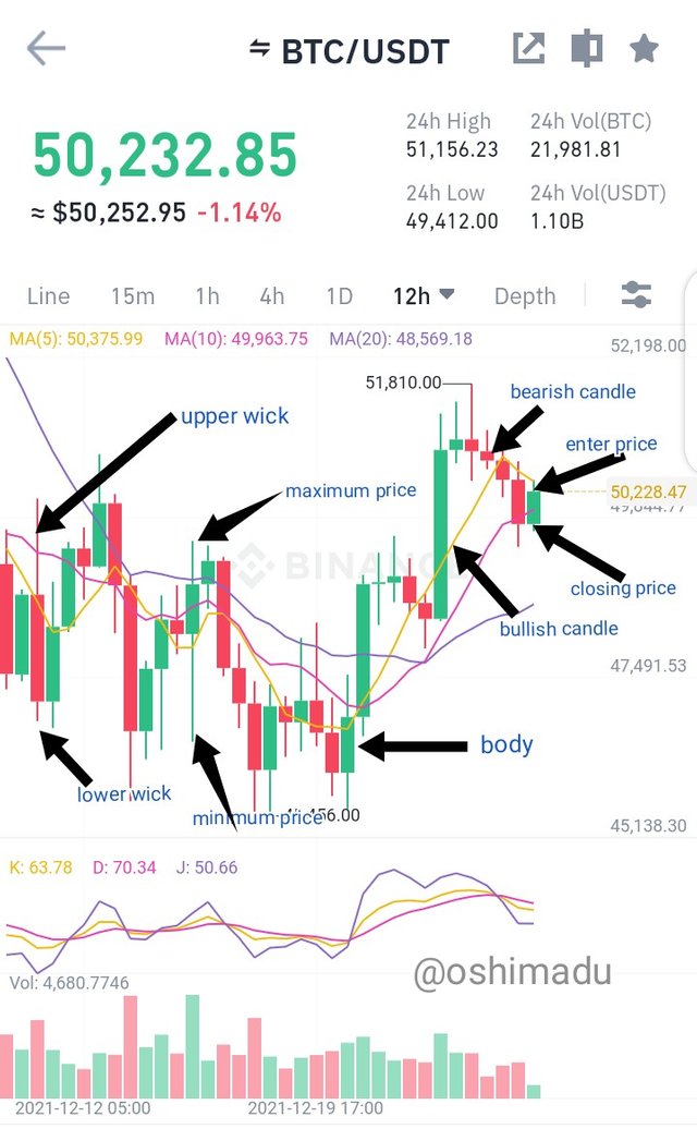
screenshot by binance
In the example shown we can see the Japanese candlestick chart with bearish(lower price to come) and bullish candles(enter and uptrend), and we can also appreciate the anatomy of a candle.
02 explain why the Japanese Candlestick chart is the most used in the financial market.
.jpeg)
This graph is the most used because it is very easy to explain , since it shows us a generalized and also individual view of the movement of the price of an asset in real time. It also shows us possible trend formation or reversal of them, which will make us identify excellent market entries or exits, that is, possible purchases or sales, in order to increase our profits or, failing that, reduce losses. Through the candles and their anatomy we can identify how strong a trend is, observing its length, color and formed pattern.
All the information that this graph provides makes it very reliable, easy to work with and provides comfort to those who use it, whether they are people who are widely familiar with the subject or who only have basic knowledge.
Everything mentioned above makes this chart a fundamental tool in cryptocurrency trading. Let's remember that the market is not totally safe, however, a good analysis using this graph will increase our chances of success. This is why this graph is reliable, and the most used by everyone.
03 Describe a bullish and a bearish candle. Also, explain its anatomy.
We already mentioned that a candle has a simple anatomy to interpret, which gives us important information to analyze about the price movement of an asset within the market in real time. These candles can be bearish (red color) or bullish (green color).
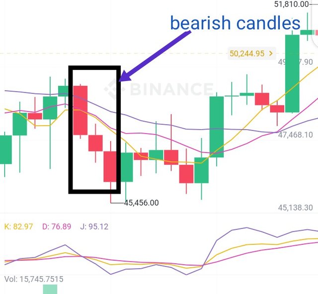
screenshot by binance
This candle indicates a fall in the price of an asset in a certain time. The fall can be seen reflected in the body that goes from the opening price to the closing price. The shadows come to represent the difference between the opening price and the maximum price reached (upper shadow), and the difference between the closing price and the minimum price reached (lower shadow) in a given time.
source
Upper shadow(wick) ~ This represents the difference between the opening price and the maximum price reached. This difference determines the size of the upper shadow. Body ~ This represents the fall in the price of an asset in a given time. The body is formed from the opening price to the closing price. The size of the body is determined by how much the price falls in the indicated time. If the body of the candle is large, we are witnessing a strong downtrend. Otherwise, if the body of the candle is small we are witnessing an indecision on the part of the traders. Lower shadow(wick) ~ This shadow represents the difference between the closing price and the minimum price that the price reaches in a given time. This difference will determine the size of the lower shadow.
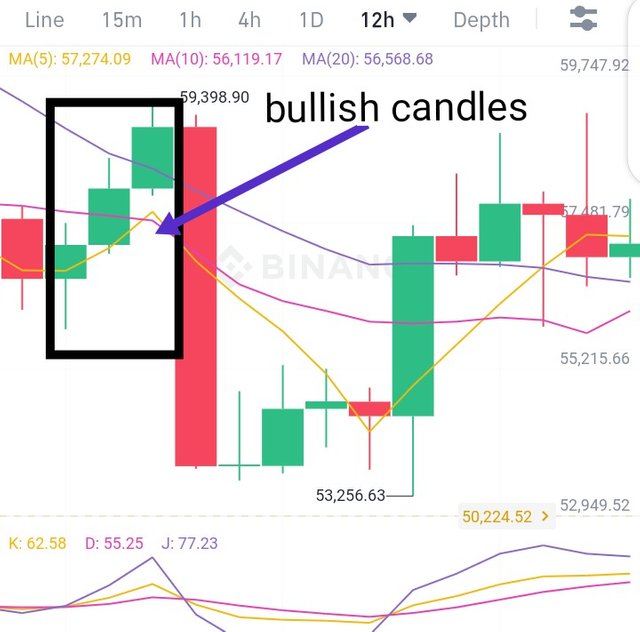
screenshot by binance
This candle indicates the increase in the price of an asset in a specific time. This increase is reflected in the body of the candle, which goes from the opening price to the closing price, and the shadows represent the difference between the opening price and the minimum price, and the difference between the price of closing and maximum price. When looking at the anatomy of the candle we can clearly see that the opening price is located where the body of the candle begins (bottom) and the closing price is located where the body of the candle ends (top). The maximum price is above the closing price and the minimum price is below the opening price.
_1.jpeg)
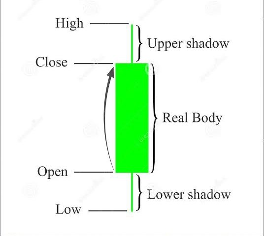
An example of the anatomy of this candle shows all the details we need.
Upper shadow(wick) ~ This represents the difference between the closing price and the maximum price reached. This difference determines the size of the shadow.
Body ~ This represents the increase from the opening price to the closing price, that is, the size of the body is determined by this increase in price. If the body of the candle is large, it is an indication that there is a strong uptrend. If the body of the candle is small it indicates that there is an indecision in the market.
Lower shadow(wick) ~ This represents the difference between the opening price and the minimum price, and this difference will determine the size of the shadow.
Conclusion
Within the cryptographic ecosystem there are many tools for trading cryptocurrency certainly one of the most used is the Japanese candlestick chart for its simplicity when explaining. Through it we can clearly see the movement of the price of an asset, the trends that are formed and possible reversals of them. Knowing the structure of this chart and the anatomy of the candles will give us important information to make more accurate decisions within the market.
Thanks