Crypto Academy Season 3 - Beginners course // Introduction to Charts for Professor @reminiscence // By @ononiwujoel
Hi Professor @reminiscence, I am @ononiwujoel one of your students in Crypto Academy and a member of the steemit platform. This is my homework submission post from your lecture Introduction to Charts
Introduction
There are some vital tools and tactics that are commonly used in trading especially in online markets to make trading easier and help traders to readily have information on the former and current movement of prices in the market. The use of charts is one of this tools.
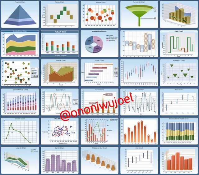
Charts can be simply described as diagrams used to illustrate data on a particular subject of interest. There are several forms of charts including pie-charts, bar charts, line charts, Gantt charts and graphs as well.
Charts are used in many areas of study including mathematics, geography, astrology, survey, economics and business plans but we will be exploring another interesting area where charts are also used and that is in the finance trading
Charts are very popular in finance trading and the crypto market such that to be a successful and knowledgeable trader or enthusiast you must understand charts and how it works.
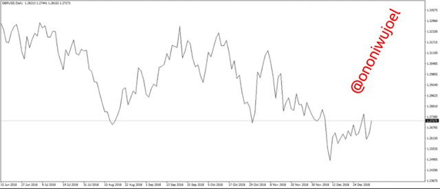
It is used to represent the prices of assets at a given time, whether they are rising or falling. When it comes to finance trading then we should be looking at charts like the Candlestick charts, volume charts, bar charts etc because these are the charts commonly used in finance trading.

Japanese Candlestick Chart
The Japanese Candlestick Chart is the most common and popular chart in trading, both in stock trading and cryptocurrency trading because it is way more understandable than several other charts and it is also one of the oldest if not the oldest type of chart in finance trading.
As its name implies, it originated in Japan back in the 18th century, when it was developed by a trader named Munehisa Homma and has since then developed into what we have today.
The candlestick in the name is because the diagram takes the shape of a candlestick with two extended poles at both ends called the shadow.
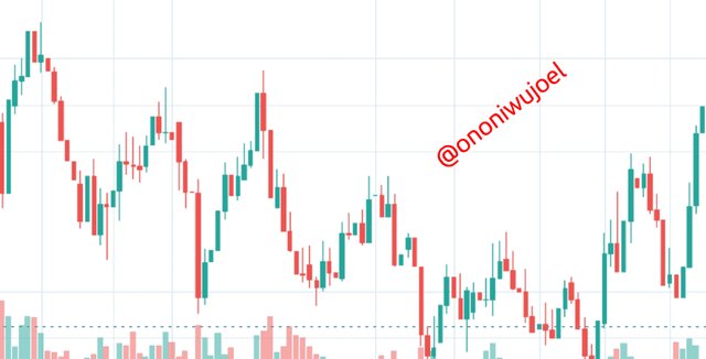
The Japanese Candlestick Chart is made up of two types of candlesticks, one represents an increase in price of assets while the other represents a decline in the price of assets. And the length of a candlestick also shows how much difference there is in increase or decrease of price of the asset.
The candlestick Chart is very useful in trading because it helps traders to be able to predict the trend in prices and know when there is likely to be a rise or a fall and to be able to make good decisions on when to buy or sell their assets.
Describe two other types of charts
Like I mentioned earlier, in finance trading there are several forms of charts aside the Japanese Candlestick Chart, so I will be briefly pointing out two other charts which are the volume chart and line chart.
Volume Chart
Volume in trading simply refers to rate or amount of an asset being sold or bought at a particular time. In other words it is the number of times an asset is ceded and received between traders at a given period.
So the volume chart is a pictorial representation of the amount of a particular asset being traded by people at a specific time. This chart is one of the most important indicators being used by traders because it can be used to predict the future trends in the market. The more the volume of an asset the more attractive it will likely be to investors. The volume of an asset also indicates the level of liquidity of the asset and it shows the amount of people trading that asset
The volume chart is not only used in stock trades but even exchanges also display their volume chart to show how many transactions is happening in the exchange so as to boost the confidence of people to trade with them without fear.
So while the Candlestick Chart is used to illustrate the rise and fall of prices of the asset at a given time, the volume chart is used to illustrate the amount of trade of an asset at a given time. So they're both different and important in unique ways.
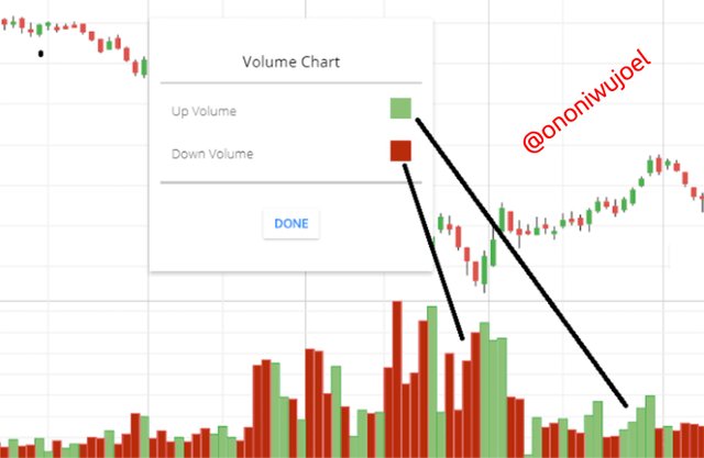
The volume chart is made up of two types of volumes, the buying volume and the selling volume
The buying volume is usually colored green and it represents an increase in prices of the asset while the selling volume usually colored red represents a decrease in the price of the asset.
Line Chart
Line chart is probably the commonest chart used in trading and it is very understandable and easy to work with as well.
Line chart is a chart made up of points connected by straight lines that is used to illustrate the rise and drop in prices of an asset, and to also show the progression of value of the asset over a given period of time.
The line chart has the X-axis(horizontal) and the Y-axis(vertical), the former is used to plot the given time of the chart, maybe in hours, weeks, months or years while the Y-axis is used to show the prices. So the line chart can be analyzed with reference to both the X-axis and Y-axis to know the progression in price value of assets over time.
The line chart is a very important tool in trading and of one the most widely used and accepted tools in finance trading and it is also used to predict the next movement of prices of assets. The line chart also have the High, Low, Support and resistance points which serve as indicators. So it's very profitable that a cryptocurrency enthusiast who wants to trade in the crypto market learn this chart and how to apply it properly
Why Japanese Candlestick Chart is mostly used by traders
The Japanese Candlestick Chart is actually the most popular chart used in trading and the reason for this includes;
The Japanese Candlestick Chart is very self-explanatory and easy to analyse, and also gives complete details on the trends in prices and thereby help traders to readily make safe decisions.
It depicts the range limits of agreement between buyers and sellers on the price of an asset at a given period of time and predicts the likely change of those prices.
Japanese Candlestick Chart also gives a more comprehensive prediction on price change over time judging from the High and Low of the former and current price ranges.
Finally, the Japanese Candlestick Chart is a very useful strategy for analysing trading progression because it focuses on the buyers and sellers prices.
Anatomy of Bullish and Bearish Candles
The Japanese Candlestick Chart is basically made up of two types of candlesticks, the Bullish (long) candlestick and the Bearish(short) candlestick. Each one is a direct opposite of the other because the former represents a rise in price of assets while the later represent a drop in price of assets.
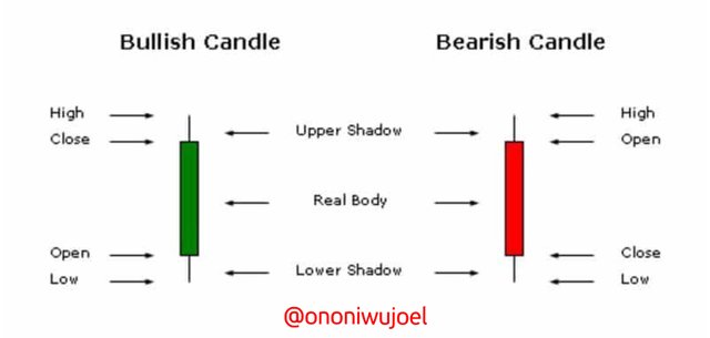
Bullish candlestick
The bullish candlestick is shapes like a candlestick with poles on both ends called shadows. The lower end of the candlestick is called the open because it represents the point or amount where the price movement begins and then continue to the point where it stops called the close. The close is higher than the open price and marks the end of range of price movement at that given period of time.
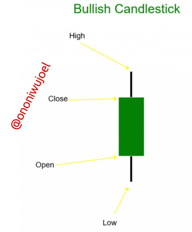
The shadow at the lower end is called the Low and it represents the lowest price the asset is traded at that period of time while the shadow at the upper end is called the High and it represents the highest price at which the asset is traded at that period of time. So the High and Low are opposite of each other as well.
Bearish candlestick
The Bearish candlestick has exactly the same shape with the bullish candlestick except it represents a drop in prices while the bullish represents a rise.
The lower end of the Bearish candlestick is called the close while the upper is the open showing that the price of assets is actually moving downwards
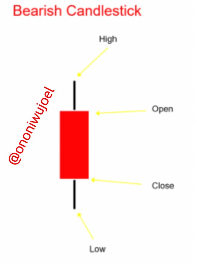
The shadows function exactly same way like in the Bullish candlestick. The lower shadow is also called the Low and the upper shadow the High. The High marks the highest price of the asset over a given period and vice versa for the Low
Conclusion
Understanding charts and how they can be used as techniques in trading is very important not just for crypto traders but all that engage in one form of stock trade or the other because with with this skill you will easily understand the market trends and know the best time to buy and sell an asset. It is also useful in sensitive types of trading like the margin trading and other short term investments with aim of making profit from the rise and fall of prices in the market.
It was a great lecture and I learnt a lot that I had no idea of before now.
Cc: Professor @reminiscence
Your assignment is well written and I love the way you took time to explain it. I must say,I learnt some tips I never knew before now.i wish you the very best even as you're being remarked by the Prof.
https://steemit.com/hive-197809/@vik24/contest-best-curator-week-1-july-4-july-11
Thanks friend, I really do appreciate your kind comment
Hello @ononiwujoel, I’m glad you participated in the 2nd week of the Beginner’s class at the Steemit Crypto Academy. Your grades in this task are as follows:
That's true. This feature is the reason Japanese candlestick chart is widely used by traders. This is because it reveals sensitive information about price that other charts don't.
Recommendation / Feedback:
I'm impressed with the research you carried out to produce this content. Keep the good work up.
Thank you for submitting your homework task.
Thanks a lot Professor @reminiscence