Effective Trading Strategy using Line Charts ]-Steemit Crypto Academy | S6W1 | Homework Post for @dilchamo
It's a beautiful thing to be back to the long anticipated season 6 and I am happy it is here with better regulations that promotes fair judgement and enhances learning.
For this week we have a great lecture by @dilchamo and it's a great privilege to learn as she has proven her potentials over and over again. without wasting so much time, let's dive into the business of the day.


One of the most helpful tools in crypto trading is Line Charts. These show the historical price data and allow traders to analyze and predict future prices. Before I explain how Line Charts work, let me give a brief explanation of such charts in the trading perspective. The graphs help present the market structures, price, support and resistance for assets graphically enabling traders to analyze historical data and be able to predict future prices.
Simplicity is the key of using line charts, which can be made with just a few clicks. Line charts are preferred because of their simplicity, which allows traders to feel in control.
Trading experts have found that line charts are one of the simplest and most effective trading strategies ever. Unlike other complex market charts, line charts present only one simplified price data point at a time. Although there is a great use of the Japanese candle stick by experts, the line chart helps to filter the noise responsible for a lot of traders failure
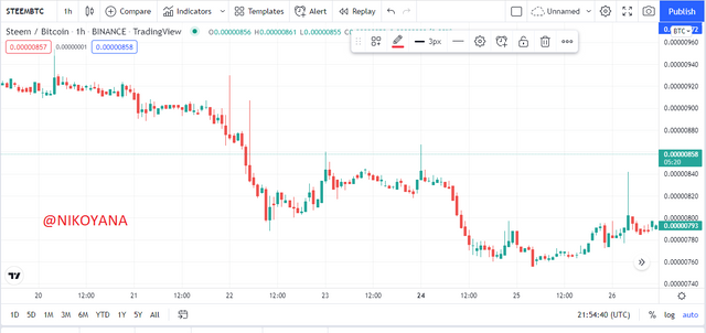
Traders can make good trading decisions with simple lines charts. These charts only show closing prices connected by a line, making them effective tool for traders to learn from the asset’s price history and data points.
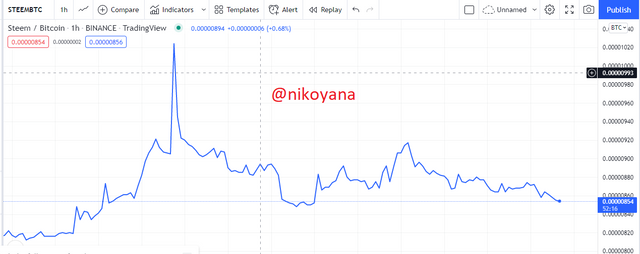
Let's take a look at an example
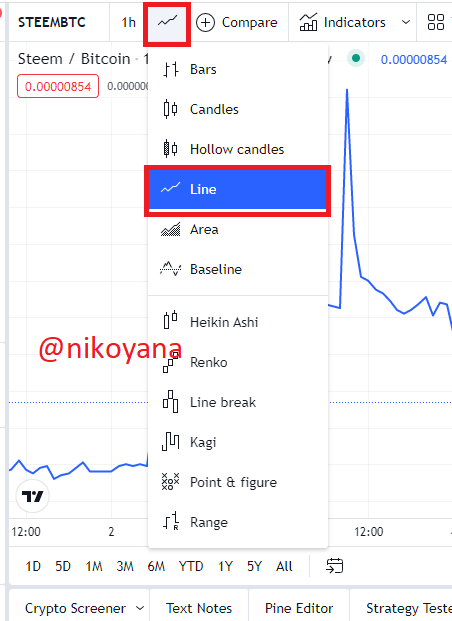
The procedures in adding a line chart is quite simple but I will be going through it just for newbies
- open the website at www.tradingview.com
- click on the icon as indicated and a list of graph will appear as seen below,
- click on the line and you are good to go
There are quite a number of the uses of line charts. Let's take a few
The line chart is used to show the changes of an asset variable over time. because it is easy to read, the human mind could easily understand the time in which the changes occurred.
It is used to identify the trend at the moment either it's a bull or a bear
It shows the ending price of an asset which is an important factor for every trader
It filters the noise on the chart helping traders achieve great trades with reduction in failure
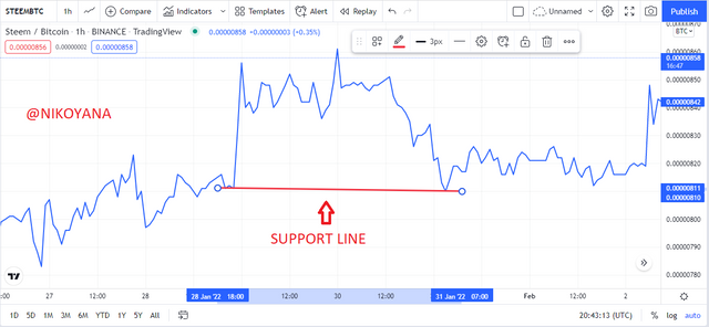
Technical analysts use the support and resistance technique for price reversals and continuation. These areas show when the buyers are in charge of the market and when the sellers are in charge of the market. Traders always utilize the support and resistance technique to make trades with confidence.
A support level on a line chart is a point of resist at which price always reverses after it approaches the level where the selling power is not strong enough to continue. Trading with support levels as your risk management tool instead of breaking them can help you to take advantage of big market opportunities. A strong bearish market can post abnormal openings that breakout from support levels, leading to large drops in price before return to normalization. Looking for this fatal flaw will help you capitalize on short-term opportunities and reduce transaction risks.
Candlestick charts are traditionally based on Japanese rice trading archives, while line charts get their roots in western world stock prices. These two types of chart allow traders to view important market indicators like support or resistance levels.
- Search for where there is a reduction in momentum, indicating that the sellers are getting weak
- Identify a previous point in which there was a retracement and place your first point of the horizontal line
- using a trendline line, draw a horizontal line to touch another corresponding point
- it is important to note that the support is more effective when it touches at least 3 lines
below is the image of a line support
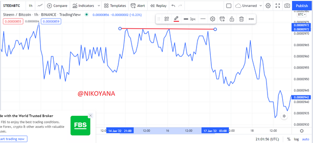
Resistance level prevents a price from rising above a certain level indicating that the buying power is no longer strong enough to push it above that level. A strong bullish market can post abnormal openings that breakout from resistance levels, leading to large rise in price before return to normalization. Looking for this fatal flaw will help you capitalize on short-term opportunities and reduce transaction risks
- Search for where there is a reduction in momentum, indicating that the buyers are getting weak
- Identify a previous point in which there was a retracement and place your first point of the horizontal line
- using a trendline line, draw a horizontal line to touch another corresponding point
- it is important to note that the resistance is more effective when it touches at least 3 lines
below is an image of the resistance level on a line chart
Traders might be pleased with the simplicity of the line chart, but this is not all it has to offer. Interpreting these charts takes time which is normally spent on other types of charts. Simplicity in this example cancels out unimportant data that's found in other charts, benefiting these traders even more.
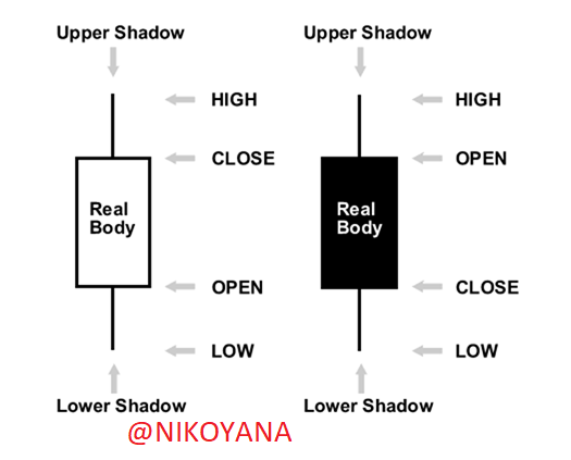
Two charts that market analysts use to analyze stocks and provide implications for trades are the line chart and the Japanese candlestick. The candlestick uses unique graphical content such as high, low, and opening points in addition to displaying closing price for an asset over a defined period. Whereas the line chart only shows closing price dialogue between buyers and sellers with time passing on a linear scale without significant gaps.
Image of a Japanese candlestick
Looking at the candlestick charts can be difficult. This is especially true for novice traders. Their colors indicate the buyer, seller, and pressure they are under. Candlesticks can then be further analyzed to identify clear trade strategies according to their color or formation.
look at a diagram explaining the different sections of a candle stick below showing 5 different points while a line chart shows just one data point.
Line charts look more simplistic and provide a straightforward way to view the price movement. Line charts work best as a clearer form of analysis for those looking at long-term trading trends.
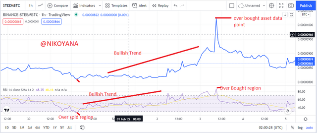
There are quite a number of indicators that can be used with the line chart but for this question I will be using the RSI(relative strength index)
The relative strength index helps to indicate regions of overbought and oversold on a line chart, as we can see below it has reading from 0-100 . when the line graph goes below 30 it indicates that the asset has been over sold signaling a possible trend reversal. vice versa when the line graph goes above 70, there is an indication of an overbought situation and there is a possible trend reversal.
There RSI can also be used to indicate the current trend on the chart as well as false trend signals to avoid losses on the trades showing a bullish trend or a bearish trend.
below is an example of the RSI showing signals of an overbought region and oversold region as well as indicating the trend of the line chart
By being aware of the direction of the market, a trader can avoid risky trades. Oftentimes people will enter into trades that go against the direction of the market, and because it appears to be a good deal at the time, they decide to go through with it. It is crucial to pick up on these opportunities before committing capital because once a trade has been attempted in a trend opposite from where it's going, the result is almost guaranteed to be a loss.
So I will be using the moving average to explain my understanding of the bullish and bearish trading opportunities
Traders can utilize the use of line charts to make quicker and more efficient trades. When price is trading above the moving average, it signals an uptrend whereas when it crosses above the moving average, it formats a trend reversal.
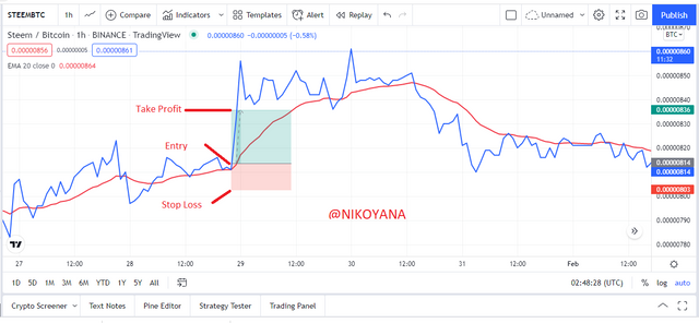
In a STEEM/BTC chart on a 1hr time frame, I noticed the trend had shifted from bearish to bullish after price broke above the moving average. As a result, I entered a trade position with a stop loss below the line at a 1:2 RRR(risk reward ratio)
Traders can use insights from the Line Charts. The traditional definition of a downtrend for Line charts is when the price is trading below the moving average line. Similarly, when prices break below the line, it also signals that there is trend reversal from bullish to bearish
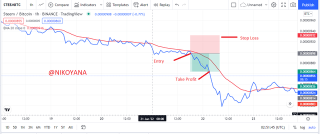
In the STEEM/BTC chart on a 1hr time frame, A slip below the moving average line signaled a trend reversal from bullish to bearish. After this, resistance was unsuccessful and a stop loss was placed above the moving average at a 1:1 RRR(risk reward ratio). This trade opportunity led to a short trade.
- It is simple and very basic to understand
- it can be used to identify a trend quickly on a currency pair
- it helps to eradicate market noise
- It is very easy to identify the support and resistance level on the line chart
- Unlike other charts it doesn't give complete information
- It gives details on closing price only
- One significant drawback of a line chart is that it offers a wide range of previous data points in order to disclose useful information about the market
Line charts are a vital part of interpreting the movement of a market. With these charts, traders can more accurately base their predictions on price movements that may not be immediately visible to the naked eye. Useful information such as momentum and price trends can easily be shown by a line chart. Line charts have been used since 1989 and will continue to be a strong trading tool for years to come.
Many traders rely on line charts to trade. It may not be the best option for everyone, however. Line charts do not provide adequate information on price ranges. This is why it is important to choose a chart based on your trading style, one that suits your needs.
Professor @dilchamo teaches effective trading strategy using line charts and I am glad I learnt something new, thank you professor