[ Effective Trading Strategy using Line Charts ]-Steemit Crypto Academy | S6W1 | Homework Post for @dilchamo
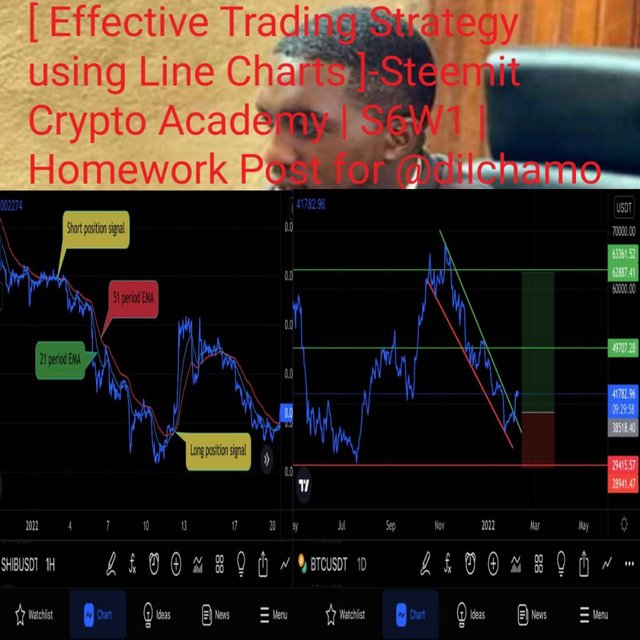

Welcome to my first homework task of season 6 of SCA. This is a task from the lesson of professor @dilchamo. This is about using the line chart for trading technical analysis. I will explain all these in the form of questions and answers as given by my professor.

1. Define Line charts in your own words and Identify the uses of Line charts.
Trading the financial markets requires that a trader be able to see the past history of an asset on a graph such that one can interpret the movement since this is recurrent to a certain level. To achieve this, different price charts have been created amongst which is the line chart. While depending on the choice of the trader upon carrying out an analysis, a specific chart type can be used. Different charts have their advantages over others and also how they can be used to perform certain unique analysis to a fault.
Like price chart is a kind of price chart that is a graphical representation of the price history of an asset in 2D format. Here only the open and close of the market is seen and this is represented by a single line. On this chart, the vertical axis stands for the price change (price increases from bottom to top) while the horizontal axis represents the timeline.
The line chart is seen to be very simple to work with since it has just a single line moving throughout with many disturbing elements on the chart to make it complex. Since the line chart is a description of the open and close of prices for an asset, it has the ability to filter noise and give clear information especially for long term analysis and trend identification. How simple the line chart has proven to be is what has given it some credit in the application of this chart type by traders during trading technical analysis. Like other charts, the line chart can also be used within different timeframes depending on the analysis that the trader is interested in carrying out.
To compare the line chart to other common charts such as the candlestick price chart, we can see how simple the line chart will look because of its direct arrangement without complexity. Notwithstanding, the candlestick chart has a lot to inform the trader about the asset compared to the information that can be gotten from the line chart. This makes the line chart a very good chart style employed by beginner traders who don’t want the complexity of the other chart styles.
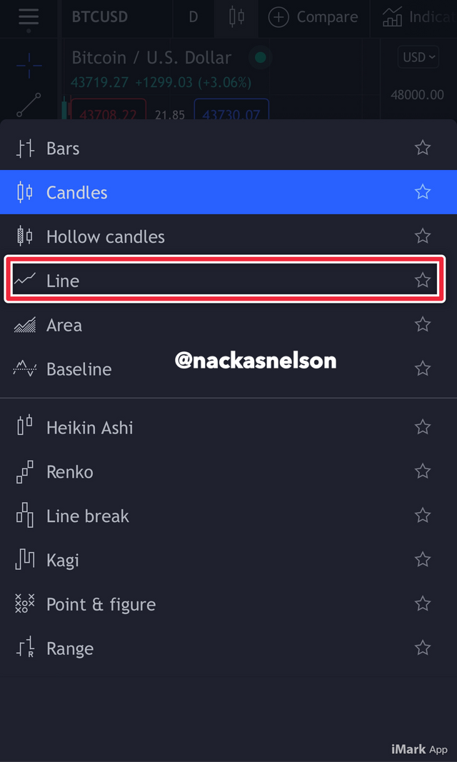
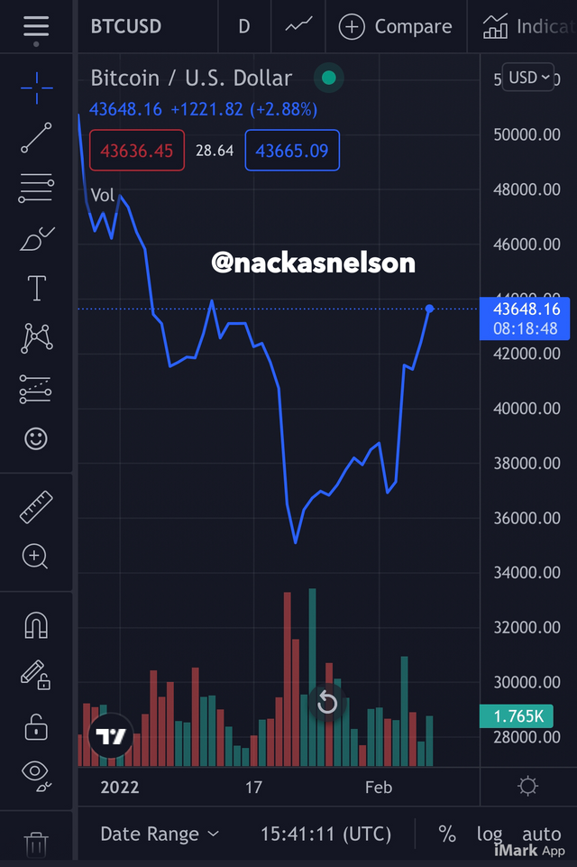
From the above screenshots I have shown how to select and set your line chart on tradingview and the second screenshot shows how a typical line chart looks like. Most at times the trading platforms have other charts such as candlestick chart to be the default chart but when you are to do an analysis with the line chart you simply change the chart style.
Due to the easy to read and interpreting nature of the line chart, traders tend to use it for analysis most of the time especially for long term analysis and for easy trend identification. This easy interpretation gives trading newbies the ability to milk the market with good trades after carrying out good analysis from the line chart without complications. Thus the line chart tend to provide traders with profitable trading analysis with great succcess. Summarily the line chart is best for beginner traders and also for professional traders when carrying out long term analysis and also during trend identification.

2.How to Identify Support and Resistance levels using Line Charts (Demonstrate with screenshots)
Support and resistance marks the bases for every trading strategy and are seen as beginner markers for technical analysis in trading. These fundamental analytical techniques are very vital to trading and should be readily applicable in any price chart on which technical analysis can be carried on. Identifying levels of support and resistance prices gives a head start to the trader on the analysis therein.
A support level is a price through which there’s repeated price reaching down to that level on the price chart such that the lowest prices tend to form a certain chain maintaining a constant price level. There the price forms an accumulation of prices at a particular price level during the live chart of the asset.
To further describe support level, I can say it’s an area on the price chart where the asset trades to the downside many times (at least three times) to a particular price and bounce back upward. The screenshot below best describes this process.
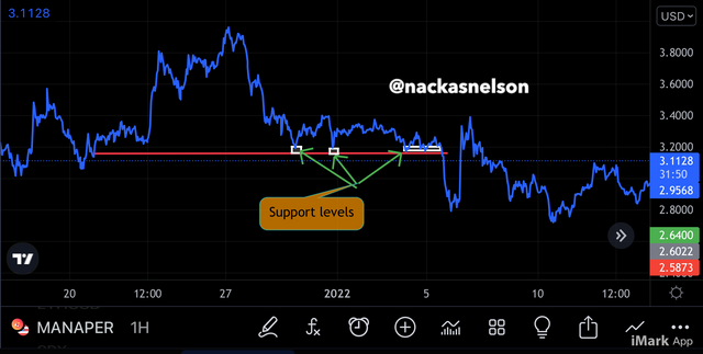
From the $MANAUSDT chart above we can see how the price hits the trend line and retired up for a long time. Drawing a line connecting these points of equal prices forms a support line
A resistance level is the level at which the asset trades many times and hit a certain price such that the point forms an accumulation of peaks on the price chart. To ease understanding resistance and identify resistance level on the line chart, I simply draw a line connecting at least three highs on a roll. This will form a chain of highs which represents a point whereby the bearish momentum was strong enough to maintain a certain buy level while the selling rate increases over time.
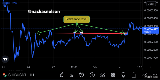
A quick identification is by spotting tips of highs or lows on the line chart and see they are in range and then draw a line to connect them together. This line is what is known as the line of support or resistance line. If the number of lows are many, the support is known as a strong support level whereas if they are very few, it cannot be considered as a major support. This also goes for the resistance. I’m conclusion, the more swing lows and highs that meet on the support or resistance level, the stinger the support or resistance level. Break of these points may signal a trend reversal.

3. Differentiate between line charts and Candlestick charts.( Demonstrate with screenshots)
Candlestick charts are a graphical representation of the price history of an asset such that the highs, lows, open, and close are in the form of candlesticks such that each candle contains these elements in its anatomy. The line chart on the other hand is a graphical representation of the price history of an asset which describes the open and close price of the asset in a single 2D line.
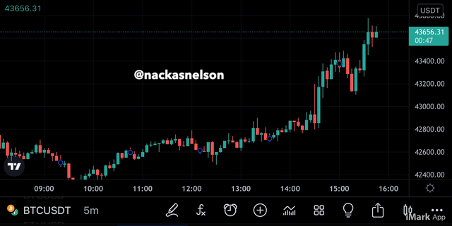
The above screenshot represents a typical candlestick chart showing the candles and how they accumulate over time to form a trend.
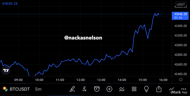
The above chart is a representation of a line chart. We can see the harmony an the clear nature of the chart just from this picture.
We can clearly see how different the two chart styles are. Both charts can be used for carrying out technical analysis in cryptocurrency trading but their significance in the process of analyzing the charts becomes different. The information gotten from the line chart of shallow compared to that gotten from the candlestick chart. The line chart gives clear information avoiding noise and complications while the candlestick chart gives a variety of resources from the market behaviors such that professional traders can analyze based even on single candlesticks. With that said, the line chart is better for technical analysis carried out by beginners or professional traders for long term analysis.
The reason for the candlestick chart being more useful for intraday trade analysis is because much is gotten from the candlesticks. This goes to a level where individual candles can be used as direct detector for trade signals.
More results are gotten from the candlesticks charts such that a variety of trading analysis techniques can be applied easily on the chart.

4. Explain the other Suitable indicators that can be used with Line charts.(Demonstrate with screenshots)
Special indicator tools are best utilized on the line chart due to its nature. Regardless of the type of chart one is using to analyze for trading, you have to apply some indicators at a certain point. Being able to apply your indicators on the line chart is of vital importance to every trader. There’s a variety of indicator tools that one can apply on the line chart to carry out technical analysis. I will describe the use of two Exponential Moving Avearge lines on the line chart and how to apply them for a successful entry and exit plan.
The EMAs are added to the chart one after the other with different tile periods so that one acts as a base for the other. In this case I will use the 21 EMA period and the 51 EMA period. When price trades above the EMA lines the will be a bullish market while below the EMA lines forms a bearish market. This is to say that when the 51 period is below the 21 period EMA line we have a bullish structure and the reverse is true. The more the price trades away from the EMA lines the higher the strength of the trend.
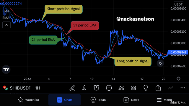
The above screenshot is that of a line chart with added 21 period and 51 period EMA lines. Whenever the two EMA lines cross over we have a trade opportunity in the market. Either short or long position can be placed once the cross is on the perfect side and satisfies the conditions I gave above.
The second indicator I will like to use is the Relative Strength indicator. This is an indicator with a zero level, an overbought area above the zero level, and an oversold region below the zero level.
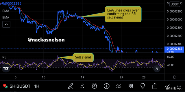
The screenshot above is showing a line chart with the RSI indicator added to the chart. When the price trades in the overbought region on the RSI, it’s is a sell signal and when it trades in the oversold region, it’s a buy signal. On the screenshot above we can see how the RSI gave a signal of an overbought area such that one could’ve taken a sell position and made profits.
On the screenshot above we saw how RSI signal was confirmed by the EMAs such that one could’ve taken a sell position with confidence and made good profits.

5. Prove your Understanding of Bullish and Bearish Trading opportunities using Line charts. (Demonstrate with screenshots)
Carrying out trend analysis on the line chart is done by several means such as the triangle patterns, rectangle patterns, trend line analysis, and flags. Ok this exercise I will use the triangle pattern to analyze for the bullish and bearish market opportunities. In a case where I want to draw my triangle I will make sure I draw a trend line connecting the highs and another line connecting the lows such that both lines meet or have the possibility of meeting and forming a triangle.
The triangle pattern forms when the price of an asset trades making new lower highs and new higher lows such that a triangle is seen in clear view.
Market opportunities on both bullish and bearish structures forms the bases of a good trade. Knowing the market direction still to come up in the market will give the trader an added advantage over the market. The aim of every trader is to make more profits and minimize loses. So identifying this patterns will ease the process and possibility of profit making.
Identifying a bullish market opportunity with the triangle pattern one has to identify the occurrence of lower highs and higher lows such that a triangle is formed. Whenever the triangle is broken (when a breakout forms) a new trend is seen.
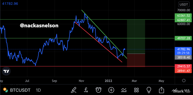
From the above screenshot we can see that after an impulsive move to the upside, there’s a retracement forming a descending triangle. After drawing trend lines forming the suppose triangle, I experienced a breakout to the upside indicating a bullish market opportunity and immediately I placed my position label. Entry is done close to the breakout area while the take profit is at the top of the triangle and the stop loss placed at the former support.
Identifying bearish market opportunities using a triangle pattern will work the same way as the that of the bullish market opportunity.
After the has been weakness in a trend momentum, the is the possibility of a trend slow down and possible reversal. On this exercise I identified an impulsive bull move which slowed down forming a triangle pattern. I drew trend lines on the highs and lows of the triangle in formation and saw a breakout to the downside indicating a bearish market opportunity for a sell trade. The screenshot below shows this explanation clearer.
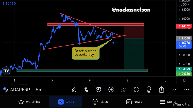
As can be seen on the screenshot above I have placed a stop loss just at the nearest resistance and the take profits at the major support on the downside.
Applying different criteria for identifying market opportunities on the line chart is quite possible. The triangle pattern I just used is a bit of an example for there are many other ways to carry out this analysis.

6. Investigate the Advantages and Disadvantages of Line charts according to your Knowledge.
The line chart is a very good chart style to be used for trading analysis especially in trading academies for beginners to understand price movement in a less complex way. Irrespective of how the line chart seems to be good and easy to work with, it also has disadvantages.
We should know generally that things with advantages have their disadvantages also. I’m the case of line charts, the is a series of advantages and disadvantages upon carrying out analysis for trading. These have been put together on the table below with one column for the advantages and the other for the disadvantages of line charts.
| Advantages | Disadvantages |
|---|---|
| Easily understood by beginners | limited mostly to long term analysis |
| Good for long term technical analysis | The stop loss and take profit prices are quite complex to locate |
| Simplified information display | can be full of lines upon consolidation |
| Display unique breakouts from trends | current close and open positions are difficult to know |
| Filter noise | limited information on the chart |
| Most efficient for technical analysis for long terms | most professional traders don’t use this chart because of its limited information for intraday trading analysis |

The line chart like the other charts are used to carry out technical analysis just the same way the other chart types can be used. Despite that, the line chart has its unique qualities that calls for its use on technical analysis. This chart type goes well for long term analysis due to its clear appearance of trends and how smart it shows breakouts when they occur. Technical indicators can also be used to analyze price movements such that indicator tools are collectively used to determine possible next movement in the market. Just like the candlestick pattern, the chart pattern can take indicators such as the Relative Strength Index, the Moving Aveerage and more. Hopefully we were able to learn from my task and I want to thank my professor for this great lesson.
It should be noted that all screenshots are gotten from tradingview.com unless otherwise stated above