[Effective Trading Strategy using Line Charts] || Crypto Academy S6W1 || Homework Post For Professor @dilchamo|| BY @msalmanjaved
Hello Everyone!
Greetings to All
I Hope everyone is doing well!
Today i am going to complete the Home Work Task of Season 6 Week 1, and task is Related to "Effective Trading Strategy using Line Charts" given by the Professor @dilchamo.


Question# 1
Define Line charts in your own words and Identify the uses of Line charts?

There are many ways to represent the price of an asset in trading platforms one of them is a line chart. Line chart graphically represents the fluctuating price of an asset and consists of a single line. The line in these graphs or charts are formed by connecting only the closing prices of an asset and thus it is a lot simpler chart pattern. This reduces noises from the chart and is much valuable to traders.
It is a 2D representation that is used to study the direction of an asset, determine a particular trend and make estimation and prediction of price of an asset a lot simpler. Traders can easily make trade decisions by combining the line chart along with any other indicator.
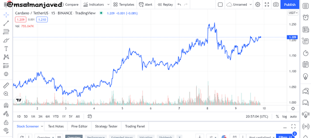
In the ADA/USDT chart of 15 min you see a line chart showing the price of an asset and its trend.
Uses of line chart
Main uses of Line Charts are given as.
- It Used to determine the direction of an asset.
- It Used to identify the regions of support and resistance.
- To Make trade entries and exist in specific time Period.
- It Used by the beginners to make sophisticated decisions.
- It is used by long term traders to get a quick glance at the direction of the market.

Question# 2
How to Identify Support and Resistance levels using Line Charts (Demonstrate with screenshots)?

To identify support and resistance levels using the line chart you need to understand what are support and resistance zones.
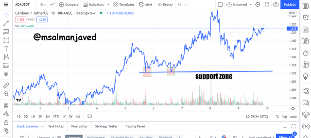
The zone of support forms the floor of the price line. It is a point which the price line touches to make a bullish move. For example, in the ADA/USDT chart we can see a strong support line.
It is identified by using the line chart because whenever the line chart touches this line the price soars above again. It is rarely that the price crosses this line. In case the price crosses this line and remains below it indicates a trend reversal. line chart tells us that a support line is formed by joining consecutive low points.
This line can be extended to predict the possible price where there will be high buyers’ activity.
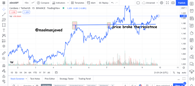
The Zone of resistance forms the roof of the price line. It is a point which the price line touches to make a bearish move. For example, in the ADA/USDT chart we can see a strong resistance line.
It is identified by using the line chart because whenever the line chart touches this line the price dips down again. It is rarely that the price crosses this line. In case the price crosses this line and remains above it indicates a trend reversal. the line chart tells us that a resistance line is formed by joining consecutive high points.
This line can be extended to predict the possible price where there will be high sellers’ activity.

Question# 3
Differentiate between line charts and Candlestick charts.( Demonstrate with screenshots)?

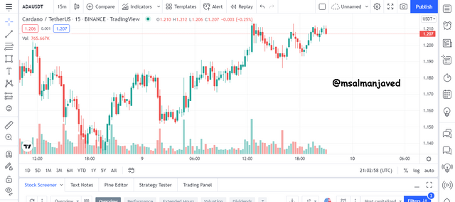
Candlestick charts are another more common type of charts use to represent the price movements of an asset.
Unlike the line chart which only consists of a single line candlestick chart consists of candles with green and red colors.
A typical candle stick has a body and wick. The red candle is a bearish candle and a green candle is a bullish candle. They provide a more detailed analysis of the price of an asset. each candle is calculated using the higher price, lower price, opening price and closing price of the previous candle.
The candlestick chart pattern is more among day traders than the line chart because they may want to know more details about the price of an asset. there are lot of patterns that have been identifies in candlestick patterns that help to predict trend continuation and reversal such as the two tops, two bottoms, flag patterns etc.
The ADA/USDT chart of four hours shows a typical candle stick pattern.
Major differences between Candles stick pattern and Line Charts
| Candle stick patterns | Line Charts |
|---|---|
| 1. provide more details about the price of an asset than the line charts. | Line Charts are based only on the closing prices but candlestick patterns are based on closing, opening, higher and lower prices. |
| 2. Candle stick patterns are bit complex than lien chart | Line charts just market direction and trend candlestick patterns visually show trend change and fluctuations using colored candles. |
| 3. Visual Presentation Makes More Understand able to the candle stick Patterns | No Visual Effects are There in Line Charts. |
| 4.Enriched information for Detailed Analysis available | Less Information Difficult to make short term Analysis. |
| 5. Interaction Between Seller and Buyer shown as bearish and bullish stick | No Interaction found in Line Charts. |

Question# 4
Explain the other Suitable indicators that can be used with Line charts.(Demonstrate with screenshots)?

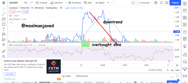
The most suitable indicators that can go well with line chart are the Moving Averages and the RSI. The moving averages are used to determine accurate support and resistance levels and thus identify trends. The RSI on the other hand is a momentum indicator and identifies overbought and oversold zones.
Line chart and the moving Average
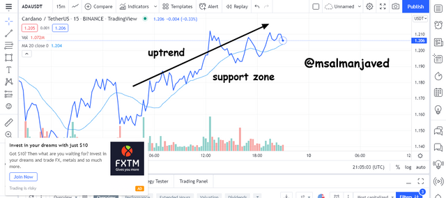
Moving averages act as dynamic support and resistance. when the act as a support the price trades below them and bounces back above when touches it. The farther the price line moves from an MA the stronger the trend.
On the contrary when the MA act as a resistance the price line trade below and bounces back when touches it. MA can also be used to confirm the trend.
When the price is trading above an MA the market direction is bullish and when it is trading below it, it will be bearish trend.
The ADA/USDT chart shows the relationship between MA and line chart and the trend direction.
Line chart and RSI
When the RSI line is above 70 it indicates that the market has entered an overbought zone and a bearish reversal can be expected and we can see the lien chart dipping anytime soon. On the other hand, when the RSI lien crosses below 0 it has entered an oversold region and an uptrend can be anticipated.

Question# 5
Prove your Understanding of Bullish and Bearish Trading opportunities using Line charts. (Demonstrate with screenshots)?

The line charts when used in combination with MA can be used locate the right bullish and bearish trading points.
Right Bullish Entry
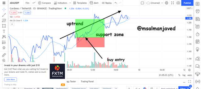
A right bullish entry can be taken when the price is initially trading below the MA. As the buyers take control and the market sentiment begins to change the price line will cross the MA lie to go above it.
Wait until t completely crosses the line. Many traders do the mistake of taking the entry immediately the price line crosses the MA but it is not right you should wait until the price line comes closer to the MA line and take the entry when it bounces back.
Adequate stop loss and take profit should be for a sophisticated risk management strategy. Stop loss was placed just below the support.
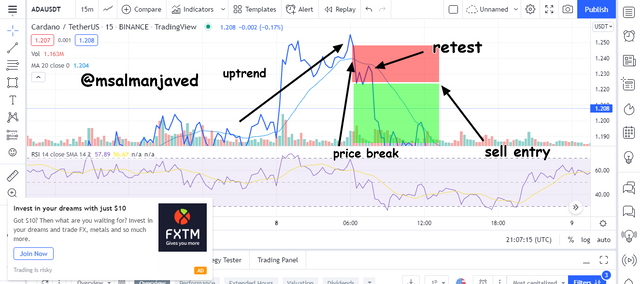
Right Bearish Entry
A right bearish entry can be taken when the price is initially trading above the MA. As the sellers take control and the market sentiment begins to change the price line will cross the MA lie to go below it.
Wait until it completely crosses the line. Many traders do the mistake of taking the entry immediately the price line crosses the MA but it is not right you should wait until the price line comes closer to the MA line and take the entry when it bounces back.
Adequate stop loss and take profit should be for a sophisticated risk management strategy.

Question# 6
Investigate the Advantages and Disadvantages of Line charts according to your Knowledge?

Advantages of the Line Chart
☑ they are very simple to understand and thus very suitable for the beginners.
☑ best for those who are still learning the basic trading strategies or chart patterns.
☑ can be used indifferent time periods.
☑ correctly identify the direction of the movement of an asset.
Disadvantages of the Line Chart
❌ Not suitable for advance traders.
❌ Miss a lot of information about the price of an asset.
❌ Based only on the closing price.
❌ Need to be paired with other indicators.
❌ Too simple to be reliable.

Conclusion
Line charts offer a solution to teach trading to beginners who cannot understand difficult chart patterns. they trace the price fluctuations using only the closing price and thus reduces a lot of noises from the price of an asset. They are simple to understand and are best to use when only the direction of the asset is concerned.
I hope I would get some good remarks from professor on my effort.

Note : All screenshots are taken from tradingview.com all the Images that i have used have been citied and source have given with every image.
Cc :
Professor:
@dilchamo

#club5050 Eligible
