[PLAY STEEM] App Layout Recommendations : Relocating the search icon, feed, and more...
Before I begin my article or proposal, please take a look at the graphic directly below, which is an edited version of mine created in Photoshop. This is not meant to belittle the app's developer; it is simply a proposal, suggestions, or recommendations, whatever you want to call it. In this article, I'll go over the specifics...
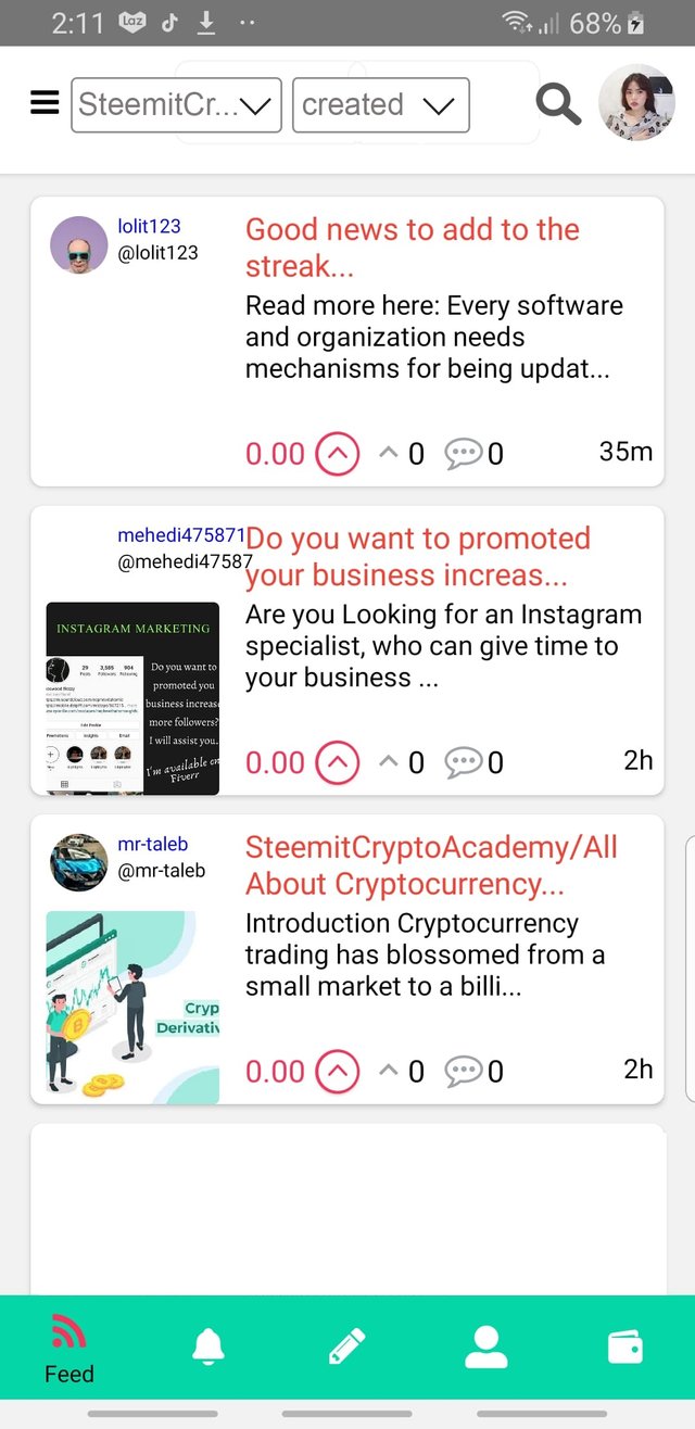
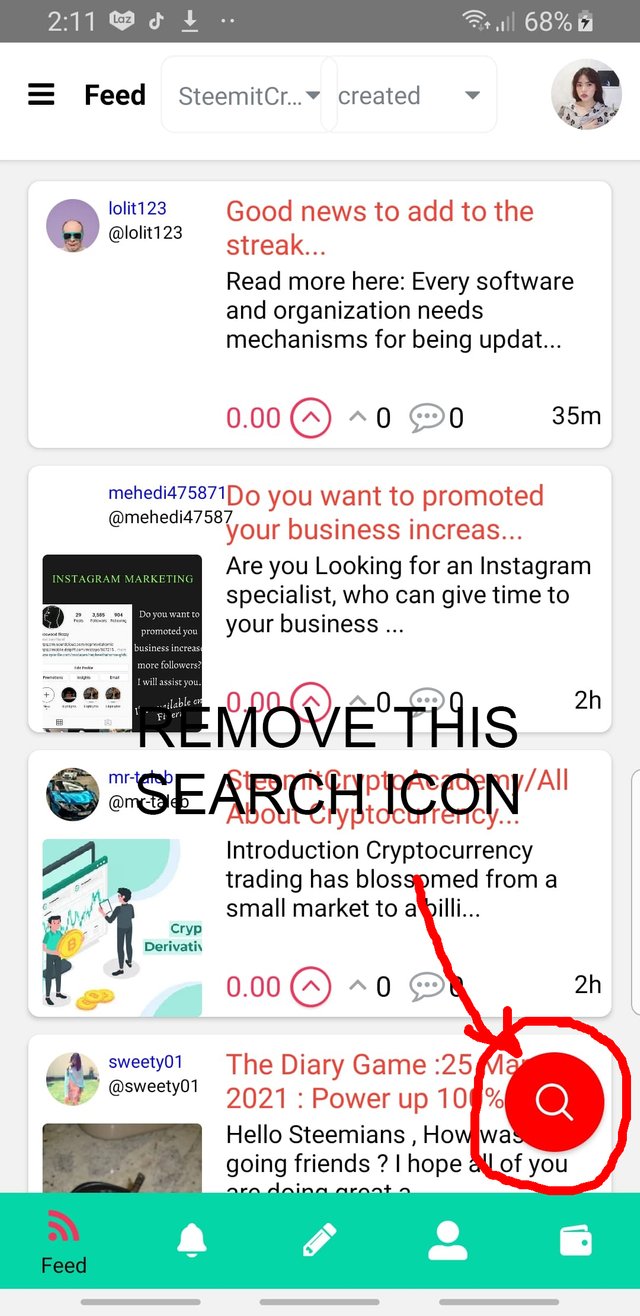
So this is the original look of the app when I open it on my smart phone. The borders or rectangular box that surrounds each of the texts are overlapping, so that is why I decided to create a space between the two.
NEW LOOK
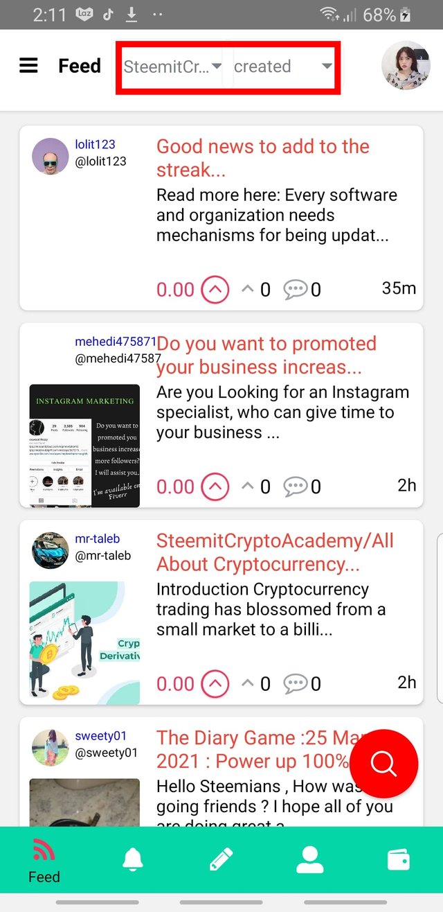
I also propose to remove the feed text near the dropdown list which is redundant in my honest opinion because you already got that feed text or button at the bottom left corner...
I suggests as well to remove the overly large search icon at the bottom right corner, I noticed that it is bugging me the whole time while scrolling the feed.
NEW LOOK
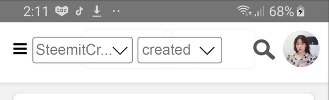
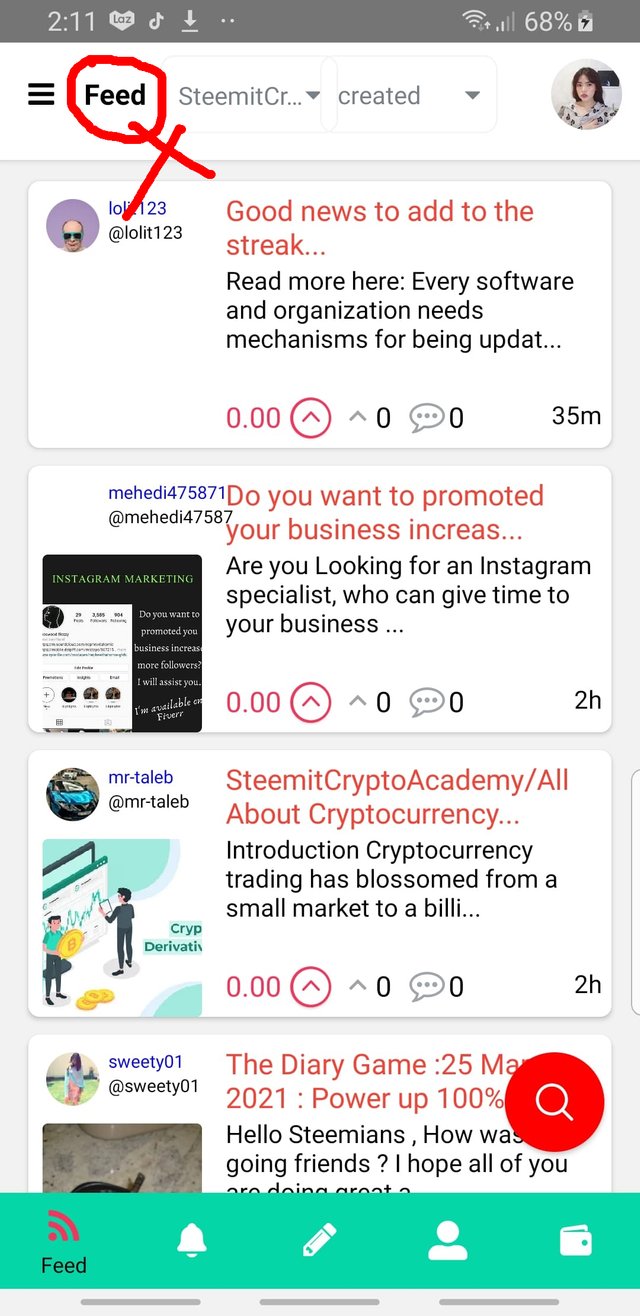
I relocate the search icon beside the profile picture and made it with the same color theme to compliment the rest of the layout.
Again this is the final layout, tho I think will try to suggest more on my next articles, I want to try incorporating my own created icons for it to be more like a steemit feels.
Thanks to @etainclub for sharing with us this amazing application now we can read articles more accessible and interact with the communities without always in front of our laptops or pcs. Until my next proposals ^-^
cc.
@etainclub
@playsteemit
@steemcurator01
@steemcurator03
@steemcurator06
@steemitblog
wow. thanks a lot! great!
thank you too for upvoting :))