Effective Trading Strategy using Line Charts ]-Steemit Crypto Academy | S6W1 | Homework Post for @dilchamo
Define Line charts in your own words and Identify the uses of Line charts.
![AddText_02-07-04.24.57[1].jpg](https://steemitimages.com/640x0/https://cdn.steemitimages.com/DQmbDdk11r4hHVXfjZmNj6vTMhHkLGobRbiZTgG38DdxN5o/AddText_02-07-04.24.57[1].jpg)
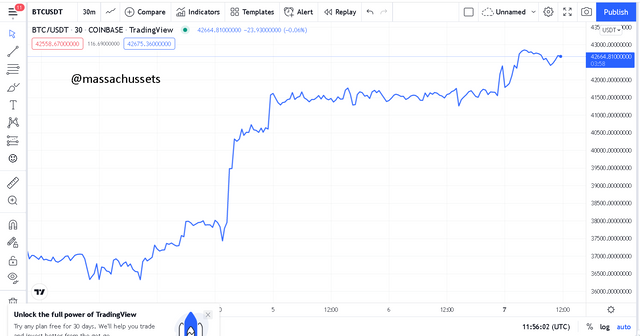
In order to make complete sense I will have to first of all break down the meaning of a chart.A chart is the visual representation of information in a graphical module with the aid of lines, symbols etc for easier understanding and interpretation.
A line chart is a type of chart the represents information over a period of time with the specific use of simple lines. It is derived by identifying the closing prices of an asset over a period of time and then connecting them to each other using simple lines.
USES OF LINE CHARTS
It can be said that line charts serves as the one of the basics technical analysis. It is used to identify price behavior or changes in the market. This helps in decision making during trading. Due to the simple nature of the line chart it is also used in identifying trends with ease, the line chart is used to identify whether an asset is in a bullish or bearish trend.
It is also used to identify the resistance and support zones or levels of an asset in the market. One advantage of the line chart is that it is able to filter out noise in the market.

How to Identify Support and Resistance levels using Line Charts (Demonstrate with screenshots)
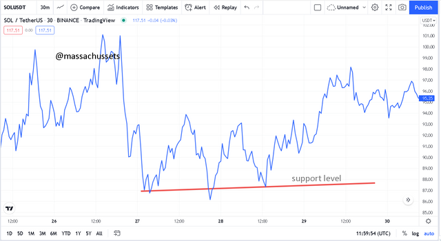
Support level is an area or zone where there is enough buying pressure in the market to always push the price back or prevent the price of an asset from further reduction. In plain words support level is the point where the price bounces back after a fall. But there is situation where the price can break through the support level in this case the support level now becomes the new resistance level and a new support level is formed below. The support level is identified using line charts by identifying the previous swing lows in recent market and then connecting them with a straight line to generate your support level.
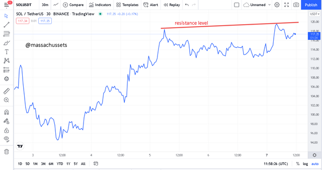
Resistance level is an area or zone where there is enough selling pressure to push down the price or prevent it from going further up. This is a point where the price bounces back up after a good bull run. In a strong bullish trend, the resistance level can be experience a break through then a new level is generated. It is identified using line charts by identifying the recent swing highs and drawing a straight line to connect them.
Differentiate between line charts and Candlestick charts.( Demonstrate with screenshots)
LINE CHART
CANDLESTICKS CHART
The main difference between the two charts is that; the candlestick charts contains or displays a lot of information thus the opening, closing high, low being the wick and body of the candlestick whereas the line charts only displays the limited information thus the closing prices only. With the anatomy of the two we can say that the candlestick chart is a 3D representation whereas the line chart is a 2D representation of the information.
Explain the other Suitable indicators that can be used with Line charts.(Demonstrate with screenshots)
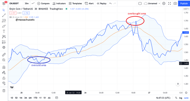
BOLLINGER BANDS.
This is a technical indicator that consist of 3 moving averages. It is used to determine whether an asset is overbought or oversold. When the prices edges closer to the upper moving average it means the asset is being overbought but when it edges closer to lower band then it means it is being oversold.
Combining this indicator with the line charts is very good as it is able to easily generate sell or buy signals and makes decision making very simple.
Prove your Understanding of Bullish and Bearish Trading opportunities using Line charts. (Demonstrate with screenshots)
In my opinion identifying trading opportunities using the line charts you will need to develop a good and reliable trading strategy. This can be the use of any strategy or indicator you find comfortable working with. In my case I will decide to work with the simple triangle pattern trading strategy. I will use the triangle pattern together with the line charts in the paragraphs below to identify trading oppurtunities.
ASCENDING TRIANGLE
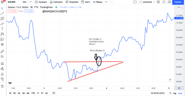
This is a pattern that is generated during a bull run, it might not be a strong bullish run. The ascending triangle pattern is made up of two lines moving in a relatively up direction. The upper line which serves as the resistance level Is a horizontal line whilst the bottom line is a line moving in an upward direction. The bottom line also represents the support level. When the price breaks out the resistance level then buy opportunity has occurred it is best for away trader to buy because it is the beginning of a possible bullish run.
DESCENDING TRIANGLE
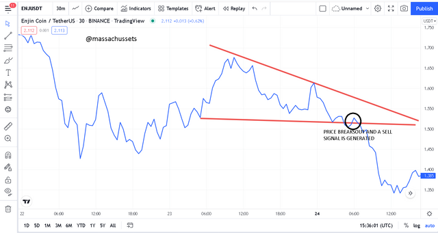
This is also a price pattern that is generated during a bear run or the beginning of a bearish run. The descending triangle is also made up of two lines. The lower or bottom line which serves as the support level is seen to be a flat line whilst the upper line which is the resistance line is seen to be slopping in a downward direction. In a case where the price breaks the support level it indicates the beginning of a bearish run and there a sell signal is issued.
Investigate the Advantages and Disadvantages of Line charts according to your Knowledge.
| ADVANTAGES | DISADVANTAGES |
|---|---|
| It is very easy to read and understand as it uses only the closing prices. | its leaves other important information out. |
| It’s a suitable chart for beginners as it very easy to interpret. | it best used for longer time frames. |
| It reduces the noise generated in the market | it can give false signals especially when you use a short timeframe. |
It has been a very insightful lesson. Being a good trader in the crypto market, you need to be able to carry out good technical analysis and the line chart is a good start for every beginner. Even though it has its limitations but when it is used appropriately you can get very good results. Thans to professor @dilchamo for such a great lecture. Hoping to learn morefromyou in the subsequent weeks.