Steemit Crypto Academy Season 3 Week 2 ||Beginners Course| introduction to charts
I want to specially appreciate prof @reminiscence01 for this awesome lecture, I can’t really express how much am grateful for these lectures delivered with simplicity.
”Explain the Japanese candlestick chart? (chart screenshot required)
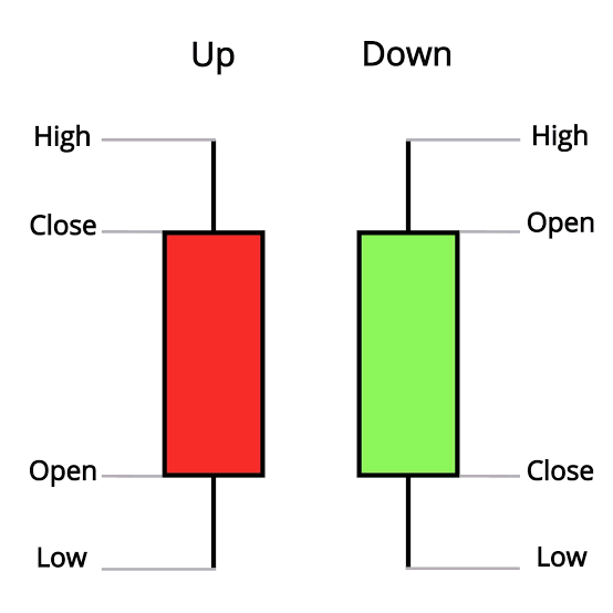
Japanese candlestick chart was invented by japanese who sell rice way back 1990. It came into limelight by a particular broke named Steve Nison .It is a kind of chart that shows a very comprehensive and detailed information about the flow of price using demand and supply as it basis. It is a very common and widely accepted method of studying the movement of price today. It shows the opening price, closing price,highest price (high) and the lowest price (low). These can be shortened usoing HLOC. One other interesting key feature about this chart is that it can be used t track previous price movement and patterns. At this point I will like to point out some useful things about the candles
(Screenshot of both candle)
- The candle are differentiated using colours (the green & Red
- The green signifies upward movements while the red signifies the downward movement
- The green candle opens its price form below and closes above while the red opens above and closes below.
- The green signifies BUYERS while the red signifies SELLERS
- Both candles usually have wick or shadows at the top and below. The wick at the top signifies the highest point that price got to within a time frame while the wick below shows the lowest point the price reached within a time frame.
- The green candles are also referred to as the bullish candle while the red is referred to as the bearish candle
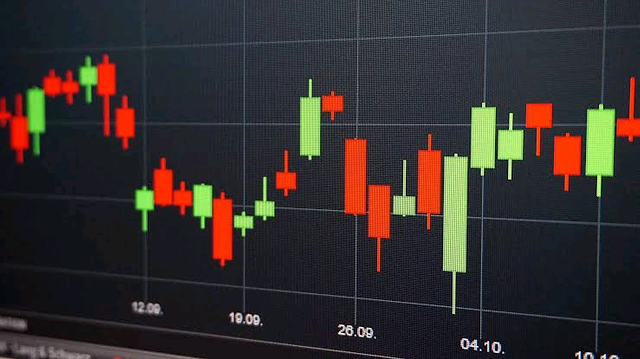
See Screenshot of both candles and a price trend of a crytptocurrency.
”Describe any two types of charts? (screenshot required)
There are other charts used by traders depending on what they want to achieve. The other type of chart includes
Line Chart
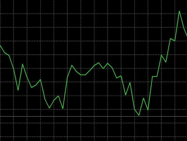
Line chart is a peculiar kind of chart that only shows the closing price traded within a particular timeframe. This is onlike the candlestick that gives a very detailed view of the market. This line chart is suitable for those who loves to trade daily.These datas are connected by a straight line from on point to another. It also important to mention that this chart is easy to understand and presented in it simplest form.
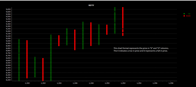
Point and figure chart
Point and figure chart can be defined as a very suitable chart for long term investors. Researchers remarked that its one of the simplest ways to determine solid entry and exit point in the market. It can also be used to study supply and demand efficiently without losing out on the market trend.
It has two obvious features X and O. the ‘x’ signifies rising price while the ‘o’ signifies the falling price.
”In your own word, explain why the Japanese candlestick chart is mostly used by traders.
The Japanese candlestick chart is widely accepted because of the following reasons below.
- it shows the state of the market easily with just a glance. The colours are vital elements in making this very easy
- It gives a very clear direction of where the market is headed. The shape of the candles has a huge role to play here coupled with the colour of the candle
- You can quickly get the trend and pattern of the market via candlestick pattern. You can easily detect if the bulls are takin over or the bear.
- One can use the previous trend of a candlestick pattern to determine the next move.
”Describe a bullish and bearish candle identifying its anatomy? (screenshot is required)
The bullish and the bearish candle can be identified with the following
Candle Anatomy in table
| Features | Bullish | Bearish |
|---|---|---|
| Colour | Green | Red |
| High | has an high point | has an high point price |
| Low | has a low point price | has a low point price |
| Open | open from below | open from the top |
| Close | closes at the top | closes below |
| Movement | moves upward | moves downward |
Conclusion
The Japanese candlestick chart has gained prominence over time and it has been generally accepted ever since it invention. That is not to say other chart are not relevant,they are depending on what you hope to achieve with your trade.
Thanks for reading through my post.
Regards:
Cc: @reminiscence01
Sort: Trending
Loading...